 pagefly.io
Mobile phones have become an inseparable part of our daily lives. Mobile platforms account for 51.53 percent of total web traffic. That is roughly half of all global web traffic. Given the prevalence of mobile usage, website owners must prioritize providing seamless user experiences on mobile devices.
Consequently, website owners must ask themselves –
- How to make a website mobile friendly?
- How to make your website mobile compatible?
This article provides an answer to that question by describing 10 effective techniques for creating mobile-friendly web pages.
I. The Underestimated Factors Affecting The Mobile-friendliness Of Your Store
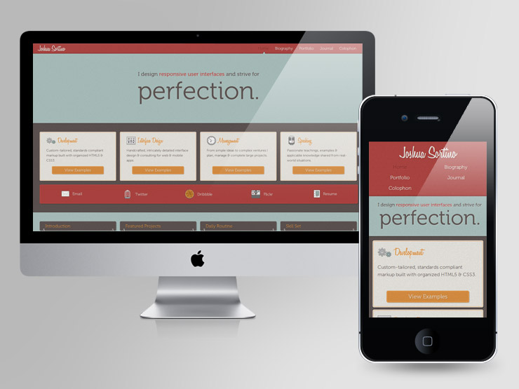
1. Make Your Website Responsive
The majority of web design experts agree that developing a responsive website is the best way to create a site that works well on both desktop and mobile platforms. This is because a responsive website contains the same content and information on any device you access it from, but the site responds to the device it’s being displayed on and optimizes its appearance accordingly.
In other words, the size of the device screen affects how a page is displayed and arranged. When viewed on a smartphone, an image that appears next to a block of text on a desktop may appear on top of it.
With responsive design, you can make your website mobile-friendly without limiting the information your mobile visitors can access – they get the same content as the rest of your visitors. Additionally, responsive design is beneficial to SEO. Google directly recommends it.
Google prefers to index and rank mobile-friendly websites. Incorporating a responsive layout can significantly help websites rank higher in Google searches.
A responsive layout allows a website to resize itself based on the device that is being used to view it. This allows the website to adapt to different screen sizes without experiencing any rendering issues.
Read more: Mobile First Vs Responsive Design: What Is Right For Your Business?
2. Make Information People Look Easier to Find
People frequently pull out their smartphones in search of a specific answer to a question, the location of a nearby restaurant, or a customer service phone number. In these situations, they want to find the information they require as quickly and easily as possible.
Consider what information your mobile visitors are most likely to be looking for when they visit your website, and place it prominently and easily accessible on the mobile homepage. Consider the most frequently asked questions when people visit your website. It may not make sense to put all of the answers on your mobile homepage, but make sure they’re easy to find and navigate on a mobile device.
Use your analytics if you’re not sure what your mobile visitors are looking for when they visit your site. You can add Mobile Traffic as a Segment in Google Analytics’ Behavior section to see how mobile visitors interact with your website.
If you run a restaurant website and your menu is frequently searched for by mobile visitors, redesign your site to make it easier to find. If your visitors frequently visit the contact information page, consider adding it to the bottom of your home page. Reducing the number of steps they must take to find the information they seek will improve their overall experience on your website.
3. Ditch Text-Blocking Ads and Pop-ups
Nobody likes them in any situation, but it’s especially aggravating when you’re trying to read text on a small screen and a large ad or pop-up blocks your view of the page.
Most of your visitors will not bother looking for the little X to minimize the pop up; instead, they will simply click away and visit another website. Avoid allowing ads or pop-ups that completely block the content of a page if you want to create a positive user experience.
If you believe they are too important to remove entirely, at the very least disable them for mobile users, or configure them so that a pop-up appears only after they have scrolled to the bottom of the page, rather than when they have just landed on it. Also, make sure the X to cancel the ad or pop-up is large enough for them to find and select.
4. Make Website Speed a Priority
Perhaps you recall dial-up and having to wait impatiently for websites to load slowly. However, because everyone now takes faster internet speeds for granted, if your website loads at the rate of the bad old days, your audience will not wait.
According to Google’s mobile loading speed research, most websites take more than five seconds to fully load, but few visitors will wait that long before clicking away.
A variety of strategies can be used by website owners to improve site speed. Some of the most important steps you can take to improve your mobile speed are as follows:
- Use AMP (Accelerated Mobile Pages) – AMP is a framework that Google recommends for improving mobile page load times.
- Compress your images and CSS – The parts of a web page that take up the most space and load the slowest are those that are large and take up a lot of space, such as your high-resolution images and CSS. You can reduce website load time by compressing image file sizes so that they load faster without affecting the quality of what visitors see on the site.
- Check your web hosting plan – Slower load times could be a negative consequence if your website has outgrown the web hosting plan you started with, or if you started with a less-than-reputable hosting provider. You can expedite the process by upgrading to a web hosting plan that meets your current requirements.
The first impression of any website is determined by its speed.
Furthermore, Google considers high speed to be a positive ranking factor. To capitalize on this, web developers must take all necessary steps to increase website speed.
Run a website speed test on PageSpeed Insights to evaluate a website’s loading time. Simply enter the URL and press the Start button. This free tool tests website speed on a variety of real browser-device combinations and returns a score out of 100 for both mobile and desktop platforms.
5. Keep the design simple
One significant difference between mobile and desktop users is their preference for simple site designs. This is a practical consideration as much as anything else – large and complicated things will inevitably become slow on a mobile device, and one of their primary demands is instant delivery of the content they desire.
Simple designs also make it easier to keep their attention on the content you want them to see – mobile users’ attention spans are extremely short, and there’s definitely a point where keeping things simple can be more valuable than investing in an elaborate, complex theme.
Read more: Ecommerce Website Design: Everything A Store Owner Needs To Know in 2022
6. Check Features Supported By The Browser
Before using a browser feature, make sure it is supported and, if not, provide an alternative. For example, before relying solely on hover inputs within the menu, check to see if the browser supports them. Once checked, however, developers can enhance their websites with features that use location and motion sensors, as well as near-field communication (NFC), to provide a native-like mobile experience.- Gerrit Rindermann, Lambs
7. Security And Privacy
Trust is an important factor in developing a mobile-optimized website, as it ensures the security and privacy of any customer’s personal data. Users are demanding better data handling across all digital platforms, including mobile websites, due to the alarming rate of data breaches in cyberspace, which negatively impacts consumers’ lives and the reputation of tech organizations. – Bob Fabien Zinga, Directly, Inc.
8. Turn Off Autocorrect for Forms
We are all familiar with the minor annoyances of autocorrect, but website owners frequently fail to consider how autocorrect can make a user’s interaction with your website inconvenient.
If you have forms on your website that ask for name or address information, one small thing you can do to make it easier for mobile visitors to provide that information is to turn off autocorrect for each form field; otherwise, their phone will try to change their name or street name to more common words, slowing down the process of filling out your form.
Make sure to include autocorrect=off in the html for the input field.
And, if you haven’t already, make your forms as short as possible. Don’t make visitors provide any more information than is absolutely necessary. No matter what device they’re using, if the form takes too long to complete or requires information that the visitor doesn’t want to share, they won’t bother.
9. Optimize Image Size
When working with mobile devices, the goal is to create images with the smallest file size possible while still looking crisp and clear on whatever screen is being viewed on. This is because mobile devices have much lower bandwidth than desktop computers, resulting in longer loading times.
So, if you require your users to download a 1MB jpeg file just to view a thumbnail-sized image, they will become frustrated and leave your site.
Remember that mobile friendliness is about more than just having a nice site design – it’s about improving the user’s experience, and the load times they experience are a big part of that. Reduced file sizes use less of their data (if they have a limited data plan), helps the page load faster, and generally contributes to a positive image of your site.
Read more:
How to Optimize Product Images for Faster Loading Time 2022 (+ Tutorial)
Website Imagery: An Ultimate Guide For Your Mobile-Friendly Store
10. Incorporate the Viewport Meta tag
The viewport meta tag is a simple way to control how your website appears on mobile devices. If your page opens at the same width on your phone’s small screen as it does on your desktop, you’ll have to scroll from side to side to read each line of text and see the different sides of the page. The viewport meta tag instructs browsers to fit the width of your page to the screen of the device type from which the visitor is visiting.
<meta name=“viewport” content=“width=device-width, initial-scale=1.0”>
Read more: The Ultimate Guide For Mobile-Friendly Store Navigation
II. Examples
1. Skyline Furniture

Skyline Furniture provides a one-of-a-kind mobile-friendly website example that perfectly exemplifies its branding and personality. The entire design is mobile-first, with user-friendly web design elements that are accessible from any device.
The “swipeable” slider on the homepage allows visitors to learn more about the company in one place. Users can then navigate to specific pages by tapping the navigation.
A similar image slider format can be found on the gallery page.
We especially like the contact page, which displays various contact forms within an expandable accordion. This type of web design element not only saves space, but it also organizes content logically, making it easier to find.

2. Cheetos

Cheetos’ website is a riot of eye-catching imagery and media. However, it does so in a mobile-friendly manner that does not compromise speed or user experience.
Mobile visitors can quickly browse a variety of images and videos that keep them interested. Following that, users can browse popular products, amusing videos, and useful recipes in various image sliders.
The “Get Social” section is a great way to get users to visit various social media profiles. It has an Instagram image grid that looks great on mobile devices.

You can follow this easy guide to add an Instagram gallery that looks just like it.
3. American Copper

American Copper Buildings rents out luxury apartments in Manhattan, and its website exudes luxury. The mobile responsive design adapts to any screen size, and users can navigate to different page sections by tapping, clicking, or scrolling.
We adore the automatic slideshow of various apartments. It provides a comprehensive visual experience and even allows you to pause for a more in-depth look.

Furthermore, the rental image carousel is “swipeable” on mobile screens, providing more visual content without taking up valuable space.
The page as a whole features large CTA buttons, simple contact forms, and mobile navigation options. You can also call or chat with a representative by tapping.
4. Microsoft by the Numbers

Microsoft’s “by the numbers” website is a stunning example of a mobile-first website. Many Microsoft statistics are displayed in a user-friendly format that is ideal for mobile screens.
Positive statistics with eye-catching graphics and links to learn more are revealed as you scroll up. You can also scroll down to see statistics with negative values. You can also scroll left to right to achieve the same effect, making it ideal for mobile users.

For those in a hurry, the page includes a hamburger menu with shortcuts to each statistic. There are also social media icons and a language selection menu.
Overall, Microsoft’s by the Numbers website is an excellent example of mobile-first web design.
Conclusion
Even if you get everything right today, the way mobile devices look and work will change over time, and today’s mobile-friendly website may not work tomorrow. Continue to test, tweak where necessary, and keep your mobile users as a priority, and you should be fine.
This may require some investment, but with the increasing number of mobile users and Google’s updated algorithm, you could argue that making your existing website mobile-friendly is a calculated and worthwhile investment.
