 pagefly.io
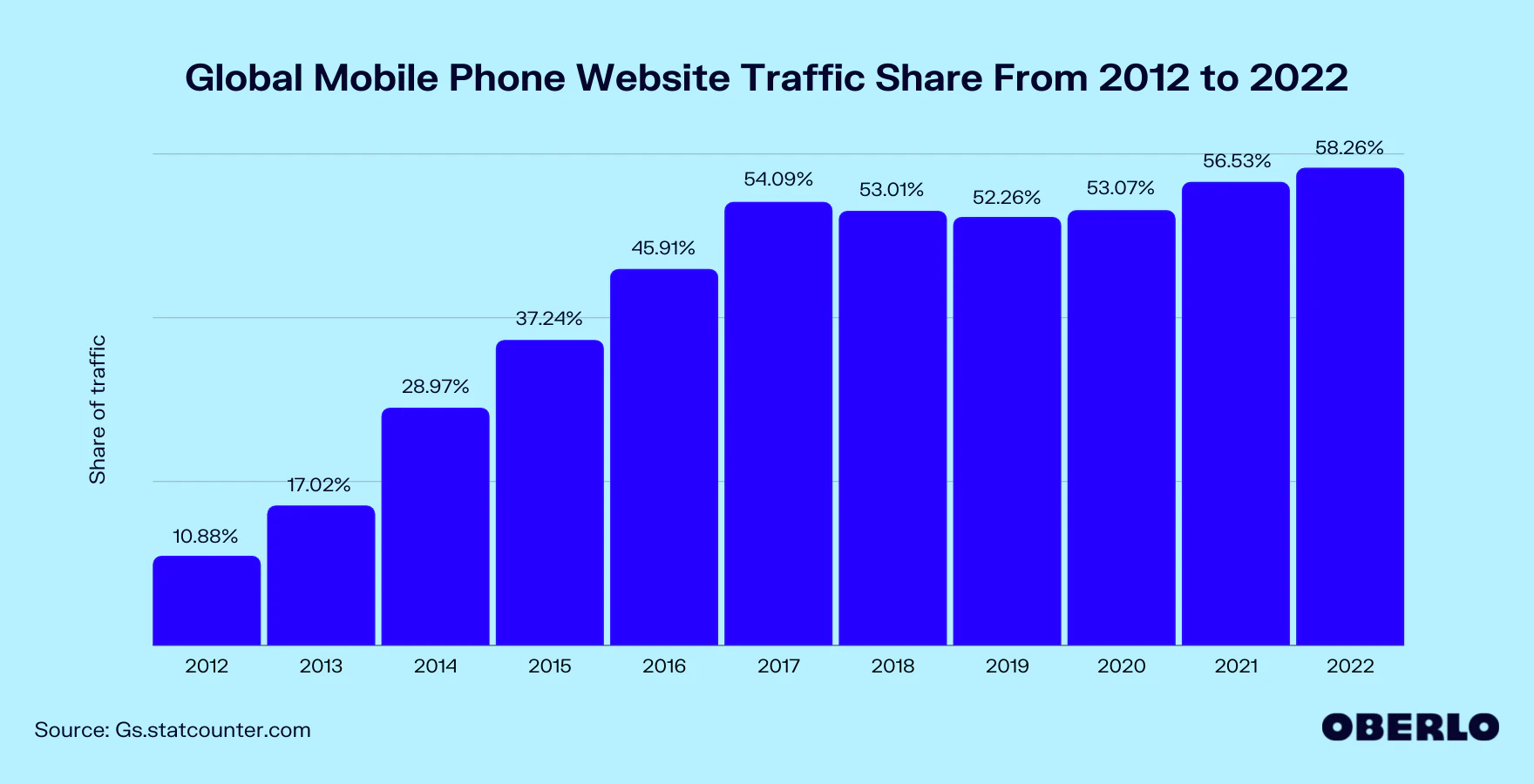
Mobile devices have been at the front of the recent decade’s digital revolution. With mobile devices contributing for around 54 percent of total web traffic, a mobile-first strategy has taken hold of the market.
The widespread use of mobile devices to access the internet has resulted in new development methods such as mobile-first design, which promotes mobile-friendly web design. This chapter will guide you in implementing the mobile first design strategy, while building device-friendly apps and websites that prioritize mobile user experience.
As online users continue to leave desktops and laptops in favor of smartphones, mobile website design has developed dramatically over the previous decade. According to Statista, there were 4.66 million active internet users in January 2021, with 92.6 percent accessing the internet via mobile devices. Having a sleek, content-driven mobile site has become critical for B2B and B2C organizations. This forces the web development community to adapt in order to better serve their clients.
Furthermore, Google confirmed in July 2019 that they are now indexing and ranking mobile versions of websites. If your mobile site has been neglected, it could be negatively impacting your Google rankings and organic SEO. This blog will discuss two approaches to creating your mobile site and how they might assist you grow your online marketing efforts.
I. What Are Mobile First And What Are Responsive Design?
01. Mobile First
Definition
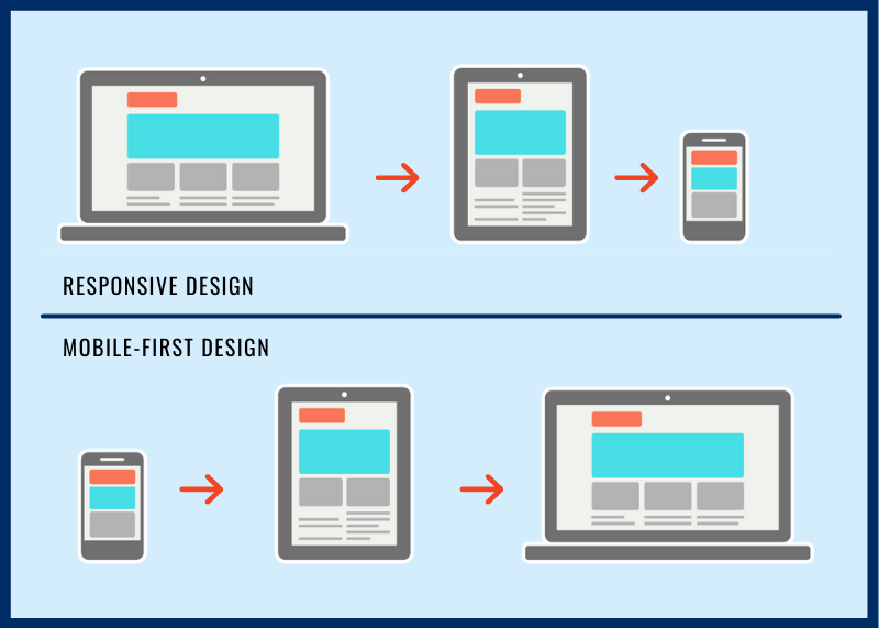
Mobile-first design is an approach in which web designers begin product design for mobile devices first. This can be accomplished by first sketching or prototyping the web app’s design for the smallest screen size and then gradually progressing to greater screen sizes.
Prioritizing mobile design makes sense because space is limited in devices with smaller screen sizes. Therefore, teams must ensure that the main elements of the website are prominently shown for anyone using those screens.
When designing and developing for small displays, designers are forced to delete anything that isn’t required for seamless website rendering and navigation.
As mobile phone usage continues to outnumber desktop usage, the mobile first website design strategy has grown in popularity. Before we go into mobile, we need to comprehend the terms “Progressive Advancement” and “Graceful Degradation.”
Read more: Mobile Site Optimization Is Your Key To Higher eCommerce Sales
Design process
Graceful Degradation
When designing a website, use Graceful Degradation to start with the complicated desktop version and then make it mobile-friendly by reducing features and content.
Read more: Build The Perfect Mobile-Friendly Store
Progressive Advancement
With Progressive Advancement, you start your website design with the most basic functions and features on the mobile version of the site. You develop the more advanced version for tablets or PCs when you finish the mobile version.
As you can imagine, Mobile First Websites adhere to the Progressive Advancement web design approach. This design approach has numerous advantages and can assist you in fine-tuning your content before beginning the more complicated coding and styling of the desktop site.
Designing the mobile version of your website first forces you to work within screen size and bandwidth constraints. This will force you to focus on highlighting your strongest assets and removing some of the fluff. Mobile First Website Designs are frequently content-focused, neat, and functional. This will be especially useful in 2021, as approximately 30% of consumers will abandon their carts in the middle of a purchase if they encounter problems with a brand’s mobile site.
Read more: Create High Converting Mobile Landing Page With These 7 Tips (6 Examples Included)
How to implement Mobile First Websites
Top-Down Approach
When developing mobile-first websites, we prefer to take a top-down approach to planning. A top-down approach starts with the big picture and then breaks it down into project segments based on that idea. This gives you insight into how the entire websites will be formatted, allowing you to develop your segments to match the overall theme.
User Experience
As you design your mobile site, keep user experience in mind. Identifying pain points in the buying process allows you to focus on those areas and tailor content and design to help customers overcome those roadblocks. Here’s a blog on User Experience and Customer Journey Maps that will assist you in completing this process.
Read more: Boosting Sales with Better User Experience: Get Started With ZAGO & PageFly
Navigating Mobile Constraints
Mobile devices have less memory, processing power, and bandwidth than desktop computers. Because of these mobile constraints, you should reconsider any fancy animations, graphics, or gradients when designing your mobile site. Below are some of the more advanced constraints you may encounter:
- Control Mechanisms: Consider how difficult it can be to type and navigate text boxes on mobile devices when designing your site. Keep the forms and content as simple as possible to enable navigation.
- Usage Context: We’ve all sat on the couch, watching TV while scrolling through social media or online retailers. Remember that your mobile site visitors may not be fully engaged, so remove any distractions from the core content you want your visitors to see.
- Updates: Keeping mobile sites and apps up to date can be difficult and time consuming. It is critical to maintain an open line of communication during updates so that developers and marketers are on the same page.
In short, keep it simple!
Read more: Crafting the perfect page with PageFly
02. Responsive Design
Definition
A mobile responsive design website responds to and adapts to the size of the screen on which it is displayed. Website designers typically design to four benchmarks: desktop monitors, laptop monitors, tablets, and smartphones.
It is critical to be strategic about your content and design when creating a mobile responsive website. That way, your website can effectively engage users on various screen sizes.
Viewport Meta Tag
A viewport meta tag in the website’s header is used to create responsive design websites. The viewport of a browser is the area of the window where content is visible, and this tag allows your website to effectively adapt to different screen sizes.
Sizing Your Content
When creating a mobile site with a viewport meta tag, keep your content within the size constraints in mind. If any of your content extends beyond the constraints, your users may be forced to scroll horizontally, which may cause them to abandon the site. Images, in particular, have fixed dimensions, and if they are larger than the viewport, a scrollbar is generated.
03. Differences Between Mobile First and Responsive Design Websites
Website Design
The design process is the most significant distinction between mobile first and responsive design websites. As previously stated, responsive design websites begin with the desktop version of the website, whereas mobile design websites begin with the mobile designs.
Target Audience
This section will begin with a disclaimer. Traditionally, your target audience will influence your decision to do responsive design or mobile first, but with more and more people using mobile, you may want to take this with a grain of salt.
B2B websites are typically more informative, and users are more likely to use desktop versions. As a result, B2B companies are leaning toward responsive design when developing their websites.
Mobile users, on the other hand, have dominated B2C for more than 5 years. Why not cater to your target audience like the majority of your favorite retail websites?
SEO Optimization
As previously stated, Google now indexes and ranks websites using their mobile versions. While responsive design websites can be very effective, designing mobile first is the best way to ensure your website ranks on Google.
Read more: How To Optimize Website For Mobile: Top 06 Actionable Tips
II. Pros And Cons Of Mobile First And Responsive Design
01. Mobile First Design
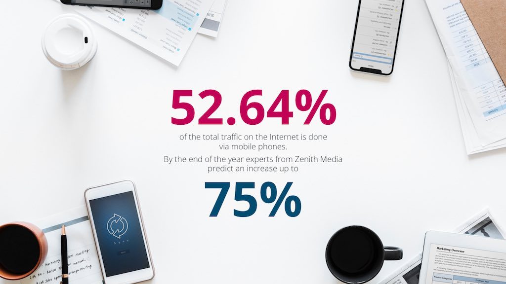
Why take the risk of a mobile-first design? Simple words, statistics show that we have become addicted to mobile device surfing. Currently, mobile phones account for 52.64 percent of total Internet traffic, with Zenith Media experts predicting a 75 percent increase by the end of the year. With this information in mind, it is critical to comprehend what mobile-first design is and the benefits it provides.
In contrast to responsive design, mobile-first focuses on the entire mobile user experience. This include: an app-like user interface, less text, larger fonts, fast download speed, video and audio, one call-to-action per page, short forms, and so on. Furthermore, mobile browsers will soon have access to more smartphone features such as camera, haptic feedback, and voice detection, allowing a mobile-first design to provide a unique experience that will put your site ahead of the competition and drive traffic.
Pros
– Better user-experience on mobile devices
– Majority of internet browsing in on a smartphone
– Design website to use built-in phone features
– Cheaper than building an iOS, Android or Hybrid App
Cons
– The desktop experience is not 100% optimized
– Not suited for content heavy websites
02. Responsive Design
In general, responsive design is more prevalent in B2B companies where website content must be informative and authoritative. Properly structuring rich HTML content is also beneficial to SEO. During office hours, 80 percent of users are using a laptop or desktop to access our site. As a result, responsive design is the best option. The content, navigation, and layout are all mobile-friendly, providing an excellent UX for our mobile users.
Pros
– Good for heavily stacked information websites
– Easier for large forms and complex call-to-actions
– Cost-effective development and maintenance
– Great for SEO
Cons
– The mobile experience is not 100% optimized
III. Which Method One Should Businesses Choose?
As you may have gathered from your reading so far, mobile first websites are quickly becoming web developers’ first choice when building websites for their clients. We mentioned earlier in the post that 92.6 percent of internet users access the internet through their mobile device. 92.6 percent of the time! This, combined with Google’s decision to prioritize mobile sites in its indexing, makes having an efficient, content-driven mobile website more important than ever.
While the traditional responsive design approach can produce positive results, the mobile first approach appears to be the way to go because this will be the majority of viewers’ first interaction with your site. It made sense to start with a beautiful desktop site ten years ago, when the majority of website users were on desktop. Shouldn’t the same be true now that mobile devices account for more than 90% of internet users?
IV. Some Common Mistakes Merchants Make When Building Mobile-friendly Stores
01. Not Prioritize Page Content
When it comes to mobile-first design, designers must remember that content is king. Because space is limited on smaller screens, web designers must ensure that the most important elements are prominently displayed, as these are the ones that users will actively seek.
02. Not Deliver Intuitive Navigation
When it comes to providing a neat and clean user experience on mobile devices, intuitive navigation is critical. Web designers can use features such as navigation drawers (Hamburger menus) to display secondary website elements. This will make it easier for users to find the information they need.
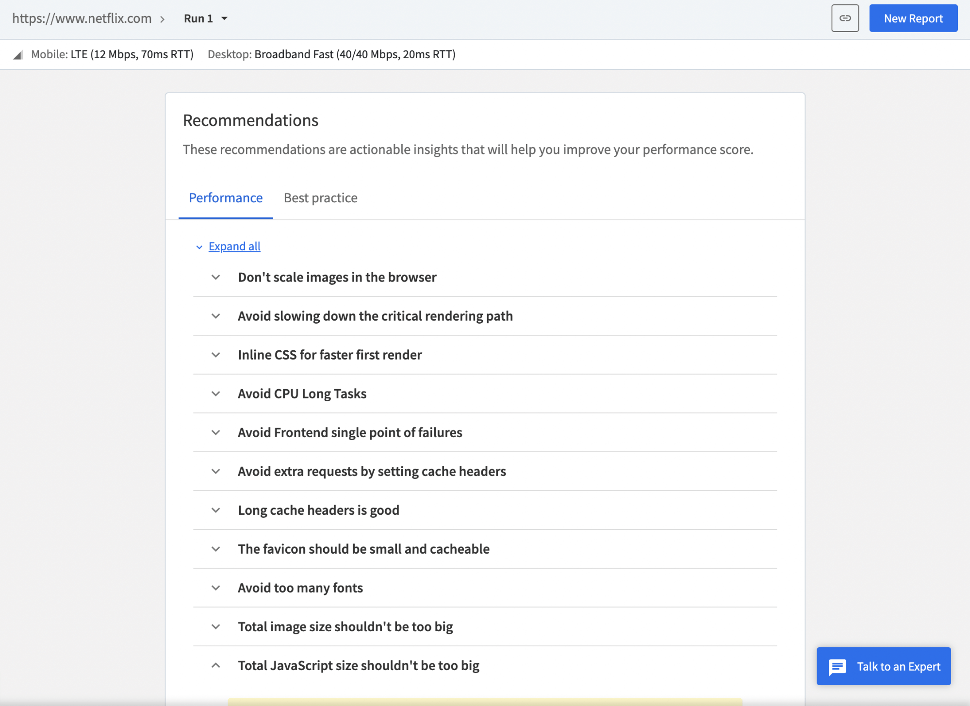
Speed and intuition are strongly intertwined. SpeedLab by BrowserStack instantly provides a Page Speed Score out of 100 for both desktop and mobile platforms. Your design team can use these insights to optimize for a mobile-friendly interface across various mobile devices and browsers.
BrowserStack also provides actionable recommendations and insights to help you improve your overall design and website layout.
The report generates precise mobile and desktop scores, as well as key metrics such as Navigation Timing API, Page Resource Summary, and others, to assist you in aligning your mobile-first design approach with actual performance.
03. Disruptive Pop-ups
As previously stated, mobile devices have limited screen space, and no user enjoys being bombarded with pop-ups or advertisements that take up the entire screen. Website owners or designers must only focus on what is important to users and provide them with the information they seek.
04. Not Test on Real Devices Under Real Conditions
Testing a website on real devices is the most effective way to ensure that it provides optimal user experiences across devices. This assists designers in determining whether the website renders correctly across mobile, tablet, and desktop devices. BrowserStack’s real device cloud provides 3000+ real devices and browsers for instant testing in real user conditions to teams and individual testers.
Conclusion
Globally, an increasing number of web users are shifting from desktop to mobile devices to access the web, and this trend shows no signs of easing. As a result, it makes sense for designers to create websites with the mobile audience in mind.
Incorporating a mobile-first design will not only assist businesses in enjoying the benefits of mobile growth today, but will also prepare them for the explosive growth predicted in the coming years.
Remember that visitors will not be able to tell the difference between a responsive, adaptive, or mobile-first website right away.

 Previous chapter