 pagefly.io
With mobile shopping on the rise and now the primary eCommerce medium, optimizing your online store for mobile devices should be one of your top priorities. Unfortunately, while good UI/UX plays an indispensable part in mobile conversions, it is not easy to master at all.
One of the key elements contributing to appropriate user retention rate and discoverability is mobile navigation design. Worst case scenario, a poorly designed layout can frustrate shoppers into rage-quitting your site. In the least, you might lose some precious potential profit just because visitors are unable to find their desired products as they are buried in a mountain of confusing headings and sub-headings.
So, in this article, we will be discussing ways you can make your mobile navigation design better and brief through a few contestants for the best navigation.
Let’s dig in!
In short, navigation is the way your customers get from point A to point B. That path, however, is not linear and can provide many chances for discovery and interaction with your online store. Effective mobile navigation is not necessarily crafting the shortest route, but rather one that facilitates the highest discoverability without distracting visitors from the real goal – making a purchase.
Good mobile navigation can boost the accessibility of your entire website, or mobile app if you love a good investment. It makes the UX a lot more enjoyable and intuitive, and it has to offer many mobile users an opportunity to explore every nook and cranny of your online store. Bad navigation, on the other hand, makes it hard for visitors to find what they are looking for and discover any new eye-catching item.
Moreover, bad mobile navigation can make the browsing experience frustrating, which can drive up your abandonment rate, and of course, no merchant would want their customers to rage quit their site.
There are a few boxes you have to tick if you want to provide the best mobile navigation experience for your customers. These tips have been compiled from tried and tested methods ever since the inception of smartphones, so unless you have come up with some revolutionary designs, it’s the safest bet to go with them.
01. Easy to read
While you can use icons and images to signify navigation options, most of the time you will need to use text. So as a rule of thumb, always make sure all the fonts and text sizes on the buttons are easy to read and understand, especially if your target audience includes those with bad eyesight like senior people or if you sell glasses.
Readability plays a huge role in a gratifying UI/UX, so make sure it is the top priority of your mobile navigation.
02. An intuitive menu
The navigation bar is where all important pages reside. Think of it as an issue tree for every problem-solving case you come across. And for every critical brainstorming session, you would want to outline the most important points, each containing 3-5 smaller important points (please don’t nest more subheadings), the collective of which make for the entire view of the big problem.
So the menu has to be logical and intuitive. Being a store builder service ourselves, PageFly takes the page list very seriously. So we have come up with the list of all basic pages a merchant should include in their header, you can use this for reference if you are not sure yet of what to do:
- Homepage
- Shopping page
- Collection pages
- Product pages
- Products on sale (this should be a separate page featured on your menu during sales season or promotions)
- Blog
- About us/ Contact
- FAQs (which has to contain your shipping and return policies)
And of course, those pages together only make the basic outline of your online store. You have to expand the list and customize it in order to facilitate the best shopping experience for your visitors. The whole package will contain a lot more unlisted pages like the Thank you page for when a customer has finished making a purchase, or the Landing page to nudge visitors towards making an order.
03. Stickiness
A great navigation menu sticks in one place and is accessible no matter where you are on the website. Imagine scrolling through a collection with hundreds of products, you are all the way down to the 95th item and suddenly want to view another collection. But as the website you are on is poorly designed, you have to scroll all the way up to the top of the page to find the menu bar. No one has time for that!
So a great tip is to create a sticky menu bar that is always either present on the screen, or appears as the user scrolls up a bit. For how to implement this on a mobile device, wait till the later part where we will discuss some popular mobile navigation patterns.
04. Effective finger and hand positioning
A lot of people have qualms about mobile devices getting bigger and bigger with time, and that is because we just love to be able to use our phones with one hand and one thumb. And since most people are right-handed, the best route to take would be to place your navigation menu in the zone closest to the right thumb.
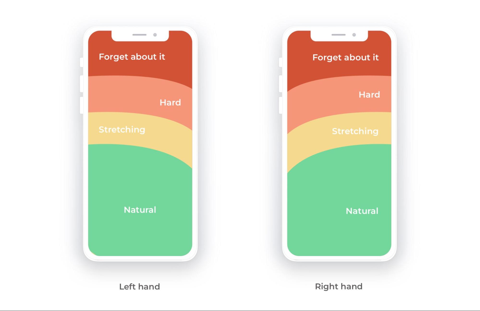
The mobile phone thumb zone – Source: Smashing Magazine
So when you design your website for mobile devices, consider placing the menu at the bottom of the screen. Apple, for example, has tackled this insight beautifully, when it updated the Safari browser’s UI to have the URL and tabs at the bottom of the phone.
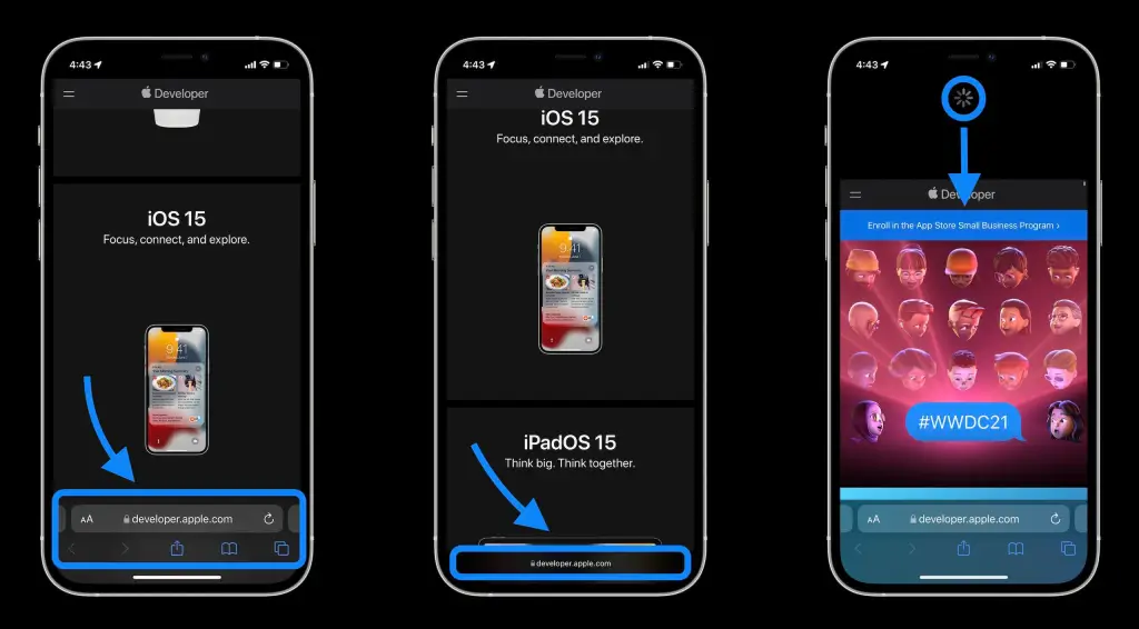
Source: 9to5Mac.
Another bonus tip is to think with your thumb. As you are probably a smartphone user yourself, you sure know how frustrating it is to have to pinch the screen every time you log onto a website. So save your users the trouble and create the best thumbing experience for them!
Lastly, the screen estate on a mobile device is rather small while our thumbs are far from the size of a cursor pointer. With that in mind, please make links and buttons big enough to click on with ease. Sometimes you have to compromise your own design just to make your website easy to use, but it is worth it. Function always precedes form!
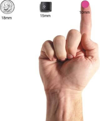
Most people can comfortably hit a 10 x 10-millimeter touch point – Source: UXmag.
05. Create a clear visual hierarchy
Just as how you are finding this article easy to navigate around, so does your mobile website need to be. We have created a minimalistic outline for this blog post, making it really easy to grasp which section is the parent idea, and which ones expand on it.
The same principle can be applied to your mobile navigation menu. For example, you have a Shop section, and if you expect users to see a bunch of collections when they go there, list a few highlighted collections under the Shop link. But, as you do so, remember to make it clear that the collections are subsections, you can signify it by simply giving them line indents, like this:
HOME
SHOP NOW
Collection 1
Collection 2
Collection 3
ABOUT US
There are a handful of navigation patterns you can utilize in your design. As eCommerce and technology evolve, designers have got more creative with layouts, but the basic principles stay the same. The only thing that has seen dramatic creative changes is the animation, it is incredibly diverse and fluid, making the visual experience really gratifying.
If you are feeling adventurous, you can always experiment with how the navigation styles are implemented. That being said, it’s time to see what is in store for you to play with.
01. Hamburger menu
This is the most fundamental menu that you can practically see everywhere on the Internet. Its most common form is a side drawer, nested in a button in an upper corner of the screen.
Source: Dribbble
When to use
Most online stores have a large amount of sections to feature in the navigation system due to the big number of collections and items as well as campaigns. The hamburger menu takes care of that, as you can make it a full-screen layout and include as many headings as you want to, even secondary navigation menus.
Moreover, you can use this menu if you want your homepage to be the highlight of your website, as the whole screen should give way to it and clear all the clutter.
Pros
- Large number of navigation options
This is the hamburger’s main advantage. Although not recommended, you can add everything in your store here to your heart’s content without taking up any too much space.
- More screen space
All your categories and sections are neatly nested in a small icon in the corner, and you will free up a major amount of screen area to put other things in.
Cons
- Low discoverability
Since the navigation links are out of sight, some users might miss them and some don’t even bother to find them.
02. Top-level tabs
Also nested in the header of the website, tabs bring users to the navigation options with one fewer click than the hamburger menu.
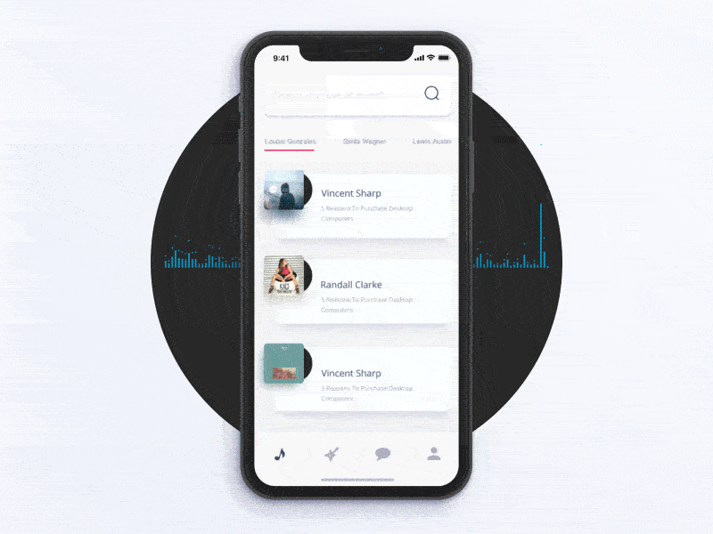
Source: Dribbble
When to use
Top-level tabs should be used when you don’t have a lot of navigation options. As it takes up screen estate on every page, it should not be too big from carrying a lot of information. You should only include the essentials that you know every customer would want to visit.
Pros
- Quick access
Since it is always visible on your store, users are more likely to click on it to discover your content.
- Context is always provided
Just one quick glance and users would know right away where they are on the site.
- Simple, fluid gestures
This is more of a cherry on top and a function you should implement, but users expect to be able to swipe between tabs. If your online store does have this distinctive feature, it would be chef’s kiss!
Cons
- No navigation hierarchy
Tab-navigation should only be used when the categories featured are at the same level of importance. This also means you cannot feature secondary navigation menus with this layout.
- Unintuitive thumb placement
As phones are getting bigger and bigger, users would prefer not having to reach for the top of the screen.
03. Bottom navigation
This type is getting more and more popular as it possibly comes with the most advantages. Bottom navigation is similar to the tab-style but resides at the bottom of the screen. The layout either always stays in sight or disappears as you scroll down and reappears when you scroll up. Regardless, it always stays in one position and within thumb reach.
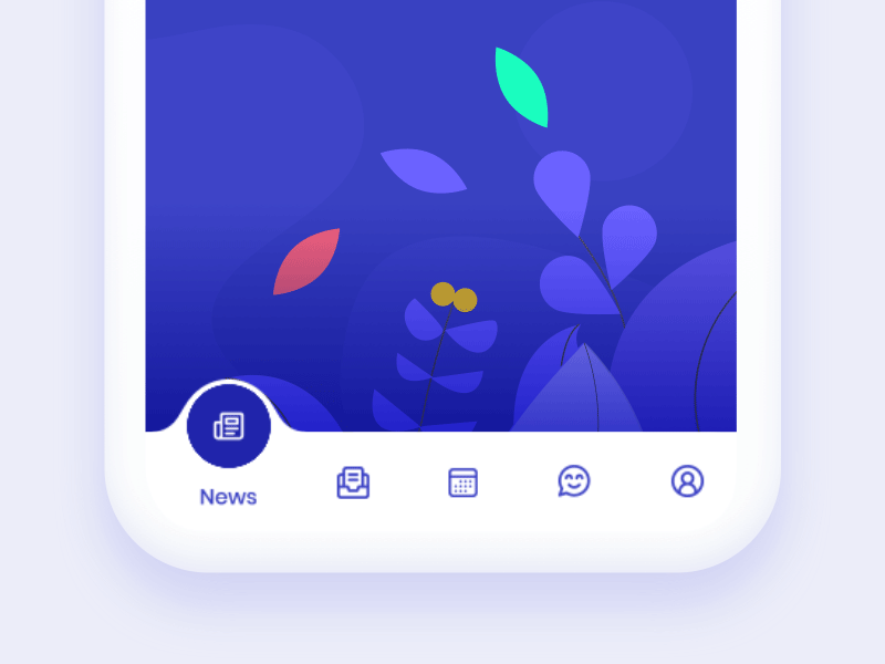
Source: Dribbble
A lot of big brands have opted for this mobile app navigation design in their mobile apps, namely Facebook, Youtube, Apple as well. Just open the Facebook or Instagram app and you will see what we are talking about.
When to use
The bottom tab bar works best with 3 to 5 sections. A lot of designers make the center of the menu bar an action button that offers even more options.
In addition, utilize icons when using this type of navigation, it will give your website a modern feel and uncluttered.
Pros
- Perfect thumb position
As mentioned above, when using a smartphone with one hand, the thumb is always comfortable reaching for the bottom of the screen. This position makes it convenient for users to click and switch among the options, leading to higher discoverability.
- Versatility
While most designers go for the middle button, you can customize each of the tab in the menu bar. You can make it so that a button pops out and shows a few submenus when users click on it.
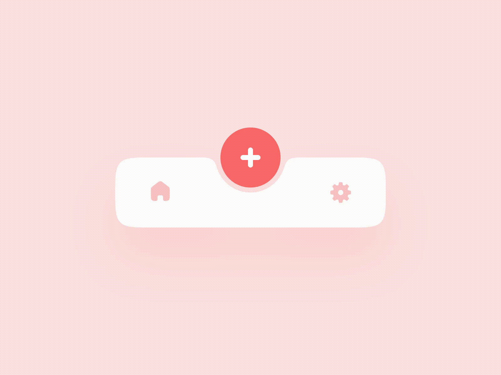
Source: Dribbble
- Context is always provided
Similarly to top-level tabs, the bottom navigation bar always shows users where they are on the site.
Cons
- Limited amount of options
While the bottom bar is versatile enough that you can add submenus, the case might not be the same for main sections. You should only include 5 options of the same navigation hierarchy level, and if you have more, you might have to do away with some of them or use a different layout entirely.
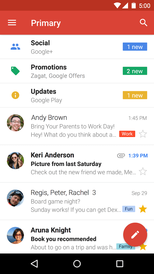
- Clashing with browsers’ own bottom navigation
Because bottom navigation is such a great UI, most browsers like Safari and Chrome uses it. And those browsers will prioritize their own navigation bar, especially Safari since it is a native app, meaning that your tab bar will be blocked by the site’s URL or settings options.
So keep that in mind when you are designing your website for mobile. This shouldn’t be a problem if you are designing a separate app of your own.
04. Floating button
The floating action button is also a versatile choice for many web and app designers. It functions similarly to the hamburger menu in the sense that all content is nested in a single button. The only difference is the floating button doesn’t have to stick to the header, and its navigation options can utilize different formats than plain text.
When to use
The action button works on the premise that users will perform a certain action or go to a certain section most of the time – that should be the center of attention in the pop-up menu.
Of course, this doesn’t have to always be the case. You can utilize this design for when you have many navigation options but don’t want to give users the liberty to decide where to find them. For the hamburger menu, the action button sticks to the corner of the header, while the floating button can be put anywhere, or at the bottom corner of the screen – a good place for thumb placement.
Pros
- It takes up little screen space
Compared to top and bottom navigation bars, the floating button takes up much less screen space.
- It is versatile in terms of design
The floating action gives you a lot of freedom in designing, which if utilized correctly can create a visually enticing experience for customers.
Cons
- It might block content
Since the floating button is designed to stand out, it might distract users from the page content. Moreover, it might block the view, as can be seen here.
Source: Smashing Magazine
- Context is less accessible
Similarly to the hamburger menu, customers have to click on the button to see the navigation options. Which means that unless you leave breadcrumbs on the page, visitors will need to take one more step to know where they are.
And of course, we need to learn from the best. So here are a few mobile navigation designs with splendid navigation to help you visualize better what you can do with your own online store.
01. Money Clothing
Although we did mention that bottom navigation might be incompatible with mobile browsers, Money Clothing seems to have overcome the problem. They included a black menu bar that covers most of the bottom of the screen.
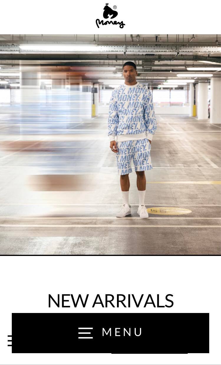
As you click on the navigation menu, it expands into a hamburger menu through a very fluid animation.
While this hasn’t been the best implementation of bottom website navigation, the site does deserve a mention for overcoming the issue with browsers that so many brands face.
02. Standart
Being a highly reputed coffee magazine, the site sure must have a great design. Its header, which contains the menu button, sits still at the top of the screen. The 3-line button expands into a hamburger menu (made up of 3 separate parts) that covers the entire screen.
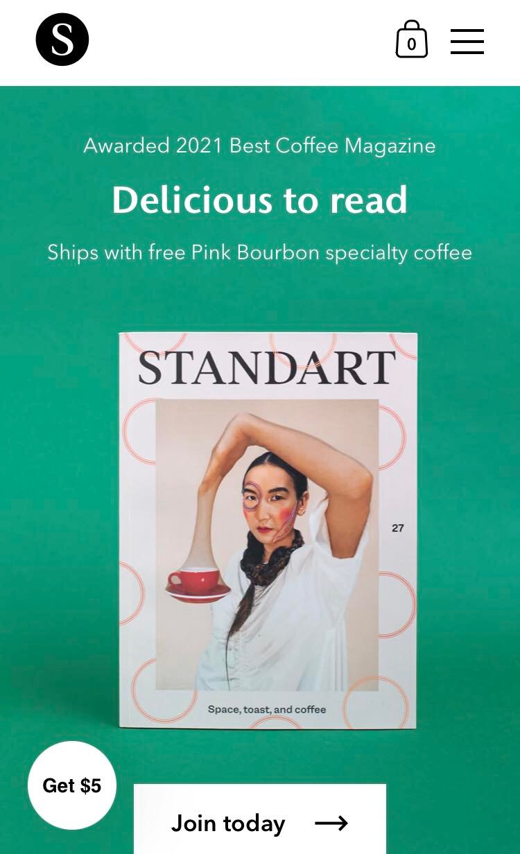
And while not a part of the navigation, the site also included a floating action button. This is a CTA present on the lower left corner no matter where you scroll. It is a fun feature that you should consider adding to your store.
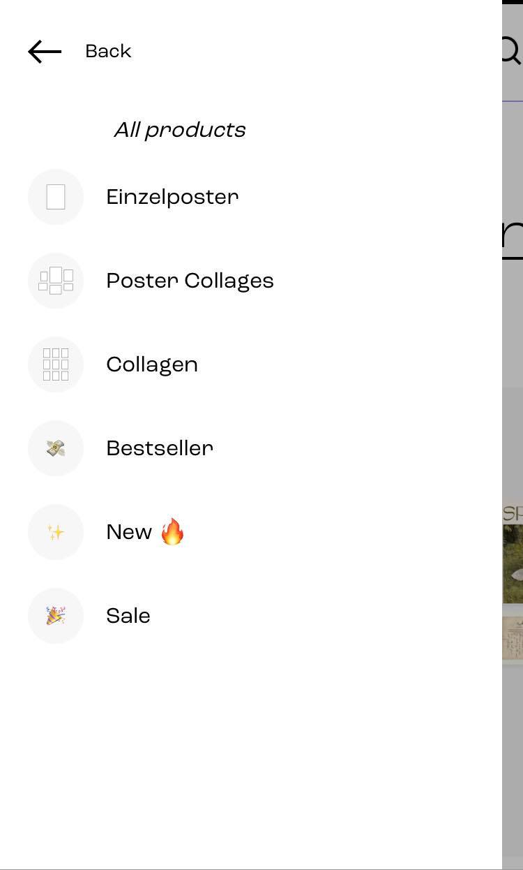
03. Vibes Only
Vibes Only is an online store specializing in aesthetic prints in Germany. The site’s navigation is simple enough, all nested in a button in the header, which expands into straightforward hamburger navigation options.
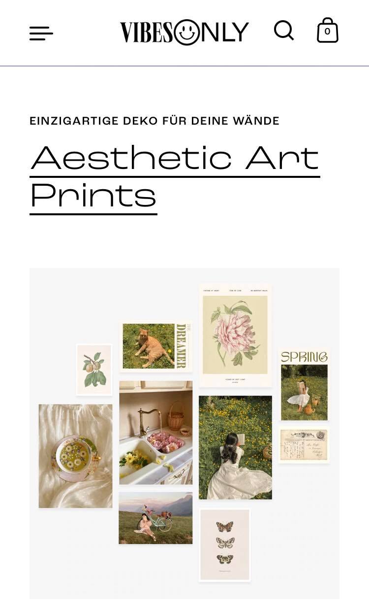
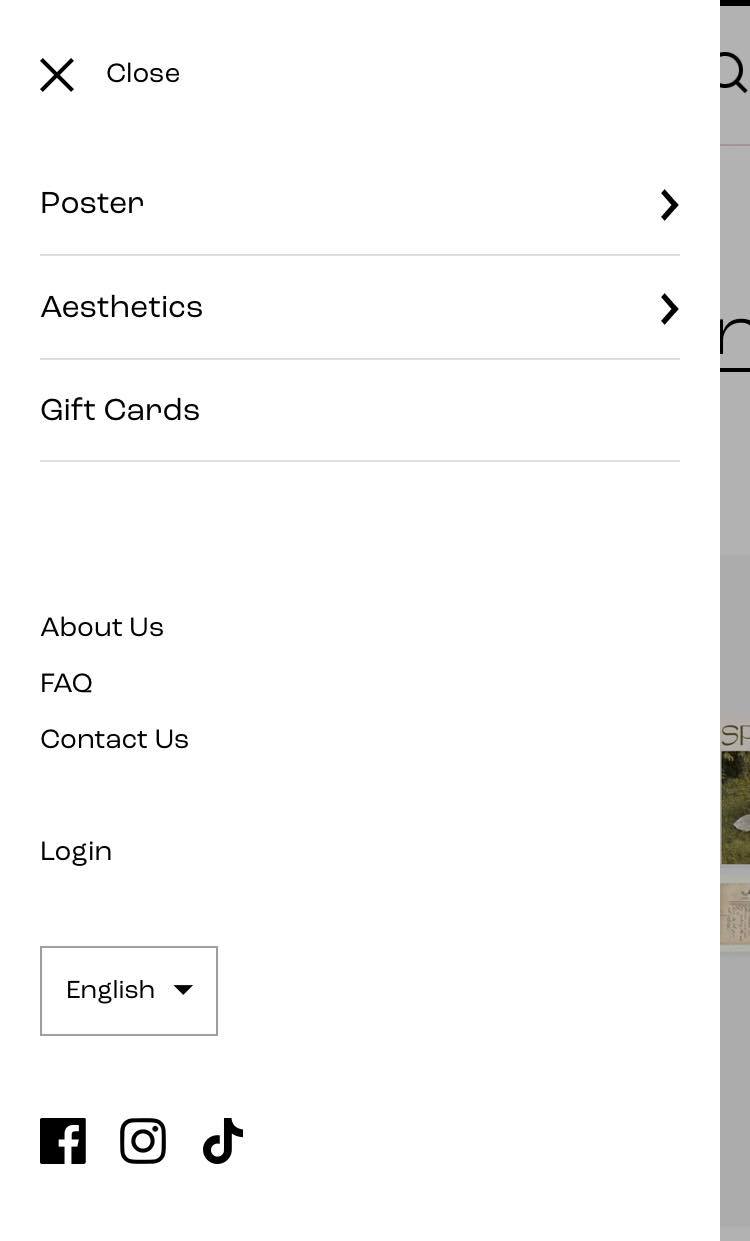
The menu’s navigation options can be clicked on to reveal a lot more submenus. What’s great about the submenus is that they aren’t placed in a dropdown menu that makes the hamburger lengthy, but on their own menu page. Users can click on “Back” to go back to the main navigation menu.
V. In a nutshell
Mobile navigation is an essential part contributing largely to your conversion rates. It will be one of the top priorities in designing your online store, and you have to make sure it is carried out perfectly.
While that sounds like a lot of pressure, there is no harm in experimenting and having fun with it. Who knows, you might come up with something new and be the pioneer in the mobile eCommerce world. We wish you the best of luck with your online business, and feel free to check out many more articles on optimizing your website as well as eCommerce tips to grow profitability!
 Previous chapter