
The US electronics retail eCommerce is the 2nd largest in the world after China. Its estimated revenue is $131.5 billion. Therefore, having an outstanding technology website design is essential.
Technology stores are tough and hard to build and even harder to run. There are a lot of factors, design elements, and detailing that go into the making.
In this article, we will tell you the tips and tricks to follow while making your technology website and some well-designed technology Shopify stores to take inspiration from.
I. Ultimate Guide on How to Pull off an Epic Technology Website Design
01. Landing Pages Strategy for Tech Websites
If you’ve been following digital trends for years, you might be familiar with the concept of landing pages.
A landing page is a pillar page of your tech website designed specifically for marketing or advertising purposes.
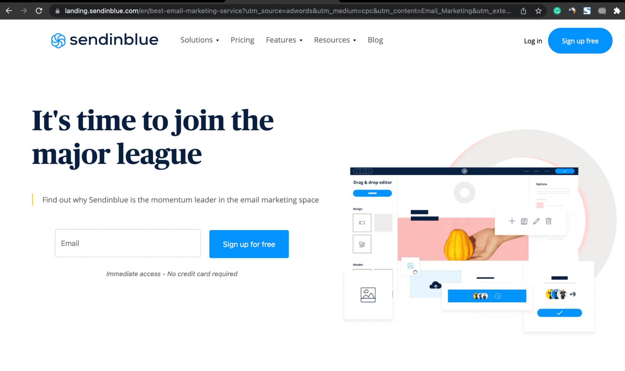
For example, if someone searches for “Best email marketing tool” and clicks on the top search result (which is an Ad), they might be taken to a landing page specially integrated with the ad.

These landing pages are perfectly tailored to coincide with the ad. Just so, if a potential customer clicks on the Ad, you can further persuade him into taking a desirable action from that page.
But you might be wondering – “I have so many website pages. What difference can it make by not adding a landing page?”
Well, more landing pages mean more conversion opportunities. And as per Hubspot’s state of marketing report, businesses having more than 10 landing pages see a 55% increase in leads.
If you have a technology-based Shopify store whose target audience is B2B, landing pages are a must.
You would be surprised to know that landing pages generate more conversions for B2B websites when compared with B2C websites. Isn’t that amusing.
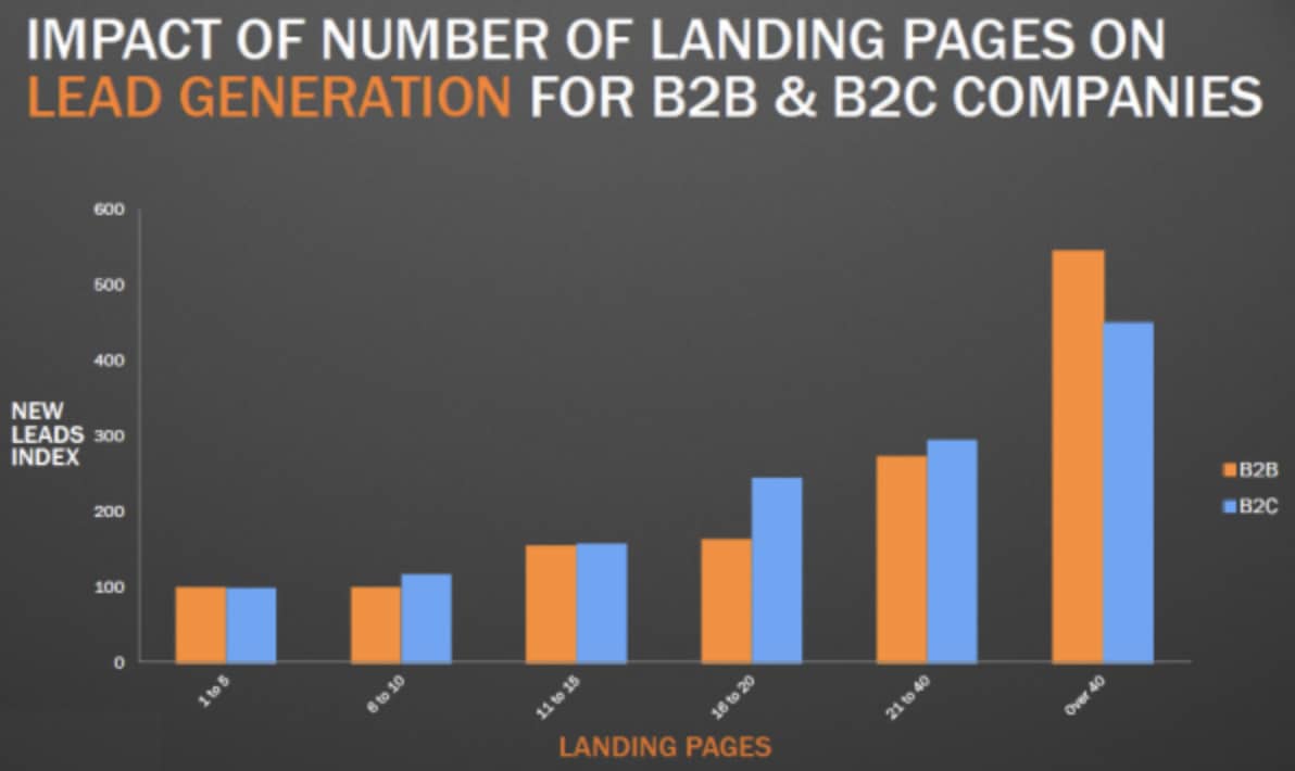
As shown in the above graph, technology products are purchased for both personal or business needs, but in B2B, when landing pages go above 40 the leads generated are greater than B2C.
So, how to build high-converting landing pages?
A search engine optimized landing page can help your website rank better on Google.
When you rank better, you get a lot of visitors who can find your website quickly and click through your landing pages, where you’ll have a tailored and actionable CTA for them.
Here are some quick tips to optimize your landing page for your customers and search engines.
i. Strong Headlines
The first thing your customers see when they visit your website’s landing page is your headline. It’s your only chance to hook your audience into reading more about your product or services.
And an eye-catching headline is the best way to do so.
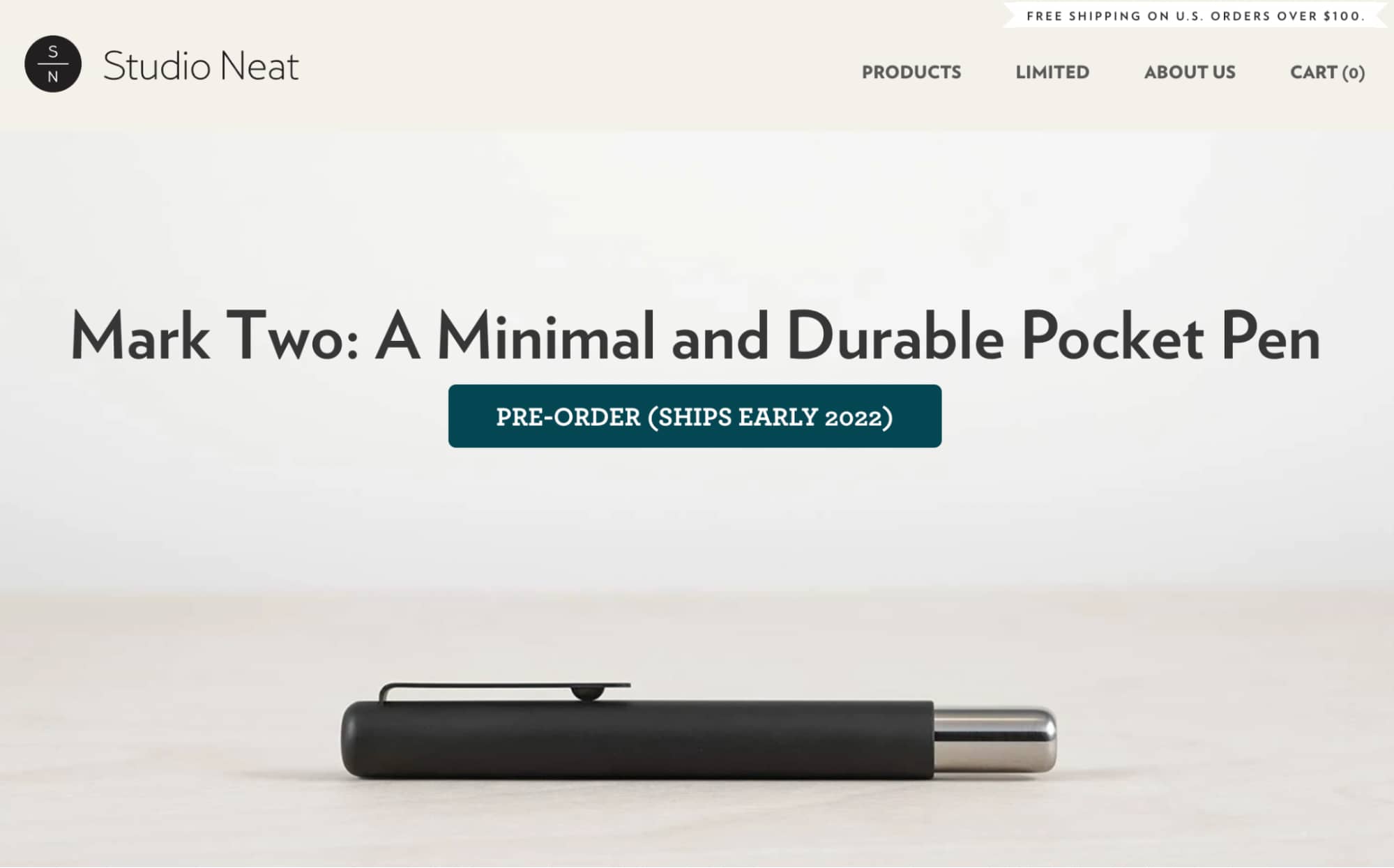
Here’s an example of how Studio Neat hooks customers’ attention with a catchy headline.
ii. Crystal Clear CTA
While designing CTAs, make sure you keep them simple and professional. Your customers are more likely to engage with your CTA if they have a clear concept of what you do and what’s in it for them.
Try not to confuse your customers with too much text or designs on your web pages.
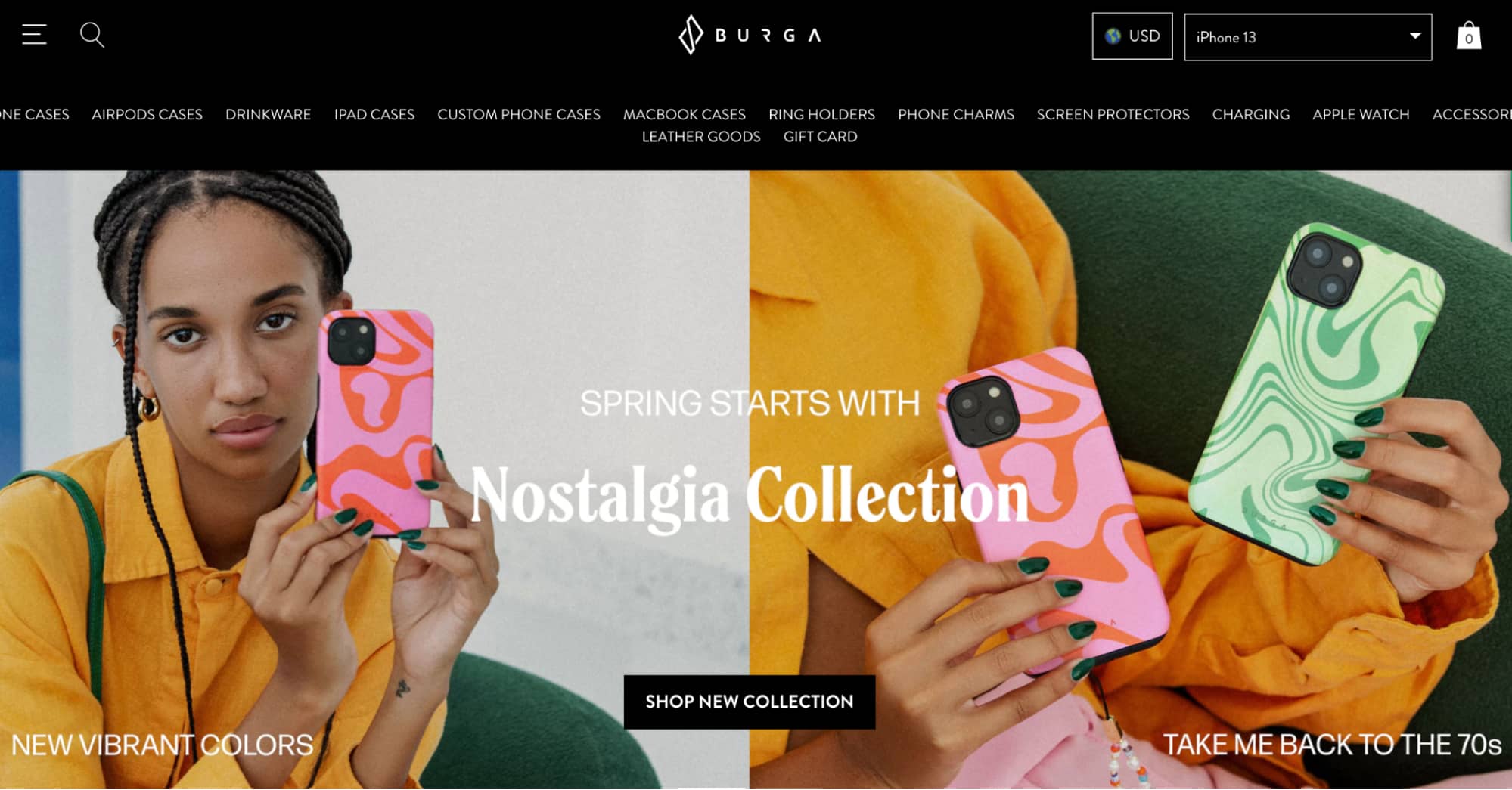
Check out the CTA text used by Burga, it’s as simple as “Shop New Collection” but as clear as what the customer is actually looking for, right?
iii. Easy to Fill Enquiry Forms
No one likes filling out a lengthy form! So make your forms short, precise, and attractive.
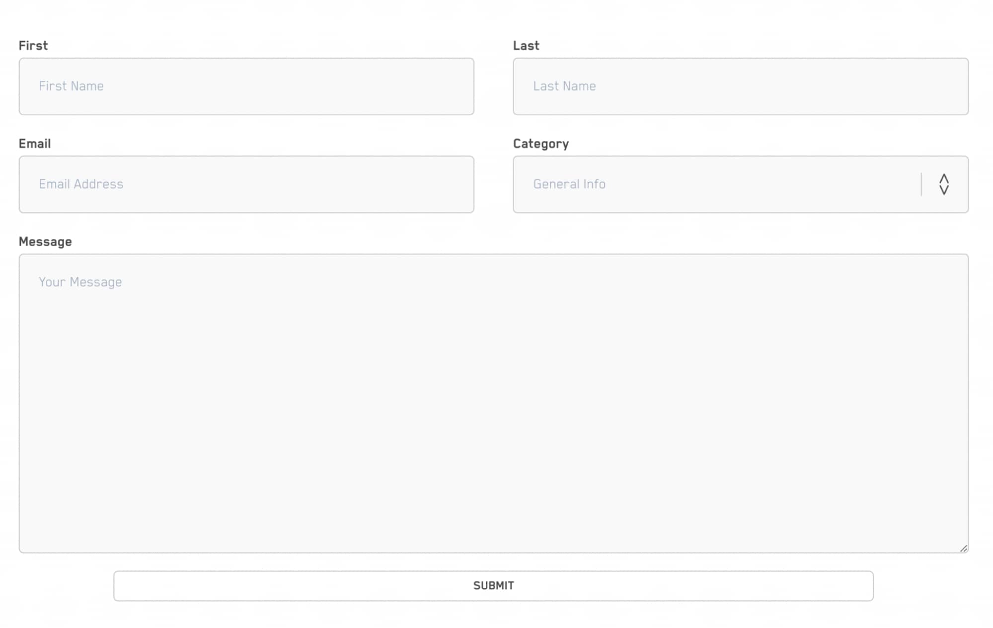
You can ask customers to fill in a descriptive form later in the customer acquisition journey. But not in the beginning when they’re searching for a solution for their problem.
Your primary aim should be to solve customers’ problems. Everything else goes at a later stage of the buyer’s journey.
02. Product Guide Pages Are a Great Addition to Tech Website Design
When it comes to a tech website, describing your products can be challenging. Why? Tech products tend to have a lot of features and concepts one needs to explain to their customers.
Although, words are a powerful way of sharing information about your products to users. There are better ways to showcase your offerings.
That’s when product guide pages come into action. Product guides are pages that act as a gallery of products with maximum use of videos and infographics to ease the transfer of information.
Follow the below tips to create a flawless product guide page:
i. Create A Step-by-Step User Guide for Every Product You Sell
Don’t confuse your visitors with jumbled steps, whether a video sequence or a text brief; present everything in a sequential flow.
It’s always better to assist first-time visitors with a clear flow of steps to move them down a logical path and convert them into customers.
Start with what problem your product or service solves and then gradually move down the path with product features and functionalities, just like Zoho did for its product guide page.
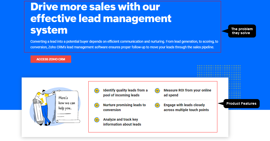
Pro tip: High quality photography on product guides are a must if you want to attract internet traffic.
ii. Micro Content
Microcontent means bite-sized content – Clear, crisp, and to the point.
Make your product page guide easy-to-understand for visitors by highlighting the essential aspects of your product or service.
For example, if your product is an app that assists customers with email marketing, don’t suffocate your product page with every detail.
Instead, have micro-content developed for the email list, segmentation, templates, and automation; present it separately to make it digestible for site visitors.
If your services amuse a prospect, he will dive deeper to know more anyways.
03. Tech Industry Related Resources & Blogs
When it comes to smart buying, technology product buyers and consumers are among the savviest shoppers in the world.
If you think you can easily sell your technology to them, you might be wrong; they will give you a hard time.
Technology product buyers are comparatively smarter; they go through whitepapers, product comparisons, and many industry talks to ensure they invest in the right technology.
So, why not provide them with all of these resources on your website?
It’s a win-win situation for all.
Chances are, they might find your products worth investing in while reading a blog on your website.
Here’s some of the most in-demand content you might want to incorporate in your website resources.
i. Blogs & Articles
Tech-based blog posts and articles that solve customers’ pain points and are SEO optimized can attract many visitors to your website.

If your blog adheres to specific SEO parameters and has quality content, Google is most likely to recommend it to readers searching for something similar.
ii. Whitepapers
A whitepaper is a report or guide that informs readers about a complex issue and presents them with relevant solutions.
It’s written with an unbiased opinion to help readers better understand an issue, solve a problem, and make actionable decisions.
However, whitepapers should focus on critical pain points of your customer base. They should have educational content with deep insights whenever and wherever necessary.
iii. Webinars & Tutorials
Many technology companies host free webinars on their websites or incorporate their product video tutorials in resources.
Webinars play a crucial role in attracting potential customers as it’s real-time and allows potential customers to interact with industry experts inside the company.
iv. Industry News & Product Reviews
Presenting visitors with reliable industry news and the latest product reviews can positively impact your website.

Including these types of information can also help your website rank better on Google.
04. Using Testimonials on Technology Websites Home Page
For technology companies, testimonials and social proof are powerful validation tactics to hook potential customers.

It’s crucial for your website because reviews influence a significant 90% of buyers’ decisions, while 73% of customers feel positive customer reviews make them trust a brand.
So evidently, nothing puts your customer’s mind at ease than seeing testimonials on your website.
Here’re some key formats to present testimonies across your website.
i. Success Stories
Customer success stories are something that visitors love reading. It’s an effective way to build trust and credibility.
Slack incorporates real customer stories into its tech website design to inspire visitors and gain their trust.
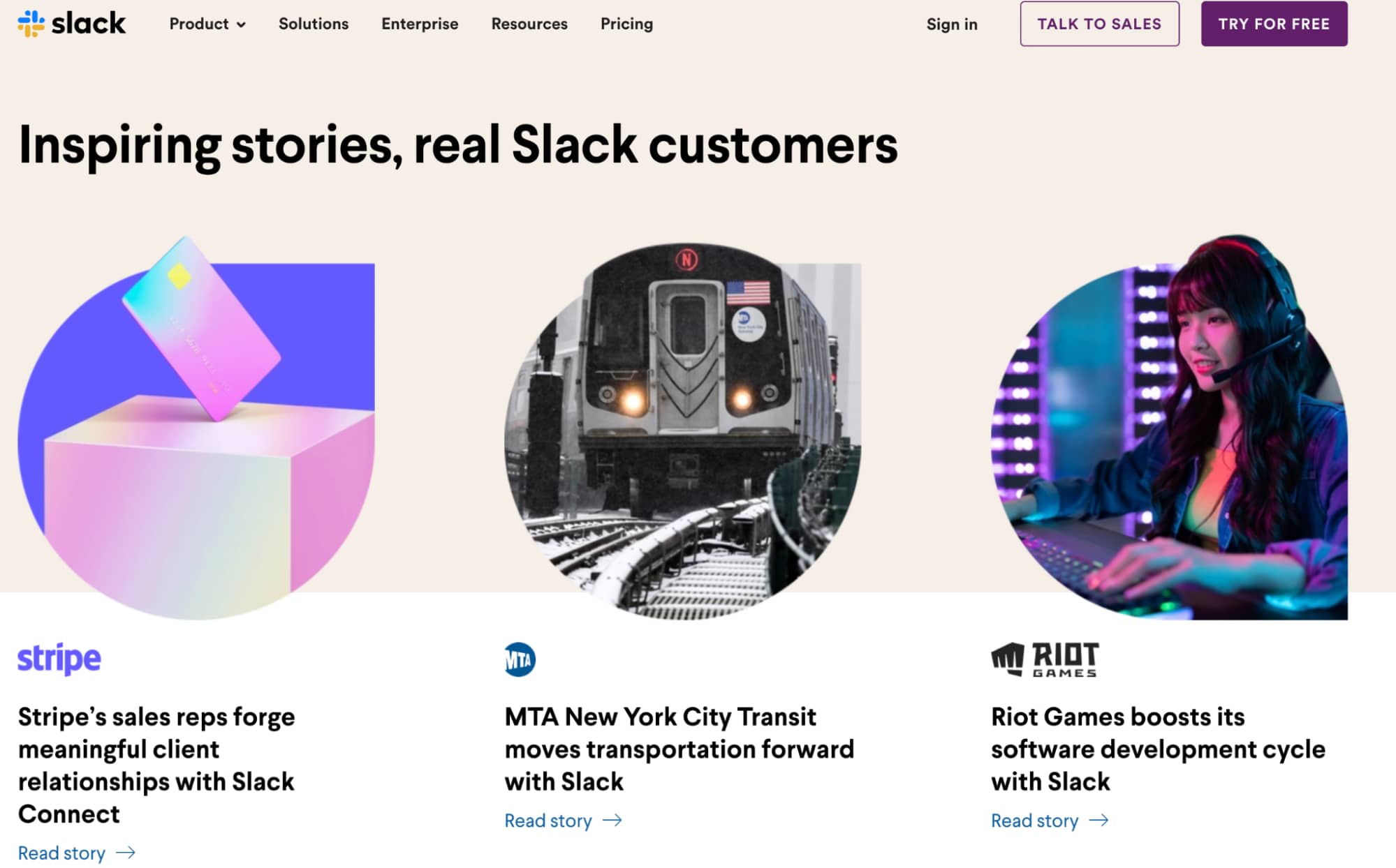
By seeing others succeed with the help of your products or services, your prospects gain a sense of trust for your brand and are more likely to become your customers.
ii. Video Testimonials
While success stories or text-based reviews effectively build trust, video testimonials give your business an upper hand by spreading word-of-mouth directly from present customers to potential customers.
Here’s how Slack successfully incorporated a video testimonial from Hubspot.
Secondly, customers willing to offer a video testimonial for your business are your most loyal customers.
They are the ones who can share some valuable insights about your product and make your video testimonial worth generating leads.
Pro tip: If you’re having a hard time getting video testimonials from your customers, give them a discount or a coupon that they can redeem while shopping in your store in exchange for their testimonial.
iii. Text-Based Testimonial
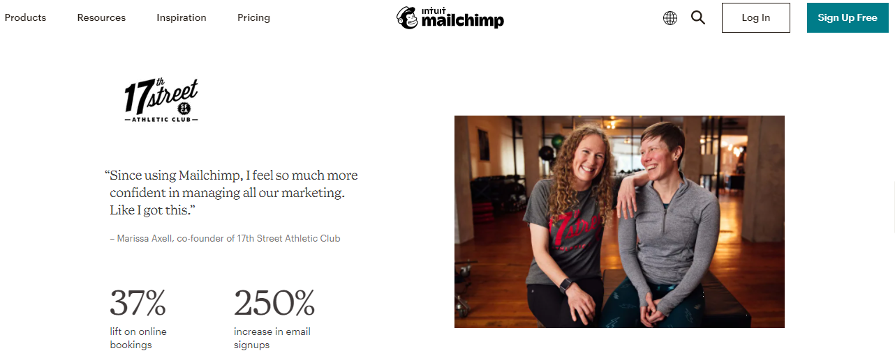
Many technology companies have dedicated specific sections or pages on their website for customer testimonials.
Here’s an example of how Mailchimp has dedicated a section of its webpage for customers testimonials.
iv. Customer Reviews
Users consistently leave reviews for technology products on websites like Google Play, Facebook, Capterra, and many more.
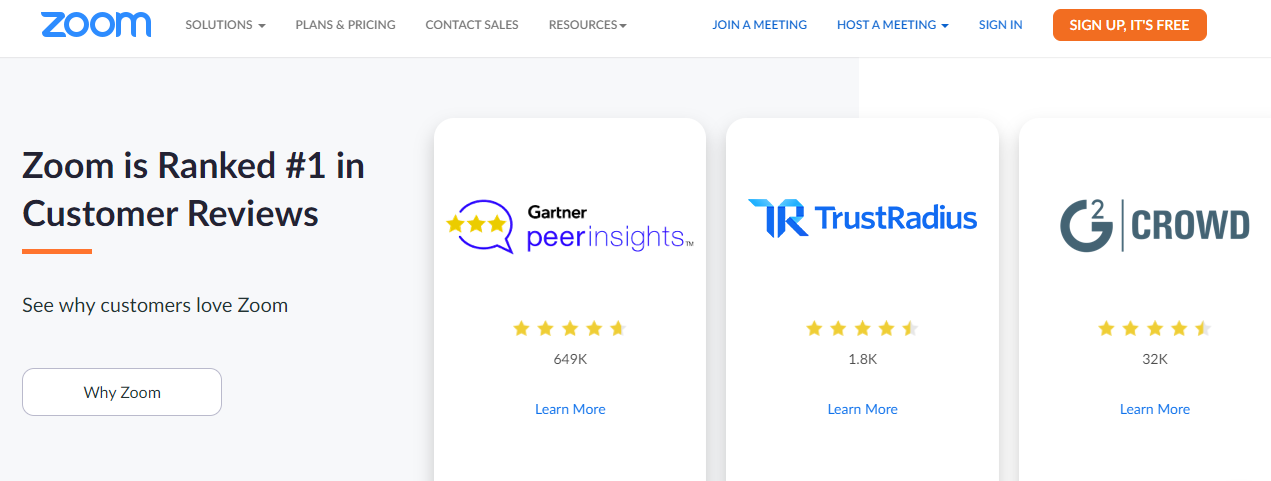
Integrating these reviews on your website and linking back to sites like G2Crowd & Capterra can be highly effective for attracting new customers.
Check out how Zoom has integrated G2Crowd and other reviews to its website.
05. Integrate Free Tools Into Your Website
Many prospects won’t be satisfied with the testimonials and reviews of your products. All they want is to know the ROI after they opt-in for your product or service.
And so, for technology websites, it’s highly recommended to integrate interactive tools into their website.
But, what type of tools can you incorporate into your website? Let’s see:
i. Calculators
A simple yet effective tool that prospects love is the ROI calculator.
May it be individual customers or enterprises, they all have one common question: What’s in it for them?
That’s when online calculators ease their minds. It allows prospects to enter critical data as per their situations and determine the potential ROI from their investment in the product.
For example, Hubspot’s ROI calculator lets visitors figure out the potential ROI by entering a few key metrics.

ii. Product Comparison Tool
Many technology companies offer different variations of a particular product as they serve various industries of different sizes.
This, however, makes it difficult for customers to figure out which product variation serves them the best.
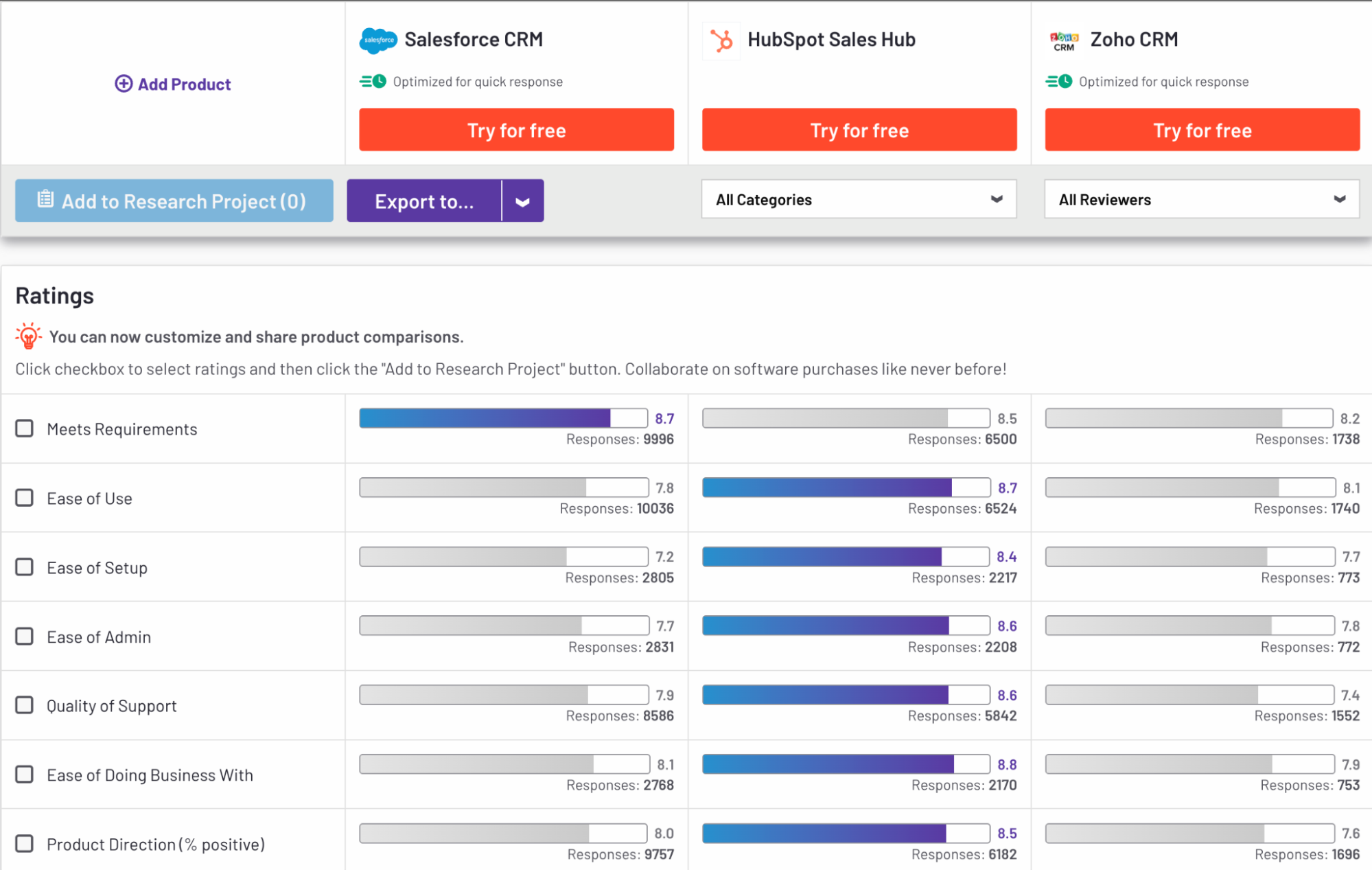
That’s when comparison tools come into play. They allow users to put in crucial information based on their needs and requirements and present them with the best-suited version of your product.
For example, G2’s comparison tool compares multiple technology products to find the right fit for your business.
06. User-Friendly Navigation
For technology websites, it’s important to provide visitors with a seamless design experience and minimal navigation.
But how do you achieve this?
Here are a few navigation trends to look for when designing a tech website of your own:
i. Your Menu Should Look Clean
A lot of menu items can be overwhelming for visitors, and they might get confused. They might even consider pressing the back button and ending up on your competitor’s website. That’d be your loss.
It’s best to keep six or fewer menu items in your menu bar.
And it’s even best to consider incorporating a sticky menu so that users won’t have to scroll all the way to the top to check for other menu options.
Here’s an example of Hubspot using a simple navigation menu and sticky menu to make its website user-friendly.

ii. Use Breadcrumbs
Breadcrumb is a secondary navigation scheme used by technology websites with multiple web pages. It helps visitors keep track of their location while taking a tour of your website.
Here’s an example of Hewlett-Packard using breadcrumbs:

With breadcrumbs, you can define a clear path to the buyer’s journey on your website.
It also provides a seamless experience for visitors when navigating between website pages.
iii. Add “Back to Top” Button
It might seem unnecessary at first, but scrolling back to the top of a web page is a process that everyone finds overwhelming.
Remember, solving simple pain points for your visitors can lead to a fantastic user experience and high retention rates.
Adding a sticky “Back-to-top” button will allow visitors to move back to the top of a webpage with a click, without scrolling all their way up.
Now that you know how to build a tech website from scratch let’s see the best tech websites you can take inspiration from.
II. Technology Store Examples to Learn From in 2022
01. Master & Dynamic
Founded in 2013 by Jonathan Levine – Master & Dynamic is one of the most popular tech brands in New York City in audio essentials.

The company has a deep passion for amazing tech tools and unimaginable creativity. It manufactures professional and luxury audio products made from the finest quality raw materials.
What We Love About M&D Website Design
- Clean design with catchy product custom graphics for product images
- Integrated product comparison tool to help customers find the best suited audio products
- Interactive CTA text on the right bottom corner of the homepage
02. Studio Proper
Studio Proper is Australia’s boutique industrial design studio.
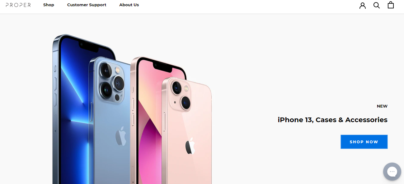
It designs and manufactures products that simplify your everyday interaction with technology in a beautiful way.
What We Love About Studio Proper Website Design
- Clean navigation increases prospective customer engagement
- Light web page layout highlights the CTA to grab visitors’ attention
- Every time a customer makes a purchase, a mini dialogue box pops up from the bottom left corner highlighting the name and country of the purchaser
03. Zero Gravity
Zero Gravity is popular in Los Angeles for its trendy tech accessories. Its in-house designers specialize in crafting beautiful and vibrant designs on iPhone cases.
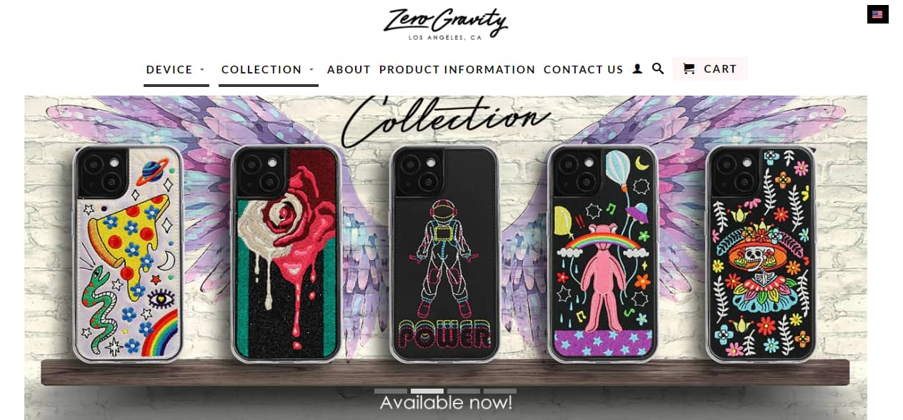
The company has designer iPhone cases for all shapes and sizes and provides a vast collection to choose from. It’s a great example to take inspiration from.
What We Love About Zero Gravity Webpage
- Bold colors and exciting presentation of products highlighting company’s major USP(Unique Selling Point)– out of the box design trends
- A simple, clear, and sticky menu bar to ease navigation for visitors
-
Powerful text CTAs on the homepage such as “Available now” and “Check out new collection” sparks curiosity among visitors
III. Conclusion
Talking about technology web design, tech companies have the potential to create high converting websites and drive crazy leads.
As the demand for technology products and services increases, it’s time for tech websites to kick things up a notch.
They can do this by incorporating the tips and tricks mentioned above into their website. So, don’t forget to look through them.
#Bonus Tip: Don’t incorporate every tip mentioned above in your website together. One tip at a time.