So you are on a mission to help people get into shape and live the healthiest lifestyle possible. Kudos to you for entering this niche! Now that you have your business idea in mind, how do you plan to proceed with your fitness website design?
Building a website can be easy with the help of Shopify, but even with the plethora of built-in tools and templates, optimizing your online storefront for conversion is not an easy task.
In this article, we will help you solve that problem. We will try our best to provide you with the best-customized tips for building an outstanding fitness website, as well as well-performing store examples for inspiration.
Let’s get right into it, shall we?
Not in the Fitness business? Check out the Shopify Store Best Practices: An Essential Checklist.
I. The Ultimate Guide to Fitness Website Design
If this is your first time building a Shopify store, you will need to revise the basics of every successful online store. There isn’t much to discuss and remember, but these few general tips can help you go a long way.
We first need to pose this question: “What makes an outstanding eCommerce website?”.
Mobile responsiveness
More than 46% of consumers use their smartphones to make a purchase, nearly 75% of which admit to abandoning sites that aren’t mobile-friendly.
Check out How To Optimize Website For Mobile: Top 06 Actionable Tips.
Good visual appeal
Images, color schemes, layouts, and so on, all play an important part in your marketing strategy. Every detail matters! Whether you are selling a service or physical items, you need to have a wow factor if you want to capture shoppers’ attention.
User-friendly navigation
User experience (UX) is a major deciding factor. You need a reasonable categorization system to make it easier for clients to browse your store.
Simplicity
What do you want shoppers browsing your store to focus on? Trim the bushes so they can see the main event more easily.
Trust
You need to accommodate first-time visitors. Consumers nowadays are very conscious of their needs and ask many questions regarding an unfamiliar brand, so you need to make them trust you first with your brand identity.
Build Your Business Credibility: An Essential How-To Guide.
Now that you have the gist of it, let’s move on to the main dish.
What makes a good fitness website design? Have a look at 5 powerful tips that will make any fitness website attractive.
01. Use a simple layout
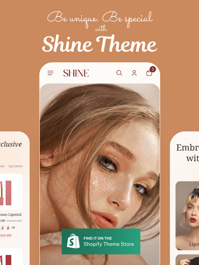
Fitness is all about energy and discipline, don’t you agree? A clustered website is very off-putting regardless of your niche. Avoid masonry-style layout if possible, it is more suitable for fashion and art stores.
Avoid masonry-style layout if possible.
What you want to use are big, bold images that best portray the essence of your products. Instead of displaying collages, try one big photo that covers the majority of the monitor. If you need to feature numerous photos, consider using reels.
And while we’re on the topic of images, invest in professional photoshoots.
If you specialize in supplements and equipment, provide high-quality mockups.
For athletic apparel stores, do remember to include photos of models wearing your products. If you are promoting your gym, include many photos of your facility and customers using your equipment.
And if you sell courses, showcase short videos of the content to give visitors a sneak peek of what to expect.
Waving Pandas
Winning Ecom Video Ads 10% OFF
High converting ecommerce & dropshipping video ads that will drastically increase your sales.
Use code PAGEFLY10 (valid for 48h)
02. A sticky navigation menu gets the job done
This is especially true for stores that are more than just one-trick ponies. If you need to cover everything fitness-related like supplements, courses, blogs, gyms, and so on, you will need a separate page for each of them.
If there are just too many categories to feature on the header, switch to a vertical navigation menu. It will make your fitness website design a lot more organized and free. And do make it sticky, i.e. make the menu stay in an accessible place (preferably on the left of the screen) as you scroll down the page.
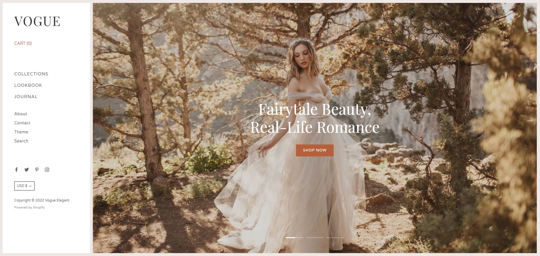
Use a vertical navigation menu – Source: Vogue theme
And as for the content of the navigation menu, you need to think ahead of time. Think of your website’s content as an essay, and the menu is the outline. Here is a checklist of what you should include in the sticky menu:
About us
Everything about your brand’s personality – visions and missions, establishment, physical address if available.
Everything product-related
Depending on what your online business sells, you should categorize them logically – supplements, class schedule, workouts, personal trainers, apparel, and so on.
Should the list be too long, consider using a drop-down menu under “Shop” to include everything. If each section needs further categorization, use a drop-down menu as well.
Blog
An online fitness business website should definitely have a blog, regardless of what it sells. You need to tell a story and inspire consumers to live a healthy lifestyle.
Collections
Do you promote and feature seasonal collections? If you don’t, you should. If you do, this will ensure they are the most accessible.
FAQs and customer support
Invest in optimizing user experience. This will keep clients happy and loyal.
Contact information
Other than in the footer of your site, contact information and socials should also appear on the bottom of the menu for easy access.
03. Always make sure your logo and trust badge are visible
Logos are the backbone of every good fitness website design. You cannot have a distinct brand image if customers don’t know what your logo looks like. Make sure your custom-designed logo appears in at least three places:
- The header, either centered or shifted to the left.
- The footer, next to the FAQs and contact information.
- The navigation menu, preferably on the bottom.
Of course, that is not enough screen time for the beacon of your brand image. You need to incorporate it into as many photos as possible. Naturally, it should be present on all of your physical products, so pick the angle where the logo is most visible.
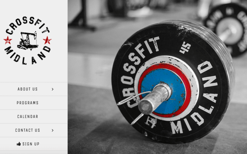
Make sure the logo is visible – Source: Crossfit Midland
Meanwhile, a trust badge, as the name suggests, helps build trust in your customers. It significantly makes your brand more credible. This especially applies if your main products are supplements, healthy meals, or workout equipment. You need that stamp of approval to signify that your products are reliable and good for consumers’ health.
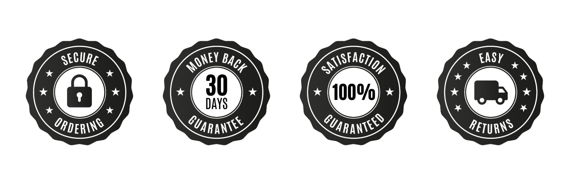
Examples of trust badges – Source: ConversionsKitchen
If you haven’t got a trust badge for some reason, try to get a “Recommended by…” stamp from a trusted figure.
The trust badge should always accompany your logo in the three aforementioned places. Furthermore, make sure to include it in the corners of your mockups and photos as well. Carve the symbol of trust and credibility into the minds of website visitors to reel them in.
04. Pick the appropriate fonts and color scheme
There are mainly two factors in fitness: zen and energy. If your fitness business is on the bodybuilding, cross-fit, or extreme sports side, you could be categorized as the energetic type. Meanwhile, if you specialize in yoga, meditation, or healthy meals, consider your brand a zen store.
The fitness website design for each type should be different. For businesses on the more mellow side or leaning towards promoting a lifestyle, opt for softer fonts. You don’t want to get your visitors on edge with bold texts in hard fonts, what you want is a sense of serenity. Other than that, you should go for earth-tone colors – brown, green, pink, etc.
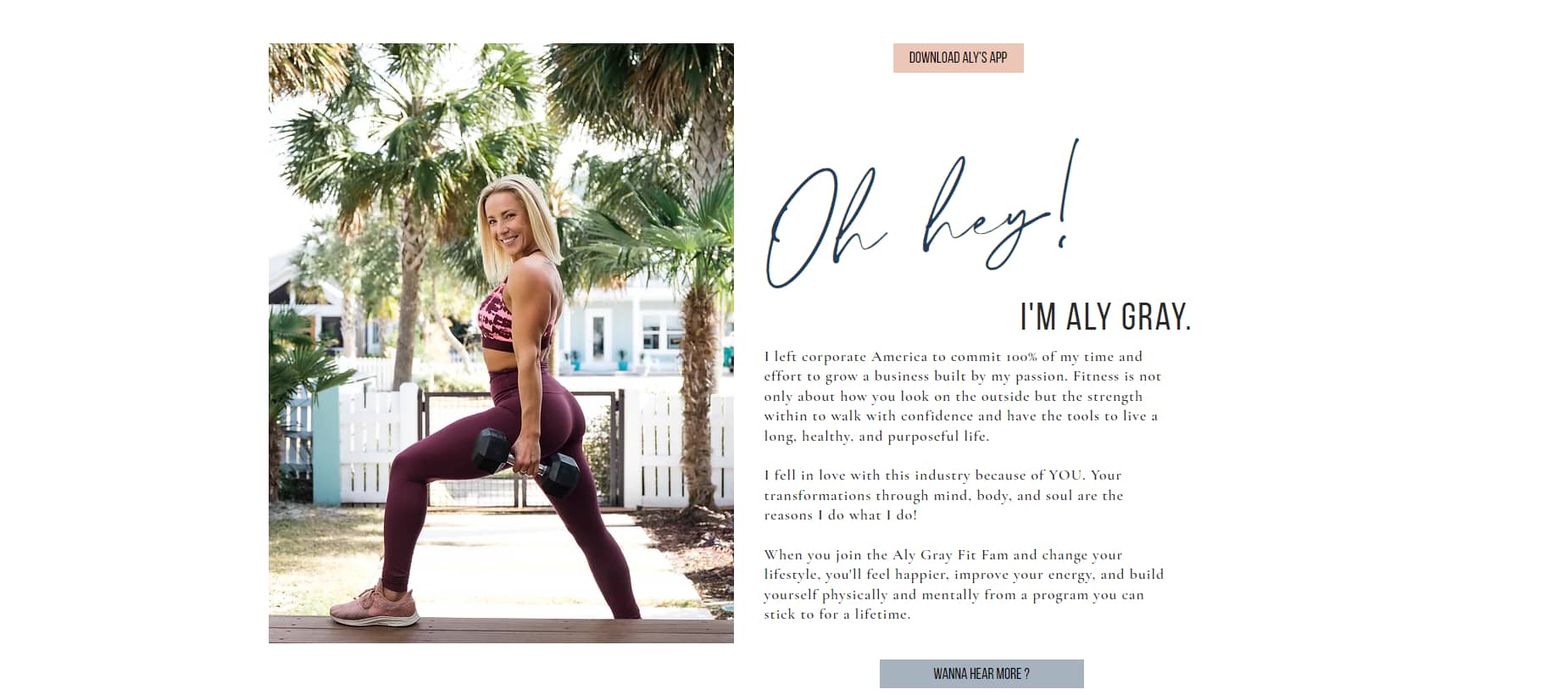
Softer fonts and earth-tone colors go well with zen – Source: Aly Gray Fitness
On the other hand, if you look for any Shopify store specializing in bodybuilding or its alike, you would see a dominant blue/dark blue color scheme. Besides the predominant blue, you can also find vibrant red, neon green, or black. A dark theme is recommended.
Bold texts will also give your page a more rugged look to complement the metal dumbbells.
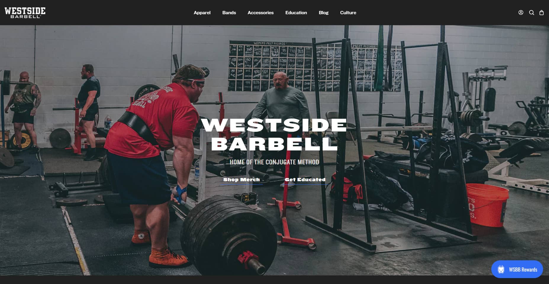
A dark theme and bold fonts do wonders for rugged gyms – Source: Westside Barbell
Of course, it doesn’t hurt to experiment and have fun. This is purely a guideline for playing it safe. But no matter your store type, always keep the design clean and modern.
05. Feature testimonials
Being in the industry yourself, you should know how tight and lively the fitness community is. Be it yoga buddies or gym bros, a customer is rarely alone. Everybody who sets foot on the fitness path will surely need an instructor or recommendations. Clients need to know if something works for other people before they try it for themselves.
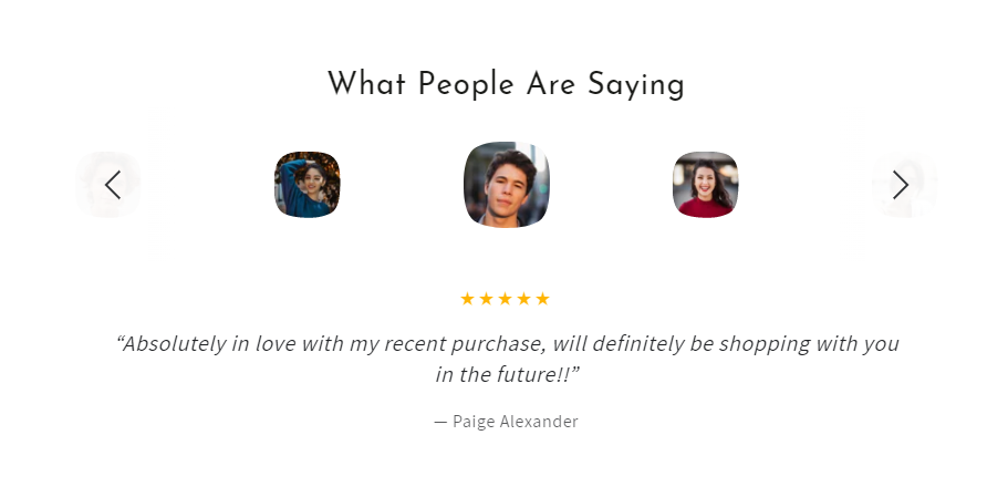
Source: Be Yours Theme – Shopify
That makes testimonials all the more crucial to your fitness website design. Trust badges make your brand more legit, but it’s customer reviews that make your products worth trying for website visitors.
If your brand specializes in one product line only, feature testimonials right on the homepage. If you dabble in many lines, try to include reviews at the end of every product page.
Thus, another tip for running a fitness store is to create a community on social media or membership for your customers. Give them space to talk to each other and be the ambassadors for your brand.
II. Fitness Website Design Examples to Learn From in 2022
When you have memorized the essentials of an effective fitness website design, it’s time to learn from your competitors. When you review the 5 best fitness websites about to be mentioned, or when you do your own extensive research, make sure to note down elements that you like about them:
- Layout
- Colors and fonts
- Animations
- Menu titles
- Special features/functionalities
So without further ado, here are 5 hand-picked, best fitness websites for your inspiration.
01. Bodybuilding.com
Who hasn’t heard of Bodybuilding.com? It is one of the biggest sites and has the most robust resources when it comes to muscle and strength training. The brand contains everything there is to bring to a gym – supplements, clothing and accessories, equipment – as well as workouts and tips for training.
You can see a simple combination of blue, black, and white throughout the page right off the bat. Moreover, they use bold, sans-serif fonts that give the storefront a strong, rugged look. They sure know how to stick to the basics.
However, the most striking feature of this fitness website design is its navigation menu. Being the giant in the fitness industry, they sell a lot of stuff.
At first glance, their menu seems simple enough with just 4 categories: Shop, Articles, Workouts, and Community. The magic happens when you hover over each category, a drop-down menu contains a myriad of collections and sub-categories to choose from.
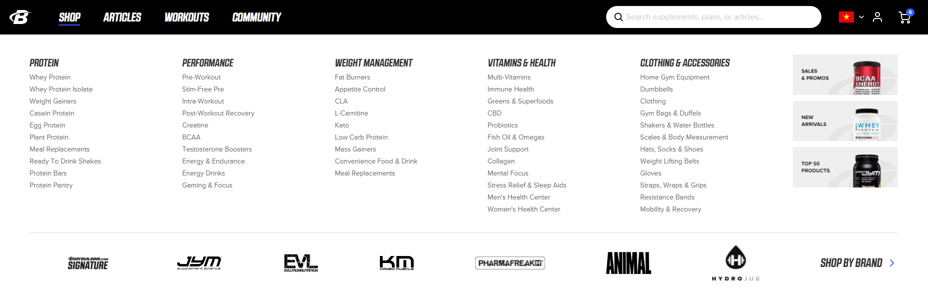
Another interesting thing about their drop-down menu is the option to shop by brand, along with many logos of different affiliated fitness brands.
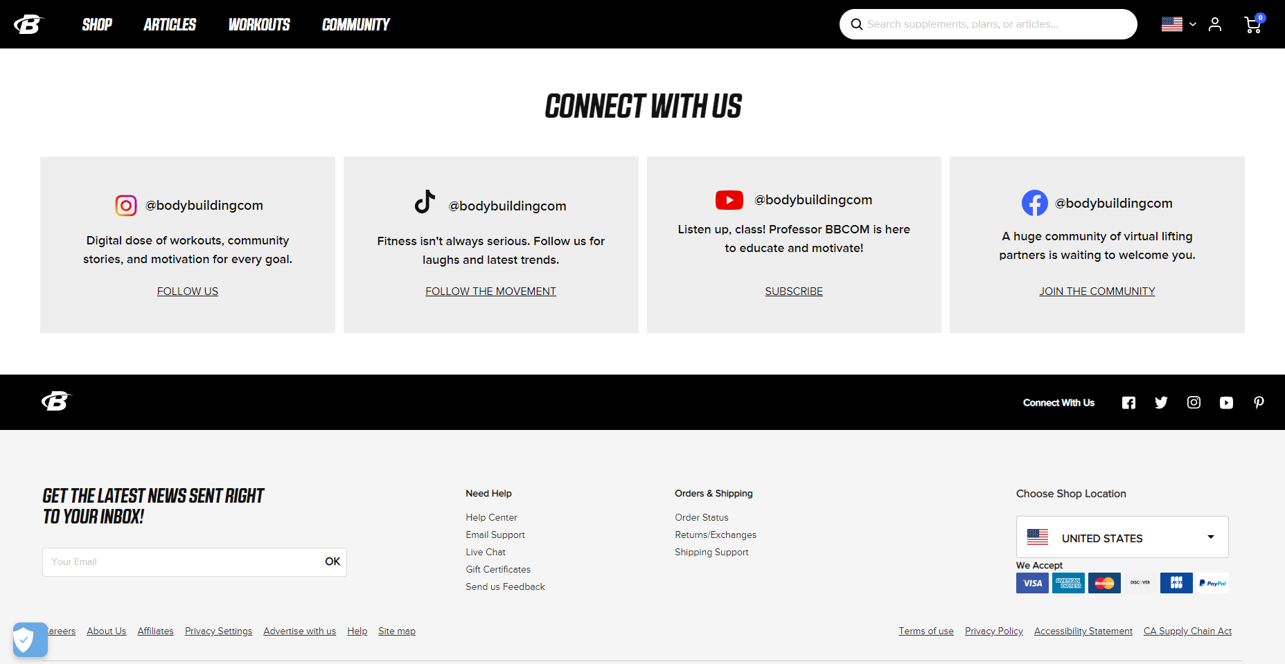
To top it all off, their footer contains all of their contact information, as well as customer support, policies, and the option to specify the shipping location.
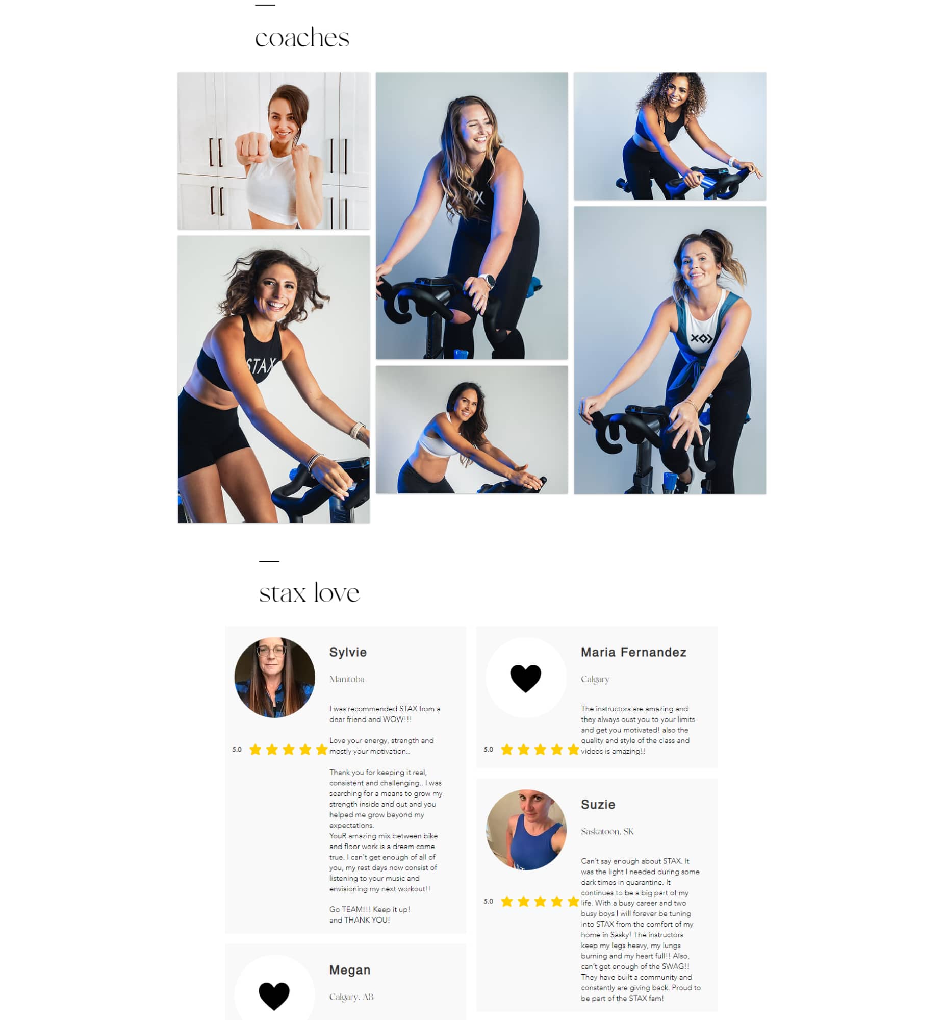
02. Stax Cycle Club
During the pandemic, the indoor cycling studio in Canada closed their gyms and operated entirely online by streaming high-quality free classes and creating fun challenges to keep members new and old engaged.
Their website is almost minimalistic in terms of colors, containing only black text and white background. That said, their photos and videos are incredibly vibrant, giving the fitness website a vibrant, youthful look.
Because Stax Cycle Club specializes in only one service – offering courses and promoting their studio – the design has more room for creativity. Even though we said not to use a masonry-style layout, this fitness website design has incorporated it beautifully, in both coaches’ images and testimonials.
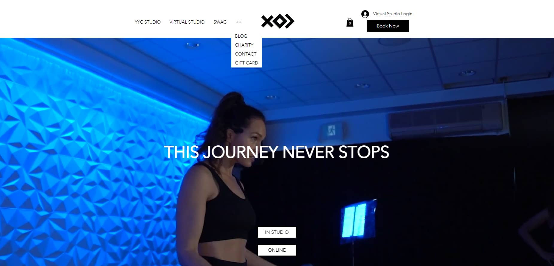
The navigation menu can be a bit polarizing. It’s nestled neatly next to the logo in the header. As the brand focuses predominantly on their physical and virtual studio and a bit on their merch, they only feature those three.
If you want to read their blog or learn more about their community, you need to open the drop-down menu. This design sure saves space and goes well with the overall design, but visitors might just miss a few easter eggs.
03. The Fighters Club
This is hands down, one of the best gym websites as it does a wonderful job in showcasing the beautiful facility. They have managed to show it off elegantly with clear, great images like an Instagram feed. Fitness enthusiasts can definitely enjoy the first-hand view of professional personal trainers that will help them lose weight.
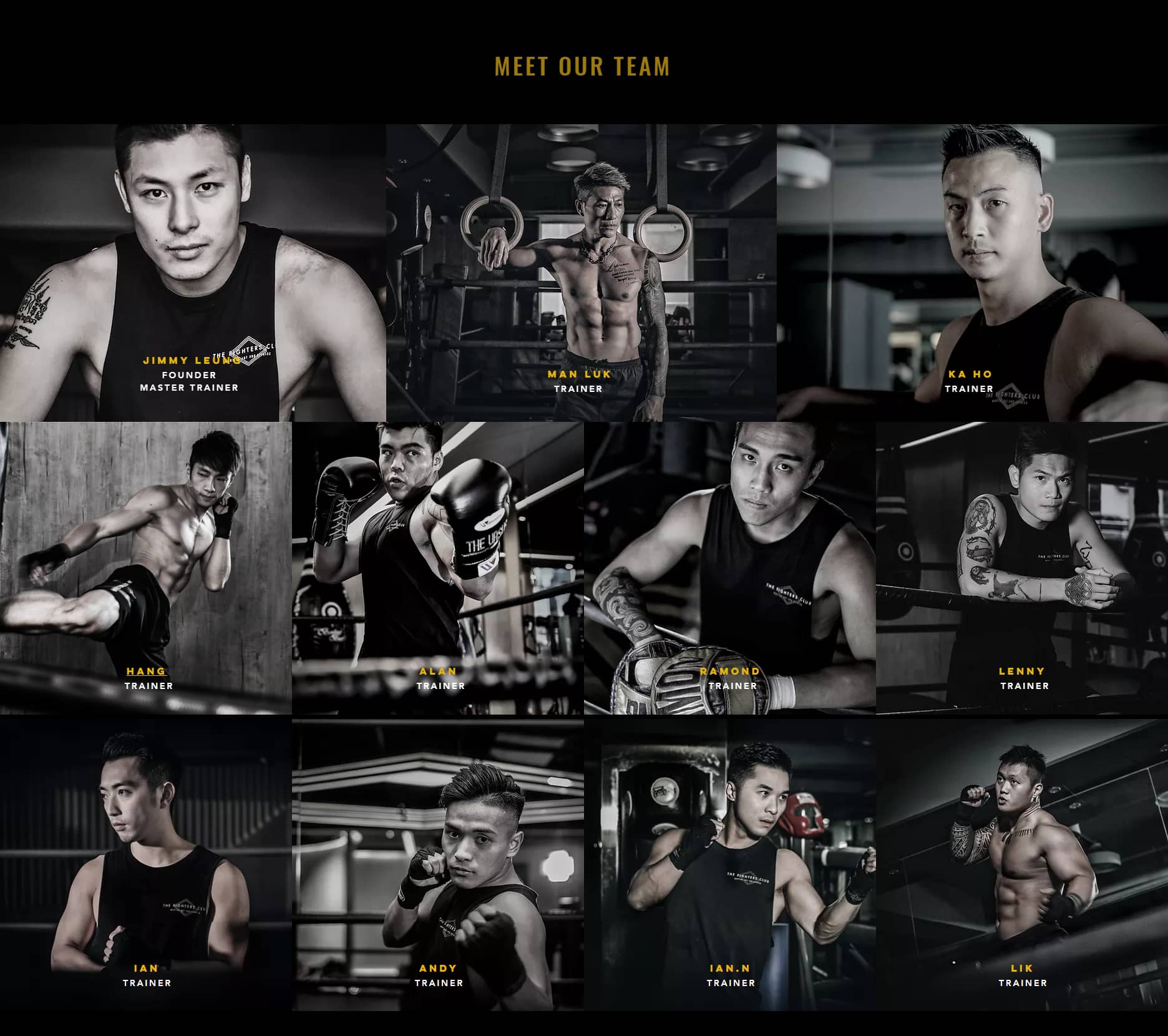
The fitness website design utilizes the contrast of a black background and dark yellow to polish the modernity of its services.
The symmetry in the placement of elements makes the homepage look all the more elegant.
What The Fighters Club excelled in is its responsive design. If you pay attention, you can see the navigation menu items shift in color as you scroll to the anchored section.
What’s more, you can see a big “Book a free trial” button right on the header. A big and simple call-to-action as this is sure to make conversion way easier for the gym.
Another interesting part of the design is that they featured a map on the bottom of the homepage to let clients know where to find them.
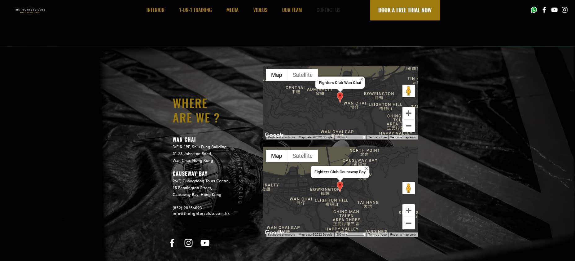
The only downside of this fitness website design is the text size. It’s a bit small and crowded, rendering itself illegible.
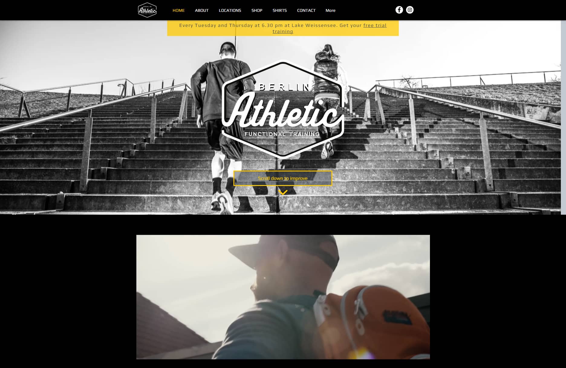
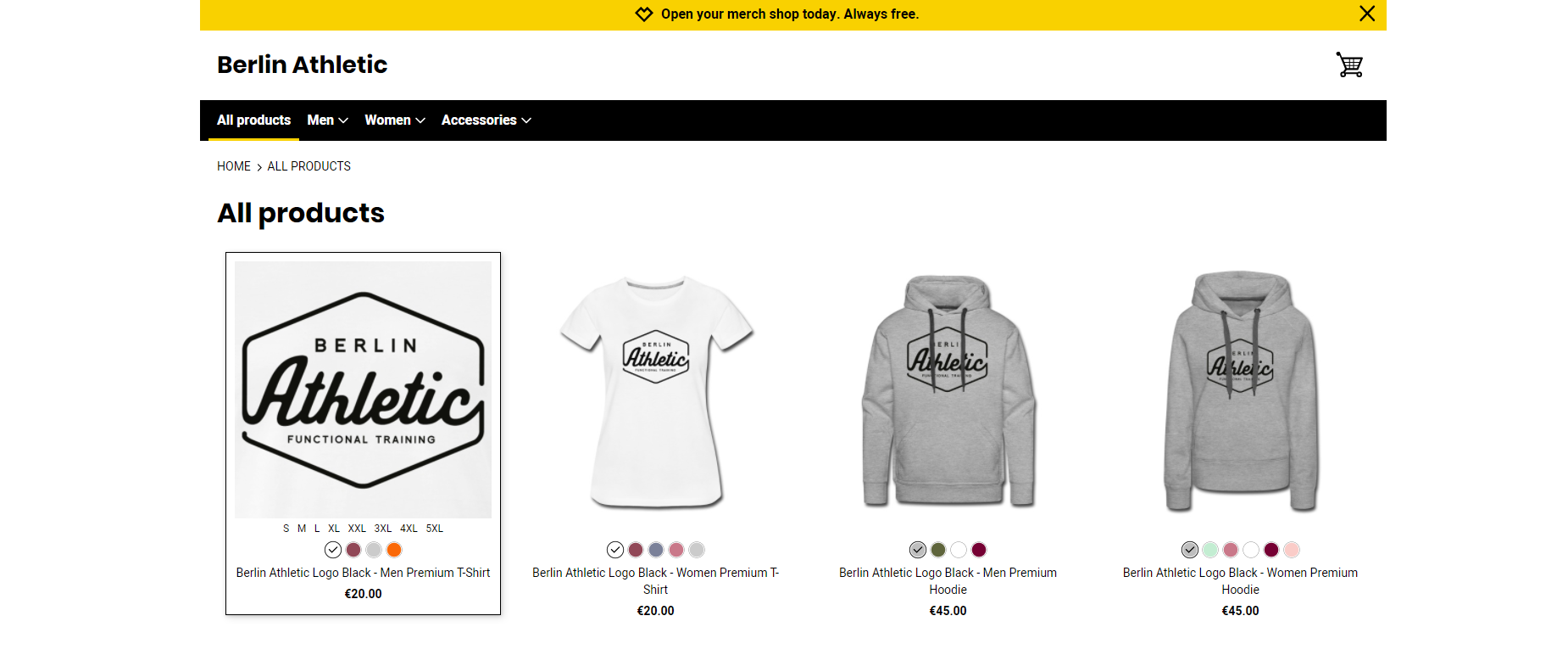
04. Berlin Athletic
This brand has a similar design philosophy to The Fighters Club. Both fitness websites have the same symmetrical placement, dark background, yellow and white text, and responsive navigation menu. They both even feature an interactive map and big CTAs on the homepage.
However, there are two key differences. Berlin Athletic places less focus on images and more on service descriptions. As a result, its text is way easier to read.
Following each paragraph is a big button to book a session or easily sign up for a free trial. You can be sure conversion is the top priority of the design team.
What’s more, Berline Athletic also sells merch, so there’s another item to analyze. The shop’s design is simple enough. It does get a point for having an interactive design, though. You can view different product colors right on the browsing page. It could be better if the cart is slide-out, so visitors can browse and view their carts simultaneously.
05. Albany Academy
Let’s check out a different design philosophy. Albany Academy is a high-end golf and tennis institution, with a web design that perfectly reflects that element.
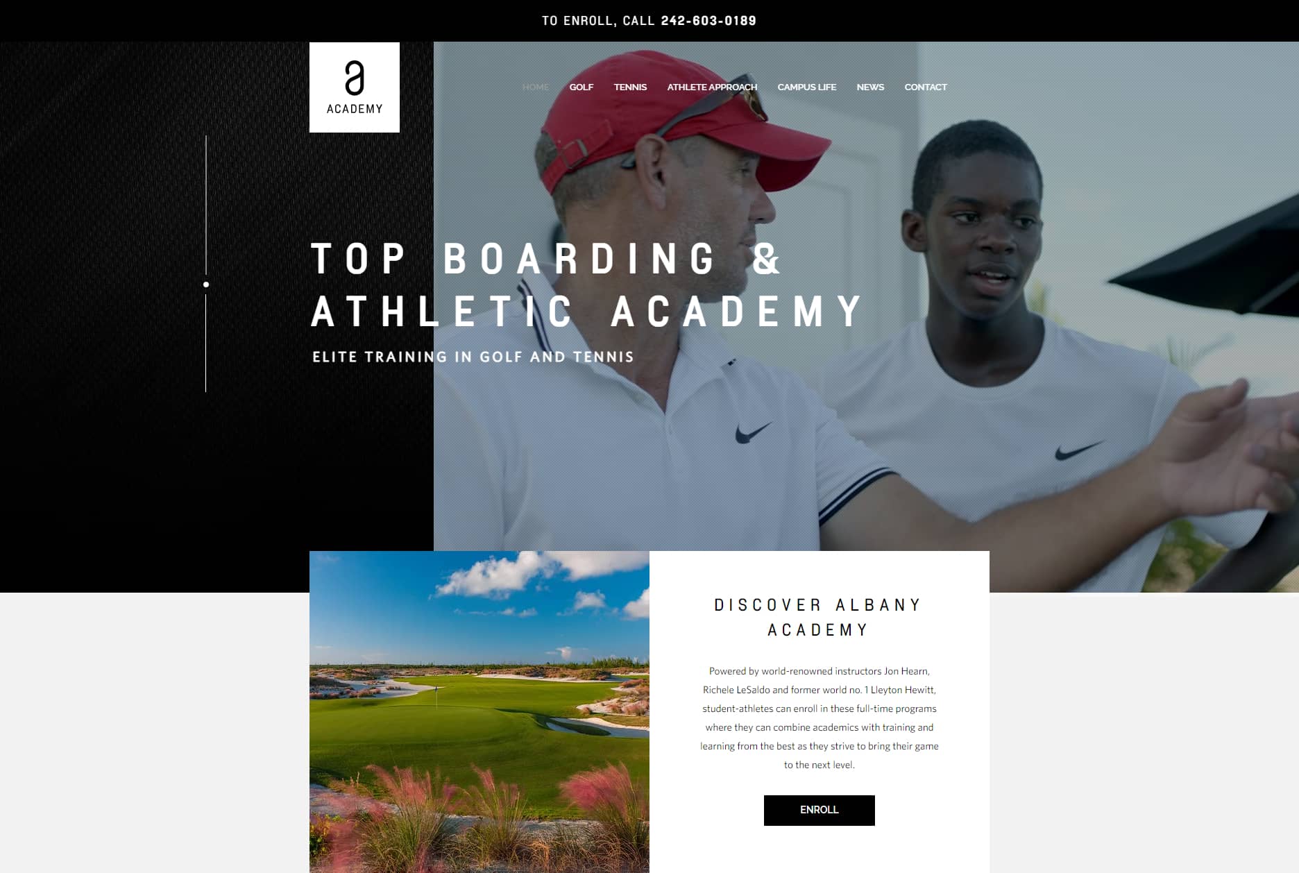
The color scheme throughout the website is mainly white, black, and sky blue. It boasts a bright, clean look, exactly like the clutter-free luxurious tennis and golf courts.
Even though this is a fairly text-heavy design, it blends in really well with the many clean images to showcase the lifestyle and community at the academy. One can describe the site as a buffed-up version of a university website design.
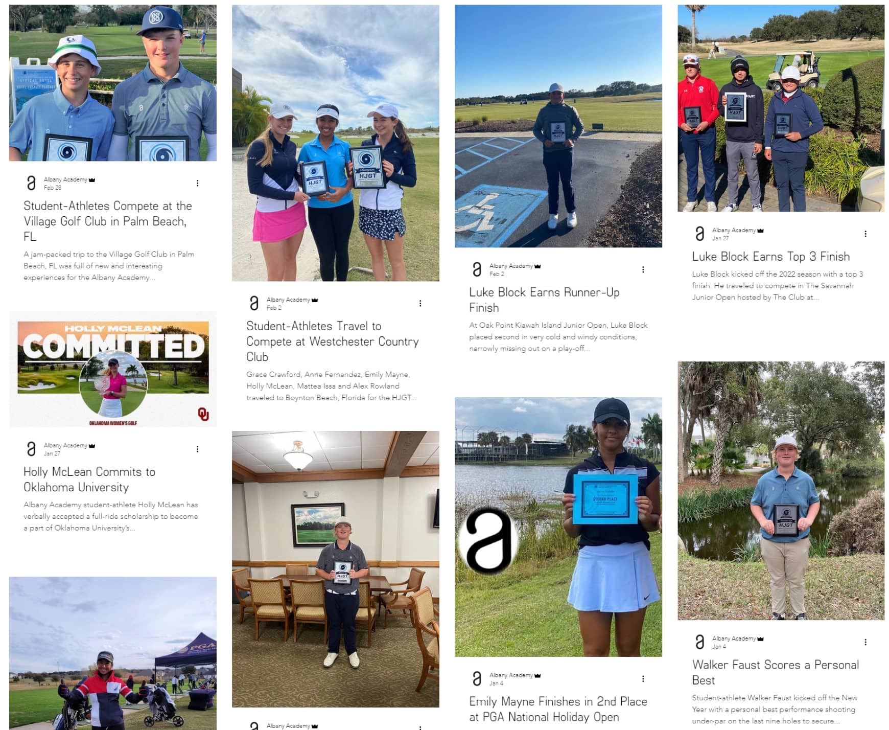
The “News” page, or the blog section, features a tiled layout with a big photo for every post followed by the first line of the article. This arrangement can help visitors feel more connected and close to the activities of the academy, giving it a more credible look that can rival that of a trust badge.
To top it all off, as you scroll through the page, you will find many small animations of line elements to make the design more lively and responsive.
And should you want to contact the brand, the phone number is right on the header, or you can just click the “Contact” button to fill out a form.
III. In a Nutshell
Kickstarting online fitness services can be hard, especially during the first stages. Take your time, but rest assured that once you have finalized your fitness website design, the stepping stones have been laid out.
We hope you found our tips and examples educating enough. Make sure to do your own further market research and learn from your competitors and fellows in the industry.
If you need more tips and tricks to optimize conversion, or how to work around Shopify, do check out our blog for more helpful content!