What makes a great beauty website? The answer can vary, but it is most likely related to the products themselves: variety, price, quality, and so on. But here’s a trickier question: What makes a great online beauty website design?
Buyer behaviors matter when it comes to an e-commerce website, and there is plenty of data to back up good web design.
Thirty-nine percent of users will abandon a website if it takes too long to load. Furthermore, 38% of customers will abandon a site that is unappealing, disorganized, or chaotic.
Seventy-five percent of people judge a company’s credibility based on its website.
That, however, should not come as a surprise to you. Whether you sell cosmetics, haircare, or skincare, or you own a beauty salon, nail bar, barbershop, or spa… As a beauty industry insider, you understand the significance of appearance.
And, without a doubt, if you’re in the beauty business, you have to look good, making this industry a gold standard for beautiful, engaging, and high-converting digital destinations. Let’s look at 9 of the best beauty website examples in the cosmetics niche to see what we can learn from these beauty websites.
I. Designing an Outstanding Beauty Website
01. Leverage A Visual Hierarchy
Visual Hierarchy
Every page has a visual hierarchy.
A professional designer employs visual hierarchy to direct the attention of visitors to the most important elements first. Position, sizes, visuals, and contrast are all part of the website layout.
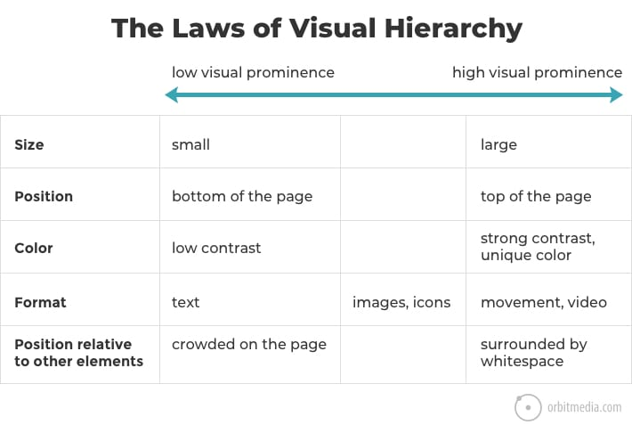
Combining elements multiplies their impact. Everyone will notice a large video at the top of the page. Few people will be able to read low-contrast text that is surrounded by images.
The reason your eyes follow a specific path on every page you visit on the internet has to do with visual hierarchy. When used intentionally, it directs the visitor’s attention through a series of messages, resulting in a call to action.
Hierarchy is an important design principle that aids in the display of your beauty products in a clear and effective manner. You’ll be able to direct site visitors’ attention to specific page elements in order of priority, beginning with the most important piece, if you use hierarchy correctly.
The main components of visual hierarchy are:
- Size and weight: Make your most important assets, such as your company name and logo, larger and more visible. Readers naturally gravitate toward large, bold titles first, before moving on to smaller paragraph text.
- Element placement: Use the proper website layout to direct your visitors’ attention in the right direction. For example, you could put an important call-to-action button in the center of the screen, or place your logo in the header.
Strips and grid layouts are powerful web design elements that can help you achieve a strong visual hierarchy.
Photos
Concrete examples have a greater impact than vague promises.
Most beauty websites make the claim that they can make people look good. However, including images of your work or people wearing your products on your beauty website demonstrates your ability to deliver.
Posting images that highlight your brand’s unique style will attract customers who will share it. As a result, you’ll gain and keep more customers.
So, include photos on your beauty website that show off your skill and style. Demonstrate to potential clients that you can be relied on to make them look and feel beautiful.
- Make a gallery of your best-loved manicures, hair color clients, or make-up applications.
- Do you own a spa or a salon? Then, create a page for each team member, complete with a gallery of their best work.
- If you make beauty products, encourage your customers to use a custom hashtag to post photos of themselves wearing your products on Instagram. Then, on your website, include a widget that automatically displays those photos.
- Allow customers to include images in their product reviews.
- You must have stellar branding if you want to be the next ColourPop or L’Oréal. That includes a professional, custom website that demonstrates to the world what your beauty brand is all about.
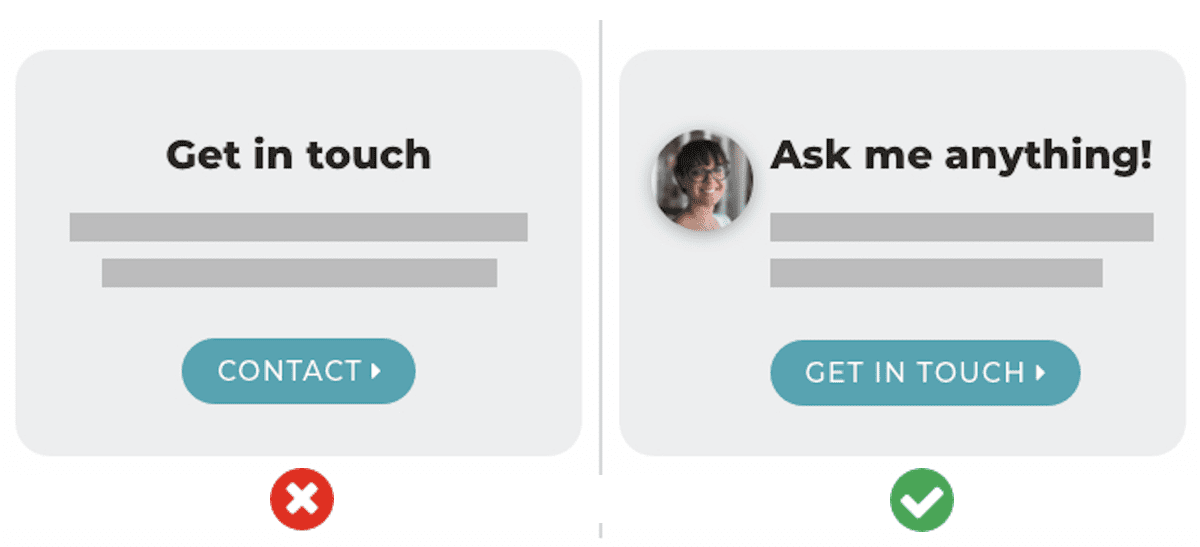
Faces are a particularly potent form of imagery. We look at faces more than anything else from the moment we are born. The magnetic power of people’s images is extremely useful in beauty website design.
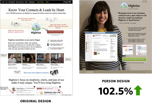
Faces not only attract attention, but they also correlate with conversion. The well-known Basecamp case study demonstrated a significant increase in results when faces and testimonials were combined on a sales page.
See more: Ecommerce Website Design: Everything A Store Owner Needs To Know in 2022
02. Ensure Your Site Is Easy To Navigate
You want your users to be able to find what they’re looking for quickly. Furthermore, a beauty website with good navigation aids search engines in indexing your content while greatly improving the user experience:
- Link your logo to the homepage: This website design tip is a standard practice that your visitors will expect, saving them a few clicks.
- Mind your menu: Whether you choose a traditional horizontal list, a mascara menu, or something else, your website menu should be visible and easy to find.
- Offer some vertical navigation: Use an anchor menu if your site is long-scrolling, such as a one-page website. Viewers will be able to easily navigate to any part of the site with a single click. Another alternative is to use the ‘Back to Top’ button, which returns visitors to the top of the page regardless of where they are on your site.
- Work on your footer: Your website footer is likely to be the last thing visitors view, so it’s a good idea to keep all of your essential connections there. This could include your contact information, social network icons, and a shortened version of your menu, as well as any other relevant links that visitors might seek.
Since navigation is always present, it provides an opportunity to communicate. Visitors usually begin their visit by scrolling over the header. Anything, even your menus, is quite likely to be viewed there.
Source: UX Movement
If your navigation labels are generic, they are shared by hundreds, if not millions, of websites. You’ve missed an opportunity to benefit from best practices in website navigation, assist your visitors, and boost your search engine optimization.
Check this beauty website out:
03. Add Evidence and Social Proof
The human desire to do what others are doing is known as “conformity bias.” Giving evidence that others have chosen you makes your company appear to be a good choice.
The fastest, easiest way is to add testimonials. Here are other types of social proof.
- Endorsements from relevant influencers
- Product reviews from customers
- “As seen in…” logos of media where your company has been mentioned
- Social media widgets showing the size of your following
- Trust seals, including association memberships, security certificates, and awards
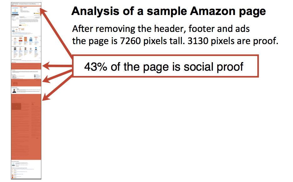
How much evidence is sufficient? How many testimonials do you think you should include?
A great deal. It is possible that no amount of proof is excessive. A quick analysis of one of Amazon’s product detail pages found that 43% of the page is evidence and reviews.
Pro Tip! Make no testimonials page. They are often low-traffic pages. Instead, include testimonials on each product and service page.
See more: Why You Need A Testimonial Page On Your Shopify Site?
04. Showcase Your Unique Brand
Each client is unique.
And, just as you encourage your clients in looking their best, your beauty website design must reflect your brand’s uniqueness.
This is especially true for a new beauty website. Don’t forget the necessity of having a strong visual identity for your beauty brands if you’re putting together a business plan to start a new beauty business.
Consumers, after all, don’t want to appear like everyone else. They want to show off their individuality. They will also check to determine if your beauty website stands out in unique ways and offers something special and distinctive.
People won’t be able to tell you apart from other beauty companies’ websites if your beauty website uses a basic template and appears like thousands of other salons, nail care, or cosmetics websites.
A great website design will highlight what distinguishes your beauty business and attract those customers.
05. Design Your Website For Fast Load Speeds
A web page that takes too long to load is one that no one will ever view.
Between seconds 4 and 5 of your website’s load time, 20% of visitors have already left.
Not only that, the faster your website loads, the higher its SEO stands for ranking. So, the easier it is for people to find.
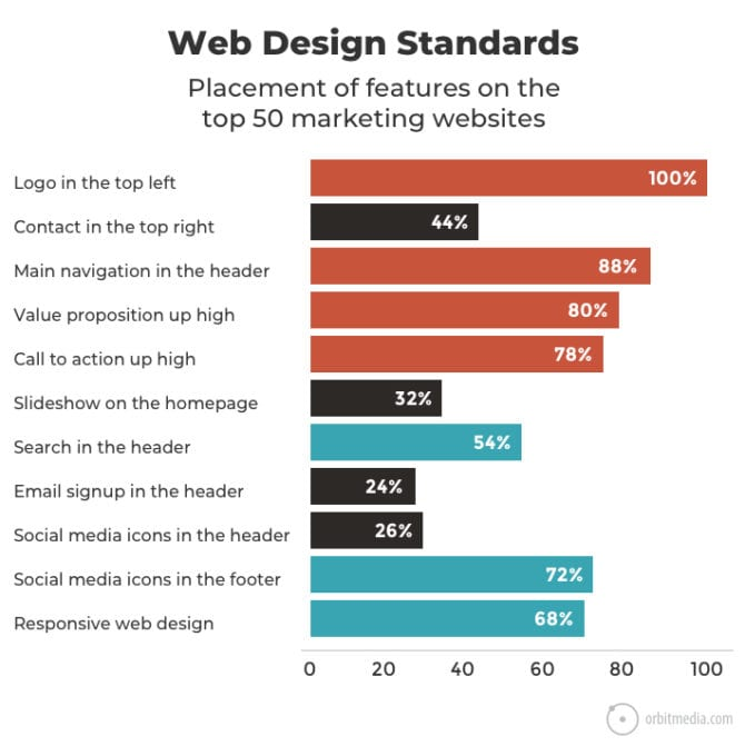
06. Stick To Standard Layouts
A website that follows web design standards is more likely to be loved.
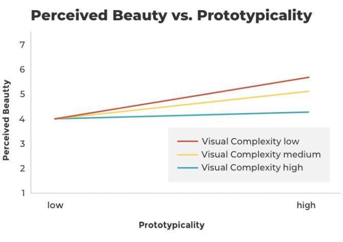
The most beautiful sites have a high prototypicality as well as a minimal visual complexity. They are both straightforward and uncomplicated.
The “standard” website with high prototypicality includes the following:
- Logo in the top left
- Horizontal navigation in the header
- Search bar at the top
- Social icons at the bottom
- Mobile responsive design
See more: Build Page Structure
07. Keep Your Homepage Minimalistic and Free of Clutter
A good beauty website should immediately deliver your main message and brand’s story. We rarely read every word on a website, after all. Instead, we scan the page fast, identifying key words, sentences, and images.
The less your site visitors have to read, click on, or remember, the better their ability to digest and assess your content will be.
These simple website design suggestions can help you split up your content and create a presentable and inviting homepage design when learning how to design a beauty website:
- Keep important content above the fold: Visitors should be able to comprehend what your website is about as soon as they arrive, without having to scroll or click anywhere.
- Space out your content: Use whitespaces between elements. By leaving some parts blank, you’ll give the design a considerably more airy, well-balanced appearance. Write in bite-sized, understandable paragraphs for your text.
- Add imagery: High-quality media features such as stunning pictures, vector art, or icons, for example, will work wonderfully as alternate approaches to communicate your message.
- Include a call-to-action: From making a purchase to signing up, encourage site visitors to take the action you want them to by including a call-to-action (CTA) button on the homepage.
08. Stay Mobile Friendly
No matter what device they’re browsing, everyone of your site visitors should be able to appreciate your professional beauty website at its finest.
Assess your site’s mobile version while imagining yourself as the user, and test out every page, user action, and button.
Consider limiting page elements and scaling down some components, such as the menu, to make your mobile website cleaner and less cluttered than your desktop version.
09. Keep Customers Connected Through Social Media
Social media networks allow beauty brands to connect with their target audience on a one-on-one basis and nurture those audience members into customers.
Cosmetics, body scrubs, hair sprays, and perfumes are all examples of beauty items that rely on a visual medium to be best presented.
Social media integration aids in achieving a couple key objectives, including improving your brand’s reach and exposure. It also stimulates website engagement and contributes to the growth of your social media audience.
Your website and social media should work in tandem. This promotes your brand and increases traffic to your social media profiles.
The challenge that beauty brands will continue to face is how to interact with consumers while also maintaining an online presence for one-on-one conversations with the public. Due to the general advancement of social media and the ever-increasing participation of consumers, beauty brands can go to social channels like Instagram, YouTube, and everything in between to interact with their devoted followers and be seen by new ones.
II. Beauty Store Examples to Learn from in 2022
01. Dior
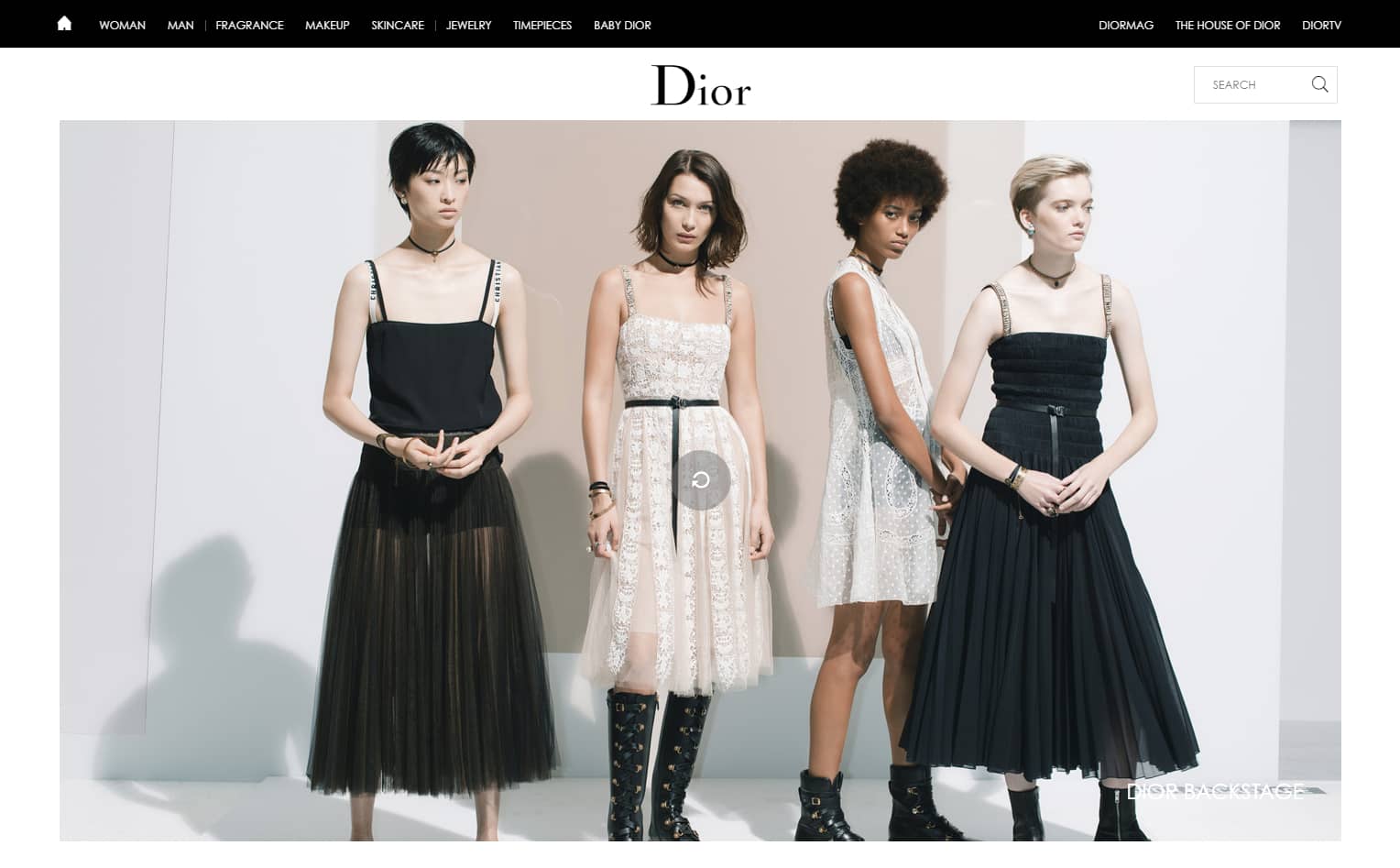
Dior is a great example of a successful beauty website that attracts potential customers right away with their web design.
The Makeup and Skin Care sections serve as a pretty neat makeup assistant. Each product comes with a detailed description about formulas, available shades, and even application tips.
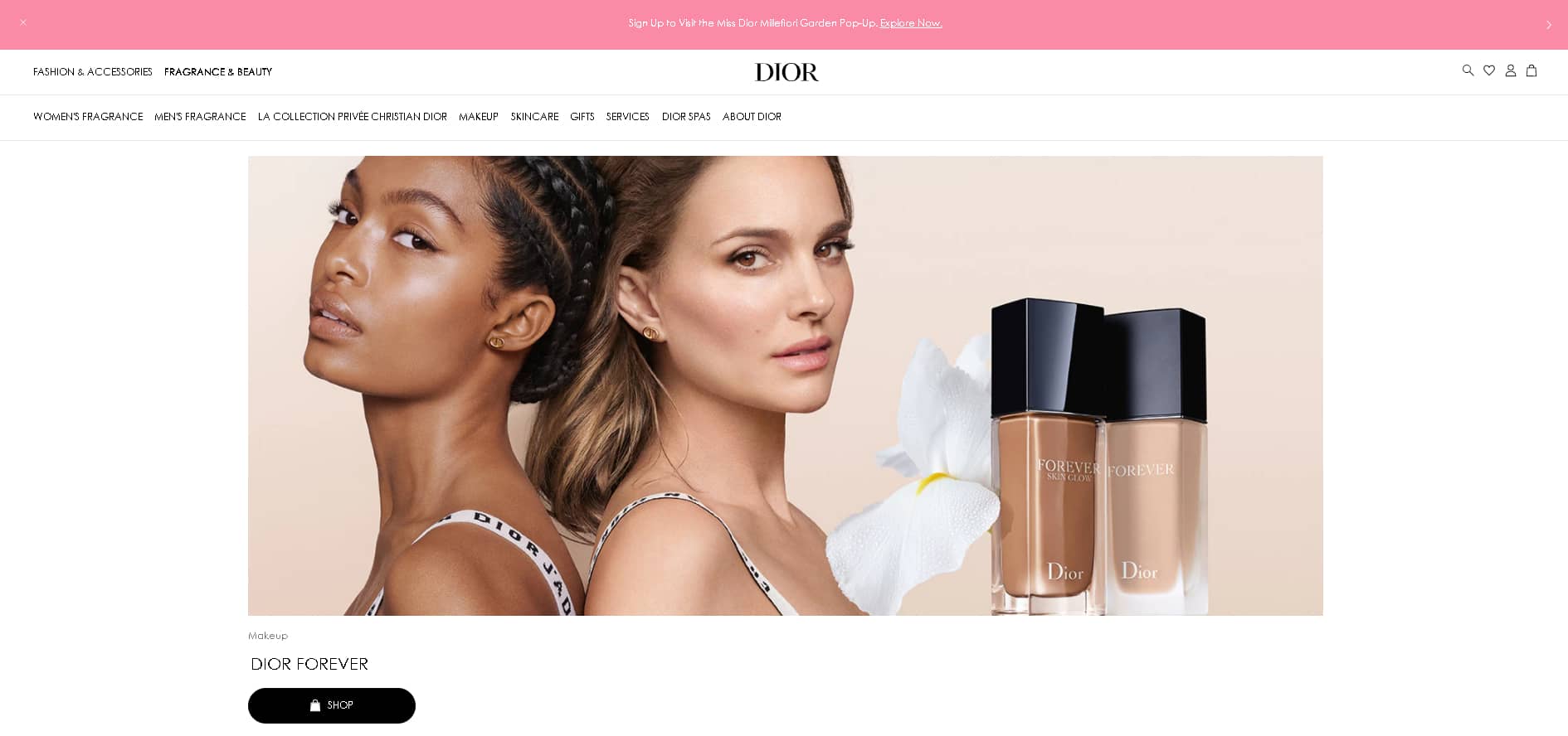
The layout on their product page is simple and neat, and there is lots of white space. That’s a good thing because you want to draw attention to the product rather than distract it with unnecessary elements.
However, on the landing page, the web design includes multimedia elements such as beautiful videos and photographs that keep the user interested.
Waving Pandas
Winning Ecom Video Ads 10% OFF
High converting ecommerce & dropshipping video ads that will drastically increase your sales.
Use code PAGEFLY10 (valid for 48h)
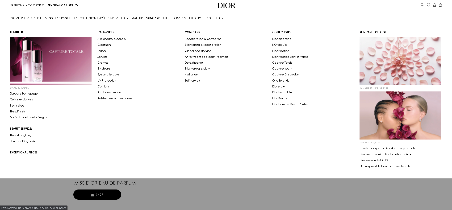
Overall, this is a clear yet highly engaging website design. The design’s minimalism is naturally engaging, encouraging interaction through a subtle layout, detailed product descriptions, and a smooth checkout experience that promotes a seamless and sophisticated buyer’s journey.
02. Guerlain
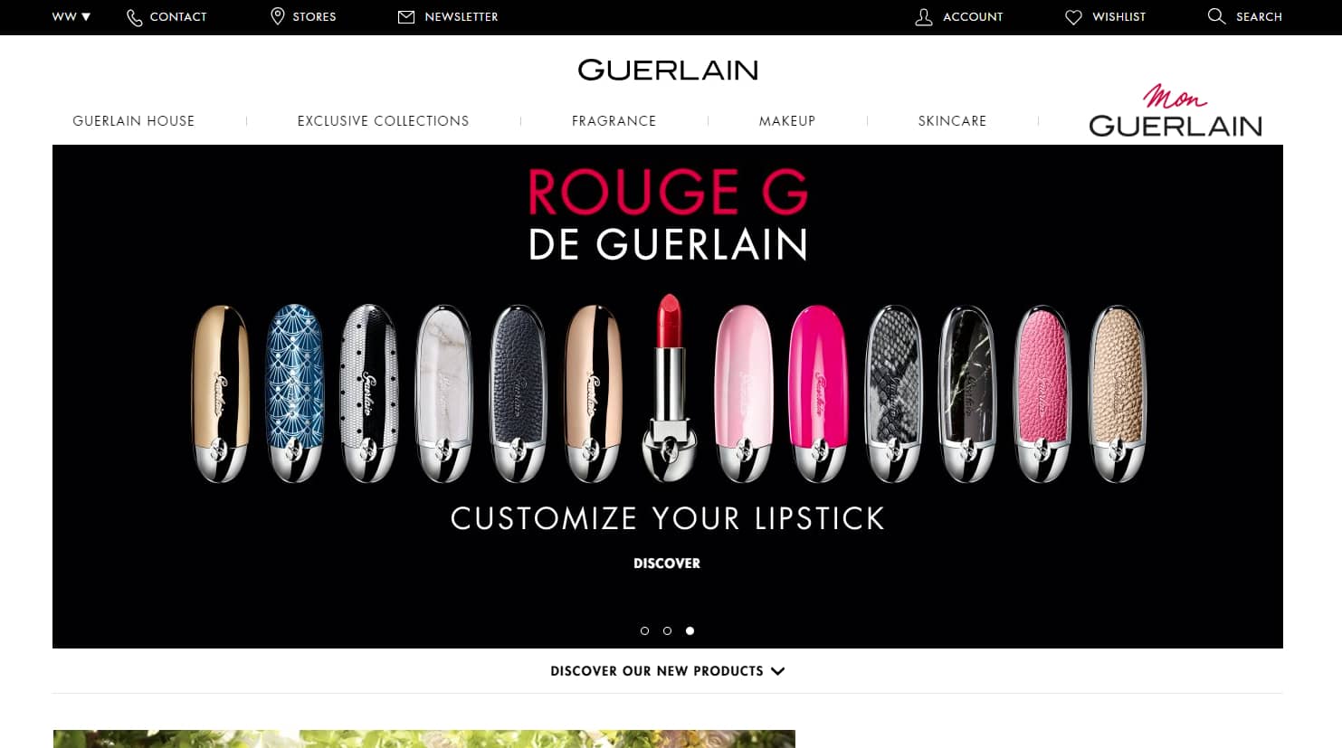
Guerlain is a well-known French fragrance, cosmetics, and skincare brand with a global following. They are a scent trendsetter and take great pride in the quality of their products.
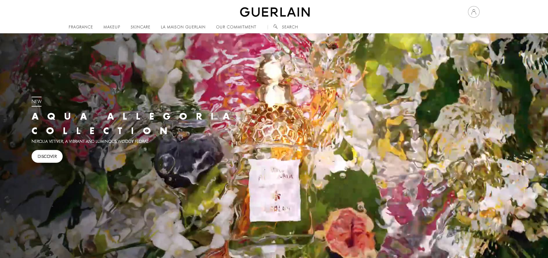
Despite being an industry leader, Guerlain does not overcrowd its website with products. Instead, the navigation is simple and supports the content. Furthermore, the product pages include more than just high-quality images and basic details. You can also find useful videos, similar things, usage instructions, and a social media menu. Everything is designed to deliver a complete on-site experience.
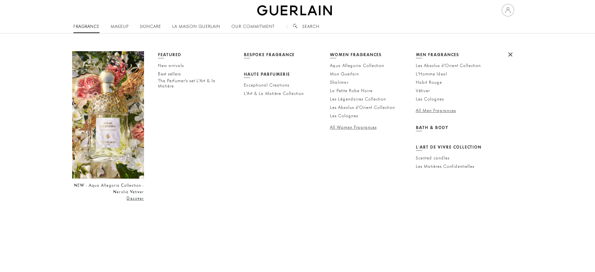
The dark background, simple layout, and prominent CTAs lend a moody feel to this design. This gives a majestic and powerful touch of luxury. It creates an atmosphere favorable to purchasing cosmetics that will make you feel as amazing as it looks, setting the mood for a fantastic buyer’s experience.
03. Sephora
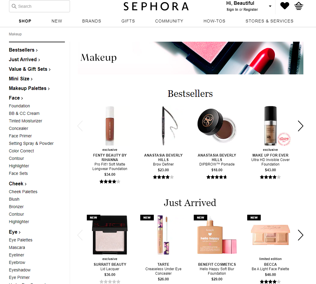
You might assume that with a brand like Sephora, which sells thousands of products from various brands, it would be impossible to navigate their entire website. That, however, is not the case.
The design is incredibly clean and breezy, and the simple navigation menu makes exploring it a pleasurable experience. You can also join an online community and a Tips and Tricks section on the platform. The nicest thing about it, though, is that it allows you to access new things long before they are accessible in physical locations.
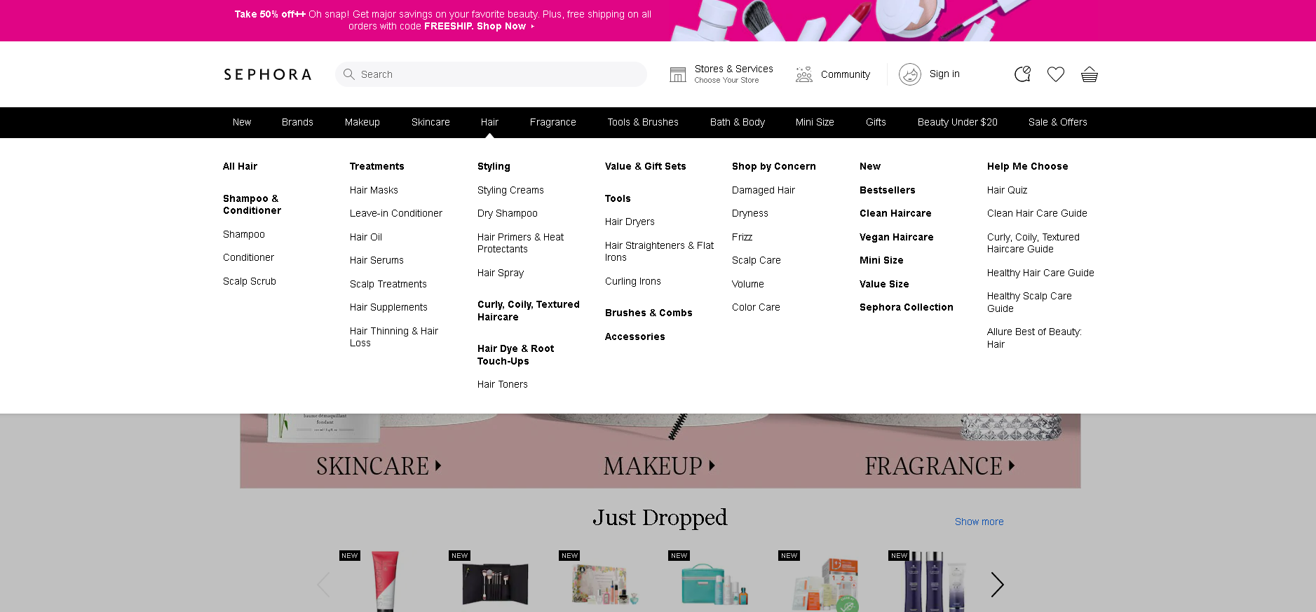
Sephora is a market leader. It’s innovative, intriguing, and incredibly engaging. In addition, it’s a website that takes pride in providing its consumers with access to products before they’re available in stores. It’s also a beauty website that learns from your actions, personalizing suggesting product to make the process even easier.
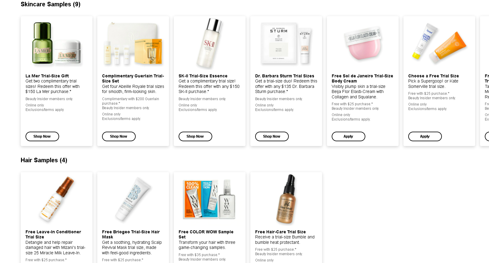
Not to add that this beauty website offers three product samples with every order. This allows people to test before they buy in an extremely user-friendly and intuitive manner.
04. Apothecary 87
Apothecary 87 is a male-oriented beauty website. It provides beard and skin products that will bring life, volume, and a smoothness that cannot be overlooked.

And it’s a brand with a solid, impactful and organic history.
To complement this rough, rustic, and real vibe, the Apothecary brand chose a vintage, traditional website design that highlighted the products and their essence.
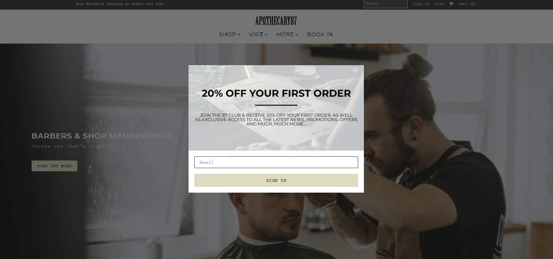
With a brown background, classic images, and an elegant buyer’s journey, this is an amazing vintage-inspired design. This look, however, isn’t the only one that adds class, refinement, and a melancholy edge.
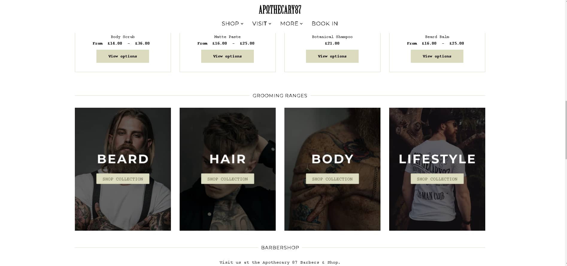
Navigating this beauty website is also a lot of fun. Instagram users may search for products, which is a novel and intriguing way to target a younger audience. Users can also search this site in a more traditional way, with product pages and clean navigation that connects them to the grooming products they need.
05. Lush
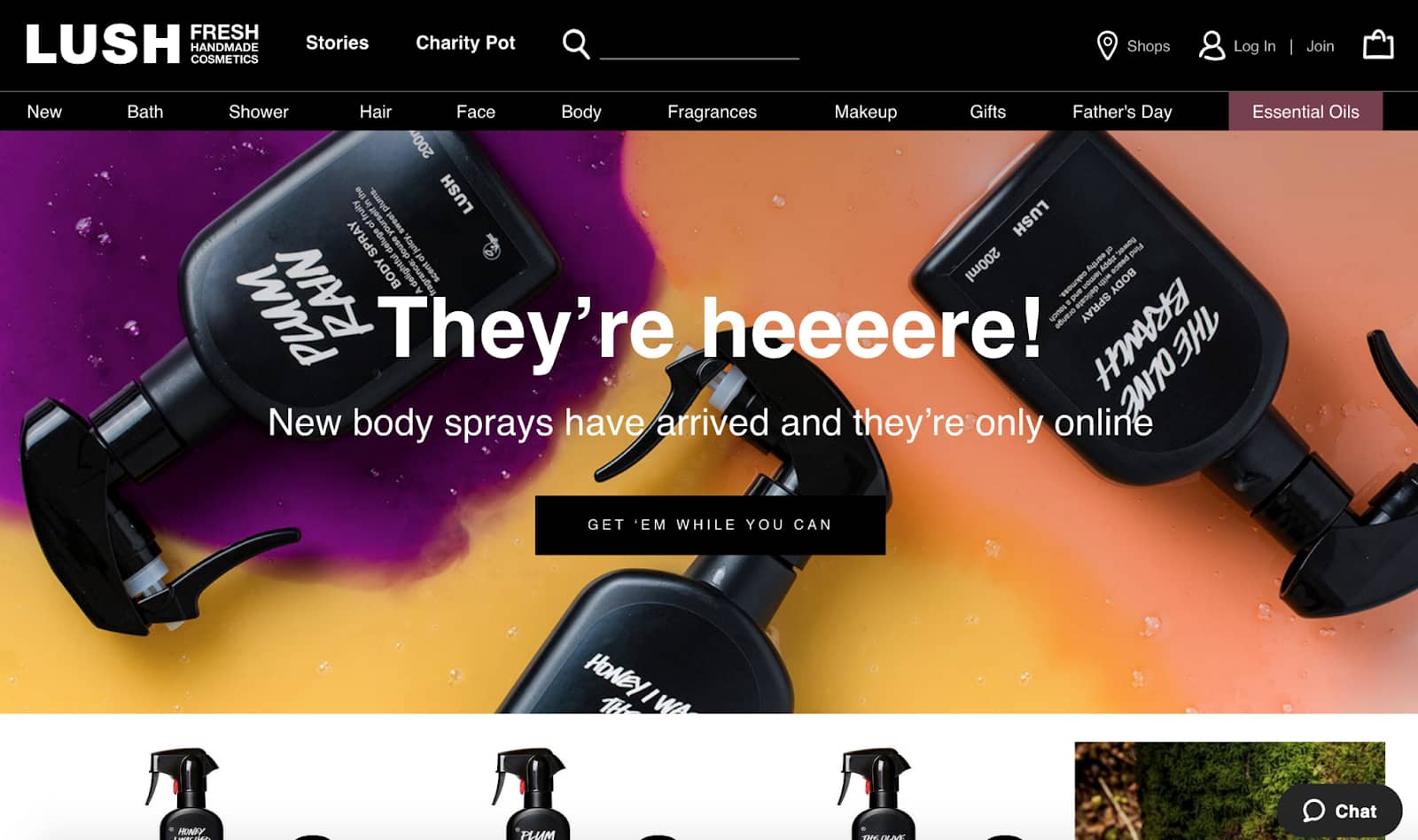
Lush is a colorful and engaging company that specializes in all-natural beauty products. It specializes in handcrafted, all-natural items such as soaps and bath bombs, as well as eyeshadows and lip glosses. It’s a brand with personality and soul, which they include into their website design.
This is a fun and imaginative website that maintains the Lush trademark throughout. This beauty website knows how to inspire and have fun, from the sleek and quirky typography to the creative patterns and intriguing color and image overlays.
It also understands how to communicate with its audience, delivering a basic, uncomplicated list of items that allows customers to easily browse through the options and select the solutions that are best for them.
Lush’s website employs the color black in a moody and classy manner. And the majority of its packaging is the same hue, bringing the Lush brand full circle. It’s a user-friendly brand with items that are ideal for anyone looking for natural, organic ingredients.
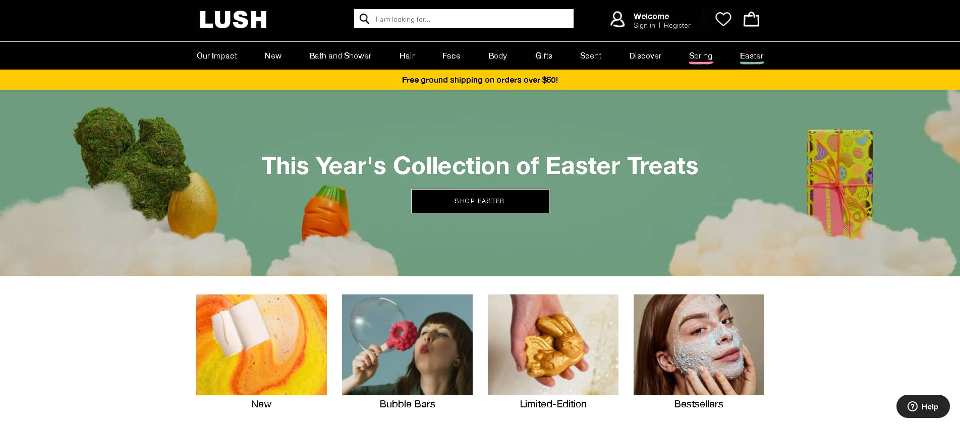
And the navigation is straightforward, with a clean style, simple menu bar, and a clear list of products. Bold black boxes with white dazzling lettering attract the user’s attention right away and guide them through the site. It’s an eye-catching option that entices viewers to get buried in its attractive UI.
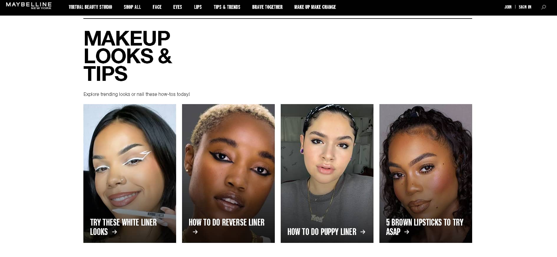
06. Maybelline
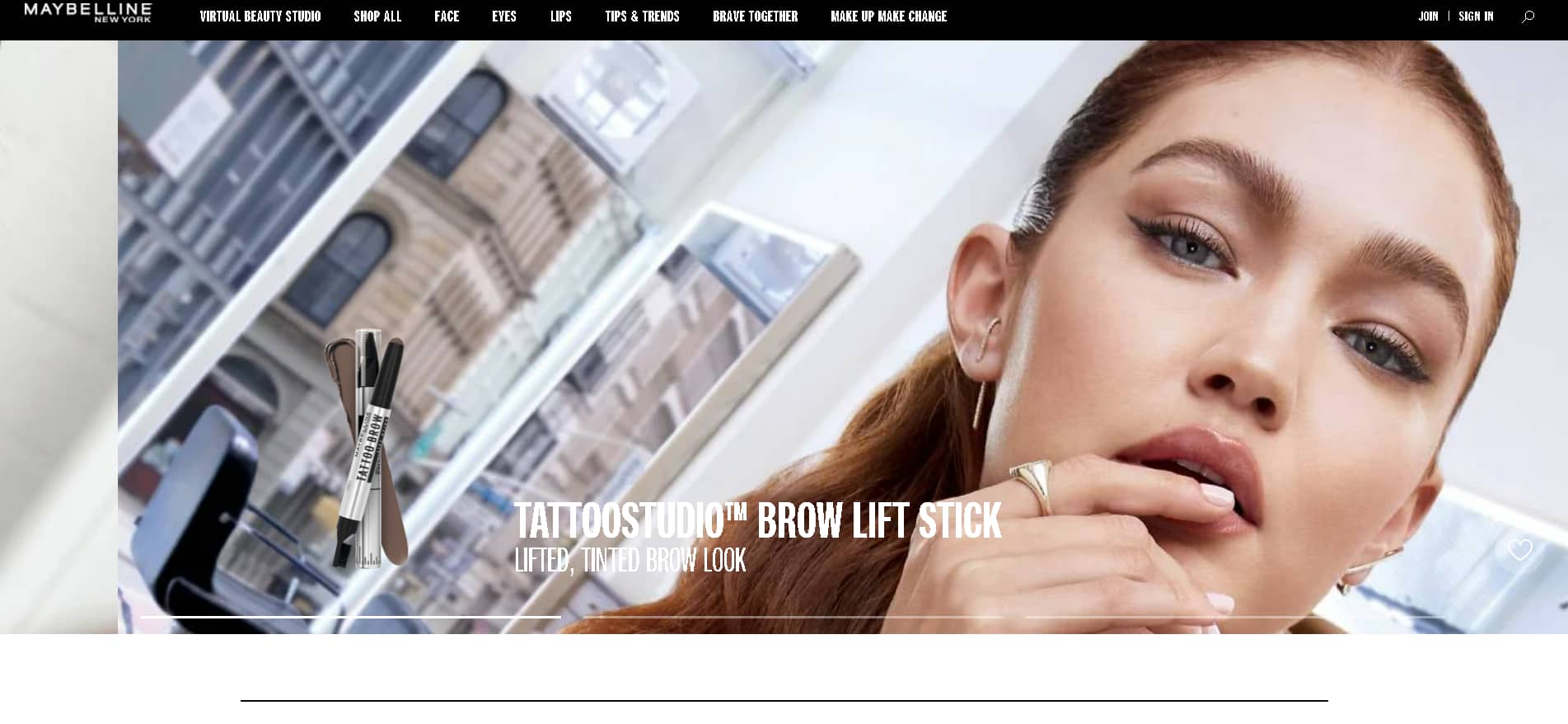
Maybelline was sure to transfer its core values and communicate the strength of its brand in the digital world too. They’ve taken a bold approach to the way they display their content, featuring grids, big typography, and large, high-quality images.
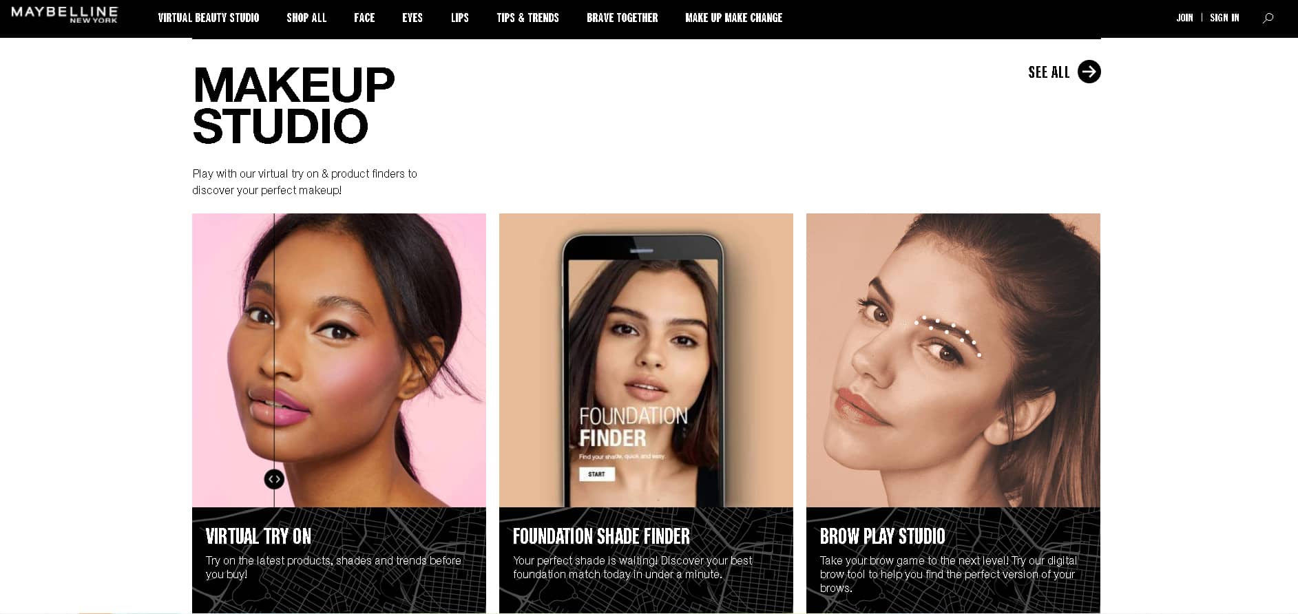
In addition to the standard product sections, the Maybelline platform has a Trend tab that keeps consumers up to date on the latest news in the beauty industry. It’s a fantastic incentive that encourages customers to stay on the site longer and explore it more thoroughly.
With the help of this forward-thinking website, you can get first-hand access to items and stay up to date on all the current cosmetic trends. This website has a modern feel to it, as evidenced by the overlapping photos and colored blocks, detailed product pages, and groovy feelings.
Swipe your mouse through the product section, depending largely on the compelling product photos that take up the majority of the screen. This is a striking style that entices you to learn more with ease and satisfaction.
07. KKW
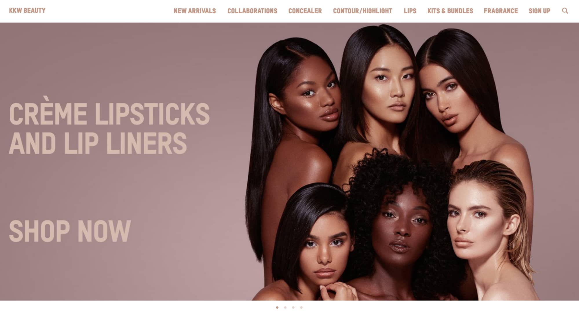
The KKW Beauty website has a clean, modern, and calming interface that connects users to some of the most popular beauty products on the market today, The Kardashian line of cosmetics that beautify, arouse, and set a dark and seductive mood.
This modern beauty website employs a soft color palette and a simple layout to help people along their way. From the image-heavy homepage to the mauve-colored text and product packaging, everything is mauve. From the homepage until the checkout, this website is consistent and seamless.
This results in a streamlined and user-friendly experience that encourages users to shop.
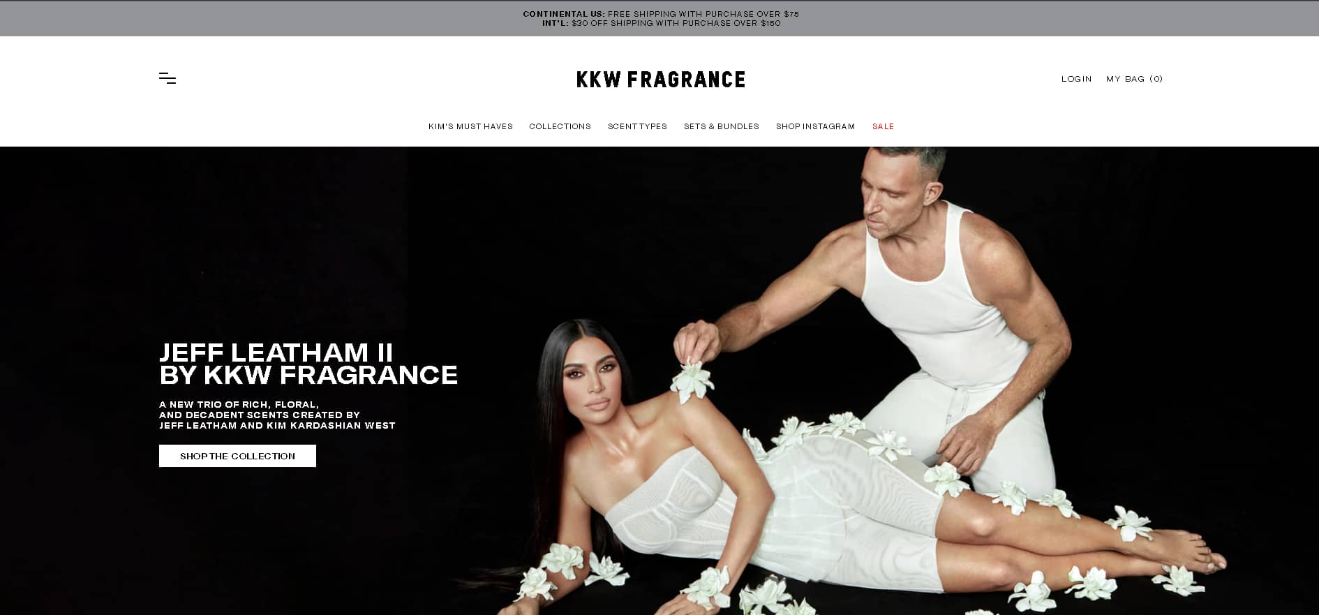
This is also a text-light, image-heavy web page. Product pages contain only photographs and products. However, these graphics stand brilliantly against the clean, white background.
The KKW beauty website is a refreshing contrast from other websites, emphasizing the products and creating a seamless experience. The navigation is calm, and selecting items is simple.
Product sections are also basic and image-heavy, with shades and colors available for selection. They’re bright, fresh, and clean, which instantly soothes and delights customers.
08. Glossier
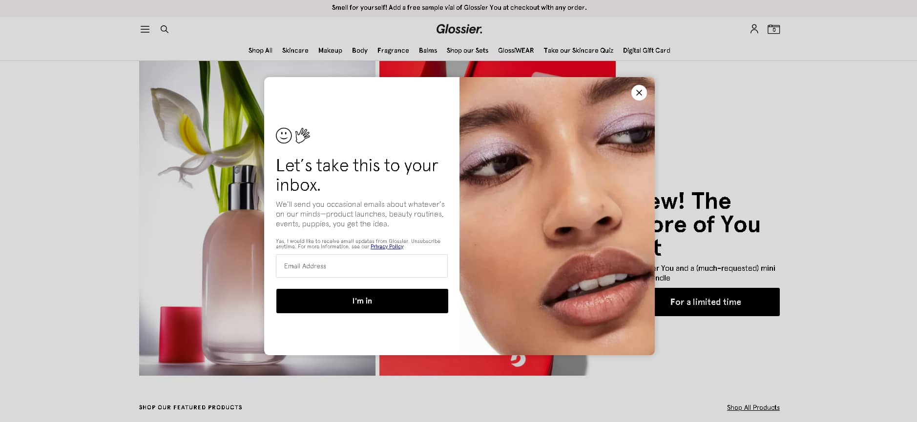
This breathable web design lulls you through the pages and products from the moment you land on this beauty website to the moment you complete a purchase. The Glossier line is composed of natural, uplifting cosmetics designed to bring forth your inner beauty.
And they make sure the entire products on display do not interfere with the truly magnificent works of art, the people who use them.
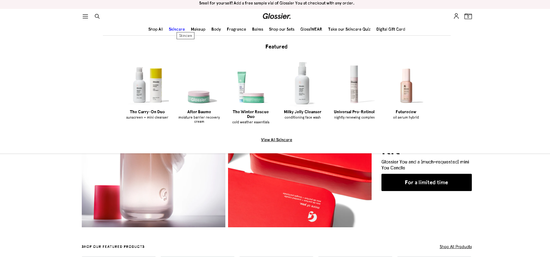
To captivate its user base, this image-driven beauty website combines photography, product shots, and trendy and smart iconography.
And this brand understands its target audience: a group of youthful, hip, and fashionable millennials looking for products that would give them a boost in their beauty routine.
This user-friendly beauty website makes it easy for consumers to finish a purchase by making the customization options apparent and in a pleasant and unique way. Select a product, then roll your cursor over to select a color.
There are a lot of interesting and fascinating elements at work here. They mix with old and new designs in a fun way. To convey its message, the About page uses old-school computer pop ups. That is only one example.
This beauty website specializes in making things simple for its customers. And it works.
09. Olay

If you’re seeking high-quality, science-backed skin care products – Olay is a great place to start. When you visit their website, you are greeted by a hero image that highlights their unique value proposition: real ladies, real outcomes.
The menu is constructed in such a way that it anticipates and meets user needs. This makes navigation a breeze and helps you to discover products you might not have discovered otherwise.
It prioritizes natural beauty and cruelty free products, removing the superficial and business sense from the overall design and encouraging enthusiasm and excitement. This contemporary and natural website is a clean and straightforward representation of brand greatness.
See more: Web Design Tips & Tricks For A Professional Site That Converts
III. Conclusion
Beauty website design is all over the place. Website design is essential. It has the power to make or break a brand. And you don’t want your brand to suffer as a result of poor design. Website design may be the first point of contact between you and beauty brands, but it will not be the last, and you can have an impact at every step of the way.
Make sure that your beauty website speaks volumes about your company and provides a happy experience. Anticipate your customers’ demands and make it simple for them to solve their difficulties rather than wasting time navigating your products.
A well-designed website can have a significant impact on the customer experience and the entire customer journey. It has the ability to create a sense of urgency, as well as attract and fascinate visitors in ways that in-store encounters cannot. And these 9 beauty websites are the ideal design inspiration to get your web design mojo going.