 pagefly.io
In this chapter, you will learn how to edit the page layout with PageFly that helps you to create your page with a logical and organized structure.
01. Configure spacing
1.1 Understand margin & padding
Firstly, you need to understand the difference between margin and padding to use the right parameter for the job.
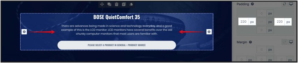
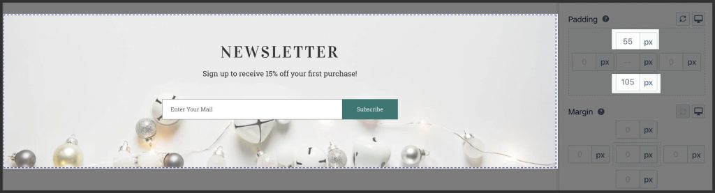
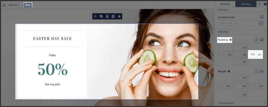
1.2. Use padding properly
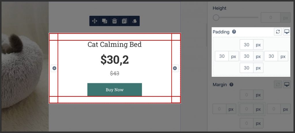
- Use padding to create inner “breathing space” around the content to avoid content “touching” the edge of the container.
- This makes sense only when the container has some background making the “edge” visible.
- The best practice is to keep the top & bottom and left & right padding the same.
- Set padding to the container of an element, not the element itself.
1.3. Use margin properly
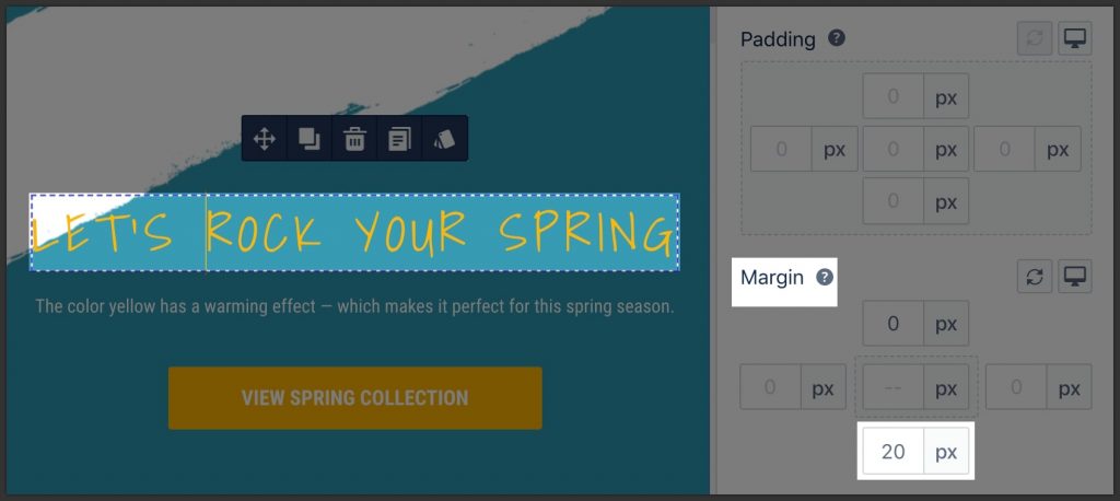
- Set margin to create spacing between content blocks.
- Margin should be set from top to bottom and left to right. For example:
- To create vertical spacing between the 2 elements in a column, set the bottom margin of the top element.
- Notice that the bottom margin of the top element will overlap with the top margin of the bottom element. Therefore no need to set the top margin of the bottom elements.
- The bottom margin of the last element in the container should be 0px
- To create horizontal spacing between the 2 elements in a row, set the right margin of the element on the left.
- Notice that the right margin of the left element will NOT overlap with the left margin of the right element. Only the top/bottom margins are overlapped.
- To create vertical spacing between the 2 elements in a column, set the bottom margin of the top element.
- Set margin exactly to the element that needs surrounding spacing. For example:
- To create vertical spacing between elements inside a container, set the margin to those elements.
- To create vertical spacing between rows inside a section, set the margin to those rows.
Do not use columns to create side spacing
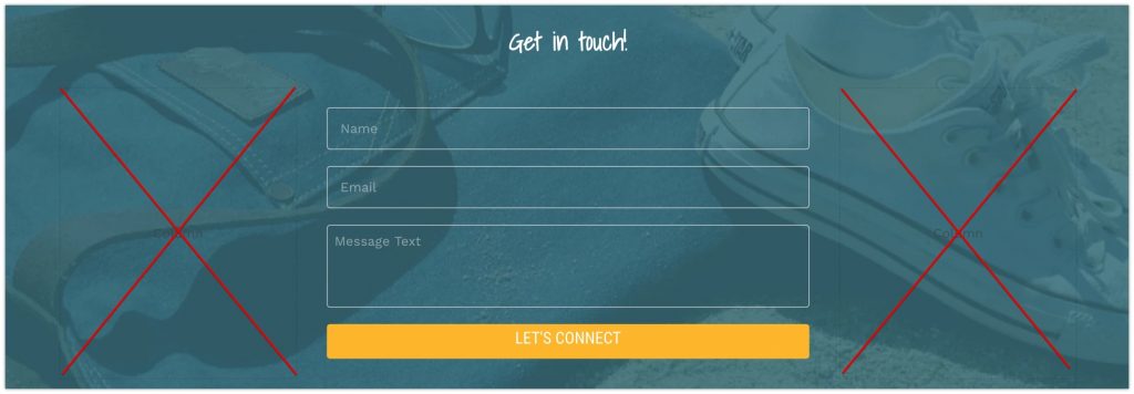
Do not use columns to create side spacing. Instead, set left / right padding for the container.
Set spacing for content “growth”
Set spacing in the way that content can be added later without breaking the layout.


Learn more about how to control the spacing between elements with margin and padding in this video tutorial:
02. Build a proper mobile layout
2.1. Present content in 2 columns layout on tablet
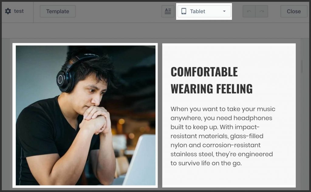
On the tablet, present content 2 columns because:
- The device’s width is good enough to present information in 2 columns.
- It’s better to avoid long vertical scroll to reduce browsing effort from customers.
2.2. Arrange products in 2 columns on mobile
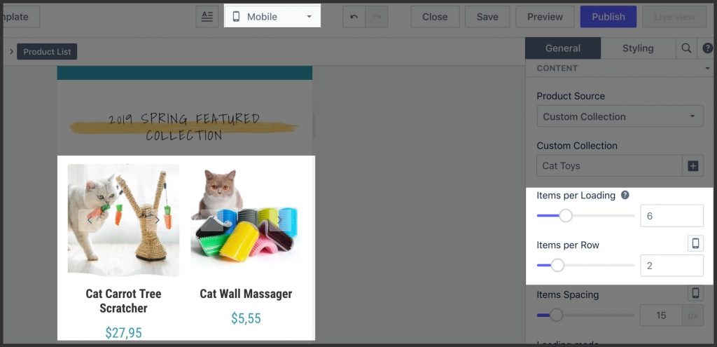
Use the Product List element and set the parameter Column to 6.
If you fancy a video tutorial to help you effortlessly customize mobile layout, check out this video:
03. Add spacing between 2 columns
3.1. Add an equal amount of spacing around the column
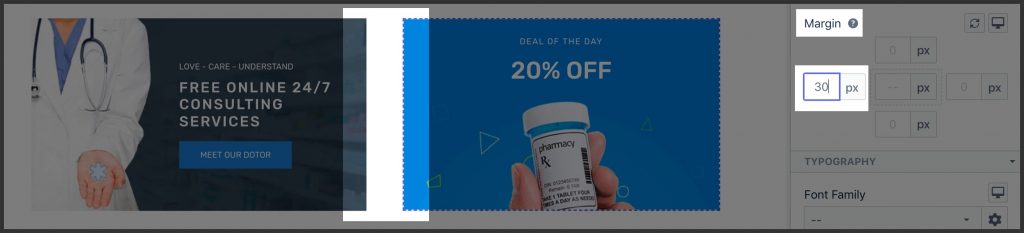
Use the parameter “Gutter” in row settings.
Note:
- The system will automatically set the negative left / right margin of the row as half of the gutter to make row reaches side edges.
- It’s recommended to have Gutter = 30px by default to make it easier to grab the row.
Connect with 2,500+ Shopify merchants and experts in PageFly Community to share knowledge and insights on building high-converting page
3.2. Add specific side spacing of the column
If you need to have special spacing between columns, use the margin-left / right parameter in the column’s settings.
04. Align content horizontally at the center
4.1. Align the whole container
- Set equal left/right padding to make the inner container stand at the center.
Important!
- Don’t forget to check and update this padding on the mobile view. It’s very common that on the desktop there is big side spacing, but on mobile, just a few pixels or event zero.
4.2. Align content elements within a container
If Flex is not applied to the container
Select the container and set center alignment.
If Flex is applied to the container
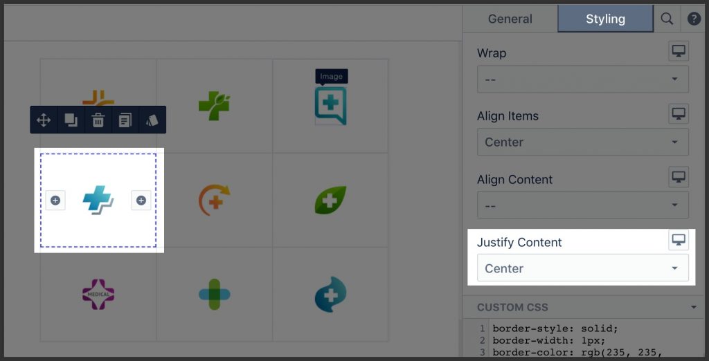
Set “Justify Content” to “Center”.
Learn more about how to adjust Spacing and Alignment in PageFly in this detailed video tutorial:
05. Align content vertically in the middle?
5.1. If the container’s height is fixed
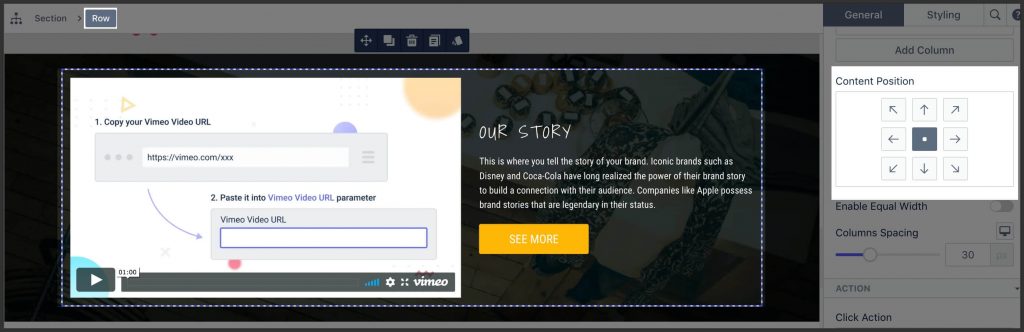
If the column does NOT have any background
Set the “Content Position” parameter in row’s settings to “Center Middle”.
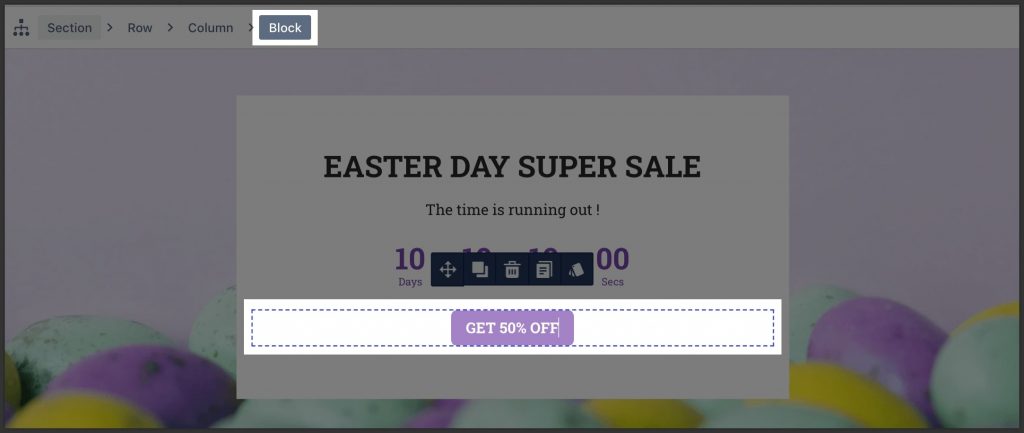
If the column does have a background
Use the “Flex” method:
- Wrap content to the “Block” element.
- Set Flex box parameter “Align Items” to “Center”.
5.2. If containers height is flexible
Use top/bottom padding of the Section to adjust its height.
Important!
- Do not set the Height parameter for the column at the same time as top/bottom padding.
5.3. Align 2 inline elements vertically
By default, inline elements will stand side by side (left / right) with each other. To align them vertically in an independent row, you need to wrap them in a Block element.
06. Handle common layout
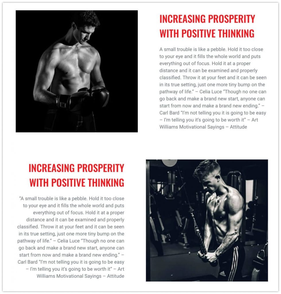
6.1. Content in “zigzag” layout
It’s a common situation when you need to present content in a zigzag layout, i.e. the first row has an image on the left, second – image on the right, etc.
On mobile, the default responsive mechanism will make 2 text blocks appear near each other.
Learn more:
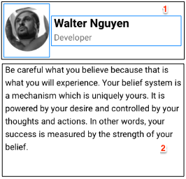
6.2. Content card
Card #1

- Set “Image Size” to “Full Width”.
- Wrap content to Block element and set padding.
- Use heading for card title.
- Set margin-top of the heading to “0”.
- Set background color to the block.
Card #2
- Create 1st row with 2 columns layout
- Set the Content Position parameter to Center Middle.
- Set margin-right of the left column to adjust the distance between the 2 columns.
- Set margin-bottom of the row to adjust the distance between 2 rows.
- Create 2nd row with 1 column layout
- Add Paragraph element and fill in your own content.
6.3. Content banner

- Set background image to the column
- Set “Height” in accordance with the banner image’s height.
- Adjust spacing inside the banner
- Set some padding to avoid content “touching” to the edge. Read more.
- If you want to align content horizontally at the center, set parameter “Alignment” to center.
- If you want to align content vertically in the middle use the Flex method. Read more.
Don’t forget to choose the content element properly. Read more
6.4. Content outside the container
To build content outside the box layout as in the screenshot, do the following:
- Set a negative margin to the top or bottom margin of the column containing content to be offset.
- Set the same amount of margin to the top or bottom margin of the section to compensate for the offset.
6.5. Content block on one side
To have content block shifted to the side, do the following:
- Set left / right padding of the container to shift content to the opposite side.
Important!
- Don’t forget to check and update this padding on the mobile view. It’s very common that on the desktop there is big side spacing, but on mobile, just a few pixels or event zero.
Content bar
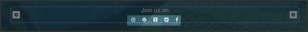
To build a bar of one or various inline elements standing side by side:
- Wrap all elements in Block containers.
- Set the right margin to elements from left to right.
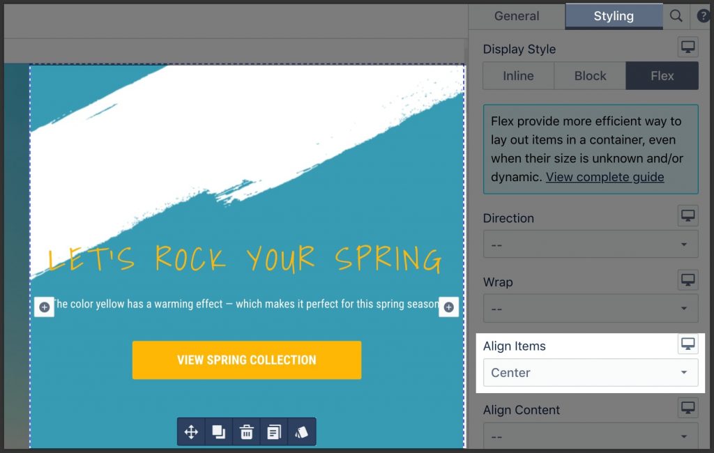
If elements do not have the same height and you need to vertically align them in the middle:
- Set Display = Flex for block, then
- Align Items = Center
- Justify Content = Center
 Previous chapter