 pagefly.io
Being the second chapter in our Responsive store series, this article is meant to give you the best practices with PageFly editor to make your Shopify store optimized for any device.
Previously we have got acquainted with PageFly’s basic settings and functionalities, so today we will take it up a notch and show you how you can use them effectively.
I. Check the Spacing Carefully on Tablet and Mobile
As you know, PageFly editor lets you build your page on 4 different device views: All devices, Laptop, Tablet, and Mobile. You start building your page on All devices view and start to edit it on the 3 other devices.
There are 3 things you need to remember when editing a page on multiple devices:
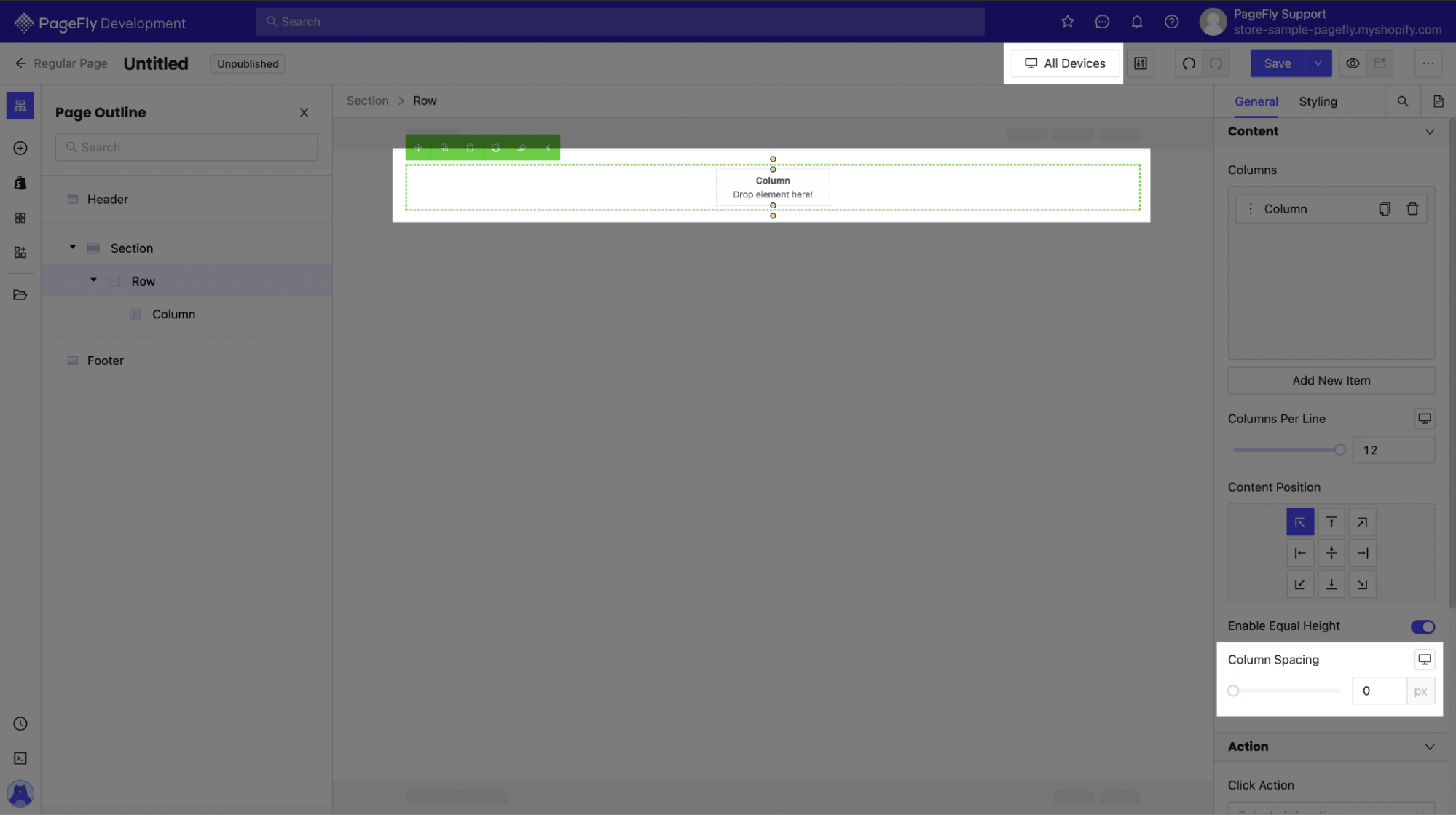
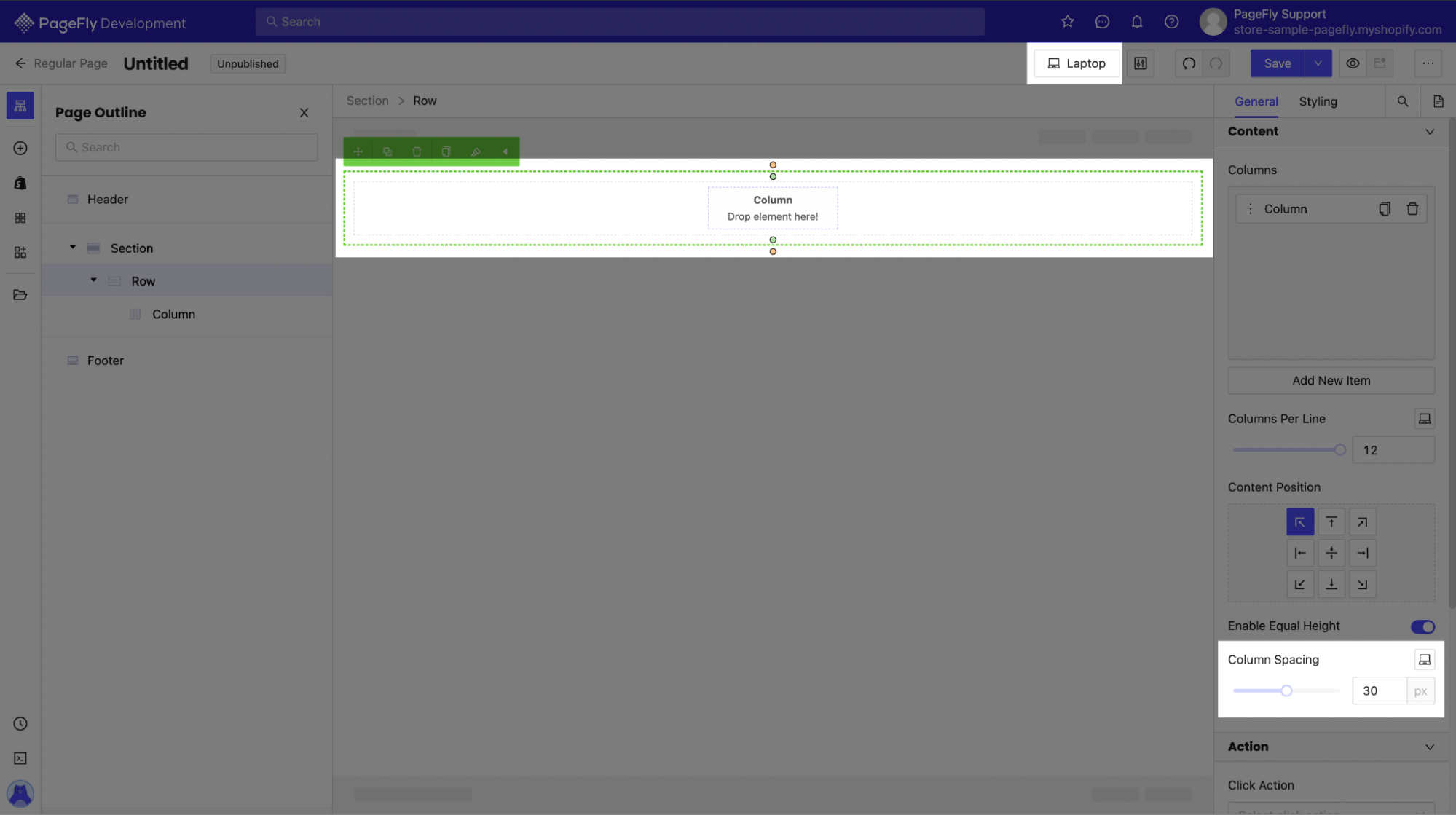
1. Column spacing settings will not transfer from All devices to the others
As you create a Row, its default Column spacing will be 30px and applies automatically on all views.
When you edit a Row on All devices, for example, make the spacing 10px, when you switch over to the Laptop view, the same row will still have 30px Column spacing. You will have to change it manually if you want that section to appear the same.
2. Padding and Margin spacing automatically updates on other devices
As you edit a page and set the Padding and Margin for specific elements, those parameters will transfer to other views as well. This is to make sure your page on every device looks as close to the original as possible.
However, because different devices’ screens have different measurements and sizes, the same padding or margin spacing settings will appear differently.
So to make your page responsive, change spacing accordingly on each device. Always make sure to triple-check every finest detail!
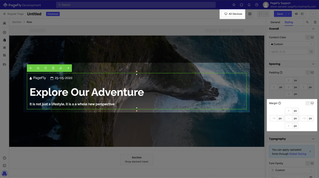
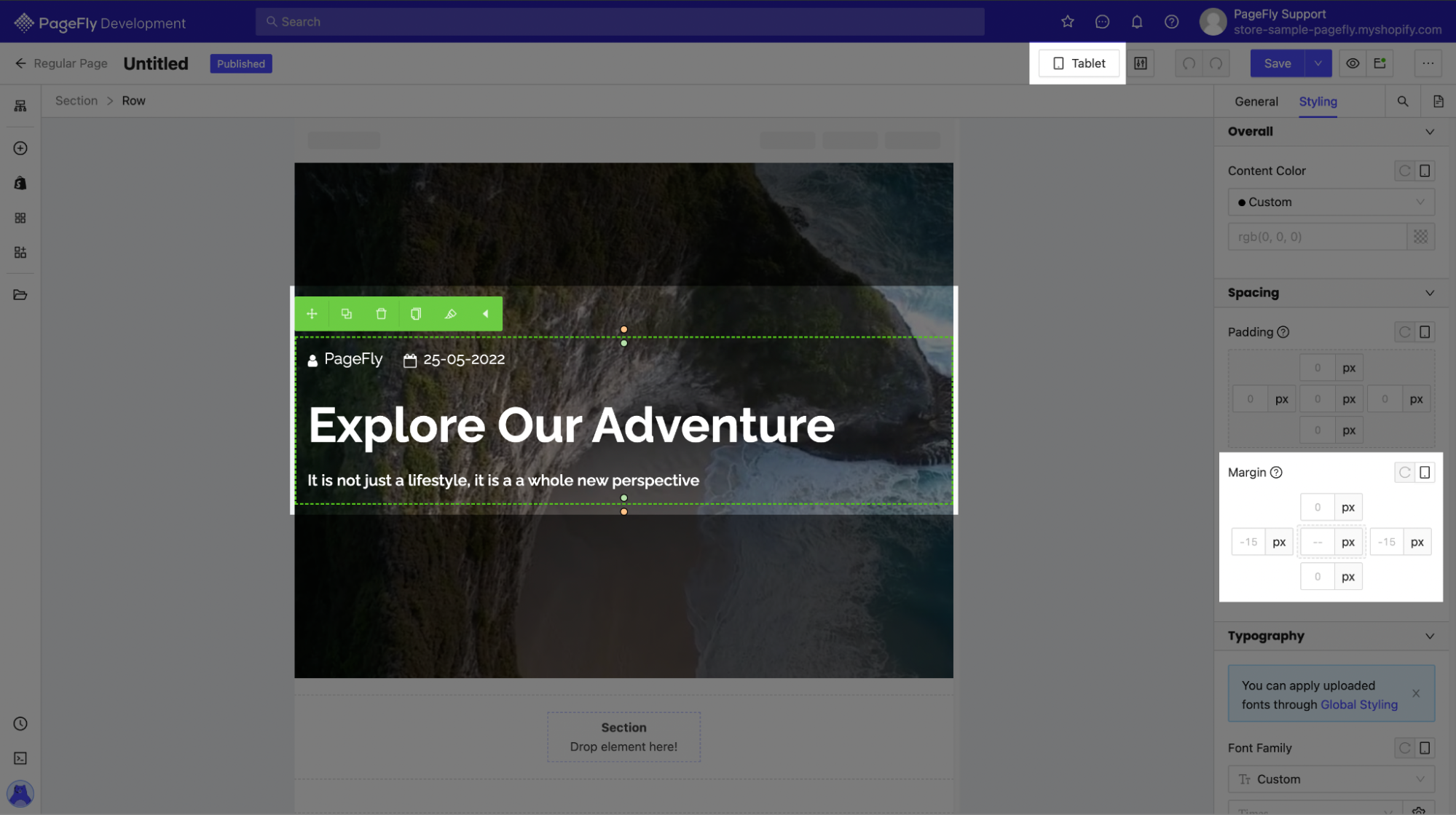
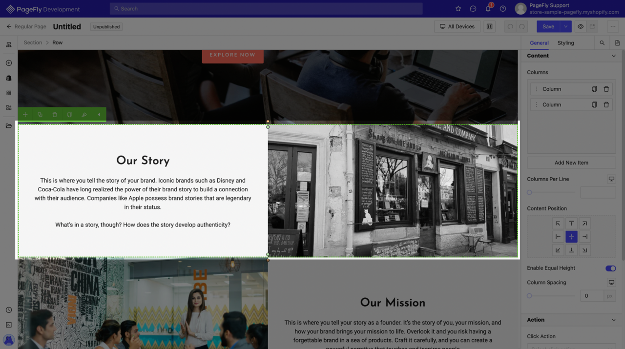
For example, the Margin setting for the column in this page’s All devices view is -15px on left and right. When you switch over to Tablet view, it stays the same, but as you can see, it’s much closer to the edge of the screen than before. That’s because tablets typically have smaller screens, making 15px proportionately bigger.
To keep the banner looking the same, you will need to change the row’s margins, as well as the section’s padding itself.
3. Typography styling is applied to all views
Similarly to Padding and Margin, Typography styling is also applied on all views from All devices.
For example, a heading with 56px in size on All devices will also be 56px on Mobile view, which could be really big for such a small screen.

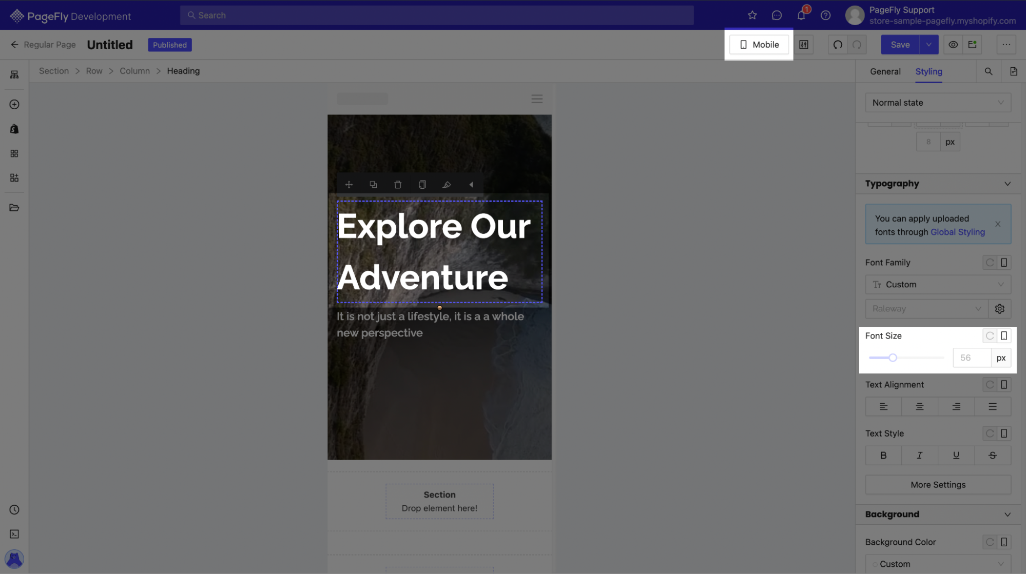
To avoid this, you will need to override the default transferred value from All devices. In mobile view (or any other view), change the text size to make it look fit for the screen.
II. 5 Criteria to Make Text Elements Responsive
Our product designers at PageFly have compiled the 5 essential components of responsive text elements, and we always make sure to have them all every time we build a new page with PageFly.
- Color
- Font family
- Font weight
- Font size
- Line height
For the first 4 criteria, you have to set specific values for them, otherwise, your browser will do it for you, and most of the time it will be something different from your initial vision.
Line height, on the other hand, is really to make sure your text elements stay the same across all devices. We recommend changing the unit to em instead of px, which will keep line height relative to other elements, keeping proportions intact.
A bonus tip to make text elements responsive is to override the default top and bottom margins. If you don’t want margins for them, set them to 0. This is to prevent browsers from adding redundant values to the top and bottom margins, messing up your page structure, as well as slowing down your site unnecessarily.
III. Only Change Padding/Margin of Elements’ Containers
In case you are not familiar with PageFly or website design in general, a container is either a Row or a Column containing an element. All elements are nested within a Column, which is nested within a Row, nested in a Section.
You can find out more about the hierarchy of elements in PageFly from this guide: Build page structure.
This will save you a lot of time when editing across devices. By changing the size of only the containers, you can keep the elements inside flexible, making it easier for them to adapt to the screen size.
If you change an element’s Padding/Margins, you will keep it at a fixed size across different screen sizes, so you cannot know for sure if a screen can accommodate said element. Sure, you can edit the spacing values for each device, but that would require a lot of time.
Bonus tip: Don’t use Padding/Margin to align items, use predetermined alignment settings for it. You can find out more from this guide on how to adjust layout with PageFly.
IV. Use Flex to Override Elements’ Priority Order
Sometimes you will build a double-column layout like this on All devices:
When you switch to Tablet view, for example, you would get this:
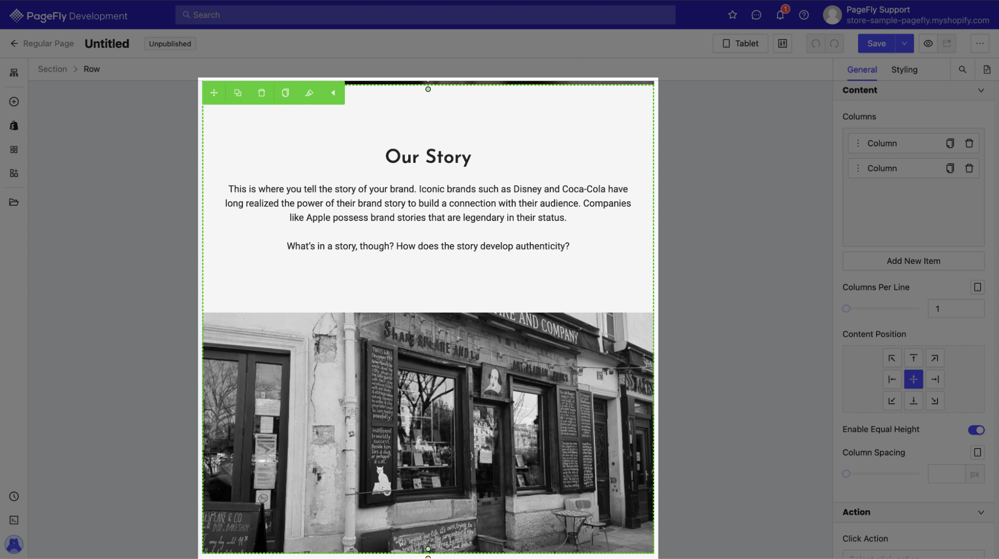
The reason for this arrangement is when switching from All devices (or Laptop view) – a typically horizontal display, to Tablet or Mobile view – typically vertical displays, the screen estate is only enough for one column. The PageFly editor will arrange elements from left to right, and from upper to lower.
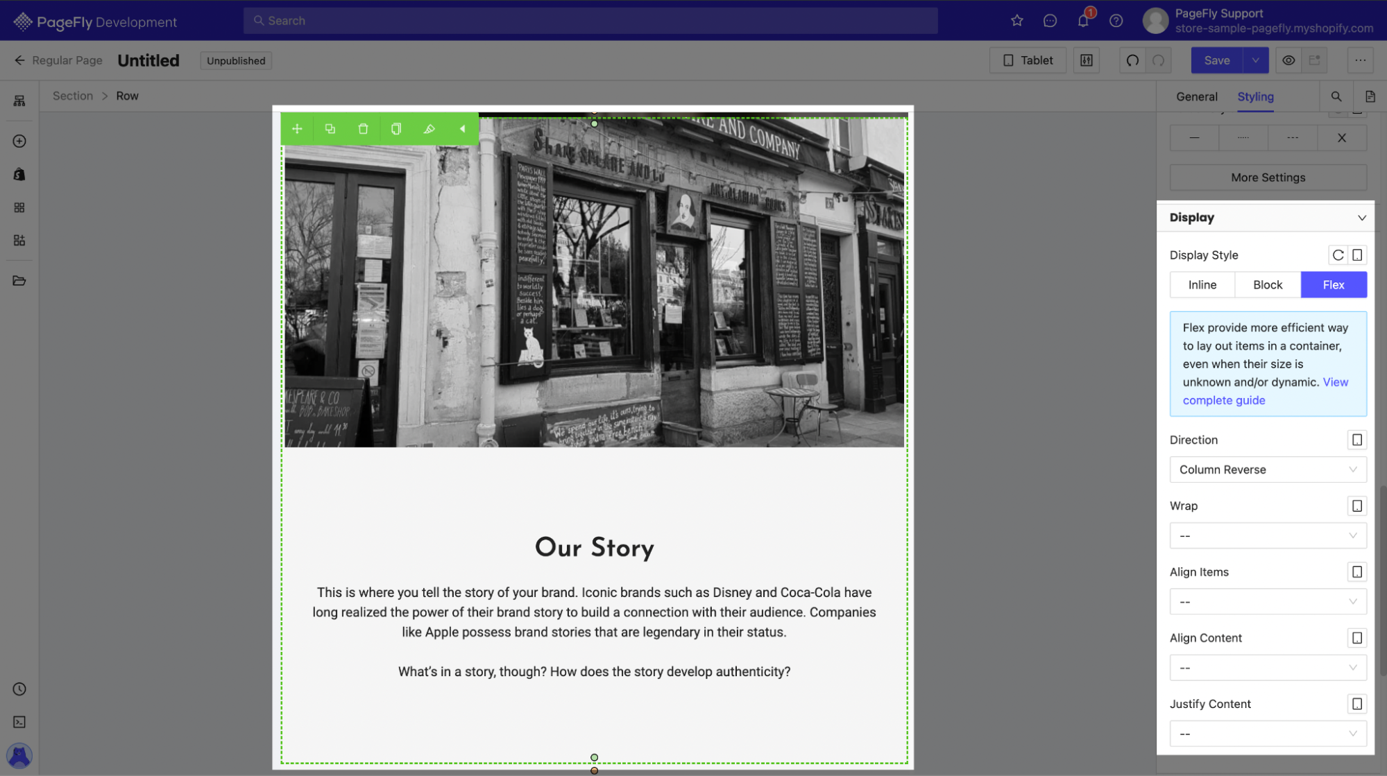
If you want to change the default arrangement and move the image above the text, for example, here’s what you need to do:
Click on the Row containing the elements. On the right sidebar, go to Styling > Display > Choose Flex. In this case, choose the Direction as Column Reverse, and the image will be on top.
Flex is a powerful tool, but can require a bit of a learning curve. You can learn more about using Flex in the PageFly editor here: Flex feature.
Conclusion
With smartphones and tablets coming out in droves every year, consumers are increasingly using handheld devices for online shopping. It’s imperative that you make your site responsive, and we at PageFly understand that very well, and will be with you all the way!
We hope these practices have been helpful to you. Happy selling!

 Previous chapter