 pagefly.io
Consumers are spending an increasing amount of time on their mobile devices, which is fueling growth in mobile retail. People’s shopping habits have shifted as a result of mobile devices.
With so many shoppers accessing your online store via mobile devices, it makes sense to prioritize a mobile-friendly design.
We understand that, with so many different screen sizes, resolutions, device types, and browsers, designing for both mobile and desktop customers is complicated and ever-changing. To get you started, we’ve compiled a list of design tips from the online store team that will help you optimize your online store for mobile shoppers.
I. Understand Mobile Customers
All online stores must perform well in Google search results. You know it, your client knows it, and online shoppers consistently favor high-ranking sites. Whether you’re building a blog, a portfolio, or, of course, an online store, it’s a race to the top, so you must optimize your mobile site for mobile customers from the start.
Google has been emphasizing the importance of mobile sites since 2010 when CEO Eric Schmidt famously announced that Google’s developers were working on mobile-first design. We know that mobile-friendly sites rank higher in Google, so it makes sense to optimize for mobile as much as possible rather than leaving it as an afterthought or at the last minute.
The stats:
Statistics on eCommerce and mobile suggest otherwise. In the first quarter of 2019, mobile eCommerce spending in the United States alone reached nearly $39 billion, demonstrating that mobile can be a profitable platform to tap into.
People appear to be more attached to their phones than ever before, making it easier than ever to buy a new outfit, sign up for an online course, or book an appointment while on the go. Ecommerce and mobile appear to be the ideal pairing—deals purchased during lunch breaks, new collections perused on the way to work, and broken heels replaced before you’ve even hobbled home.
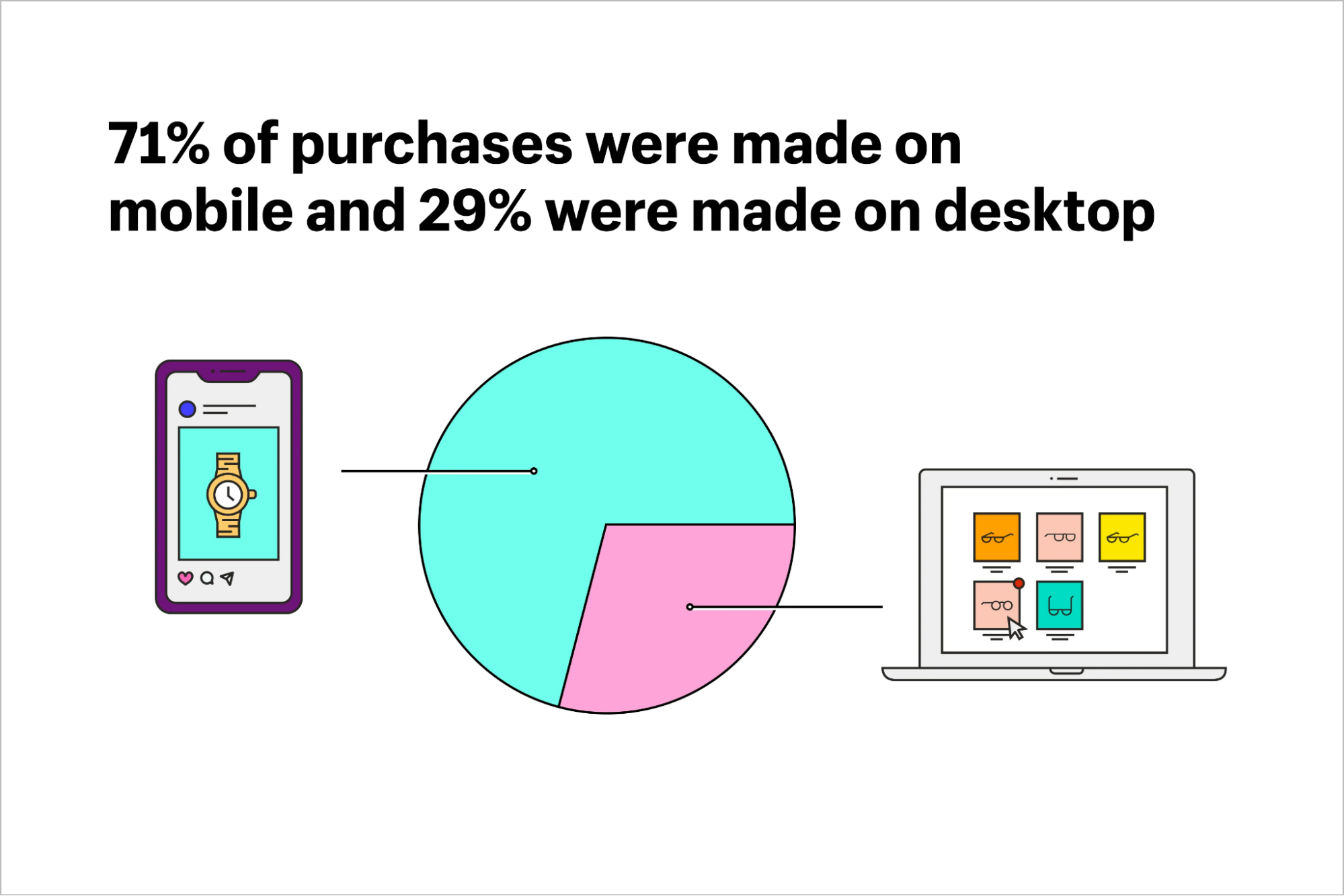
Shopify’s Black Friday/Cyber Monday 2021 analysis confirms this rise in mobile. Customers no longer need to be seated comfortably in front of a computer to make a purchase—in fact, Shopify revealed that mobile accounted for 71 percent of sales over the Black Friday weekend. Only 29% of sales were made on a desktop computer!
Research & identify your smartphone customers
- Who the people are, you know how to get to them (the blogs they read, the sites they visit, the stuff they search on Google, etc.);
- How they describe the type of services you offer, you can word the copy on your site to match the conversation in their head (very important!);
- How they choose and compare products in your category, you know how to structure and prioritize content on your site;
- What they want, your value proposition can state exactly that and the whole site can be 98% relevant to them;
- What they don’t care about, you can dismiss and cut it from the site;
- How their life is better thanks to your service, you know which end-benefits to communicate.
Customer expectations for the right approach
Make mobile site speed a priority
How patient do you think a visitor will be waiting for your online store to load if you only have a fraction of a second to hook them?
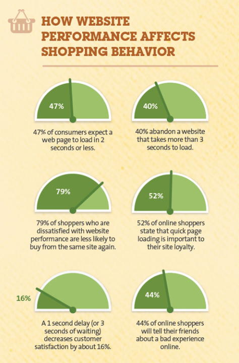
You have about three seconds before the average customer will leave and look elsewhere.
That’s not a big deal if you have a reliable broadband connection at home. However, signal degradation on mobile can have a significant impact on conversions.
And a greater impact on your revenue.
II. Strategies To Design Your Mobile Store
Think about the customer journey
The goal of mobile-first design is to create smooth customer journeys and give people what they want quickly. If your client is busy promoting products on social media, it’s likely that a significant portion of traffic is coming from mobile devices.
It’s jarring and frustrating to land on a non-optimized page directly from a platform like Instagram. This “bump” is removed with a mobile-first design, resulting in a more seamless journey.
Remember that the journey does not end once the customer arrives at the eCommerce store.
Consider the shopper’s final destination. Are the checkout and basket pages mobile-friendly? You may not always have control over the payment page, but if you do, keep it as simple as possible. Enabling Apple Pay, for example, can save shoppers a significant amount of time.
If you can prevent customers from entering the same information multiple times, you will help to smooth the checkout process and reduce the frustration caused by clunky checkouts.
Read more: Create High Converting Mobile Landing Page With These 7 Tips (6 Examples Included).
Mobile first, content first
When it comes to mobile-first design, the first thing to consider is content. Because mobile devices have fewer resources, you must prioritize content so that the most important information and actions are easily accessible.
You must understand exactly what shoppers are looking for when they visit your store, as well as which content is most valuable to your client. By developing a content-focused online store, you are also putting the customer first by providing them with exactly what they are looking for.
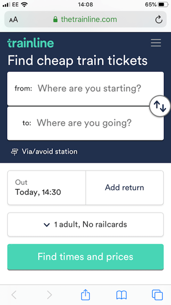
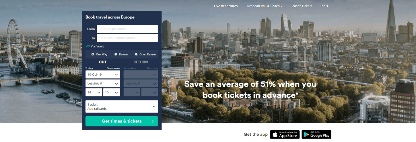
This example from Trainline.com, a European travel mobile site, provides mobile shoppers with a simple, full-screen form for booking trips. It recognizes the shoppers’ primary reason for visiting mobile eCommerce sites and offers a quick way to meet their needs. The following table compares the mobile and desktop versions:
When it comes to creating mobile content, less is more. In theory, it sounds simple enough, but you’d be surprised how difficult it can be to pare down to the essentials.
The primary goal of designing for mobile is to provide clear, concise content that assists customers in making decisions and taking action quickly. Speed is always important, but it is more important than ever on mobile.
Make mobile transactions simple and quick
As many as 69% of customers abandon their shopping carts during the checkout process. Not every reason for a transaction being abandoned is within your control, but your store design is. Long forms that add more steps to the checkout flow or send your customer away from your site may result in someone abandoning the transaction halfway through. Make information about returns and exchanges available from the checkout page so that customers feel confident about making a purchase.
You can make your site’s checkout process more user-friendly by customizing it. If you want to give customers the option of signing up or logging in, include a check-out as a guest option. Better yet, provide express checkout options that autofill address information and reduce the number of clicks required to complete an order.
Finger-friendly, uncluttered, coherent interface
Use visual hierarchy
To really make your content stand out, arrange it in order of importance and use this to help structure the page’s layout. Featured products, sale items, new collections, discount codes, forms, and call-to-action buttons are examples of high-priority content.
Biko, a Shopify-built online store, does this well by drawing the customer down the page with large, bright pink CTAs and capitalized headings.
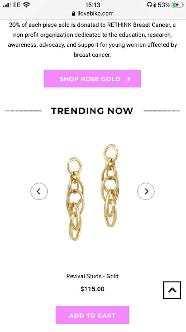
Headings, different-sized elements, bolding, and other elements help to catch the shopper’s eye and guide them through the mobile version. This has an added benefit on mobile. Making CTAs large on mobile not only attracts attention but also makes them super simple to click with a thumb or finger.
Avoid large chunks of content
Any type of content that is too long, whether it is a large body of text, a massive image, or a mile-long form, will be a major turn-off for mobile shoppers.
We’ve become extremely impatient creatures, which is exacerbated by mobile—people are on the go, in a hurry, or doing some quick browsing between meetings at work. Customers will abandon anything that feels like a chore, from excessive scrolling to heavy reading.
Instead, consider how you can convey the same message in fewer words, or how you can incorporate an interactive element to make the information more manageable.
Adrian Zumbrunnen’s website, azumbrunnen.me, is a great example of this, as he introduces himself using text-like chat bubbles. The customer can select responses that direct the flow of the “conversation,” which fully embraces the mobile experience and feels very natural in your hand.

Make elements clickable
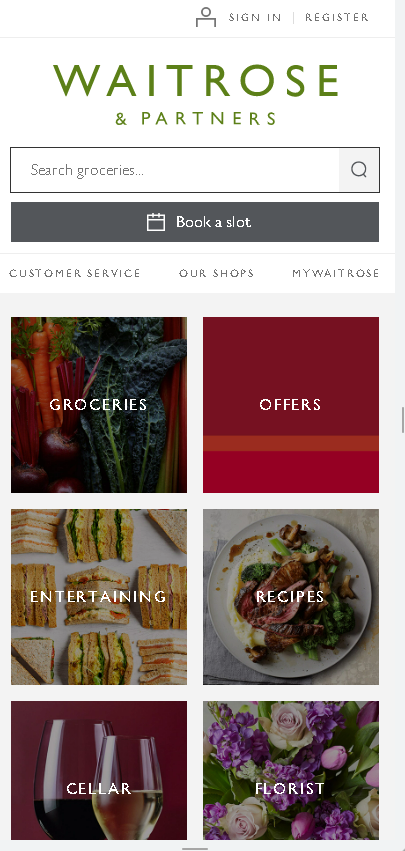
Have you ever been on a mobile version and had to zoom in to make buttons big enough to click? Isn’t it frustrating? Don’t be like the British supermarket Waitrose of yesterday, where you have to zoom in to read or click on anything, making navigation difficult. But nowadays, they are different, and the mobile is UP TO DATE. Check the comparisons from these two screenshots below.
Before and after:

When designing for mobile, make sure that elements like menus, buttons, images and navigation arrows are large enough to be clicked with a thumb or finger. They should be clear, uncluttered, and isolated to avoid accidentally pressing on the wrong thing.
White space should be used to surround any interactive elements, in-text hyperlinks should be spread out, and button sizes should be large. This is in contrast to designing for a desktop, where the visitor will most likely navigate the store with a mouse cursor.
Consider placing menus and important buttons at the bottom of the screen to make life easier for customers. Pitchfork, an online music magazine, does this, and it makes perfect sense. I know, it’s pretty revolutionary, isn’t it?

Forget hover control and scroll effects
While these are useful on the desktop, the lack of a mouse cursor negates any benefits provided by hover control or scroll effects.
Hover control is especially useful in eCommerce for product images, displaying basket options, alternative color options, back views of products, and product zoom, as well as activating dropdown menus. On mobile, however, this isn’t an option because “hovering” means the customer isn’t actually touching their phone screen.
If you rely on effects like these to create good UX, you’ll need to reconsider how to display this information and make it clear to the shopper. Directional messages, such as “tap to zoom” or “swipe for back view,” can help to create a clear path for customers.
Harness the power of white space
Clutter is no one’s friend on desktop, but it’s your worst enemy on mobile. Keep things simple, clean, and distinct.
You can direct the customer by emphasizing important elements in mobile design by using a lot of white space. Mix micro and macro white space, and plan your white space rather than letting it happen. Google is a well-known user of macro white space, whereas micro white space is commonly found between paragraphs, images, and lines of text.
Bright, bold colors, clear graphics, and strong shapes are also appropriate for mobile. These work in tandem with white space to draw the customer’s attention and make the page stand out (again, think of that bold and colorful Google logo).
Not only will the mobile version look better, but it will also be easier for mobile shoppers to navigate, increasing the likelihood that they will stay in your eCommerce store and convert.
Take advantage of page builders
Ease of use
Creating an online store, whether with or without code, is often complex and time-consuming. As a result, an app that allows you to create a mobile version but has limited functionality in terms of drag-and-drop, mouse, keyboard, and so on, must be extremely simple and intuitive. You don’t want to waste time looking for a function that doesn’t exist. You don’t want to feel limited in terms of design because you can’t move a block or style things the way you want.
Furthermore, and this may seem obvious, you want an online store-building app that feels exactly like that: an app. It won’t be much fun if it looks and behaves too much like a desktop site. The simpler, smarter, and more phone-friendly an app, the better.
Template library
Sure, you could create a store from scratch, but if you want to get up and running quickly, using a ready-to-go template is probably the best option.
Consider the templates available and whether they meet your needs when deciding which mobile design app to use. Are you creating a simple ‘hire me’ one-pager that summarizes your profile, accomplishments, and skills? A ready-made template that looks great and helps highlight your best bits without you having to spend a lot of time will be a safe bet. You’ll also need a template if you’re launching an online store. Your shop’s eCommerce configuration will be handled, so you only need to worry about copies and images.
Customizing options
Previously, doing anything as complex as building a store from your phone would have been awkward, limited, or simply impossible. However, tools are evolving. While some mobile apps are still fairly limited, others now allow you to customize everything on your site to make it look exactly how you want.
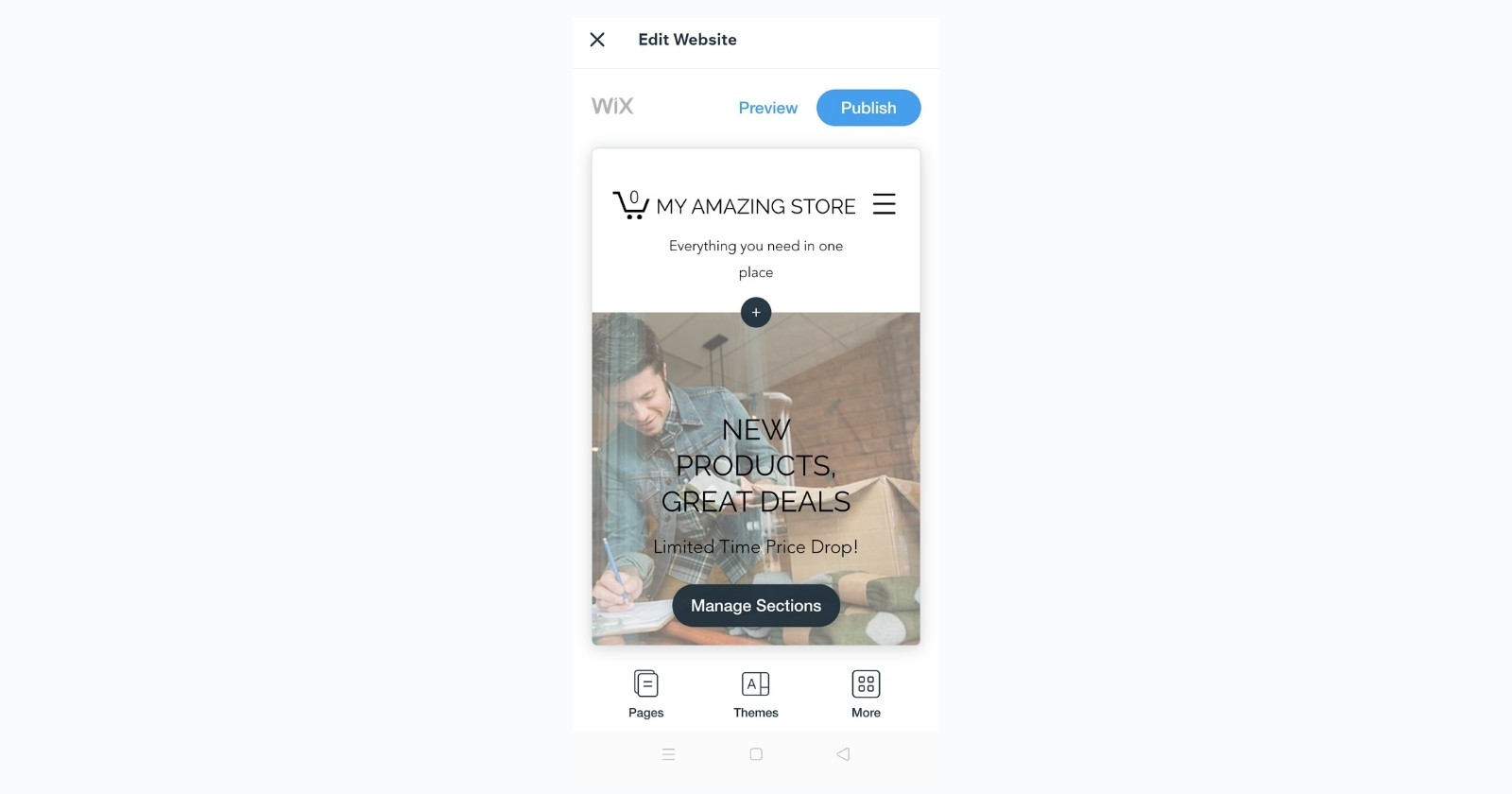
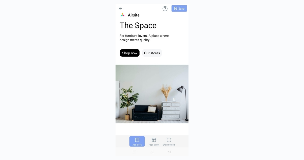
Take the PageFly app, for example. PageFly is a Shopify app that lets you create personalized pages for your store using the drag-and-drop concept with over 100 pre-designed templates, and support for Shopify’s product and blog pages. PageFly can be used to create landing pages, product pages, collection pages, and more. This app is a fantastic way to create custom pages for your store without having to code anything.
As an all-in-one page builder, with PageFly not only can you build a page and do it super quickly, but you can also:
- Add regular content
- Link your payment accounts and sell products
- Manage your inventory
- Integrate with a host of other apps
- Keep in touch with your customers via email
- See how your site’s performing with in-app analytics
When it comes to mobile page builders, customer experience is critical, and PageFly excels in this area. It removes the clutter by employing a simple building block format that allows you to move and edit sections of your site as you see fit.
Read more: Build The Perfect Mobile-Friendly Store.
III. Design The Customer Interface For Your Mobile Store
Mobile navigation
Lead customer navigation with visuals
When a visitor arrives at your online store, there is a lot going on visually. Images, calls to action, text, trust signals, benefit statements, descriptions, and other elements vie for their attention.
Furthermore, their mobile device receives notifications on a regular basis, which can cause them to lose focus.
By utilizing your site’s visuals, you can improve the customer experience and draw them into your funnel.
This is where Fitts’s law comes in handy.
In short, the larger the object, the more likely it will draw your eye (and attention). That means they’re more likely to click and interact with your online store. Among design principles, this is also known as “visual weight.”
Keeping this in mind, using larger text and graphics to communicate the next steps, important information, and calls to action is an important part of optimizing your site for mobile.
Look at how GameStop adds visual weight to draw the visitor’s eye to its homepage.
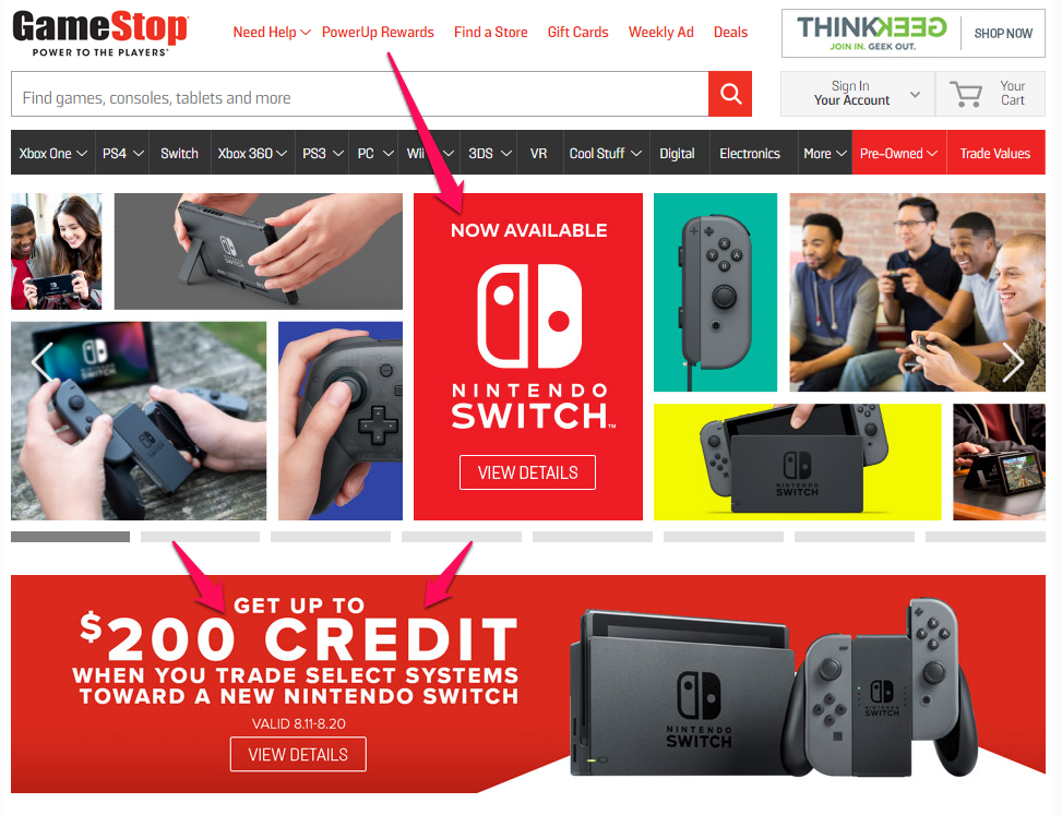
It’s common advice to use bold and contrasting colors for a call to action, but you can apply the same strategy to other visual elements to guide and focus your visitors’ attention.
Make navigation easy to understand
Because of the limited real estate on smaller mobile screens, including tablets, a responsive design isn’t always enough.
When communicating with customers, every word counts.
If the text in your navigation menu is unclear, it can cause confusion and make it difficult for the customer to take action.
Unless they have a strong desire for your product, they are likely to give up quickly.
Simplify navigation to minimize clicks
At the top of the list of conversion optimization recommendations is for online stores to shorten the journey to checkout as much as possible, reducing the number of clicks required to complete the purchase.
This is echoed in mobile optimization, which ensures that touchscreen navigation is simple and intuitive.
This can be accomplished in a variety of ways, including:
- Grouping options together
- Organizing similar pages into a single page
- Prominently featuring important pages
- Dividing navigation into subcategories
Another excellent example of using visual navigation to facilitate navigation rather than plain text or simple buttons.
With that in mind, one thing you should avoid is minimizing clicks simply to shorten the funnel.
Minimizing taps is a good strategy for mobile conversion, but only if the customer knows what they want to buy.
Don’t sacrifice the shopping experience to optimize your mobile site.
You don’t want to press the customer into making a hasty purchase decision.
According to ConversionXL, the best results come from mobile optimization that considers the buyer’s journey. Exploration should be simple and painless.
When the customer is ready to begin a purchase, the path to the checkout is as short as possible.
Mobile content and imagery
Make sure content appears in the right order
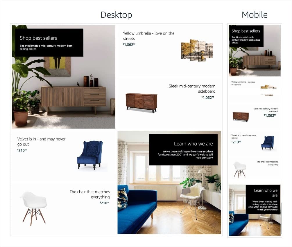
Mobile screens are narrower and designed for faster scrolling, so the order and layout of content differs between desktop and mobile. The order of content in Mobile Stores is determined by a left-to-right row prioritization, or a right-to-left prioritization when Arabic is selected as the language of preference. As an example, consider the following:
Check your store on a mobile device to ensure that the content is in the desired order.
Optimize your header image
It is now possible to upload a separate mobile header image. It is important to note, however, that, unlike an image tile, the height of this image cannot be changed, and the same dimensions must be used for both mobile and desktop. This means that the store’s dynamic resizing for mobile will reduce the size of all graphic elements within the header, including text.
Because of this, please keep in mind the following for the mobile header image:
- Limit the number of items on a header to three. The more products you use in the header, the more cluttered the page will appear on mobile.
- The copy in the header should be no more than 30 characters long so that you can increase the text size to make it legible on mobile without overwhelming the header. We recommend a minimum font size of 90pt Arial regular font or equivalent for this.
Mobile product lists
Upload products and descriptions
You can begin listing products in your store once you have completed the key pages of your online store and have product photos ready to go. Even on a smaller screen, your photos should be high-quality and highlight the unique features of your products.
Write product descriptions that reflect your brand’s voice while covering important details that customers should be aware of. If you’re selling handmade jewelry, including a list of the materials you used as well as care instructions. Keep descriptions brief and to the point so that they don’t necessitate excessive scrolling on a smaller screen.
Mobile forms
Filling out forms on mobile devices can be difficult due to the limited screen space.
Customers expect to have to fill out some information when shopping online (shipping and billing information), but the more form fields you require to complete the checkout process, the more friction there is.
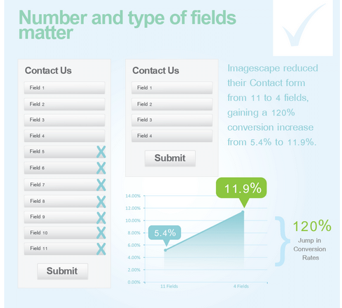
Less is more when it comes to mobile optimization. Unnecessary fields should be removed.
ImageScape was able to improve its conversion rate by 120% by limiting the number of fields on its contact form.
That’s a little harder to do in eCommerce, but there are some simple tricks to streamline the form field process:
- Auto-fill customer data.
- Auto-advance customers to the next segment when fields are completed.
- Port information to save repeat entries (use shipping info for billing info).
- Customize key entry. If it’s a name field, use letters. For numeric spaces, bring up a number pad.
IV. Good Examples Of Store In Mobile Device
1. Overstock
Overstock is obviously doing something right when it comes to the mobile customer experience, as a 7-time award winner for Best Retail Mobile Application! The Overstock app includes augmented reality (AR) so customers can see how furniture will look in their homes, as well as the ability to pay with Google Pay.
Key features of the award-winning app include augmented reality (AR) featuring the highest quality digital 3D models, personalized product recommendations, and unique search functions.
2. IKEA
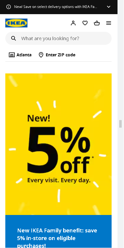
IKEA also understands that customers shopping for furniture will want to see how it will look in their home, so they launched IKEA Place in 2017 to meet that need. The app automatically scales furniture based on the dimensions of a room, and it’s so detailed that shoppers can see the textures as well as how light and shadows will appear. The app digitally places IKEA products in a room and allows shoppers to capture and share the setting as an image or video. Perhaps if customers use the app instead of the physical stores, fewer people will get lost in the massive mazes that are also part of the IKEA experience.
3. Starbucks
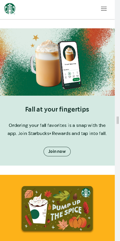
Knows people want their drinks fast and to pay for them quickly, and that’s what the Starbucks app delivers. Customers can order and pay for their drinks and food with the app, plus tip their barista and identify the songs they’re hearing in the Starbucks store so they can add them to a Spotify playlist.
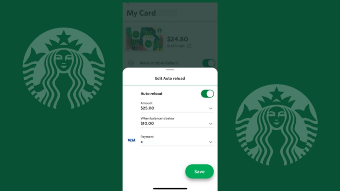
The Starbucks app is intended to keep your gift card topped off. You can program the card to automatically reload when you run out of funds. This way, you can order quickly, earn rewards, and never have to enter credit card information (after the initial transaction).
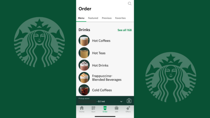
When you’re looking for a drink at Starbucks, you want to be able to find it quickly. The menu organization makes perfect sense in the app.
The horizontal menu atop the Order screen is divided into four sections: Menu, Featured, Previous, and Favorites. If you choose the all-inclusive “Menu,” you’ll find drinks, foods, and merchandise properly classified. If you know what you want, you shouldn’t have too much trouble finding it.
There’s also a “Featured” menu where you can find all of the seasonal and promotional treats. It’s fun to see what’s new, but you won’t be spending much time here.
4. Apple
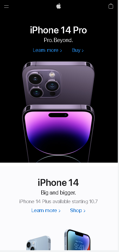
The page design spans the entire width of the mobile browser and is responsive, so there is no chance that the content or product imagery will be cut off. Many people like the consistent modern and simple design.
Despite its extensive product line, Apple has a simple and effective navigation system.
Apple provides smooth navigation which makes the UX better. Users can find what they are looking for quickly and easily.
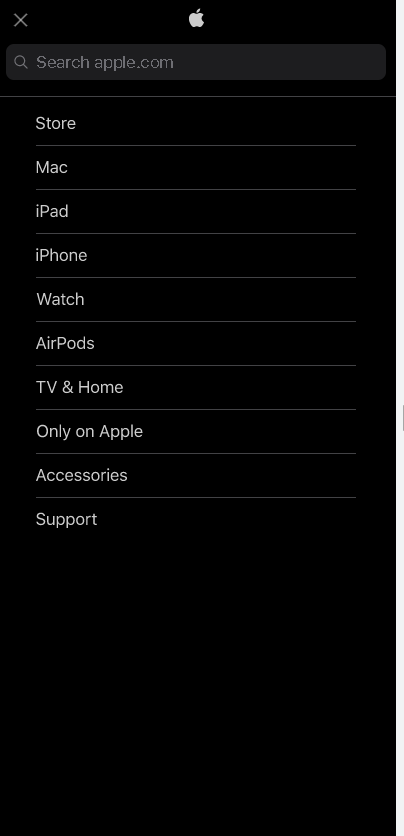
When your customer is ready to make a purchase on mobile, you want to get them there quickly.
Sticky buttons can keep those “add to cart” and “checkout” buttons front and center on mobile. Here’s an example of a sticky CTA in action on the Apple website.
No matter how the shopper navigates and scrolls, the call to action (CTA) buttons remain visible, ready to take them to the next step in the funnel.
Conclusion
The mobile-first design makes sense because it results in better mobile sites while also paving the way for better desktop design. It prioritizes customer needs in design to increase conversions and integrates seamlessly with apps and social media.
The first step is to consult with your client to ensure that you’re on the same page in terms of conversion goals and content priority. Once you’ve determined what action the shopper should take on the site, you can start designing a beautiful, user-friendly store that will have shoppers buying like crazy as they rush around their daily lives.
When there’s so much to consider, it’s easy to become engrossed in every idea and try to apply everything to your design. Our final piece of advice is to keep things simple—remember, the most important aspect of designing for mobile first is to create lean, concise, killer online stores that aren’t weighed down by any of the extra stuff that comes with a desktop.
 Previous chapter