Choose the container element wisely
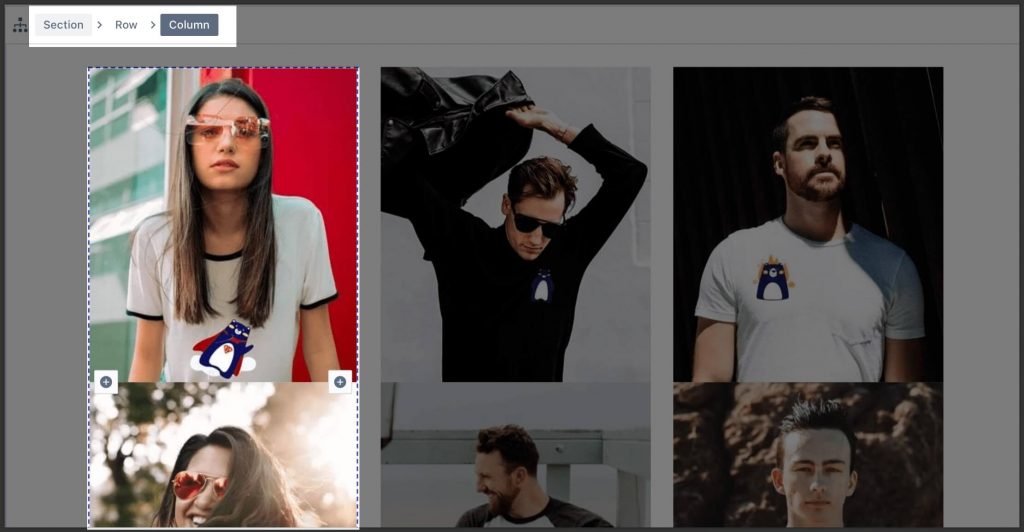
PageFly provides 3 main containers which are Section, Row, and Column to design your page. These containers are made for specific purposes that you need to know before jumping into the editing page.

- Section is the biggest container which contains all content units dedicated to some topic
- Each section can have multiple rows.
- Row contains content dedicated to some sub-topic
- Each row can have one or multiple columns depending on the layout.
- Avoid creating multiple rows when unnecessary to reduce HTML code. Only create a new row if a complex layout with multiple columns is involved.
- Column contains content of the sub-topic but arranged inside columns as per layout.
Use the “Block” element only when necessary

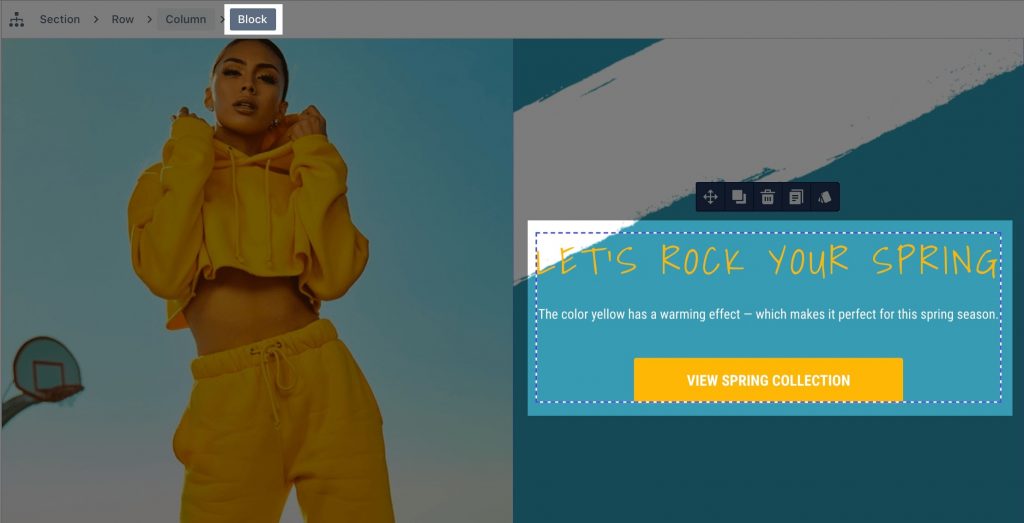
“Block” element is designed to be the single unit that contains a series of elements for special layout arrangement and styling.
In general, no need to use Block element. Try to operate either with the container (section/row/ column) or directly with the element.
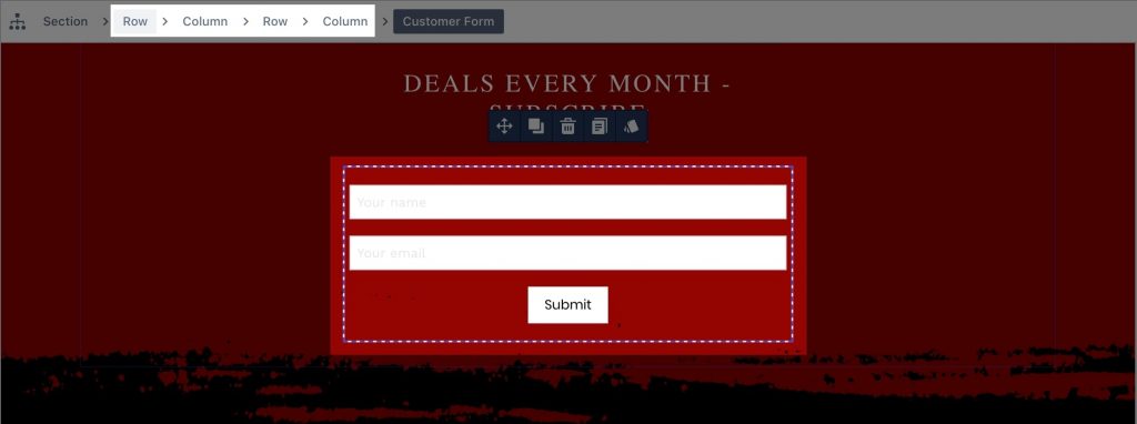
Avoid using too many nested levels

When possible create content in dedicated rows instead of nesting.
Avoid columns of 1 “physical” row to be presented in multiple “visual” rows

It’s unintuitive to have columns of 1 “physical” row that is placed on multiple “visual” rows.
Use default value

If there is no necessity, use the default value.
Check out this video tutorial to build your page layout and structure effortlessly!