
What do all high-converting, professional-looking stores have in common? Find out with our web design tips & tricks for eCommerce merchants.
What’s better than a page with a beautiful web design? A beautiful page that converts well.
You can have all the traffic in the world, but if it’s not converting, and getting you more business online then you’re not making money. I bet you have heard of urban eCommerce stories with less than attractive websites that have rocketed conversions.
So what are their secrets?
You could head over to Reddit and ask for their advice, but you’d be verbally whipped and crucified, destroying all motivation to continue on your eCommerce journey.
If you’ve been wrestling with your website design and struggling to push that conversion rate up, you’ve come to the right place. We’re about to share some awesome web design tips and tricks that beginners, bloggers and merchants can use to boost sales using proven psychology.
You don’t need a graphic design degree to implement these techniques. Nor a web developer. Only a willingness to learn and improve your current store.
Before you start building the first page, remember to keep your audience in mind. You are building for a group of people that share the same problems or interests in some ways.
They may have visited other brands that provide similar solutions, so your brand design should be aligned with them too. Not similar or completely the same, but aligned. Focus on the overall theme and keep your wild and creative ideas at the bottom of the list. About 75% of customers will judge your brand credibility based on the website design. Meaning that you only get one shot here.
1.1. Simple design & navigation wins
The first principle in web design tips is making it as easy as possible to buy from your store, especially on mobile devices.
Above all else, aim to keep your navigation as simple and clear as possible for the best user experience (UX).
Super advanced menus with lots of options can overwhelm customers, especially if it’s the first thing they see. Try to rely on filtering instead of adding dozens of top-level or subcategories.
Place less important links in your footer, like your privacy policy, contact form, or maybe even your social media links. Eliminate redundancy as much as possible. This is an example from Beats – the company that sells more headphones than any other on the planet.
If you’re a relatively new startup, you may not have too many products, which means you can keep your navigation minimal for now.
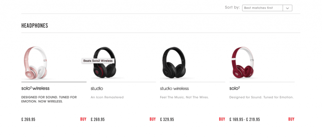
Test your navigation periodically to make sure all your links are working and you haven’t forgotten to add, remove, rename, or otherwise adjust something.
One idea you can try to increase conversions with your store’s navigation is by creating visible links to categories created around highly desirable goods.
The most obvious example of this is a link to a sale category or a landing page where you stash your “last chance” products that are about to sell out for good. But you could also link to products that are brand new, exclusive to your store, or even limited editions.

In addition, keep your web banner color and font consistent with the theme of your site. We’ll touch more on the importance of color later.
If you want full control over the design and layout of your navigation menu, check out conversion rate optimization too Pagefly.io.
1.2. Use breadcrumb navigation
Breadcrumbs and permalinks are an essential part of optimizing your e-commerce product pages. Not only can they dramatically improve the user experience that your e-commerce store provides, they vastly increase your product and category page traffic, which in turn can boost sales and revenue.
Breadcrumbs are a series of links typically found at the top of a webpage that track user navigation through your website so they can easily identify what they’re looking at and find their way back to similar products.
For example, if you’re operating a clothing store and your customer is looking at a winter jacket, a breadcrumb trail example may look like:
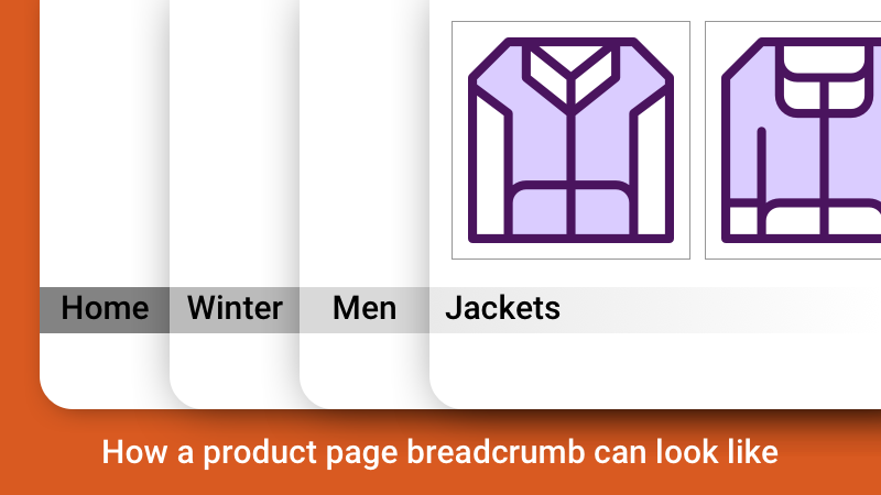
Breadcrumbs help Google index your product pages and SiteMap as well as give your customer a better user experience on your site. Baymard Institute recommends using breadcrumbs based both on product hierarchy (where they fit within a range) and history (where people have visited on the site).
1.3. Show top categories
This is not so much of one of the new, game-changing web design tips, but rather a classic principle. In the modern age of consumption, people are not so generous with the time they invest in exploring a merchant store. Driven by millennials (born 1980-95) and Generation Z consumers (born 1995-2010), the desire for instant access and fast turnaround will be the norm by 2026. To them, navigation through the store is less about exploration, but about finding the desired product/service as soon as possible.
If you have a meticulously crafted product showcase, but your visitors cannot find it within a few minutes, then you are already losing sales. Showing top categories on your homepage is a tradition for eCommerce businesses, but still there are those who push this section down below in favor of other elements they think are more appealing to visitors.
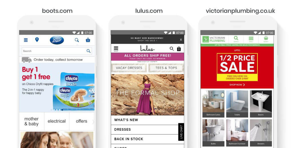
This may work well on desktop view because of the large space, but on mobile view where things are extremely compact, you may want to place top categories above all others. In the USA alone, 79% of smartphone users have made a purchase online using their mobile device in the last 6 months.
When showing top categories on the homepage, you need to be upfront about the design. Include attractive visuals, clear headlines, and bold CTAs.
Make them easy on the eye and interactive. While carousels (sliders) save space, they can be perceived as banners and therefore will be ignored. If you must, opt for user-initiated carousels instead, as visitors will have control on which content they want to see and how long they want to see it.
02. Efficient Layout Optimization Tips
2.1. F-layout principle
Researchers found that people look from left to right when looking at the beginning of a page. Their eyes move downwards with a few glimpses to the right.
The bottom right of the page gets the least visibility of all areas of the page. The movement of the eye results in an F-pattern. Furthermore, the attention of the viewer diminishes towards the bottom of the page. This is immediately applicable if you have a text-only or image-only layout.
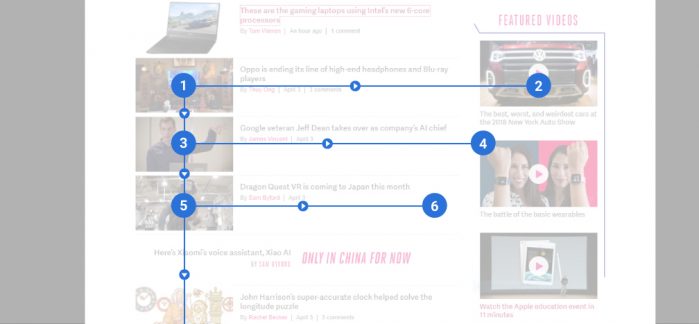
This behavior is helpful in encouraging conversions. You can place the most important elements along the F-pattern. Those that aren’t as important as other stuff can occupy the areas with low visibility.
However, if you are building a text-by-image (2-column) layout, the attention of the viewer is renewed once their eyes meet the image. This forms a “Z” pattern for content assumption.
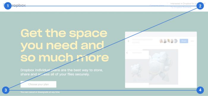
Use left-alignment. This method will increase form completion than center-alignment, according to recent research.
Minimalism is an ideal choice – lots of white space, 2-3 complementary colors and a bold and brightly colored CTA.
A negative space, or white space, is an area on a page that is intentionally kept vacant, meant to give an easy breeze for the eyes of the viewer.
According to Crazy Egg, white space around text and titles increases user attention by 20%. Using a combination of negative and positive space can provide a better user experience which allows you to better showcase your products and services. It goes without saying that a good example of effective white space is Apple’s website.
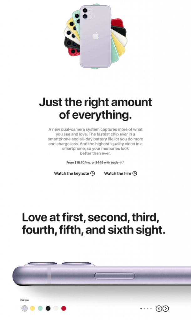
Less is more, so make your website simple to use. Aim for the least amount of clicks and swipe, because it should be easy for the customers to get the information or complete the action they wish to accomplish with only a few clicks. Don’t make it a challenge for them to understand.
03. Font and Typography Tips
3.1. Easy-to-read font face and sizes
Typography and the fonts that you use on your website have a dramatic impact on customer experience in terms of readability, which directly links to conversion rate. You can get high quality, attractive fonts on Google Fonts, Font Squirrel or TypeKit and MyFonts.
Now you’ve got the resources in handpicking the right fonts is the tough part. You need to take into consideration the following: font families, sizes, weights and styles. Focus on what you want to portray to your visitors and customers. What vibe are you trying to achieve? Is it bold, whimsical, refined, minimalistic, etc.? Once you have defined the look you want with your pillar words, get inspired from Pinterest, print materials, leading sites, or anything else you feel inspired by. You can put all your inspiration in Pinterest. Here you can create mini mood boards to organize your inspiration and direction to move forward.
3.2. Use sans-serif for titles and headings
Your fonts should always be legible. Sometimes you can download fun fonts that look fabulous, but if your customers can’t read them then it completely defeats the purpose.
Use a clean sans-serif font for titles and headings as they’re best suited for screens and hand-held devices like phones and tablets.
Serif fonts (those with “hands” and “feet”) are a good choice for long-form reading (in print books and e-readers, for example). You can spend some time on research by visiting famous blogs and websites and take note of the font families that they use.
Fount plugin for web browsers can help you with this task. It’s important to use white space between large elements of the site, especially if your customers are Westerners. You should also break up your long text into small paragraphs to make them readable.
Some body and paragraph fonts that work well are:
- Premium fonts: Proxima Nova, Calibre, Roboto, Droid Serif and Circular.
- Free fonts: Oswald, Gibson Bold and Montserrat.
Don’t use more than 3 font families on your websites. Choose one for your headlines and titles and one for the body text and paragraphs. The last one can be used sparingly in promotions or graphics to catch attention.
Make sure the font size is big enough for people to see even if they minimize the tab. Set the font size for body and paragraph text between 13 – 18px. This size is not too small to be uncomfortable and not too big to have your users scroll or swipe unneccesarily, and can assure good readability. Numara Software, a leading provider of integrated IT management solutions for Desktop Management, used to use Arial 10pt for their text body, but later tested the font size to 13pt and added a little extra spacing between each line.

Even though the original version may look better with smoother content flow, the test results were incredible. That simple change reduced bounce rate by 10%, exit rate by 19%, increased pages per visit by 24% and 133% in form conversion rate.
However, there’s always exceptions to these rules so don’t be afraid of thinking outside the box if you want to be different (especially if you’re in the creative industry). These guidelines are here to keep your focus and inspire you to kick off only.
04. Web Design Color Tips
In countless factors that influence how and what consumers buy, color is the strongest and most persuasive, with 85% claiming that color is the primary reason for their purchase. They can trigger emotional responses in viewers so you can use specific colors to influence customers.
Choosing a color palette is dependent on your brand and your target audience, so stay attentive. Colors used in graphics are just as important as those used in CTAs, links, banners, etc. because they all live in one ecosystem – your website. The right colors can represent your brand and indicate the mood of your website.
4.1. Know why and what colors
Color is powerful and your color palette can speak a thousand words about your brand, so look deeper into what each color portrays, especially while choosing the main color of your brand.
Learn about your prospects and customers. If you work in health and beauty industry, it’s better to stick with calm colors and smart use of negative space. Unless you work in creative industry and you’re trying to provoke strong emotions for visitors, keep the common sense in mind. Familiarity is a dangerous thing, but it can be handy when it comes to good control. Entrepreneur claims that the least effective colors are brown and orange, so steer clear.
Take note of your color code, in both RGB and CMYK forms (even Pantone, if you plan to use them in prints). Failure to do so will lead to inconsistent brand experience, which hurts your brand credibility.
4.1. Web design color mistakes to avoid
Web design tips: Never use more than 5 brand colors – unless your brand is rainbow or unicorn-themed. The ideal number of colors is four, with shade and highlight for each color. One piece of advice when creating brand colors is to include a primary color, a secondary color, background color and an accent color.
Pinterest is a great place to extract inspiration – take some time browsing and pinning what your brand rings true to. Don’t push yourself to create a brand new color palette for your brand. If you don’t have creative blood in your body, don’t stress out. There are other useful tools to help so you don’t have to reinvent the wheel. Some places are Adobe Color, Color Hunt, Coolors and Colors by HailPixel.
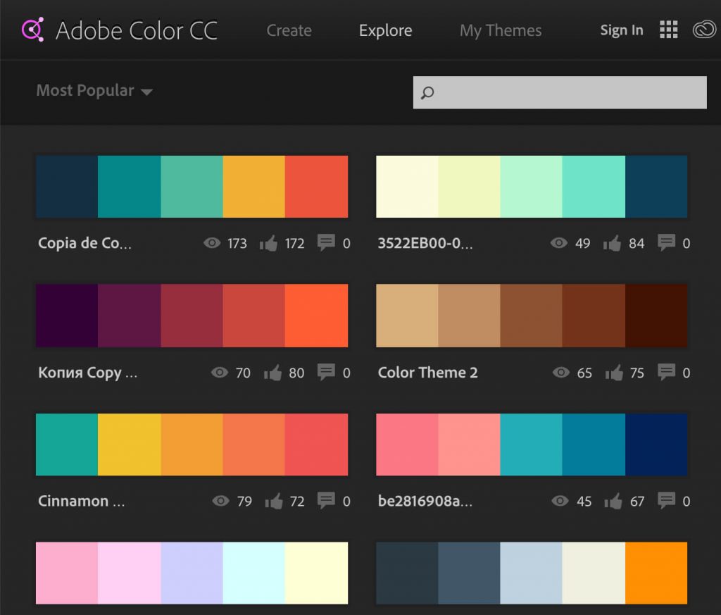
05. Color Design Done Right
Humans are visual creatures by nature. With 90% of information transmitted to the brain being visual, we are drawn to images over text. This can be a powerful character, especially when you want your viewers to key in on a new product or promotion.
5.1. Visual hierarchy and directional cues
Powerful layout guides visitors through reading patterns, making them naturally follow the information they need to eventually reach the CTA. Don’t make people hunt for what they want. Instead, create simple and intuitive navigation so they can find anything in less than 3 actions.
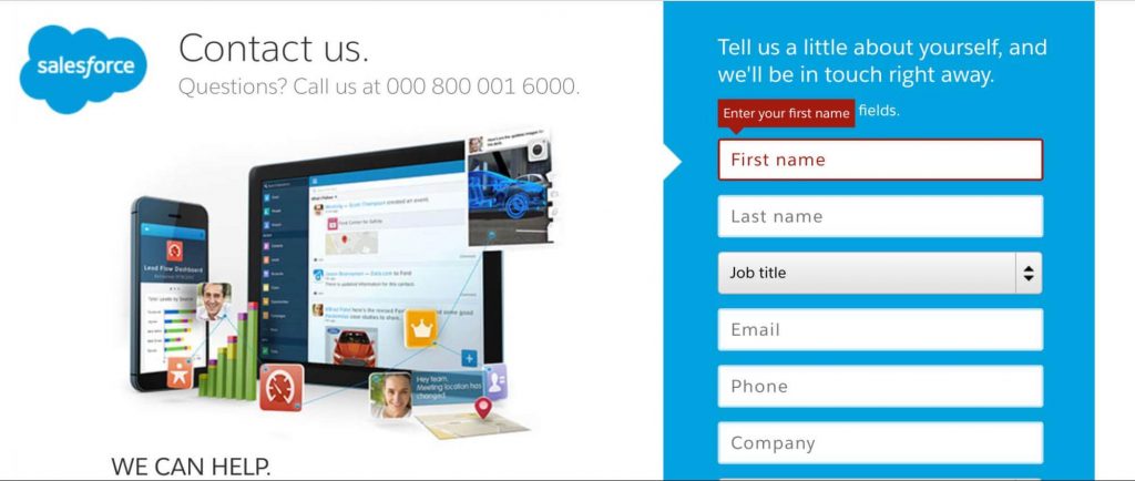
Another vital factor in efficient web design is directional cues. They are intuitively essential in making visitors follow the direction where they point. They don’t have to be all text and arrows, but most of the time, efficient cues are subtle yet naturally-embedded into the design.
The example below is from Salesforce. They integrate an arrow into negative space so it can point directly to the first form field, still, it is negative space so there’s balance in the design. Plus, they set the first form field to be immediately highlighted when a visitor goes to the page with a small pop-up above. Salesforce wins the game here.
The last example is our favorite, created by Sunsilk and analyzed by Think Eye Tracking. The brand took the directional cue to the next level – seamlessly integrated into the model image. A slight difference in the model’s eye direction made a huge impact: 14 times more people looked at the visual comparing to the previous version.
![]()
5.2. Contrast your Call-to-Action colors
CTA optimization is one of the most recommended web design tips. The most common CTAs are: Start a trial, sign up for updates, download an item, book a consultation, etc. CTA should be placed on every page of the website as it is proven that websites that have a clear CTA have higher conversion rates. Now let’s dive into how to create an irresistible CTA.
First, the colors are powerful. Using the right color can give the CTA more prominence. The secret is to choose a color that contrasts to the background for the CTA, with a relevantly bold font too. This infographic from Edubirdie is super helpful to decide the best color for your CTA tests. Click on it to see a larger view.
Different colors evoke different messages. Think about the message that you want to evoke for a user (trust, experience, intelligence) and choose your colors wisely. Also, make sure to double-check if the color is in perfect (or harmonious) contrast to the background colors on the page.
Check out the infographic below to see how the colors work together.
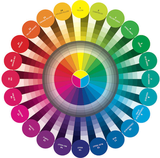
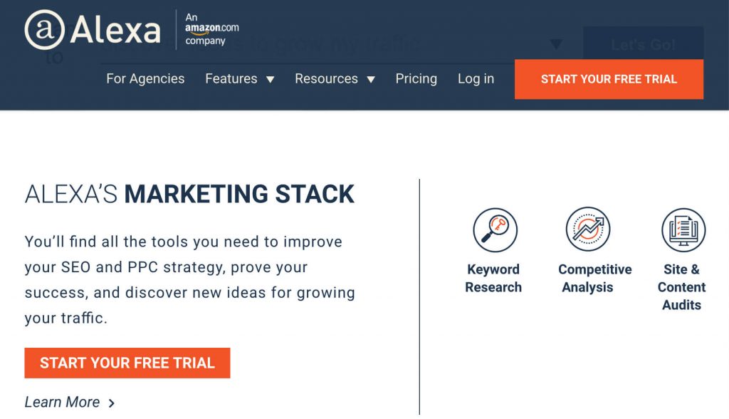
Two colors that set good contrast are opposite on the color wheel. Looking at the color wheel, we can see that violet and fuschia are not ideal to make a strong pair. But yellow and violet or yellow and fuschia are powerful at calling for attention. See how Alexa team uses contrast effect to make their CTA stand out excellently on both dark blue and white background.
If you want to make sure the colors you choose perfectly “fit” with each other, use great color wheel tools available online like Accessibility Color Wheel to find the best pair that stands out. Now you can see there’s no magic color to boost conversion.
It’s all about finding the right combination to increase contrast or catch attention. However, it’s also good to know that red and green are the colors those with color blindness or deficiency struggle the most. If you’re in health, medical, or any area that your audience having such character, you want to steer clear from these colors. Here is another great example from Hotjar.
Notice how they leave most of the page white and nicely use an evident contrast pair of color side by side. If you can’t find the CTA in this page, it’s time to contact your nearest eye doctor.

Secondly, size matters.
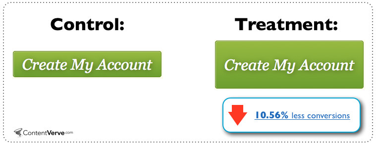
Another commonly ignored web design tips: Bigger doesn’t mean better. It’s not just the copy or color of a CTA that can make an impact on conversions – the size and spacing around it matter too. WriteWork tested if increasing the size of their CTA button would boost conversions. On the contrary, it dragged down 10.56% in conversions.
06. Effective Search Design Tips
Search should always be available. Some customers will always prefer searching to navigate, no matter how much work you put into your site. Google also pioneers in search autocomplete, which has become a must for online stores with a wide range of products.
When search autocomplete is implemented properly on your site, you can help visitors solve many problems: Recall a product or service they may have forgotten to search for on your site, complete partial search queries, prevent misspellings, and narrow down the search results to what they need. 82% of the top Ecommerce sites offer autocomplete suggestions to enhance visitors’ search experience both on desktop and mobile.
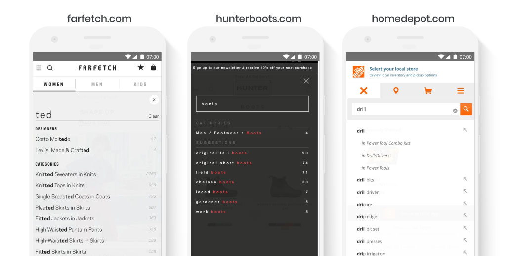
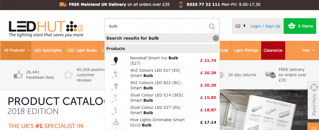
You can also test showing images of products in the search box, by adding product images right next to suggested search keywords. This tactic is becoming popular among Ecommerce websites, especially retail businesses with long range of products similar in name and function, in which a combination of spotlight search and image preview can help a lot in user usability and efficiency.
If you want to attract the attention of search engines, make sure that you create unique title tags for each of your product pages. Use key phrases for your title tags as opposed to specific keywords to minimize the risk of using duplicate title tags throughout your website. Use a digital marketing toolkit like SEMRush or another keyword research tool for detailed keyword assistance for creating your title tags.
For example, instead of using the title tag ‘LED television’ for each model of television you have available, you can create a title tag specific to each brand, size and model number, such as ‘Sony 48″ 1080p LED Smart TV.’ Use this technique on every product page you have on your website.
Place your most important keywords at the beginning of the tag, since search engines will rank the importance of words based on their placement. Although there are a ton of variables that come into play when it comes to the ordering of words in a title tag, the most important thing to consider is the words you actually use (link is external).
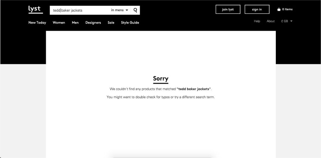
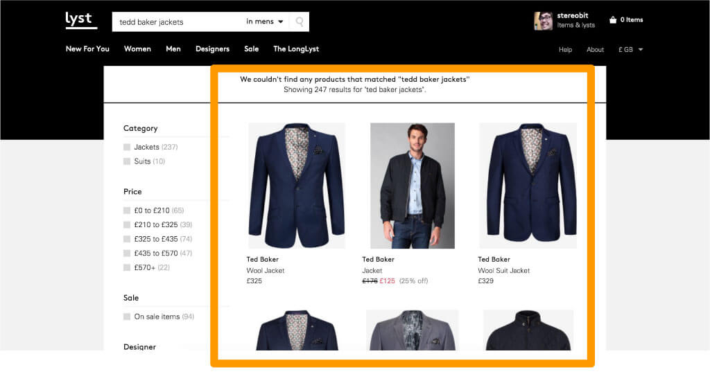
If you have the resources, take an extra step in customer consideration and implement the “Always return” results feature to your search engine. Oftentimes visitors will not find what they are looking for by using specific keywords, but you do not have to turn them away with the “No results” answer. Instead, take that as an opportunity to divert their attention to other similar or popular categories within your store. LYST added an algorithm that returned product results without an exact match and saw their page views increased by 15%.
Before:
Versus after:
07. Product List Layout & Design Tips
7.1. Add an awesome filter
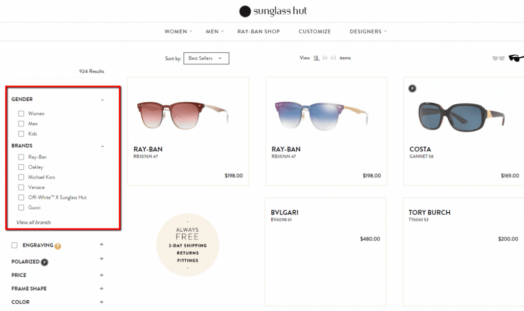
Another web design tips are to aid visitors and help them make decisions is to include product filters. Some helpful recommendations are:
- Create specific filters for the most popular categories. Don’t just rely on simple filters like color or size. Think of what people really want to differentiate between various items.
- Put the most important filters at the top. The list of filters doesn’t have to be in alphabetical order. Sometimes certain product filters are highly important to the user. For example, when searching for a camera, it’s likely the customer is interested in a certain type of camera like a DSLR or mirrorless camera.
- Include compatibility features when things like device type or operating system matters.
- Make sure customers can select multiple filter values. With multiple filter selections, the customer can narrow down their search and likely to find what they want, which save their time and boost conversion with little browsing efforts.
- Try to create theme filters when appropriate because some themes intrigue your customers and get them to think about the purpose of your products. For example, creating a filter for floral themed items can help people find products from different categories that could pair well together. This is one of the less common filtering practices, but it’s a great way to stand out from other competitors and show that you know what your customers are interested in.
- Show the applied filters in multiple locations. Filters are generally shown on the left or towards the top of the search page. However, sometimes customers have trouble finding the selected filters to jump back a step or add more. That’s why we recommend revealing the filters in multiple locations, whether its a summary of those filters in the sidebar or simple breadcrumbs at the top of the page.
According to Baymard Institute, of the 50 retailers studied for the benchmark report, the ones with the highest ranking for usability were Nordstrom, L.L. Bean, Macy’s, Amazon and Wayfair. Business owners who are looking for examples should take a look at how these sites handle filtering for inventories featuring thousands of products.
Plus, Google monitors how quickly and easily your customers move around your site. It also takes filters into consideration, since filters serve as a map for those customers. Since bounce and abandonment rates usually decrease with filters, Google will most likely notice this, meaning your SEO ranking can jump.
7.2. Showcase top-sellers
While the majority of your traffic is first-time or new customers, give your customers some direction. Show them what people are buying the most, usually in the “best-sellers” section. Not everyone browsing your site will know exactly what they’re looking for.
If your company sells a wide range of different products, it can be overwhelming, especially for a new customer. When someone stumbles upon your site, they may get drawn to products that are popular. Here’s how Black Yeti does this on their eCommerce site:
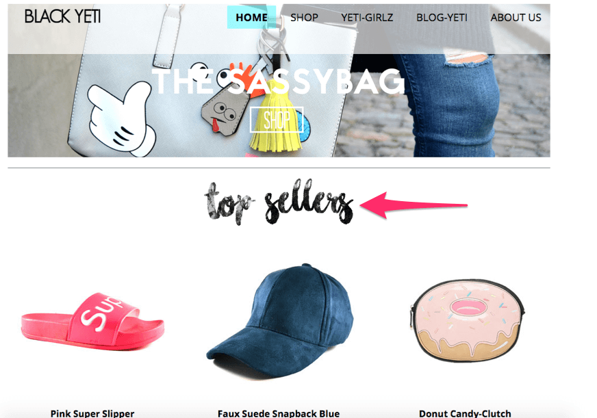
You can also take this opportunity to promote products with the highest margins. Even if they aren’t actually your top sellers (nobody needs to know that), you can put them on your homepage. In a perfect world, your top selling products are also your most profitable products, so try to make that happen if you make adjustments to increase profit margins.
7.3. Display new arrivals
This is again the best means to keep your customers updated with the fresh introductions in various collections. Customers are inclined to viewing these products with more focus as the idea of a new arrival grabs their attention in terms of uniqueness. Your SEO rankings can also improve significantly this way.
Display new arrivals on the homepage or collection page, depending on where you see fit.
08. Product Detail Design Tips
One of the obvious downsides of shopping online is not being able to touch, feel, or physically examine a product you’re considering. Because of this, product descriptions, especially visuals, have to do a lot of heavy lifting in order to provide similarly useful experience.
In our Conversion Talks 2 about How To Write Effective Content That Converts, we went into details about best practices to write effective content (product details) to increase conversion, no matter what you sell. Now, let dive in to check out these web design tips for Product Details.
8.1. Sharpen value proposition
Value proposition is the most important yet most difficult to get right for conversions. Look how effectively Square does this with their point of sale systems:
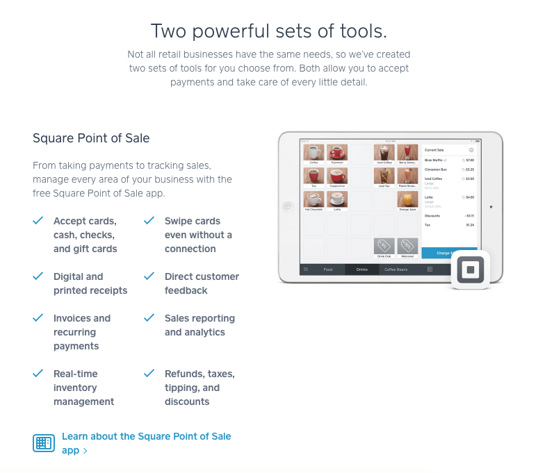
A value prop is a combination of copy, images and a CTA that captures your entire business in a split second. It’s where you tell your customers who you are and why they should buy from you in a split second. Web design tips for creating a strong value proposition are:
- It’s specific: What are the specific benefits the customer will receive?
- It’s pain-focused: How will your product fix the customer’s problem or improve her life?
- It’s exclusive: How is it both desirable and exclusive? How does it set you apart from your competitors?
- Don’t confuse brand slogans and catchphrases with value propositions as they’re two very different things.
Your value proposition should focus on the superpowers, not the product. Rarely is your value proposition the product itself or its features. Instead, it’s the way the brand or product improves the lives of your customers and the way it makes them feel (like they have superpowers, for example).
A value proposition should be front and center when a visitor arrives on your site. Although it’s often found above the fold on the homepage, you should be aware of other common entrance points (e.g. category pages, blog posts and product pages). Essentially, you need to reiterate value prop at different conversion points within your sales funnel. A “free shipping” disclaimer can be placed on the product page, under the Add to cart button, and in checkout page.
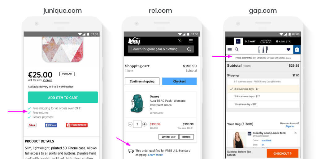
The best value propositions use voice of customer copy. That is, they use the exact words of your current customers to hook your future customers. How do your customers describe your product? How does it improve their lives? How do they describe your company? Why do they choose to associate with your brand?
8.2 Spice up product visuals
Take a look at the quality of product images at Target. You’ll get a zoomed-in view of the area over which your cursor is hovering. And you can properly see all the details such as the texture of the fabric in the following product image.
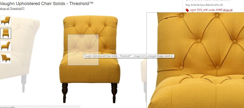
Offer multiple photos with multiple angles. Include photos on your product pages that let viewers see your products from every angle. Allow interested visitors to zoom in and out, and click through a gallery of photos that show your product featured alone and being used.
Create an interactive 360° viewing experience. Provide a way for your visitors to explore your product from every angle, like the below example:
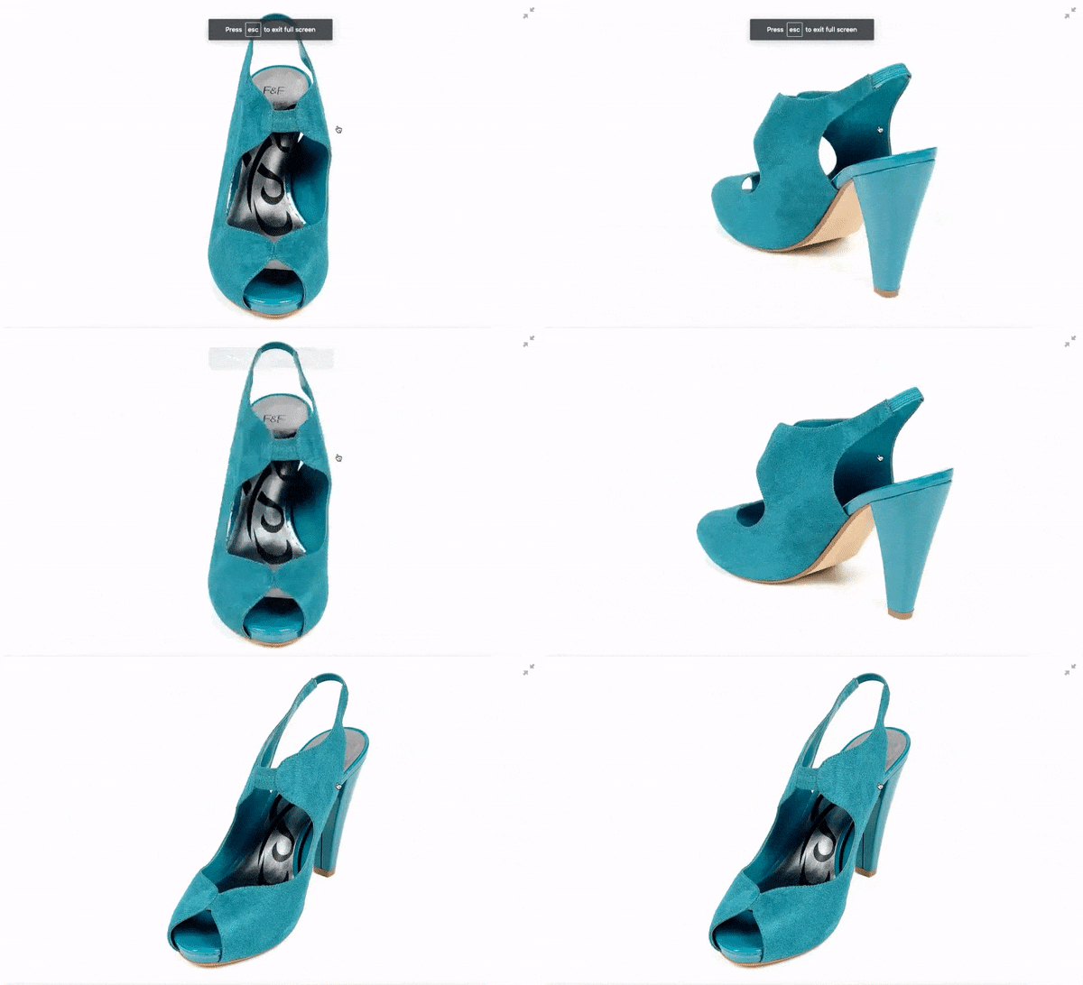
While we’re at visual web design tips, It’s important to remember that visuals aren’t just limited to photography, and effectively using visuals isn’t just about aesthetics; great photography, GIFs, and videos, photo labels, stickers, badges, all keep your customers questions and concerns in mind and help them make a more informed decision. It can greatly reduce anxiety and increase their desire to buy.
You can go one step further – show it in action. Listing this is one thing, but showing customers how it works through video demonstrations is much more effective. The video shows a demonstration of the product in the kitchen, car, bedroom, boat, office, and even bathroom, so it appeals to a wider range of people. Zappos does this with shoes, and it’s pretty effective.
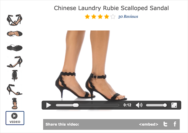
If your customers were buying this product in person, what would they closely examine? What would they want to see and compare? Online stores can bridge the gap by correctly using visuals to show customers what they’d naturally look out for when buying the product in person.
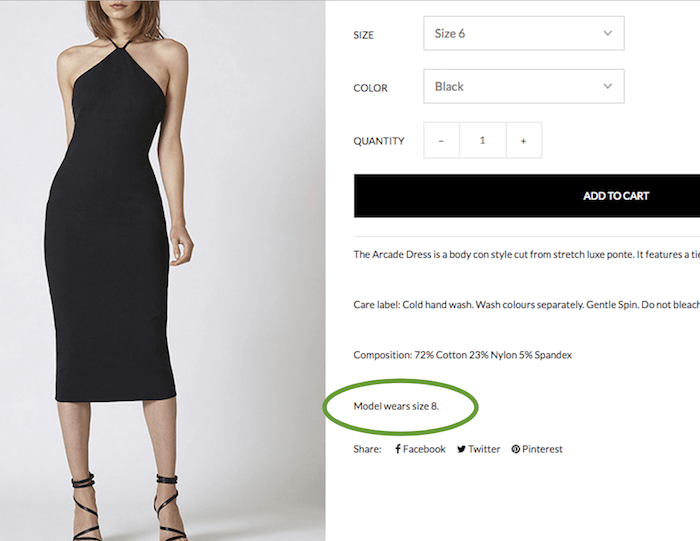
For clothing & shoes, provide a size chart, esp. if you are selling international sizes. For example, Australian clothier Ruby Sees All has a lovely Arcade Dress available on their site. But how will it fit? To give us a sense, they add a helpful line to the description: Model wears size 8. An extra helpful step is to provide body measurements of the model too.
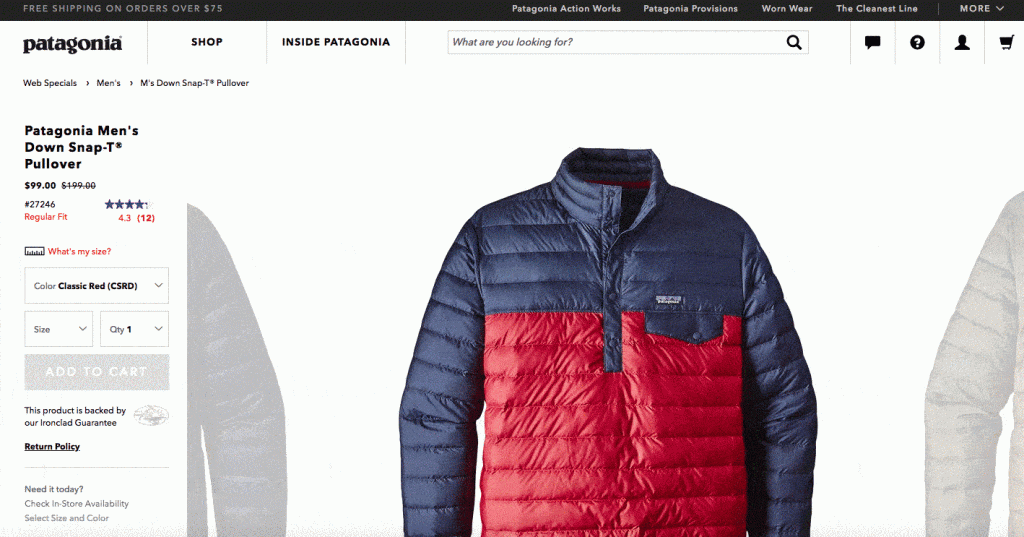
Web design tips: Be thoughtful and designing micro-interactions on your website that solve common problems engage your customers in ways that make them feel cared for!
Most web design tips in visual focus on crisp product photography, however, customization is the new king. Patagonia combats this issue with their sizing quiz. If you’re unsure of your size for a certain product, Patagonia asks you to fill out a mini in-page survey answering questions about your height, weight, and body type. They also ask you how you like your clothes to fit: are you someone who prefers things a little loose or a bit on the tighter side?
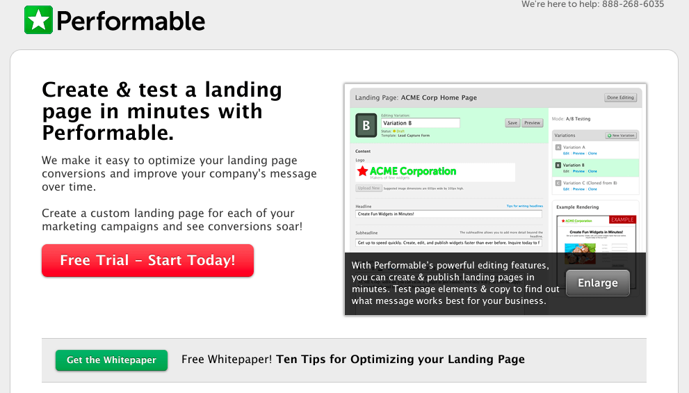
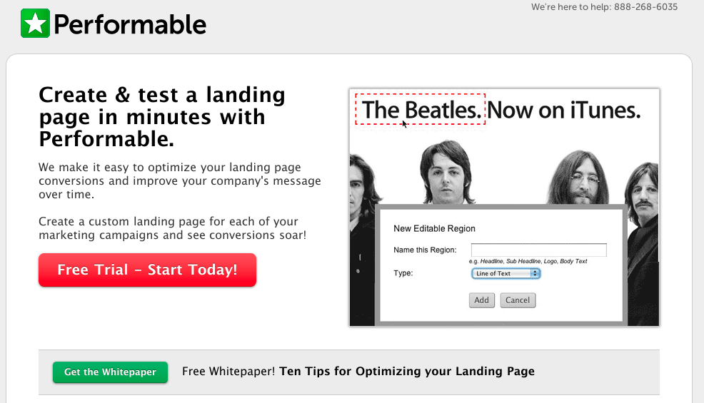
Let’s look at another case study by Performable. They A/B tested their landing page with the goal of getting visitors to try the trial. They switched from using a product image to a stylish image of The Beatles, which resulted in 112.5% conversion rates [Source: abtests.com]. Usually, real images with human faces will result in better responses compared to other types of images because it creates instant connection. Once the customer feels connected, they are more willing to buy from you.
In conclusion
Be consistent in your web design, from color schemes, font faces, types of images, etc. Inconsistency reveals poor and unprofessional execution. Once you have everything sorted out, it’s highly recommended to create a brand style guide to keep all designs aligned together.
And don’t forget to make your site responsive and mobile-friendly. Recently, Google started penalizing sites that aren’t optimized for mobile devices, making the need for responsive web design even more crucial.
We are officially living in a mobile-first era, so your website should reflect this. It can seem like a monumental project, but building your site this way offers better benefits with far greater user experience.
Additional web design tips resources:
If you’re interested in more advanced web design insights, check out this podcast for easy listening on your way to work.
Or, check out this comprehensive PDF guide to beautiful web design by Sitepoint.
We gathered a ton of actionable web design tips in one place in this article. And the best part is, you don’t need to go outsourcing for design skills. If you found them helpful, implement them and study the impact it has on your site. You’ll be pleasantly surprised.