Fact: Your Shopify store isn’t ready to launch until it’s mobile-optimized.
It’s a safe bet to say that the majority of online shoppers have smartphones and frequently shop on their mobile devices. Mobile-friendly store design has progressed from a nice-to-have to a must-have in recent years.
Aside from selecting the right theme, there are numerous strategies you can use to improve your store’s mobile experience. Take out your phone, open your Shopify store, and let’s go over five different ways to improve your customer’s experience and drive more mobile sales during the holidays.
Previously, we have published the following chapters for our Guide: Make Your Store Responsive With PageFly:
- Chapter 1: Getting Started With The Basics
- Chapter 2: Recommended Practices For A Responsive Store
- Chapter 3: Design Your Store In Mobile Devices
And this is the next and last chapter of the guide.
I. Conversion Rate Optimization For Mobile Design
1. Make elements translate beautifully to mobile optimization
Your store builder may handle displaying your images and text at different screen sizes, but you control the visual experience. Choose clear and readable fonts and color combinations when designing your site so that important information or links don’t get lost on a phone or tablet screen.
Remember that an image or description that appears clear and takes up little space on a laptop or desktop screen may appear very different on a smaller screen. Upload multiple photos of your products if you’re selling them to highlight the details or features that set them apart. Product descriptions should reflect your brand’s voice and include relevant details such as dimensions without becoming overly lengthy.
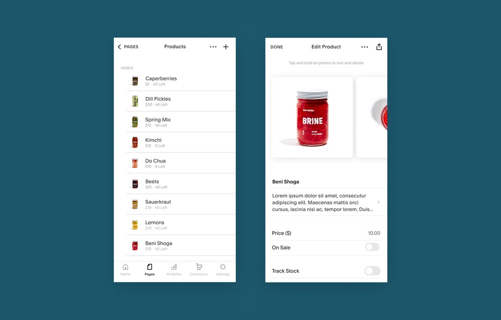
Source: Hester
a. Texts: Visibility (font family, size, and color), cut down the amount of text
Make Your Font Large
Despite the limited space provided by mobile devices, you must still provide consumers with critical information about your offerings. A small font is difficult to read and may discourage visitors from shopping on your site again. Merchants are recommended to choose a font size between 14 and 16 pixels and scale it within the viewport for Shopify mobile optimization.
Go for Conventional Fonts
Unless shop merchants absolutely need a fancy font to describe your products or services, stick to standard fonts like Arial. Why? Consumers who do not have the non-standard font you’ve chosen may need to download and install it on their devices. This reduces the speed of your Shopify mobile site, which is one of the major causes of bounce rate growth.
Cut Down the Amount of Text
We recognize that you are facing a difficult challenge. You must provide as much information about your offerings as possible within the limited space of the viewport. As a result, you should only include the essential information on product pages: what the item is called and how much it costs, as well as a CTA button.
How can you give more details? We recommend two main methods:
- Display them after a user clicks a photo or image
- Toggle them with a hamburger, three dots, or caret menu button
b. Images: Check text overlay, size, and quality
Overlaid text is integrated into the code of most banner ads. If you leave a banner like this alone and use it on a mobile device, your shoppers will likely struggle to understand your message as the viewport shrinks.
To address this Shopify mobile optimization issue, we recommend extracting the text from a banner’s code and placing it underneath.
c. Collection pages: Collection list layout (list view vs. grid view), minimize scrolling
Grid view
Grid views are useful for displaying images, but they also allow you to display multiple products next to each other at the same time. This also allows the user to visually compare different items. The disadvantage here is that there isn’t much room for text.
List view
When the content or description is the most important thing to the user, the list view is used. There may or may not be an image, and if so, it is supplementary or used to provide additional information.
Because a list item takes up all of the vertical space, fewer results appear on the screen at once. This may appear to be a negative, but if the user is skimming the results, having fewer results on a page may help reduce cognitive load and allow for easier comparisons.
d. Product pages: Description length, adequate visual information
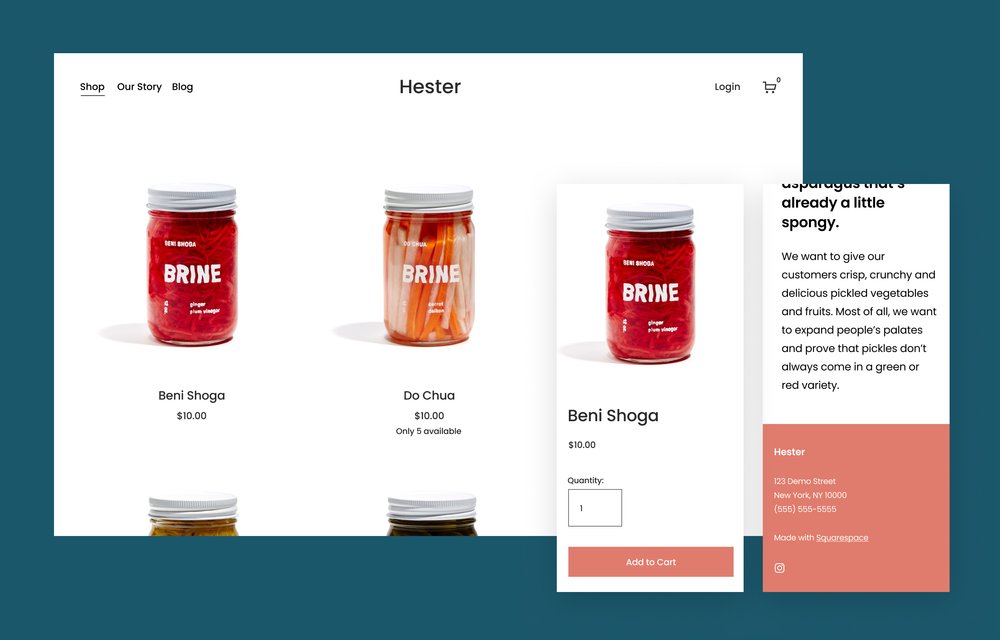
Source: Hester.
While your desktop store may have the ideal amount of white space, beautifully written product descriptions, and eye-catching text embedded in photos, this does not always translate to the best mobile experience.
When it comes to minimizing text on your product pages, there are a few key factors to consider. “Is the written content on this page absolutely necessary for converting customers?” ask yourself. ” If it isn’t, get rid of it.”
Reduce the length of your product descriptions to include only the essential information. This eliminates the need for your shoppers to scroll down your page.
If you have overlaid text embedded in images, consider removing it for mobile and placing the text beneath the image. As your customer’s screen size shrinks, this will improve legibility.
Finally, if the layout of your product page on your mobile store appears cluttered, look for a more mobile-friendly Shopify theme that keeps important content at the forefront (like your add-to-cart button) and sorts the rest neatly below in a prioritized order.
These tips are helpful in avoiding abandonment & gaining sales.
2. Ensure smooth checkout flow
Allow customers to quickly add items to their cart and fill out their shipping and checkout forms with minimal scrolling and tapping.
When viewing your product pages on a mobile device, add-to-cart buttons must be displayed front and center. The last thing you want is for your customers to get lost while trying to purchase something from you. Make it simple.
When a customer visits your mobile store, they will naturally scroll through products, watch videos, read about your company, and so on. Don’t force them to go somewhere they don’t want to or intend to go.
When a customer taps your add-to-cart button, it should place the product in their cart, let them know it’s there, and allow them to continue browsing.
A smooth checkout experience is important on the desktop, but it is especially important on mobile. Since not all customers are accustomed to shopping on their phones, do everything in your power to make the entire process as clear and simple as possible.
a. Visible, easy-to-tab CTAs
CTAs should clearly state their purpose (e.g., “Add to Cart” or “Sign Up Now”) and be simple to enter and exit.
Obviously, the primary goal of any e-commerce site, whether web or mobile, is to sell products or services. Visitors should be gently but persistently urged to make a purchase. On a desktop, you have plenty of room to display the Buy button on every page of a store; on a mobile device, you don’t have as much room.
The best way to deal with this issue is to have a fixed CTA button no matter where the user is. Simply keep it on display at all times. Who can say? Perhaps a customer will purchase something they weren’t looking for after seeing this button, increasing your sales.
b. Check real-time pop-ups
Despite widespread criticism, pop-ups remain one of the most effective methods of capturing a visitor’s attention. As a result, we wouldn’t be surprised if your site includes one or two strategically placed pop-ups designed to capture leads or pass vital information to consumers.
Pop-ups can be very effective, but they can have a negative impact on the mobile experience. Screen space is more important on a smaller device, and even medium-sized pop-ups can be far more disruptive than they are on the desktop version of your store.
Google began to crack down on pop-ups a while ago by implementing a set of rules that these elements must follow in order to not negatively impact the user experience. Among these rules are the following:
Pop-ups should be as unobtrusive as possible: on mobile devices, pop-ups should take up only a small portion of the screen.
They should be simple to dismiss: It should be obvious how mobile shoppers can dismiss the pop-up, typically through a clearly visible, decently sized button.
c. Clear and easy checkout process
All of the mobile optimizations mentioned above will improve the mobile experience of your online store. However, keep in mind that mobile commerce-specific optimizations, such as the checkout process and payment options, must also be addressed.
Customers should be able to quickly add items to their shopping cart and proceed to the checkout. The checkout process should then feel intuitive and simple to complete, even with limited screen space. Try collecting billing and shipping information in smaller, progressive steps rather than in one long form. Provide multiple payment options, including express payment options that do not require someone to find and enter credit card information in order to complete the checkout process
II. Optimize Page Speed For Mobile Design
Page load time
Why is it important?
Speed is a killer.
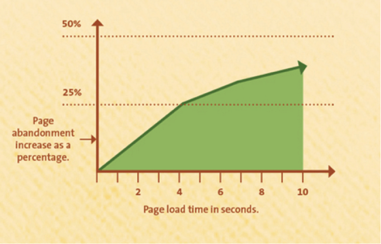
Hubspot reports that 64% of smartphone shoppers expect pages to load in less than 4 seconds. To be more specific, if your site generates $100,000 per day, a one-second improvement in page speed generates $7,000 per day. Kissmetrics even created an infographic to show the percentage of customers who abandon a page due to a longer load time: if your page load time exceeds 4 seconds, you’ve lost a fourth of all visitors – and a potential quarter of conversions.
Speed test tools
There are some tools you can use to assess the current status of your site, including:
- TestMySite: This tool measures the site’s performance across devices, from mobile to desktop, and provides them with a list of specific fixes that can help their business connect with people online more quickly, as well as free test reports.
The all-time simple and intuitive design of TestMySite
- PageSpeed Insight: This tool evaluates the performance of web pages, assigns a Page Speed Score (ranging from 0-100, with 85+ being good), and suggests how to speed up the page.
- WebPage Test: This open-source tool will run speed tests from multiple locations around the world and across consumer connection speeds to provide rich insights such as resource loading waterfall charts, page speed optimization checks, and improvement suggestions.
- Mobile-Friendly Test: This tool, designed specifically for mobile sites, analyzes how mobile-friendly the site is and focuses on elements other than speed.
Best practices
1. Optimize image files
Visual contents are extremely effective at conveying ideas and summarizing your points, so they should be included in some form or another. They can, however, pose a significant challenge for mobile stores because they take longer to load than standard text.
Make sure the images you upload are properly sized to optimize your shop for mobile. It means that if your site uses large or wide images, you should figure out how many pixels are needed and try not to exceed that number. Cropping your images to the correct size is one of the simplest ways to reduce image file sizes. For example, if you want an image to be 570px wide, resize it to that size.
Optimizing page performance by lazy loading images. Lazy loading your page content has several potential benefits, including faster page loading. This improves the visitor experience, the number of engaged visitors and conversions, and your SEO. It saves data because the browser only loads a portion of the total page content per visit.
Don’t just upload a 2000px wide image and set the width parameter to the desired size. This requires your page to load the entire image, then adjust it to the proper size, which slows down your page. You can also use pixel-based photo editing software like Photoshop to downsize the pixel if necessary. Always use image optimizer tools like Shopify Online Image Resizer, tinypng.com or imagecompressor.com. Among Shopify page builders, PageFly – Free Landing Page Builder has a lazy load function that you can apply in the settings easily to help your pages load super fast. PageFly’s lazy load function strictly follows Google’s guidelines, thus will help your page earn the perfect score on Google’s PageSpeed Insight tool.
Watch this video on how to change the settings of a page in PageFly #1 Shopify Page Builder:
Read more: PageSpeed Optimization.
2. Optimize front-end codes
Front-end optimization is critical when it comes to page load time. The speed with which your page loads is primarily determined by the technical processes that comprise a shop’s performance. Front-end optimization also includes file optimization: when you optimize files, you are optimizing your front-end.
Simply put, front-end optimization means reducing file sizes and reducing the number of requests required to load a page. Along with file optimization, the following techniques are used to optimize front-end code:
- Reducing HTTP requests
- File Compression
- Cache Optimization
- Code Minification
- Image optimization
To learn more about how to implement techniques for optimal front-end code, read this article about Reducing Page Load Time or find “Shopify Experts” at experts.shopify.com.
3. Reduce external scripts and plugins
It’s worth noting that the Shopify apps or Shopify themes that are integrated into your store have a significant impact on load time.
If you have a Shopify store, chances are you use a lot of apps to design it, run marketing promotions, create effects, and so on. They make your life easier (and richer), and they are extremely simple to install. Unfortunately, the number of Shopify apps you install has a significant impact on site speed. Because of the large amount of Javascript code embedded in the pages, the more apps you have, the slower the pages become. Even if you don’t have many apps, it’s a good idea to regularly evaluate the ones you have installed.
Stay informed and selective when installing apps to optimize your store for mobile. Unnecessary Shopify apps can be removed to increase overall speed and make maintenance easier in the long run. You can run a selective speed test to see how each app affects your site if you want to be extra cautious and data-driven. Therefore, merchants should monitor the store’s performance every few days and closely look at the page speed score before and after the installation of the new Shopify app.
4. Good to have a solution with Shopify app/service
In addition to the server that hosts your site (the Shopify server), you can use other server networks to reduce load times for your visitors. You can cache your site on a global network of servers using a CDN (Content Delivery Network). When a visitor’s browser requests files from your site (in general, loading a specific page, image, or data), that request is routed to the nearest server.
As a CDN, Shopify Files is an easy-to-use option. It’s under Settings in your Shopify admin.
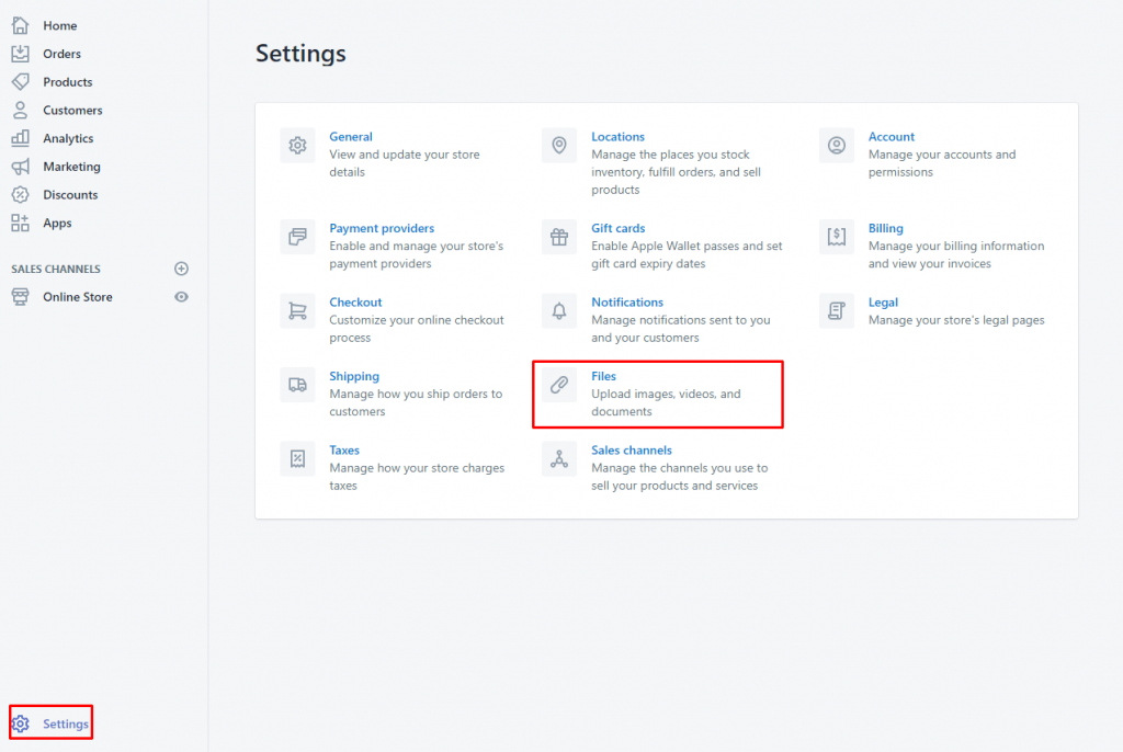
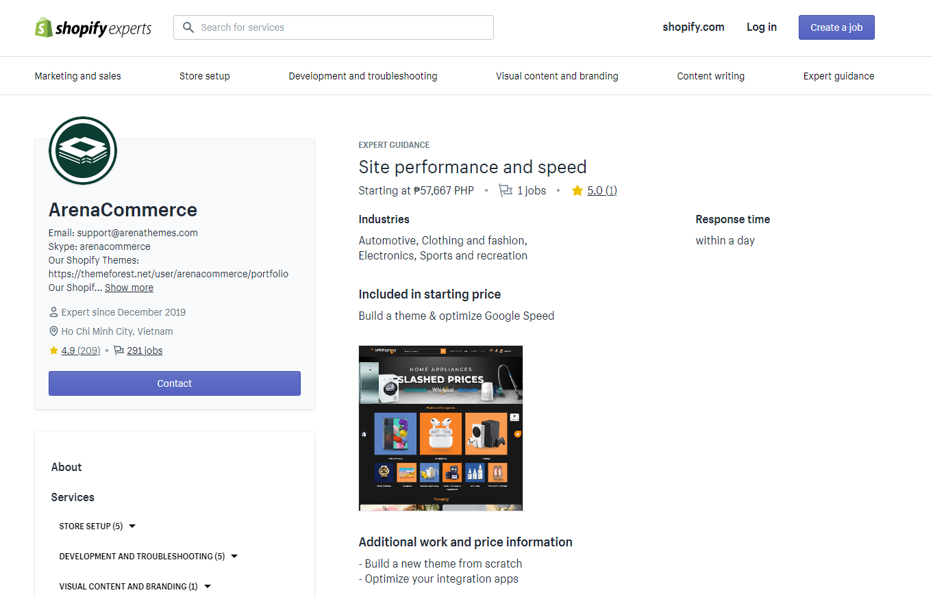
For example, service from ArenaCommerce.
5. Test on actual mobiles
It’s critical to test your site on a regular basis as you build and update it to ensure you’re still providing a good experience to mobile visitors.
There are a few quick ways to test your site:
- Use a mobile-friendly testing tool: There are several tools available that allow you to enter a link to any store and analyze its mobile-friendliness. A quick Google search will yield a few popular options, and it never hurts to test your site with more than one tool.
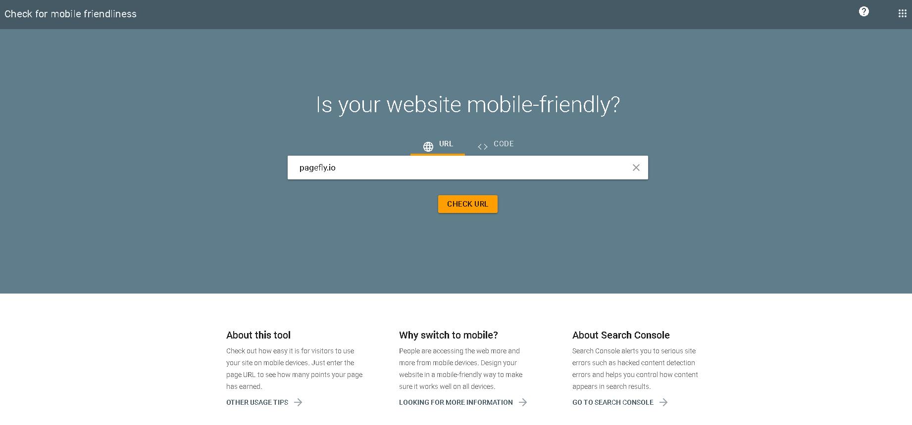
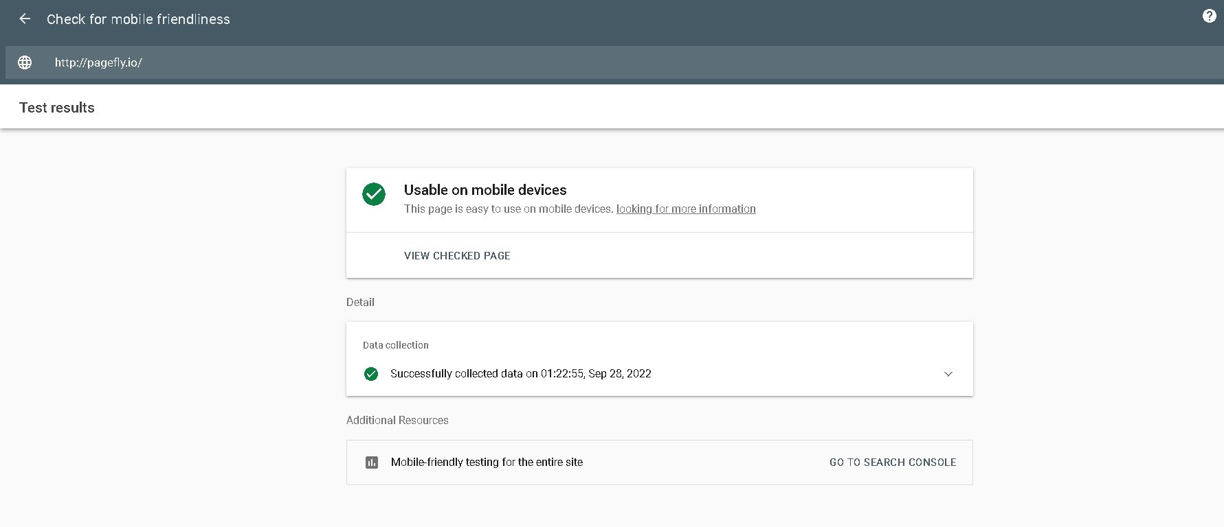
- Test in your browser or store builder: Many store-building tools include a mobile preview option that displays a close representation of how your site will appear on a phone or tablet. If your site has a responsive or adaptive design, you can also reduce the size of your browser to see how the design looks at different display sizes.
- Test it on a mobile device: Put yourself in the shoes of your customers by visiting your site on a phone or tablet, and then ask friends or fellow entrepreneurs to do the same. Take note of any flaws that a testing tool might miss, such as a cumbersome sign-up prompt or a difficult-to-read CTA.
Conclusion
If you’re serious about your online store’s success, answering the question “How to optimize Shopify for mobile?” is essential. Making your Shopify store mobile-friendly is an important consideration. An online store that is not mobile-friendly is doomed to lose SEO rankings, suffer a drop in sales, and tarnish a company’s reputation. That is why we recommend that you use the optimization techniques described in this post.
With more web browsing taking place on mobile devices and search engines favoring mobile-friendly stores, having a mobile-optimized site should be important to everyone, not just eCommerce business owners. However, as technology has advanced, the mobile commerce subcategory of e-commerce has grown significantly, with customers earning trillions of dollars.
A site that isn’t optimized for eCommerce may miss out on a portion of those sales. An online store that loads slowly is difficult to navigate or view, and has a lengthy checkout process on mobile creates roadblocks for customers, increasing the likelihood that they will leave, costing you a sale and customer trust.
It is relatively easy to create an online store for mobile commerce. After you’ve selected your eCommerce platform and uploaded your products, decide which parts of your site need to be optimized for mobile shoppers and how to do so.
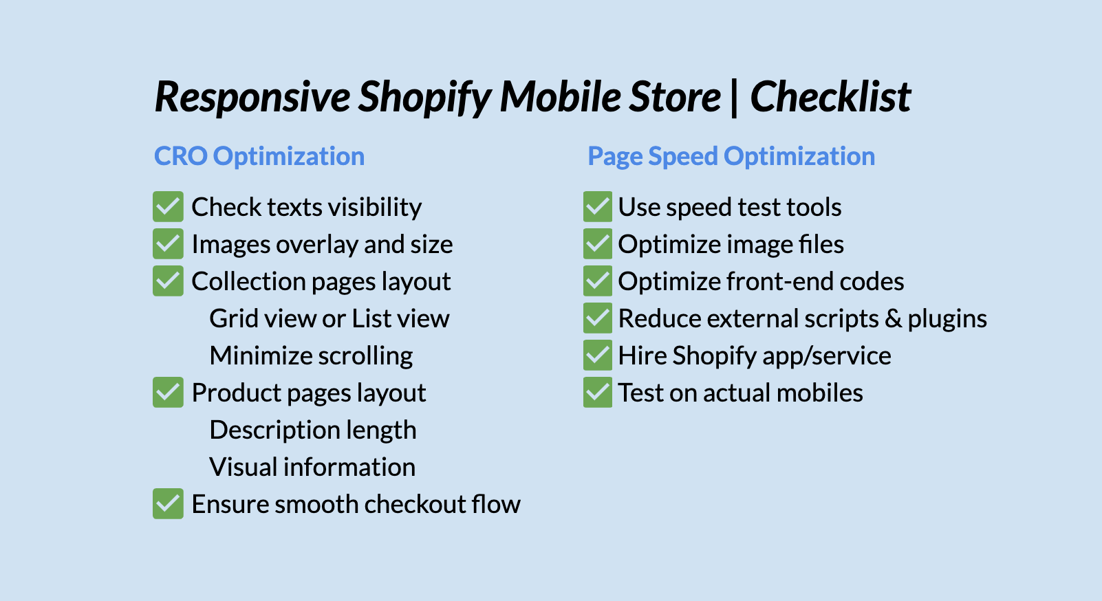
Long story short, check the list below to make sure your Shopify website mobile friendly. And here’s the closing chapter of our Guide: Make Your Store Responsive With PageFly.
