This is the first chapter in our series that aims to show you how you can make your Shopify store responsive with PageFly.
This guide will help you get acquainted with PageFly’s editor so that you can easily navigate through our myriad of functionalities and elements to build the best online storefront possible.
Let’s get started, shall we?
I. But First, What Is Responsiveness?
Just in case you are new to the eCommerce game, or if you simply aren’t that familiar with building online stores, let us walk you through the concept of “Responsive” again.
Basically, a responsive website means that it has been optimized to look good and work on all digital devices, such as desktop/laptop, mobile, and tablet devices.
You might spend days building a website that looks perfect on your laptop screen, but when you try opening it on your phone, it looks ugly and all wrong. That website is not responsive; you have to tweak some settings as well as make adjustments here and there to make the site more compatible with mobile devices.
Here at PageFly, we take that very seriously, so our app has been designed with that in mind. Continue reading to find out!
That brings us to the main attraction of the article – The basics of PageFly’s editor.
II. Editor Configurations
Before you build or edit any page, you need to first configure the editor to make sure it works the way you want. There are 2 key configurations you need to keep in mind: Page Settings and Device viewing modes.
1. Page Settings
In the editor, click on the 3-dot icon at the upper right corner to open Page Settings. You can also find the option to build the page with Templates, which are all responsive by default.
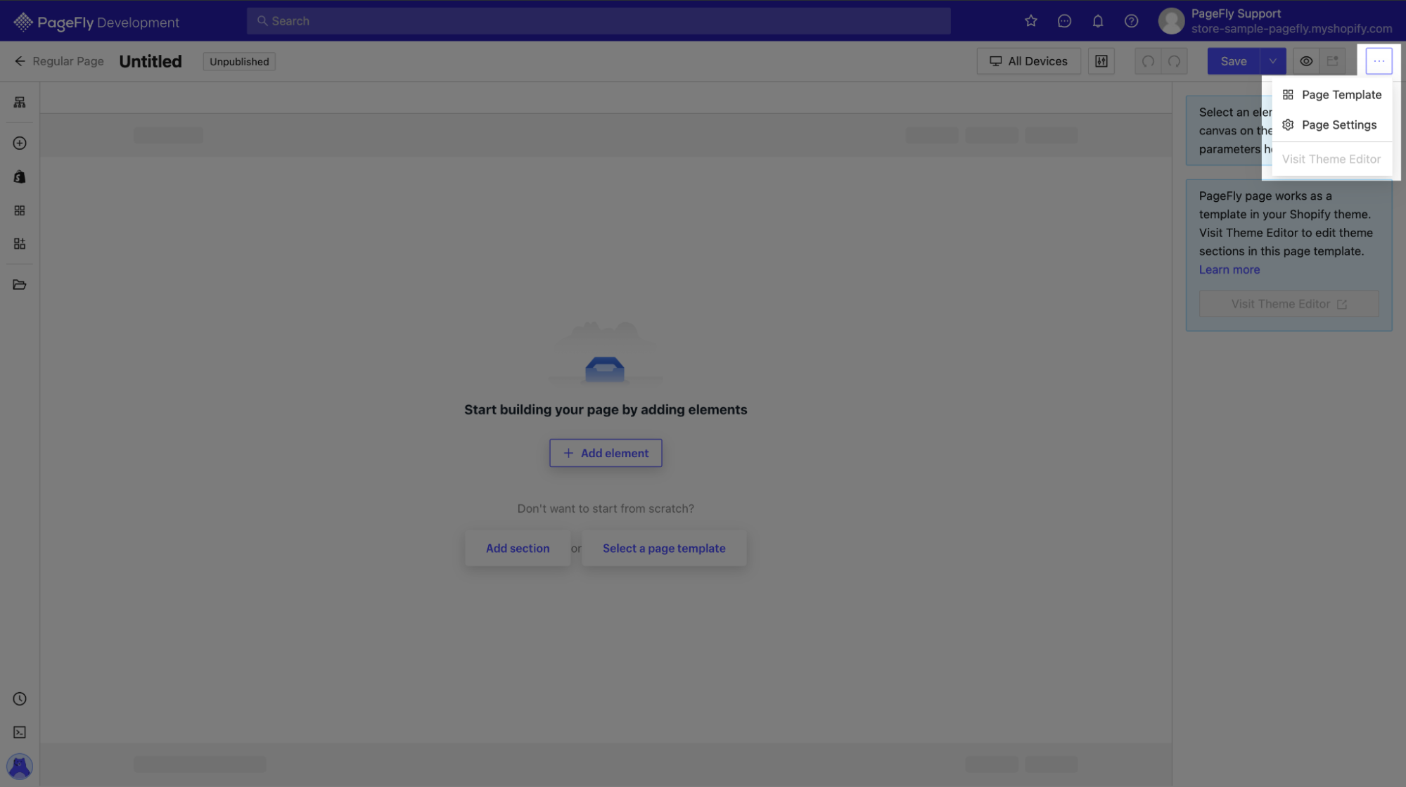
Once you open Page Settings, you can find a few simple configurations for your page:

You can change page type right here, as well as name your page and designate a URL handle. Other than that, you can disable the header and footer if you are building a landing page.
Last but not least, you can change the page’s sharing image and enable/disable lazy loading in Optimization.
2. Device Viewing Modes
This is what will decide the responsiveness of your page. You can easily change the viewing mode in the editor or each section in the Styling tab. The option to view elements on different devices is always within reach no matter where you are on the page!

Normally you should edit on “All devices”, but if you want to change and edit something specifically for one, you can choose among Laptop, Table, or Mobile.
III. Basic Controls
The overall layout of the editor consists of 3 parts:
- The left sidebar: This is where you can find all elements to put into your page
- The middle section: Your page is being edited in real-time
- The right sidebar: This is where you can configure and style elements on your page
1. The Left Sidebar
Page outline
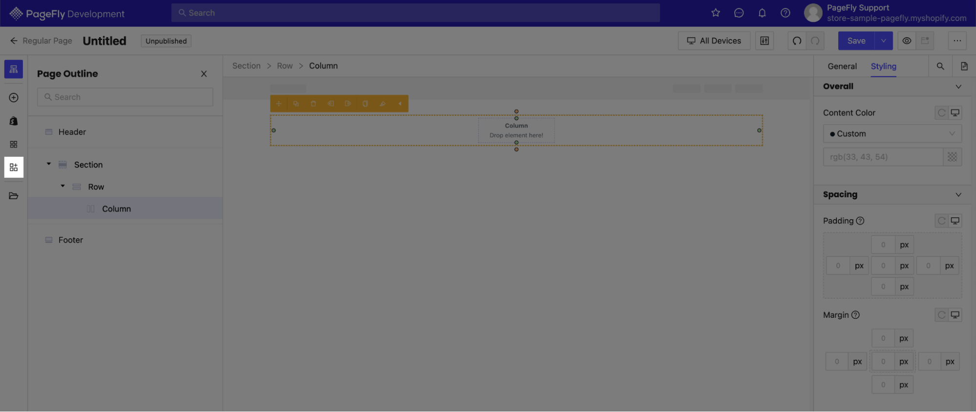
The outline helps you see the arrangement of all sections, rows, columns, and specific elements used on your page. Thanks to this feature, you can easily navigate to the element you would like to work on by clicking on the name of that element.
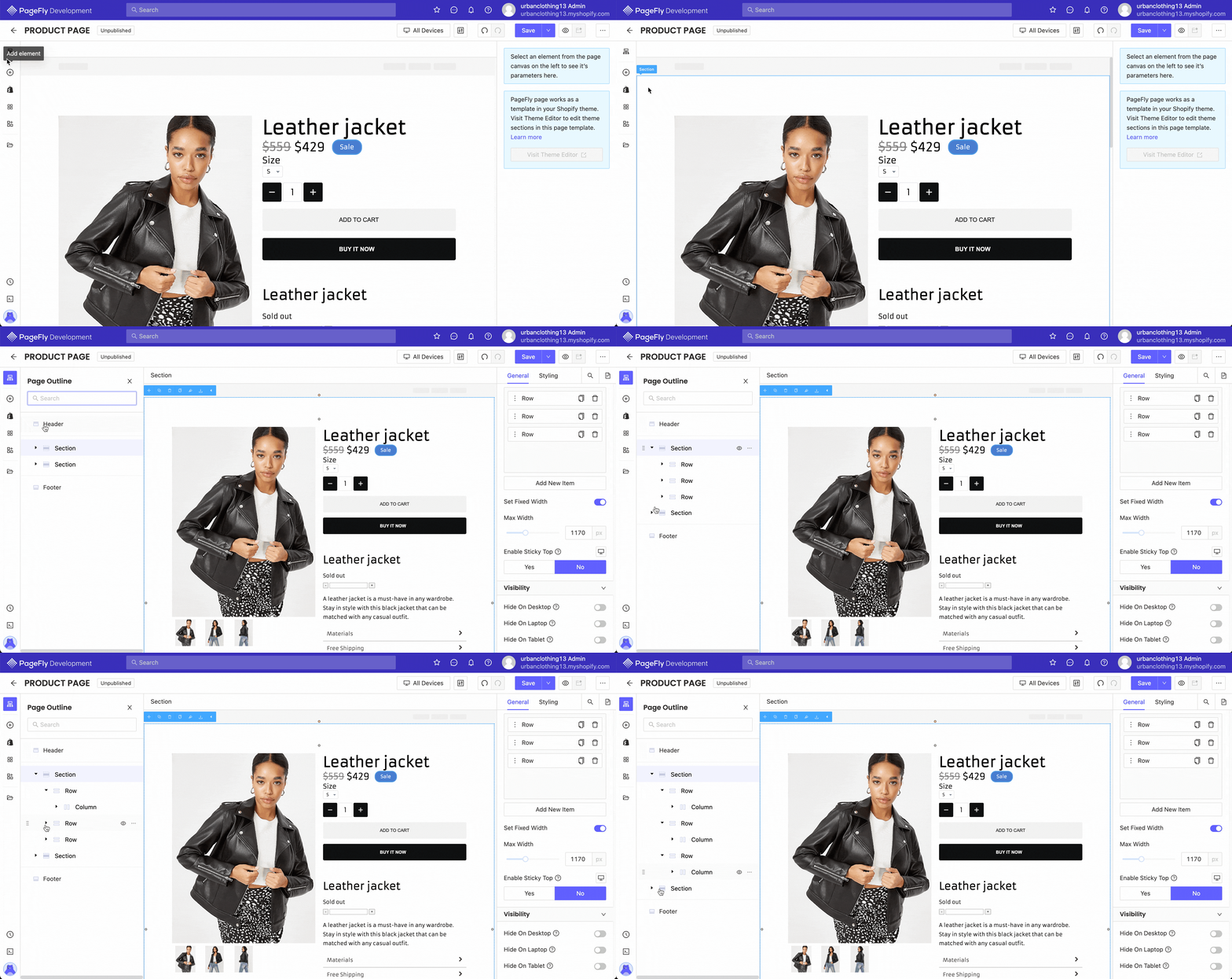
You can find more information about PageFly’s page outline in this article from our Help center.
Elements
Elements are the backbones of a page builder. You can find nested here 3 categories of drag-and-drop elements:
- Normal elements: They are common and work with typically any site on the Internet. You can expect to find containers and layouts, text elements, media, social elements, and a few advanced ones to spice up your site
- Shopify elements: Since PageFly is a Shopify app, this section is indispensable. You can find anything related to products and collections, as well as blogs and contact.
- Third-party elements: A seemingly endless array of integrated elements from our partners. They are tailored for the specific needs of a merchant, so learn about them and find out what works best for you!
- (Bonus) Extra third-party applications: You can go here and find Shopify apps that are integrated with PageFly, but have not yet developed elements that work with our editor.
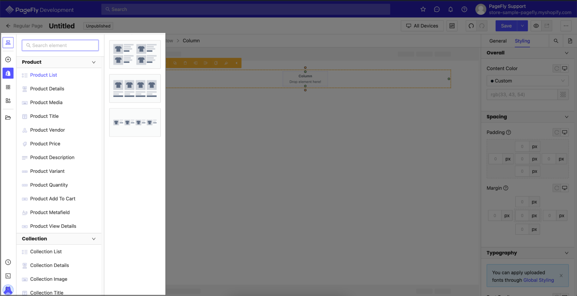
Shopify elements
Here you will find all elements that require data from Shopify to be displayed on your page. It consists of anything related to your Products, Collections, Contact and Customer forms, as well as Blog posts.
Third-party apps
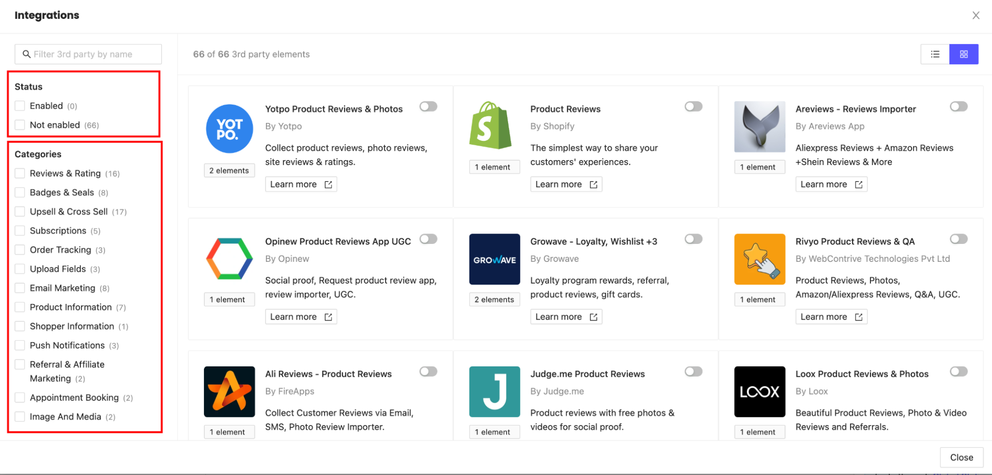
PageFly is integrated with up to 66 third-party apps as we want to provide our customers with the best of the best and freedom of choice.
To make it easier for you to pick from such a large number of options, we have put them into a variety of categories, each will serve a different purpose:
- Reviews & rating
- Badges & seals
- Upsell & Cross Sell
- Subscriptions
- Order tracking
- Upload fields
- Email marketing
- Product information
- Shopper information
- Push notifications
- Referral & Affiliate Marketing
- Appointment booking
- Image & Media
Keep in mind that some third-party apps only work on specific page types, so read the manual carefully before you use an app.
To access third-party elements, click on the fourth icon, then either click the Gear icon or Edit your 3rd party elements.
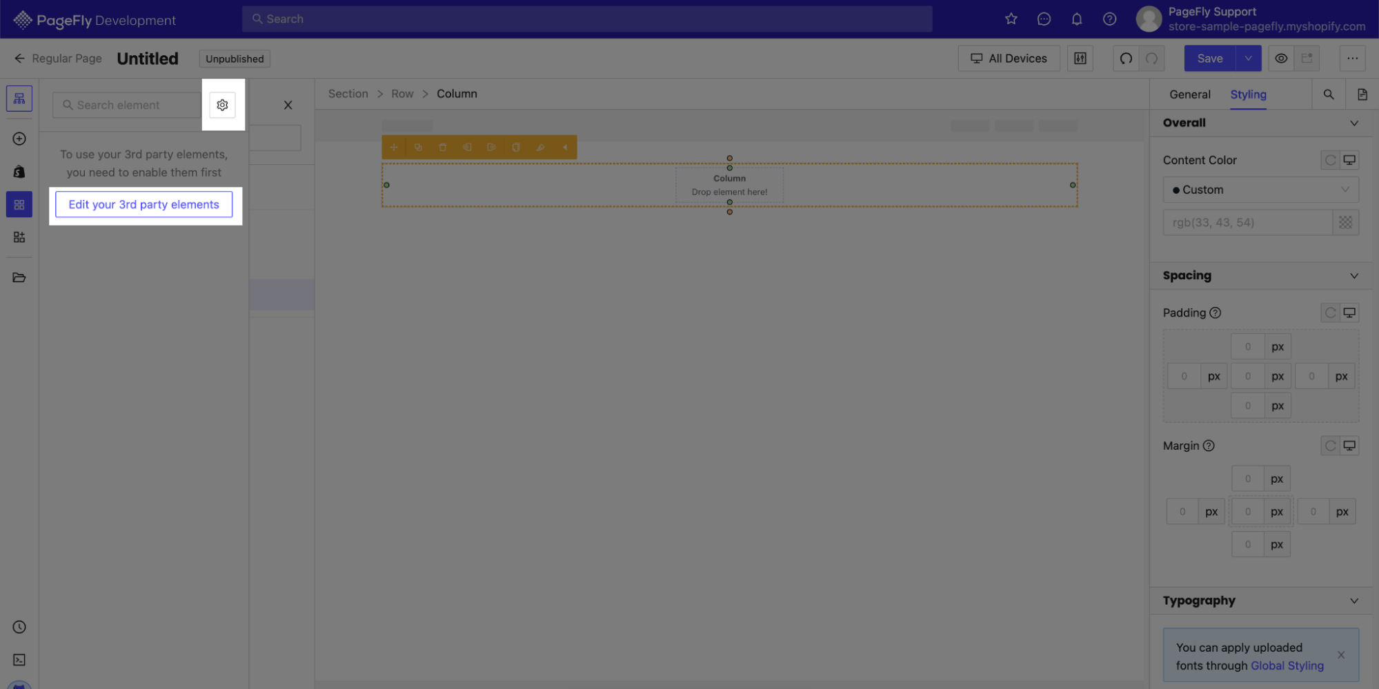
Upon accessing third-party elements, you will be redirected to an integrations menu, where you can enable or disable any app you want. You can filter the apps on the left side of the menu to easily find the ones you need for your page.
Extra third-party apps
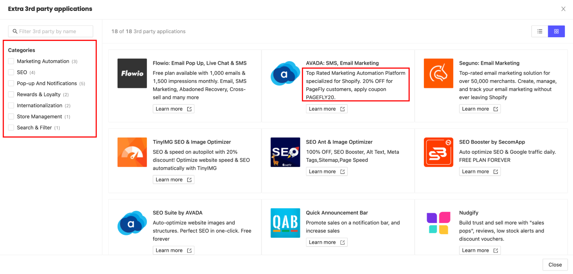
Here’s a bonus if you cannot find the third-party app you need, you can access the extra apps to find the right ones for your Shopify store.
Keep in mind that these apps haven’t had custom elements developed for the PageFly editor, but they can work directly with your default Shopify theme. Read their instructions carefully to find a way to incorporate them into your PageFly-powered page.
Better yet, since these extra apps are also PageFly’s partners, some of them come with discount codes specifically for PageFly users. Keep an eye out for them!
And again, you can filter the apps based on your needs.
2. The Middle Ground
This is where the magic happens in real-time. You can see your page as it unfolds according to your edits.
While it is not much more than a view of your page in edit mode, you can interact with it to some extent.
First of all, since PageFly is a drag-and-drop page builder app, you can drag elements from the left sidebar and drop them into the middle part to secure said elements on your page. Elements will be put into columns, rows, and sections depending on their characteristics. You can learn more about PageFly’s layout in this article.
You can also edit text directly by clicking on them in the editor. And while you can resize items by dragging their borders, we don’t recommend that since it will not give you precise measurements.
3. The Right Sidebar
The right side of the editor will let you configure and style elements on your page. There are 2 tabs for you to play around with General and Styling.
The General tab lets you configure the necessary settings, which vary depending on the specific elements. In addition, you can always change an element’s Click action, Visibility, Attributes, and Animation.

The Styling tab allows you to change how any element looks. We have divided Styling options into many subcategories so you can easily edit your page:
- Overall
- Spacing
- Typography
- Background
- Borders
- Display
- Effects
- CSS Code for custom effects
What’s more, you can edit elements in different states to make your page look more dynamic:
- Normal state
- Mouse over/Hover state
- Active/Selected state

Read more: Elements’ style settings
In a nutshell
PageFly has had more than 10 years of experience in building Shopify stores, so we have gathered quite an amount of knowledge and understanding of what makes a good website. Our app has been designed through trial and error to bring you the best experience as a merchant.
We hope that this guide has been helpful enough for you as a newcomer to get a grasp of what your next best eCommerce tool looks like. For more information, you can always visit our Blog or Help center, as well as join the Facebook Community.
Happy selling!