The homepage is arguably the most important page on any eCommerce store. It’s typically where your visitors first get an impression of what you’re offering and from where they navigate to anywhere else on the site. For this reason, it’s important that the homepage has character, including elegant design and great functionality.
Because it’s one of the most flexible pages, there’s so much you can do with a homepage, let’s take a look at what some great brands have done with their own.
Scroll down to watch the video tutorials at the end of this chapter. Click here.
Home is Where the Heart Is – What your Shopify Homepage NEEDS
As the old adage suggests, the homepage is the heart of the eCommerce site. It is the connector to all other areas and serves as centre stage for getting your brand message across and captivating visitors.
The key aspects of an awesome homepage are:
- Navigation
- Brand
- Story
Savvy eComm merchants know full well the importance of getting visitors attention, as the more time spent on the site usually indicates a higher likelihood to buy. That’s why it’s important to pack as much information in without being too long-winded or confusing.
Great Additions to your Shopify Homepage
Great homepages can contain the following:
- Exquisite design: awesome photos, intuitive navigation, great colour palate, modern, etc.
- Clear branding: Let the people know exactly who you are and what you do in your own unique way. Keep it consistent to promote recognition.
- A pop-up offer: pop-ups are great on homepages, they are the best way to make an impression on a visitor by offering them value.
- Video or other interactive content: in this day and age, most content is consumed through video. Having a branded video with great production value that clearly demonstrates your USP and benefits/solutions to the customer will go a long way in influencing their decision.
- All the CTA’s: seriously, you should have a CTA in (almost) every section of your homepage.
- Contact info and Social: Encourage your visitors to get in touch and also reassure them that you stay connected and accessible to your valued customers.
- Opt-in: always give your visitors the chance to subscribe. Having a solid list of MQL’s that have voluntarily submitted their email address is a powerful tool to any marketer.
The first section of the homepage should always have a great image, strong heading, a killer value prop and a CTA. The rest is open for serious creativity, so without further ado, let’s check out some tasty homepages to get you inspired.
Let’s Drive the Point Home..
You can have a look at PageFly demo store for some ideas and inspirations, or check out some of these breath-taking homepages that make great use of different components in a way that motivates the visitor to explore the site further and engage with the content on the page.
Greetabl
I have mentioned Greetabl in several of my articles because it’s just so…. A -greeabl. Ok, that was an awful attempt at a joke but seriously check out this homepage.

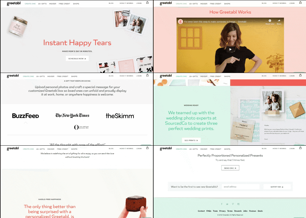
These guys are always on top of the next major holiday marketing-wise. It makes sense, because their products are personalized gift boxes (i.e. the box itself constitutes the card) with different gifts inside.
The first section has the Mother’s Day theme with a clear value prop (“Make mom’s day in minutes”) and a CTA.
They follow this up with a wicked video that I have personally viewed several times. Next are some logos from very recognizable publications that have featured them, and finished off with several sections that contain fantastic imagery, headings loaded with brand-appropriate personality and – you guessed it – ALL the CTAs.
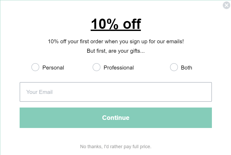
They also have a great pop-up:

This is a great incentive for visitors to opt-in because they’re given a discount. It’s a classic technique for obvious reasons.. It works!
Hebe Boutique
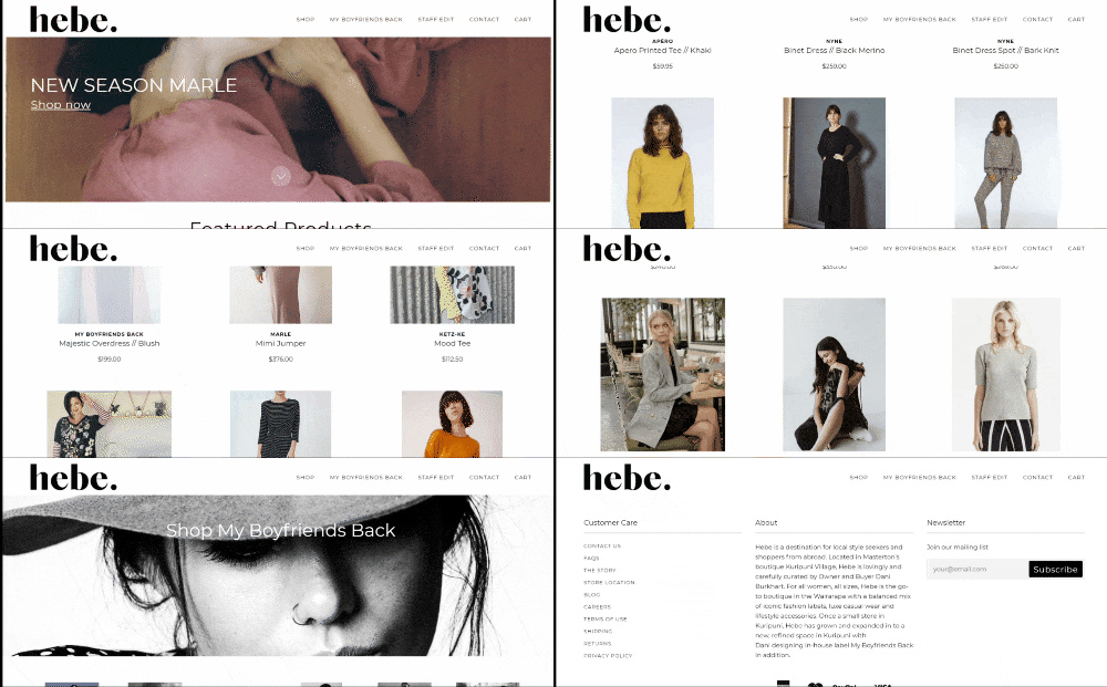
I chose this page not because it’s perfect technically or strategically, because there are definitely some things they could do better. I chose hebe because they dive right into what matters: their products.
They’ve evidently made a conscious choice not to consume the visitors time with cliche copy and instead the first section has a simple CTA and an arrow pointing down to their featured products.

They’ve included great photography throughout, and the footer contains support links, about us and an opt-in.
As I mentioned, there are some easy improvements they could make like a stronger value proposition, more engaging content and more brand identity, but seen as hebe started as a small retail outlet in a village in New Zealand, I don’t expect them to be eCommerce experts just yet and I’ll look forward to see what the brand does to improve going forward.
Harry’s
If you’ve read some of the other articles in this series, you’re probably well-acquainted with Harry’s by now. I keep including them because I want to drive the point home that simplicity is often the most effective because it’s so easy to become familiar with the design.
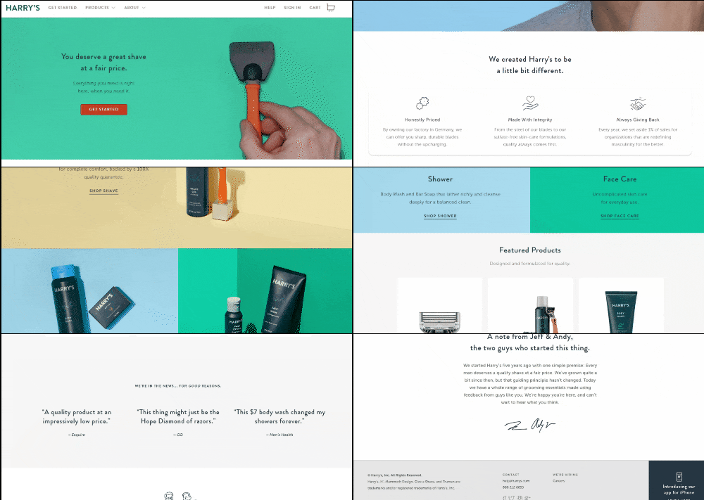
If you look at any page on Harry’s site once, then were shown another page from the site with all the brand names blurred out, you would very likely be able to identify it as Harry’s because of how easy it is to recognize.

The lads at Harry’s maintain this philosophy on their homepage. They emphasize simple, modern design that helps the products stand out. They’re also big on trust building and social initiatives. They’ve included notable mentions from well-known publications and a note from our friends Jeff and Andy, the founders of the company.
Make yourself at Home
It’s time to build your own. The main purpose of the homepage is to get customers excited and make a strong first impression. Definitely give it some thought as to how you wish to represent your brand, but don’t be afraid to pack in features to test what works.
PageFly comes loaded with conversion-increasing features that complement any homepage. There are also a ton of templates to help get you started.
Check out our video tutorial to get more familiar with how to use these great features to build your own homepage in no time.
[Video] Building Your Shopify Home Page
PageFly elements used in this video:
Learn more: