Sadly, it can also fall into the “afterthought” category where merchants don’t pay attention to the opportunity the Shopify contact us page presents. After all, the page name itself is a call-to-action, so use it wisely!
High quality Shopify sites will make sure that they’re available through several channels to promote trust and put their customers minds at ease:
- Traditional Telephone
- Instant Chat
- Social Media
- Regional Locations (if different)
The contact page is a great place to include links to your About us and possibly even career pages as well.
Scroll down to watch the video tutorials at the end of this chapter. Click here.
The Alpha and Omega of Shopify Contact Us Pages….. Shopify Itself!
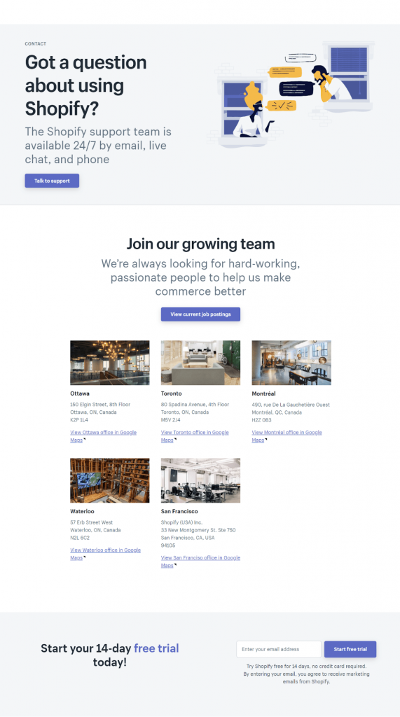
So first we may as well take a look at the original Shopify Contact Us page. The platform itself has a fairly minimal but recognizable design, which shows you don’t have to do anything unnecessary to get the point across.
Of course, Shopify has a reputation for its extensive support network and ready-access to live contact channels. These are what really matters, cause if you claim to be accessible, you better be able to back it up or risk losing all faith from visitors that reach out to you. Let’s take a look:

They’ve clearly summarized the contact channel with a button to access them, then they move onto a job opportunities section – a clever place to put this as they likely were receiving a lot of inquiries about how to apply.
They’ve included all contact info and addresses for their offices, and finally, in class Shopify fashion, a free trial CTA at the bottom. This CTA could easily be replicated on your own Shopify Contact Us page.
Shopify Contact Us Page Tips
Shopify eCommerce contact us pages should:
- “[Be] easy to find so a visitor can quickly get in touch should they need it.
- Explain why someone should contact them, and describe how they can help solve their visitors’ problems.
- Include an email and phone number so visitors can quickly find the right information.
- Include a short form using fields that’ll help the business understand who’s contacting them.
- Include a call-to-action to provide visitors with another option if they choose not to complete the form.
- Showcase the company’s thought leadership, whether that’s by including a list of recent blog posts or articles about the company in the press.
- Link to active social media accounts like Twitter, Facebook, Instagram and LinkedIn to give visitors a way to engage with the business.
- Redirect to a thank you page that explains when and how you’ll be contacting them and links to helpful content and resources.
- Are creative and memorable so visitors associate contacting your brand with a positive or funny memory.
- Show off what your brand does so visitors and potential customers can get a sense of the work you do before they even get in touch.
- Avoid unnecessary fields and words so your page remains as straightforward and simple as possible — no fluff!”
[source: Kolowich, 2018]
Examples of Great Shopify Contact Us Pages
ēdn
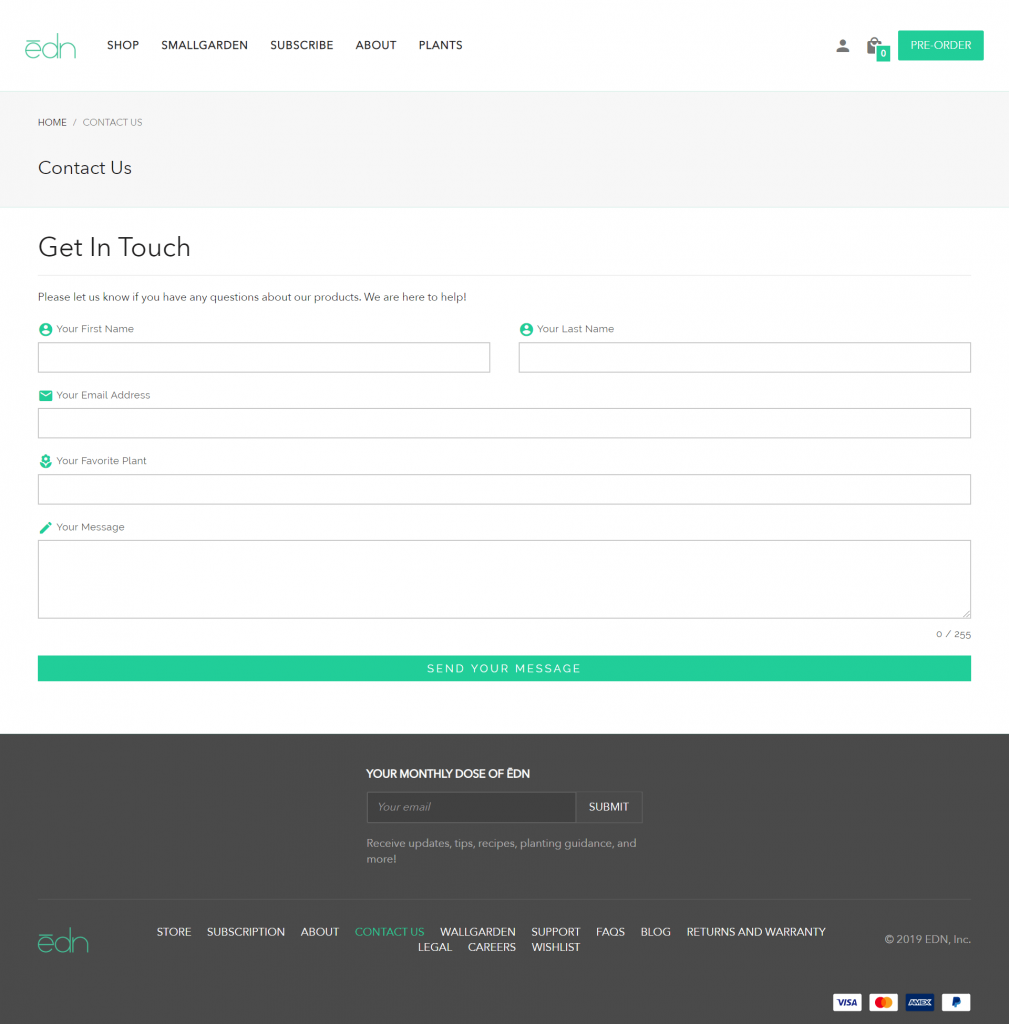
This Shopify store sells high-tech, design-centric indoor gardens. The thing is, they’re only available through pre-order right now, so I chose this contact us page ‘cause I’m sure it’s getting used A TON by prospective customers.

They’ve kept things simple for sure. They just included a contact form for users to fill out and reach out to them. It might seem like not enough, but I believe it’s strategic.
Number 1, they’ve included a “your favourite plant” field which really relates to their brand and kind of puts you at ease as though they’re really showing an interest in you as a person.
Number 2, at this stage in their business (pre-order only), they absolutely want to avoid being inundated through other channels while they focus on manufacturing the product to ship out. This form allows them to receive inquiries from one place while still building a lead list and engaging with consumers.
Death Wish Coffee
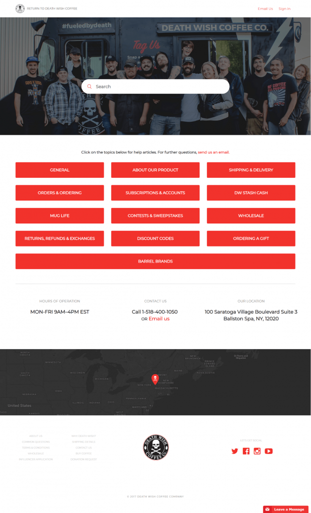
Here’s an old favourite from our Shopify FAQ page list. I love the bold personality and strong branding that this Shopify brand brings to the table. Though they lack an instant contact channel at this time, they’ve included their email, telephone, address, hours of operations and loads of access to need-to-know information.
Each one of these buttons connects to all the necessary info a visitor might need, encouraging them to seek the information themselves before contacting the company, but still letting them know they can be reached.

Let’s Build our own Shopify Contact Us Page
So it’s time to crack open PageFly (Install it if you haven’t already!) and start building your own page.
For the tutorial video accompanying this article we will be in the presence of greatness – recreating Shopify’s Contact page itself!
Good luck and enjoy!
[Video] Building Your Shopify Contact Us Page
Part 1
PageFly elements used in this video:
Part 2
PageFly elements used in this video:
Part 3
Learn more: