
Ecommerce checkout page is where conversion rate rises and falls.
Among 100 customers adding products to their carts online, only 25 make purchases for real.
This means there are 75 customers that want to buy your products but give up before or at the final hurdle.
Imagine the revenue you got now is just one-fourth of what you could have had – that’s a lot of lost money, no matter how much you make. So there must be something wrong with the checkout process of your business, and we gotta fix it. Now.
ECommerce checkout process explained
First… what is the definition of an eCommerce checkout process anyway?
Whether you’re new to eCommerce or not, it’s important to remember that the eCommerce checkout experience encompasses the specific steps a consumer must take when completing an eCommerce purchase.
It is the grand finale for an eCommerce website, where the prospect finalizes choices about the product, selects any add-ons, confirms shipping options, then provides payment.
Dropping the ball during the checkout process is like a football team getting to the opposing team’s goal line, then failing to score. All of the effort it took to move that far goes unrewarded.
Usually, checkout process design varies according to the strategy in play for each eCommerce business, but the process typically comes after this flow:

Somewhere in this 6-step flow, likely during the first 5, your customers find a reason not to continue down the funnel. Your mission is to make sure their pain points are completely erased in 6 stages above, locking the sale safe and secured.
I. Checkout Abandonment Rate Statistics
First, we need to understand the trends and why online shoppers abandon their carts. The web is stacked with lots of distractions, so it’s necessary to define the problems first before jumping to conclusions.
This can be an “It’s not you, it’s me” moment for you and your customers, but sadly, it’s mostly you, or more specifically, your website. The eCommerce checkout flow chart below based on Statista’s 2018 research explains the situation fairly crystal clear.
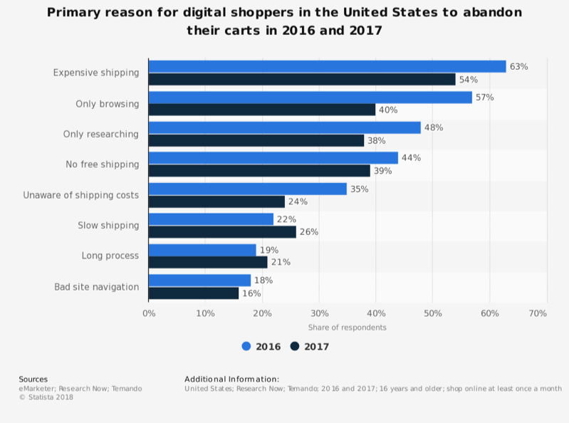
Within 10 main reasons, we categorize them into 2 types, your blame, and their blame. In each, we got:
- Your (website’s) blame: high shipping cost (54%), no free shipping (39%), unaware of shipping costs (24%), slow shipping (26%), long process (21%) and bad site navigation (16%).
- Their blame: not intend to purchase (40%) and only for research (38%).
Notice some common themes here? Now we know the faces of the problems with a winner here (I’m not rooting for you in this one). With 8 checkout issues to tackle, we got a lot of work to do. Let’s started!
Read about abandoned carts here.
II. Tips to Optimize eCommerce Checkout Flow
2.1. Quick checkout ideas with examples
2.1.1. Simplify and shorten
According to Statista data above, 21% of online shoppers drop out because of the lengthy undertaking, which is understandable – not everyone has the patience for a long eCommerce checkout process. Unless your product is wholly unique, they will find an alternative.
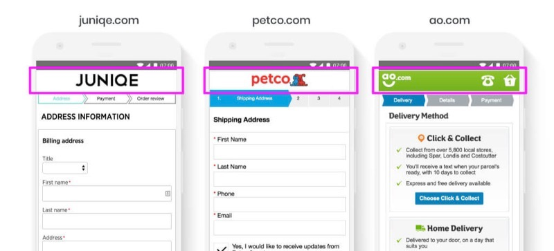
The answer is, KISS – keep it simple, stupid. Apply an “enclosed eCommerce checkout process”, which removes unnecessary distractions like menu and navigations.
With the main navigation removed, the checkout process will be even more focused to encourage purchases to customers. However an enclosed checkout process does not mean a locked checkout process, you should not revoke all means to exit (minus closing the browser) from your customers, which will only lead to confusion and frustration.
Instead, within your eCommerce checkout page, only allow users to go to homepage, back to cart, or contact support. No navigation menu is needed, but these essential gateways will make users feel comfortable enough to proceed with their checkout.
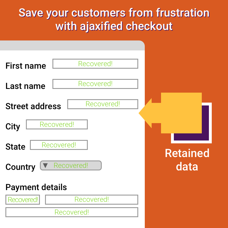
Another awesome-to-have key is Ajaxified checkout. This means customers don’t need to navigate from one web form to another and everything is saved immediately within the session.
Don’t you hate it when you have to refill the checkout form over and over again just because you changed your mind on the shipping address?
With Ajaxified checkout, data submitted is retained right away, which elevates the burden to re-type when customers go to previous step during checkout process. Especially, if the payment fails, customers don’t need to start from scratch because everything will be placed as before and they just simply pay again.
If any error occurs, it will show at the same place. Bonus: Ajaxified checkout process reduces page load time and improves page speed which vastly helps in online shopping on mobile devices.
Also, if the information you require is personal (ex. phone number), justify why you need it. Shoppers aren’t mind readers. Sometimes asking them for private information can raise alarm bells in their heads.
“What does a phone number have to do with buying these clothes?” The easiest way to overcome such issues is to display small messaging explaining exactly why you require that information.
You just need to be transparent with your messaging if you want to drive the sale home. No trickery.
To make your store GDPR compliant, tell them where their data goes, what data you collect and why you collect it.
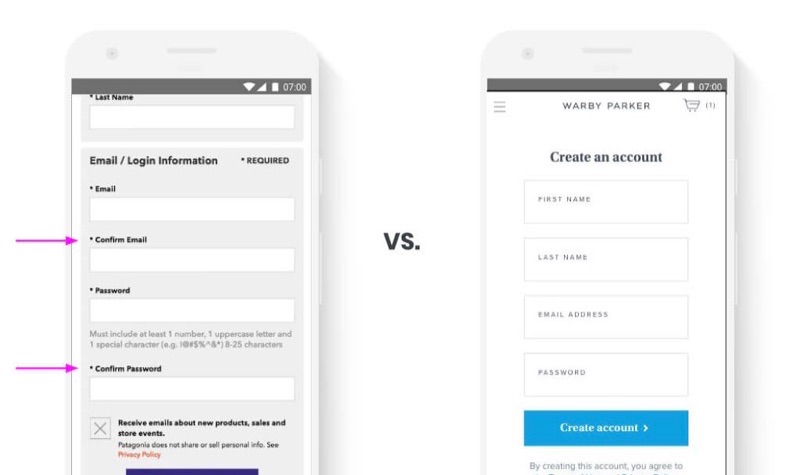
Additionally, one of the form fields that should be left out of the checkout process, yet many businesses still include it in theirs until this day is the Confirm account info field. It’s not hard to see a “Confirm email” or “Confirm password” form field on many stores’ checkout page, yet its necessity is becoming more and more questionable.
If you require your visitors to provide authentic email addresses in exchange for an account, consider email validation instead. Otherwise, you should no longer make users confirm account info when they have already typed in quite a lot.
2.1.2. Try one-page checkout design
There’s an on-going debate about one-page checkout design versus multi-page checkout, so we may leave this suggestion up to your decision. Most retailers, however, stick to a multi-page checkout process and never even try to experiment with a single-page alternative. But we highly encourage you to test it out, you never know what you can find.

Couture Candy applies a one-page checkout nicely.
Based on research, these 2 solutions fit different business. For example, a furniture retailer with a high AOV (above $2,000) where a multi-page checkout converted 38% higher than a single-page eCommerce checkout process. At the same time, Elastic Path’s A/B test case study from 2010 found that a single-page checkout for the 2010 Vancouver Olympic Store converted at 21.8% higher than a similar multi-page checkout.
However, if applied correctly, a single-page checkout process offers several benefits:
- They appear shorter and give customers an incentive to complete the transaction.
- They have all the fields on the same page, avoiding unnecessary complications from users.
- They require fewer clicks. Behavioral research shows that the fewer the number of clicks required to complete an action, the higher the conversion rate.
- Since there are fewer clicks required, customers have less of an incentive to skip off to another tab or do comparison shopping.
- Single-page checkouts work particularly well if your average order value is low or if you’re selling impulse purchases.
2.1.3. Offer social log-in
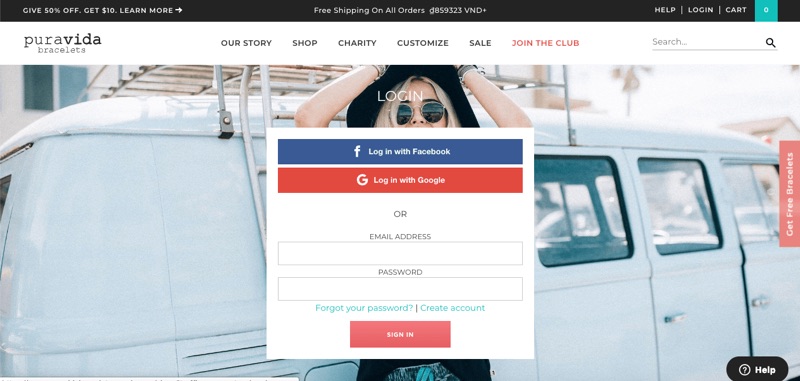
Many customers abandon their cart because it requires them to sign up for an account, which takes up their time and eventually bombards the customer with newsletter and countless promotions. Imagine shopping at 10 different brands and you must sign up 10 times – that’s crazy. Giving an option for social login is much more convenient cause they don’t have to sign up all over again, plus they are more likely to come back to you because it quickly connects with their Google account.
2.1.4. Let them use a guest checkout system!
Sometimes, customers just want to grab something real quick, pay for it, and leave. And that’s alright. It’s your job to make this quick task as seamless as possible for them.
Number one rule is, don’t ask for too much information. If the customer is buying a shirt, why do you need to know their company, or even phone number? People abandon their cart because they are asked for information a lot.
Guest checkout pages allow customers to enter as least information as fast as possible and head straight to checkout, which secures their excitement for purchase.
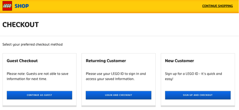
A classic approach to show two (or three) options in columns after customers hit checkout. Logo offer their customers the option to log in (returning customer), create an account (new customer), or checkout as a guest.
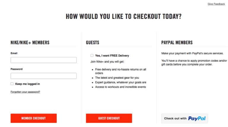
Nike also adopt the same practice but with a slight alteration: They include the benefits of the Nike+ account to customers before checkout, while still allowing for guest checkout.
Even Paypal suggests you should allow people to pay without registering first.
2.1.5. Use smart form
Here comes the cart devil – form. So many people hate form and even the way it operates. While long forms increase complexity and confuse customers, inconvenient (or bad UX) forms annoy them in a more unspeakable way.
You should make form faster and easier for shoppers, while ensuring that the information is correct. A great option is to use address predictor tools, which suggest matching addresses as shoppers type. It applies data validation and autocomplete to speed up the checkout process and reduce input errors. An efficient and popular tool is Google Autofill.
The implementation is very easy and it’s supported by the biggest mobile and desktop browser around – Chrome. It’s one of the best eCommerce checkout page optimizations you can make to boost conversions.
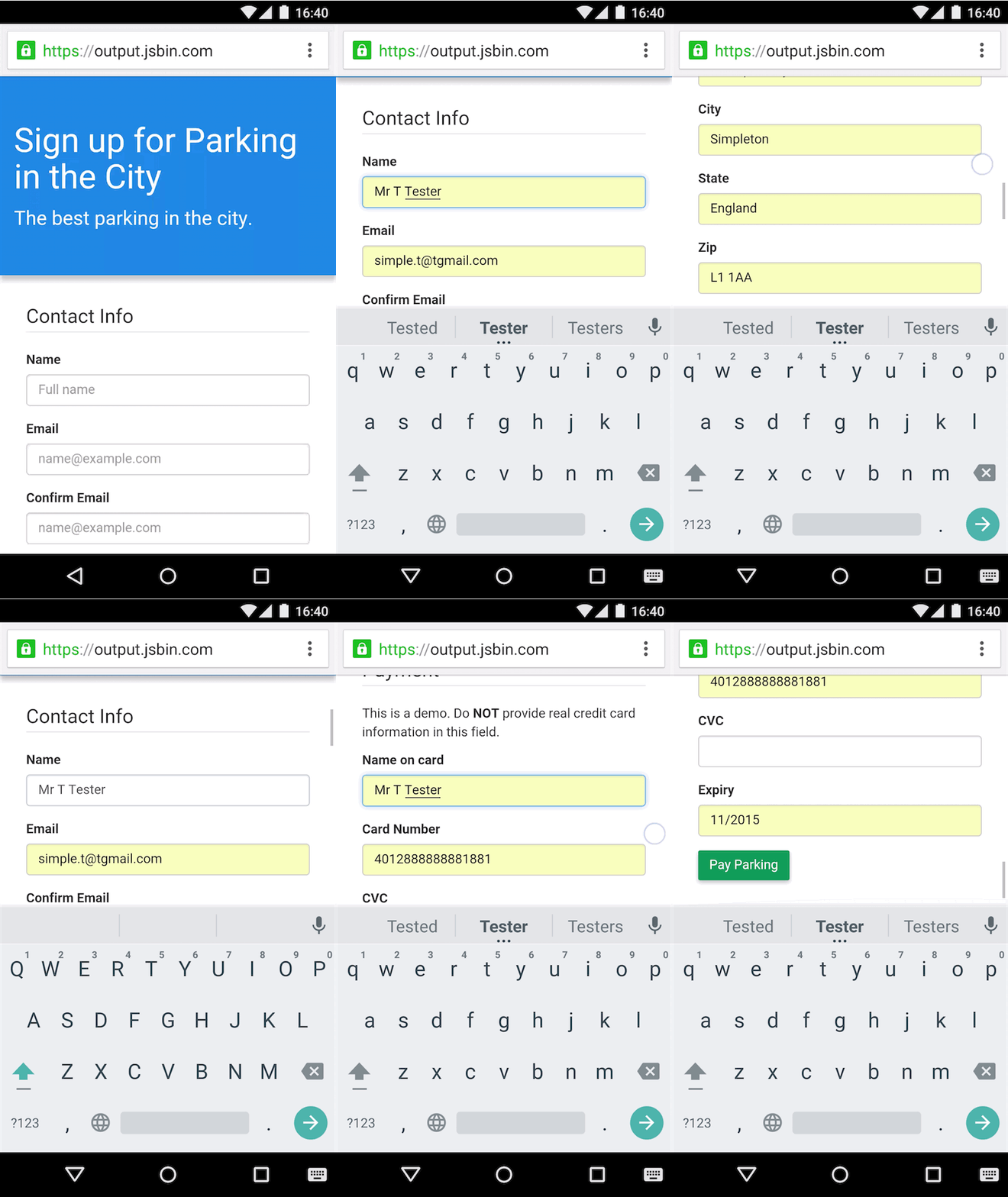
Another challenge for form builder is error typing. Don’t you hate it when you spend ages filling out a form on a website and press submit, and then are told that there are errors you need to fix?
Even worse, you must go track down each form field to see where you messed up. This frustration can easily break a sale, so show proper and clear error indications to users which helps them identify and correct the error quickly.
You scroll the screen at the place where the error has occurred, so no matter which device your customers are using for online shopping, they can quickly find the error. A guiding error message will help them find the cause of the error and resolve it with ease. Lesson: Let them know where they went wrong and how they can fix it as quickly as possible.

But worst-case scenario, what if you must re-submit the form to fix errors, and then nothing else was saved even the correct information? Nightmare. Be a savior by auto-saving form details in case the page reloads again. It unloads a ton of frustration from the customers. It’s a small trick but could save a sale.
2.1.6. Mind the details
Besides form functions and error indicators, another factor that you should pay close attention to is micro-copy.
Though small it may seem, it can influence customers subconsciously. Usually, in the checkout process, we use micro-copy to make sure users take the next step, or complete a specific action. At checkout for digital products, make it expressly clear how the customer can download their order.
If they need special software to open it, show them how to download it. And in the future, if they need to download it again, provide them with instructions on how to do so. Don’t assume everyone knows where and how to get Adobe Reader. You can compel more shoppers to buy if they have some help with installation and setup. This is particularly advantageous for computers and other technical equipment and incredibly valuable to first-time customers.
Micro-copy plays an important role when errors happen. Though it’s likely that they happened not because of you, which makes it a typical “It’s not you, it’s me” moment and be extra-sensitive here. We’ve all heard that before and there’s a good reason why. Sometimes it’s comforting to know that something wasn’t your fault (even though it might have been).
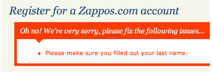
The best way to keep shoppers engaged and happy when errors occur is to take the rap yourself and be polite about it. Divert the blame away from them and be sorry about it. Check out how Zappos does a great job at it.
Do you offer package tracking? Feel free to make it visible that you do somewhere along the checkout process.
2.1.7. Allow one-click-buying
Amazon’s “1-click” order button is a game-changer that helped to alleviate cart abandonment rates. Since the customer’s payment and shipping information is already stored on Amazon’s servers, it creates a checkout process that is virtually frictionless.
With this invention, the future of e-Commerce lights the way to optimized mobile shopping.
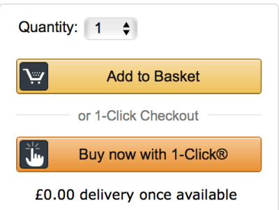
Following one-click checkout, more and more companies are using creativity and produce “two-click checkout” or “swipe-checkout”. If you haven’t tried it yet, do it as soon as you can.
2.2. Progress indicator
Progress indicators do a great job in telling customers which stage they are at in the checkout process, and how much there is to do to complete a purchase. It’s a useful visual reminder for customers and helps to reassure them that the process won’t take long, or perhaps that they’ll have a chance to review the order before confirmation.
Customers want simplicity and convenience, so giving them a clearly marked, direct route to the checkout is a must.

In the progress indicator, make the next steps clear. The entire process should be absolutely simple to grasp and easy to perform (we can’t stress that principle enough).
Ensure that your checkout process is completely linear, meaning having no repeated steps. The most common violation of many stores is to require new customers to register an account before proceeding with their checkout, and then sends them back to the initial checkout page once they are done.
This is annoying and time-consuming and can send customers away.
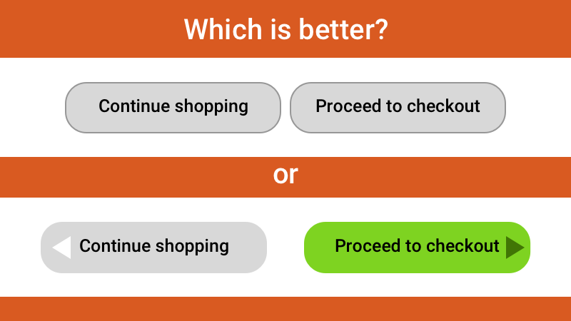
Finally, use color differentiation to make the “Next Step” buttons stand out. Differentiate checkout and continue shopping button colors. If you have these two buttons side by side, consider changing the color of one of them to make it visually separate from the others and lessen the chance that the user will click the wrong one.
Add plenty of space in between them so there’s no mistaking where the user clicked.
2.3. Smart exits
In this part, we refer to smart exits as any signals, pop-ups or any factor in the last checkout step that can boost the sale’s value if done wisely.
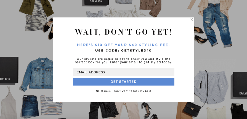
The first is exit intent pop-ups, which is among the most popular and efficient shopping cart abandonment solutions nowadays. This tactic uses exit-intent technology, which examines online visitors’ mouse movements and detects when they are about to leave the website before making a purchase.
Commonly, exit-intent popups will present an irresistible (and relevant) offer to visitors which convinces them that by leaving they either 1) miss a one-in-a-lifetime deal or 2) skip over some interesting incentives that all the other customers are getting. Free shipping, discount code for a specific product category, limited-time sales, … those are all tempting popup that can convince your visitors to stay.
Sometimes, all it takes to convert abandoning visitors into lifelong customers is a little push, and cart recovery emails to convert abandoning visitors can be extremely effective.
Omnisend discloses that sending 3 abandoned cart emails results in 69% more orders than a single email. A successful shopping cart recovery email taps the customer when the lead is still “warm”. Typically these emails are sent 1-3 hours after the abandonment (longer for purchases that demand more research) when your brand and your product are still fresh in the visitor’s mind.
It’s also a good idea to reserve the item in the customer’s cart – you don’t want to drive back the customer only to run out of stock. You can apply FOMO effects here to urge the customer, such as reminding that you have only 2-3 items left in stock, or limited free shipping is available). A typical shopping cart recovery email looks something like this:
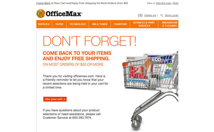
As you can see, this is simply a reminder that the customer has some items in his/her shopping cart. To increase chances of conversion, the email also emphasizes the free shipping for orders above $50.
Thirdly, you can give away complimentary samples with each order. Depending on what you sell, this could become a serious factor in getting repeat orders. It works particularly well when bundling, such as including free sampler perfumes with a clothing order, or in the case of the Freeman Beauty sites, a sample travel beauty product with each item added to the cart.
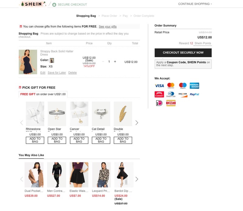
SheIn is a master in smart exits, using holiday free gifts and appealing cross-sells.
If the sample doesn’t speak your soul, consider a loyalty program. Award customers with points in exchange for reviews, purchases, ratings or other actions that can help contribute to your website. These points could be redeemed in exchange for samples, a coupon toward a future visit, or other rewards.
Another way that leads to repeated purchases is by showing them smart cross-sell products with limited time and quantity to add urgency. Or, you can cross-sell with gift cards. The option to add a gift card to their cart or get $X off their purchase when they add a card can increase your total sales per customer considerably with no extra effort on your part, even if the cards are delivered digitally.
It’s worth noting that don’t be too salesy every step of the way, or the customer will walk away. GoDaddy is a perfect example of this practice. They try to increase the sale during every step of the checkout process. Their process has been called “tedious at best”.
2.4. Clear policies
People hate hidden shopping costs, with 28% people abandon carts for the reason. Thus, make sure to include links to your privacy policy, shipping details, FAQ and returns policy within easy reach of the checkout screen.
You may also want to consider live chat support on the checkout page in case the customer has any pre-sales questions before placing their order. If you can’t provide live chat there, try including order number and contact info for any questions to let customers know how they can reach you by phone and email. Having email and phone contact details on key pages can make a world of difference and prevent carts from being abandoned due to unanswered questions.
2.4.1. Free shipping is a must
With 54% of cart abandoners claim that expensive shipping is the main culprit, free shipping is an absolute must in today’s market!
Think you can’t offer free shipping? Keep in mind that this is often a psychological game. $5 shipping can change a lot in the psychology of buying. It’s a small amount, but it is a barrier that turns people away. A study by Forrester found that 61% of customers prefer stores with free shipping, so the ideal solution is to offer free delivery to everything and price the delivery cost into your products instead.
According to Dr. David Bell from Wharton Business School, a free shipping offer worth $6.99 seems more appealing to a customer than a $10 discount on the same product – with 60% online shoppers agreed.
Or, offer free shipping when the customer spends $X. You can set a dollar amount needed to reach the free shipping threshold, but the fewer requirements you set, the more likely people are to increase their maximum order volume and come back to purchase again.
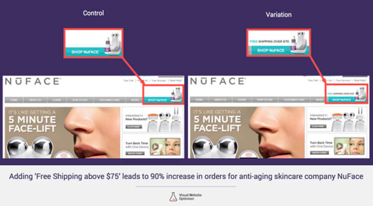
Adding ‘free shipping’ above $75 leads to 90% increase in orders for NuFace.
If free shipping comes with a higher cost, let customers decide how quickly they want to receive their order. Include an approximate shipping date in exchange for their zip code when the item leaves the warehouse or an arrival date when they can expect to receive it.
2.4.2. Hassle-free returns
Most customers will read the return policy before buying. As they are paying for you, their defense is up high and they want to know if their purchases are guaranteed or covered by some sort of warranty.
Don’t over-promise here, but definitely make it as painless and easy as possible for customers to return products (within reason). Countless studies have shown that the longer the guarantee/return policy is, the less the likelihood of returns or refund requests. And, while not appropriate for every business, it has certainly earned them a loyal following.
So why not give them the opportunity to easily review your purchase warranties, payment guarantees, and other important messages as hyperlinks at key areas of your checkout?
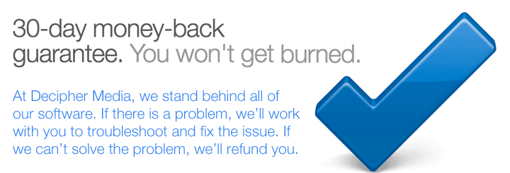
If you are selling digital products, such as the SaaS platform, a similar strategy that can be implemented is a “30-day guarantee”.
2.4.3. Saved items in cart
In a research by Magento and Bronto, the question “How frequently do you use a shopping cart to build a wish list of items to shop later?” gathered enough valuable data to wipe out any suspicion of its use.
They categorized online shoppers into 3 groups: Frequent, Occasional and Infrequent and evaluate whether the frequency of adding-to-cart feature influences their shopping behavior. Overall, its position is so positive that we should pay more attention to optimize it.
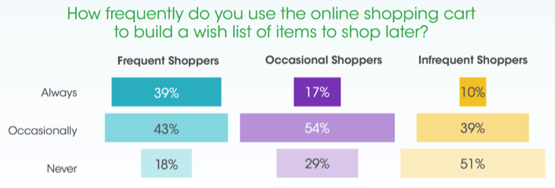
It turns out that many people use a shopping cart as a glorified wishlist, to save things for later, so let buyers save their cart or add to wishlist.
Why not give them the opportunity to do just that by letting them save their cart or optionally add products to a wishlist for a future purchase?
All you need to do is to offer a ‘Wish List’ or ‘Save for Later’ option. Send them a friendly email reminder if they are a registered user. Amazon has excellent options in their shopping process, including ‘Saved for later,’ ‘Proceed to checkout,’ and an ‘Estimate your shipping and tax option.’ Amazon gives customers options, and gently reminds them of items they were previously interested in.
Just a small note, but you should allow customers to print or email their cart contents. In the case of certain purchases, they may be buying for someone else, need their manager or boss to sign off on the purchase or some other step that forces them to stop the checkout process.
Make sure that if there has to be an interruption, you give them the tools necessary to make it as smooth as possible.
Showing pre-order availability is a must if you don’t want to lose sales. If your customer is pre-ordering an item, let them know when it’s expected to be available. Although release dates can and do change often, Amazon takes the uncertainty out of the pre-order process by offering users a credit if the price drops between the time they pre-ordered, and the day the product launches.
2.4.4. Announce the promo loud and clear
There’s nothing worse than going off-site to a coupon directory to find a code and then returning to the site in question to use it, so put the latest promo codes directly on your website. Keep those shoppers on your site longer by including the promo code right on the checkout page, along with a field to use it.
Food order website Now displays discount codes at an “impossible-to-miss” place and even saves customers’ efforts by adding a quick “Copy code” button that quickly claims the code in a snap.
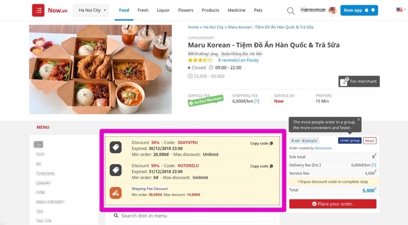
Now has made using promotion code addictive and effortless with a one-click action.
2.5. Security badges & trust seals
Who wouldn’t feel better when they see known and trusted security seals when you require someone’s credit card? Placing any sort of security imagery as close as possible towards the credit card input space is definitely a game-changer when trying to overcome the security fear some people have when shopping online.
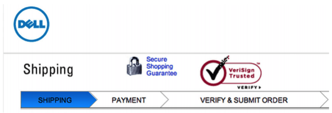
Notice how the VeriSign seal is placed right above the “Verify & Submit order” indicator? Double protection confirmed.
A study conducted by the CXL Institute to evaluate the impact of trust elements online show great insight. Among 20 popular badges, McAfee is unarguably the most loved. VeriSign, PayPal, BBB, and TRUSTe run close behind.
Blue Fountain Media conducted a split test to see how adding the Verisign trust seal would relay a sense of trust to their visitors and affect sign-ups. The original page below did not display the Verisign trust seal, while the test page did display the Verisign seal.
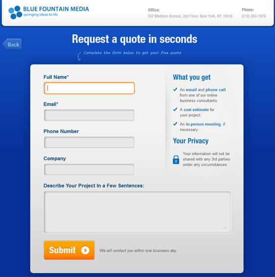
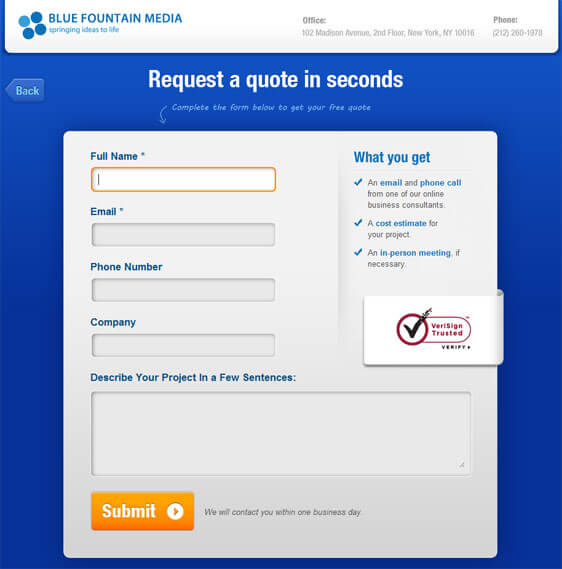
Except for the additional VeriSign, page layout, button placement and color and the data requested all stayed the same. The test page that displayed the Verisign seal resulted in a 42% increase in sales, showing that by adding the trust seal, visitors feel more confident to submit their personal information.
According to a study conducted by Synovate, 94% of shoppers are likely to complete a purchase when a Norton™ Secured Seal is displayed in checkout, while 77% of online shoppers are more familiar with the Norton™ Secured Seal than competitor seals, and 65% of online shoppers feel that the Norton™ Secured Seal is reassurance that the site would not give them a virus and is safe to browse.
If you want to stick with the familiar approach, CXL Institute confirmed that familiar brands like Visa, Mastercard, PayPal, Norton or Google were the most trust seals when paying online.

2.6. Testimonials on the eCommerce checkout page
Adding a testimonial statement to your checkout will always help layer in an extra level of comfort for a shopper. If the customer is shopping at your brand for the first time, it can be hard for them to trust you. Social proof or testimonials give buyers a reason to trust you, and when they do, the conversion happens faster. It is important that you don’t lie or falsify the information because it’s unethical.
Make sure the statement you use is related to directing the actual checkout experience or product. Speak to the desires and fears of the people that belong to your target market. You can even highlight certain parts of the testimonial and bolding or italicizing bits of relevant text to attract the eyes of customers. If possible, use pictures of the people who gave the testimonial. After all, human images are known to boost trust.
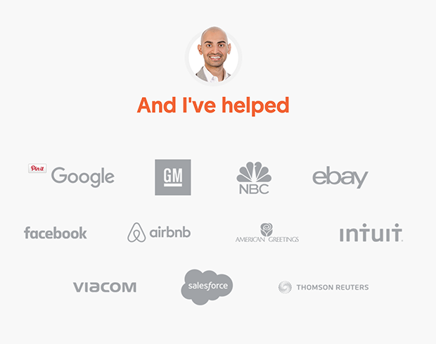
Another form of social proof that you can use is a series of “used by” logos. These logos are simplified testimonials, showing big-name clients that you might have. Customers will think ‘If it’s good enough for them, it must be good enough for me. Checkout NeilPatel’s impressive profile below and try to say that with enough budget, you wouldn’t want to hire him as your marketing consultant:
2.7. Let people review their cart
More and more e-commerce sites are showing a product summary with detailed shipping method before final checkout. The purpose is to help prevent orders from being lost due to the customer’s idea of a perceived price increase in the form of shipping/handling/tax fees.
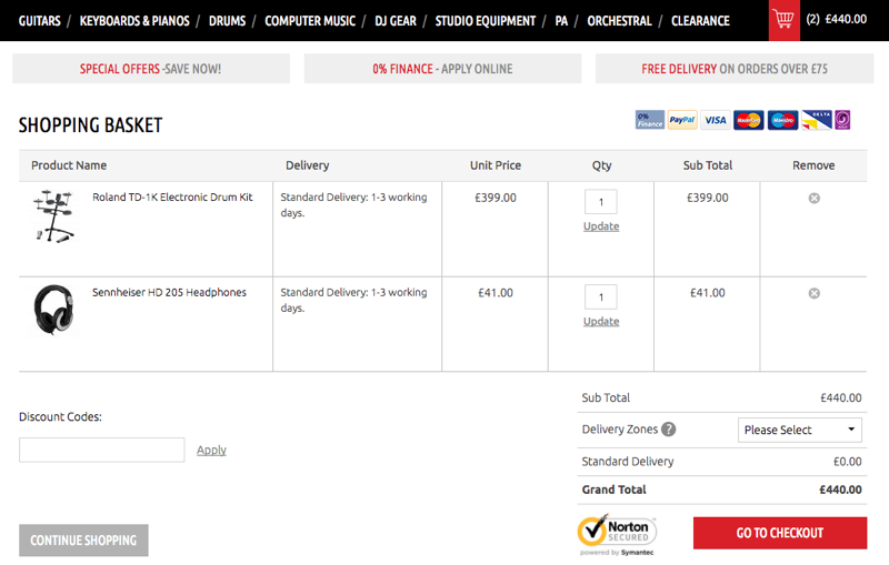
Display cart contents plainly and make it easy for shoppers to make changes to their selections. Having just a name and a number might be enough on the merchant’s end, but letting the customer know what size, color, and other customization options are available will help them ensure they’ve made the correct choice for their needs.
Let the customer update quantity, remove from cart or even change shipping method while they’re still on the checkout page. The more times they have to hit the back button (or look for the cart icon) to go where they want, the more chances they’ll simply give up and drop the process altogether. Below is a great example of a simple and clear order summary at point of purchase from Dawsons:
Plus, this is a good chance to confirm that the item is in stock or available. If an item is on backorder, allow the user to enter their email address to be notified if/when it’s back in stock.
In this step, it is a good choice to include gift wrap or message options. This tip is particularly valuable near different holiday shopping seasons, depending on what you’re selling. Any “little things” which can add a personal touch while helping the shopper save time are highly valued and remembered when shopping online.
Last, but definitely not least, keep the shopping cart open all the time.
Give shoppers a way to keep shopping during the checkout process without having to start the journey over again. If they want to add another item, let them! Just remember that when they come back to the checkout, all information added before is still available and they don’t have to refill anything.
This is also a good time to recommend related products before checkout. This excellent shopping cart practice which is sorely under-used, widely applied in the field of electronics, where shoppers want to be absolutely sure they have everything they need to get the most out of their purchase. No one wants to find out too late that the item didn’t come with an adapter (or that one wasn’t recommended in the first place).
Finally, follow up with a confirmation email to finalize the transaction. Let them print the order or send a copy to a different account easily if they want to.
2.8. Extra tip for brick-and-mortar
If you are running a brick and mortar store besides your eCommerce business, don’t wait until the holiday seasons to innovate your checkout process. Just because people have more time to swing in your store doesn’t mean that you can take all the time in the world.
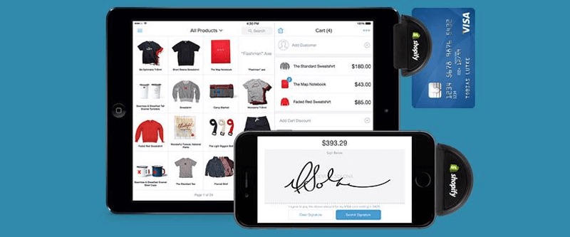
The first innovation is to apply mobile POS systems with integrated payments. Shopify recently released a tool called Point of Sale which available for iPhone, iPad and Android devices, to help merchants synchronize their offline business with online numbers.
This can be extremely beneficial because it allows you to run your business from your little handy devices, so you can get out from behind the counter and bring the checkout to your customers, wherever they happen to be.
Medisave applied Vend and PayPal POS to their store and armed their people with iPads, card reader and printer belts, and since then they successfully converted to an internet-based medical supplies company with “walking POS people” to keep the hectic crowded moving fast. Plus, credit card transactions were integrated directly into the process, and that cut out the checkout time in half.
The second innovation is to enable in-app checkout and contactless payments. We are living in a time when there are nearly 450 million mobile payment users around the world, so bringing mobile and contactless payments in your business is a no-brainer.
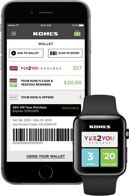
Take Kohl’s for example. They combined their loyalty program with the membership card to create Kohl’s Pay – an effortless system that uses the shopper’s mobile app to store their Kohl’s card, coupons, and loyalty points. When a customer is ready to pay, he heads to the checkout counter, where the sales associate rings up his items and presents him with a scannable barcode.
The customer scans the barcode through Kohl’s Pay, which automatically charges his Kohl’s Card and applies those loyalty points and coupons to the purchase. It’s quick, painless, and – most importantly – easy for the customer! Walmart and CVS have also adapted their own system to reduce friction in the checkout process. Sam’s Club is also adapting in-app Scan & Go payment so their customers can scan barcodes and bypass checkout lines.

Rich checkout allows a shopper to digitally combine loyalty points, coupons, special offers, personalized pricing, third party points and gift cards with payments and tender splitting, to provide a seamless experience.
This is something that several eCommerce channels have started offering once the user proceeds to complete a purchase from the electronic cart. Some new players now allow for such a user experience to take place in physical retail leveraging the capabilities of the shopper’s mobile device and the retailers own app.
In this scenario, the shopper connects digitally to the POS through a cloud-based service. This connects to the retailer back-end at the beginning of checkout. They can scan a QR code identifying the retailer POS at the start of checkout.
This allows the shopper to see their entire physical cart on the mobile device within the retailer app and apply coupons, offers, cashback, rewards, and payment methods with a single click. The ideal combination can be pre-selected for the shopper, so they don’t need to make these choices. Instead of the shopper and associate working through the checkout steps one after another, they can carry out their respective tasks in parallel, saving considerable time and friction at checkout.
As Walmart CFO Charles Holley said in 2012, “For every second that WalMart reduces in checkout time, we save $12 million annually in cashier wages.” The checkout time reduction is shown by the empirical tests conducted with Mobile Rich Checkout clearly translates into considerable operational savings for the stores.
Conclusion
The sale is on its way! It’s a lot of hard work, but everything will be worth it.
If you’re using Shopify, there’s not much room to modify your checkout page itself unless you use Shopify Plus. You can, however, work on the above points mentioned above, and even consider improving your product page using pre-optimized templates. This is where the purchase process begins after all.
Use Google Analytics and set up Tag Manager if you want to get super specific with the data surrounding checkout abandonment.
Your checkout process isn’t the only part of the buying process that needs consistent optimization consideration, but it’s certainly one of the most crucial parts of the process which is often overlooked.
Conversion rate optimization is an ongoing process. Develop ideas, make changes, test to see how it affects sales. Keep going. Eventually, you’ll discover that optimization can not only be fun and enlightening – it can pay off big in return on investment.
Need additional resources? Check out the e-commerce checkout usability Baynard pdf.