Shopify collection pages are certainly nothing to write home about. They offer little more than image and title content to play with, but with the PageFly Shopify Page Builder extension, merchants can make their collections page an experience of its own.
Scroll down to watch the video tutorials at the end of this chapter. Click here.
What does a Shopify Collection Page need?
Don’t get stuck thinking your Shopify collection pages need to be the same as everyone else’s. As with any page on a branded site, there is rampant opportunity to show off and add personality.
The basics are always important:
- Great images
- Clear titles
- Good organization
- Smart design
- Search feature
But at PageFly, our philosophy is always to go above and beyond, so we’ll take this chance to show you some great collection pages for inspiration when building your own. You can also use one the great Shopify collection page templates to get started creating your own or check out our Demo store.
How do I add a Shopify Collection Page?
This is a common question among new merchants, but actually, every store has a stock Shopify collection page built in.
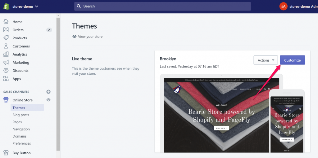
Step 1:
To access it, first navigate to the theme editor by hitting Online Store > Theme > Customize.
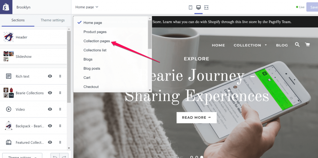
Step 2:
Next, hit the drop down menu at the top and select Collection Pages.
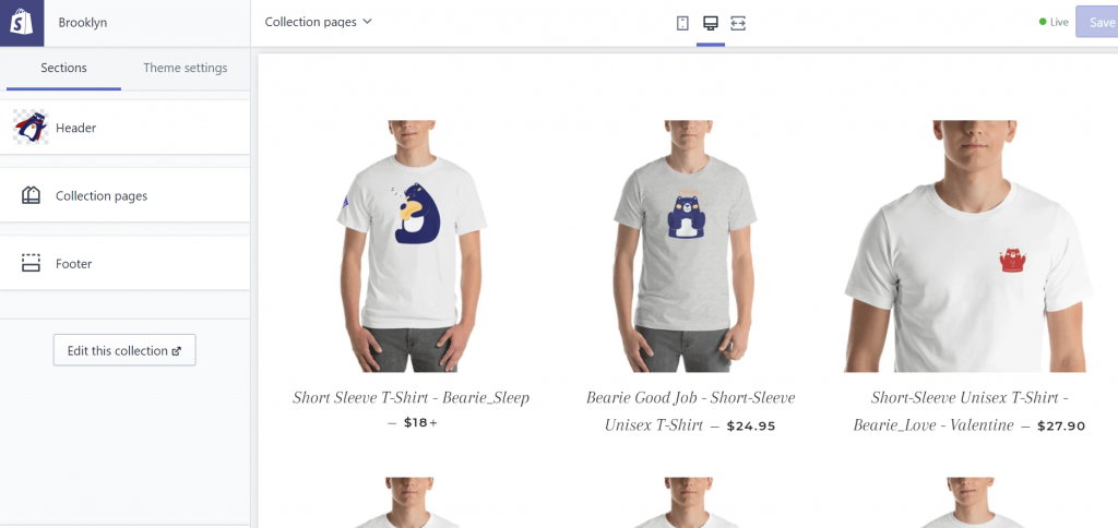
Step 3:
You’ll now see your Shopify collection page preview displayed on the right. For information on how to add custom collection pages and more, check out our article covering everything you need to know about Shopify pages.
How do I Sort my Shopify Collection Pages?
Another frustration that we can quickly touch on now is how to sort product within Shopify collection pages.
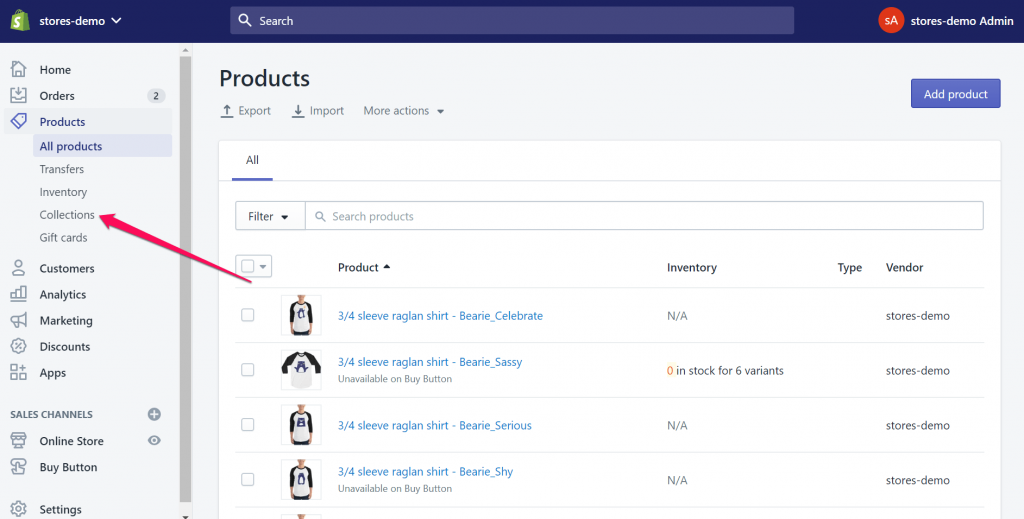
Step 1:
First navigate to Products > Collections.
Step 2:
Now just choose the collection you wish to reorganize.
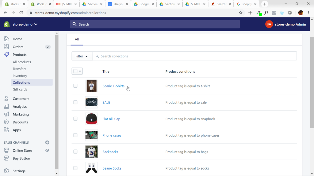
Step 3:
Finally scroll down to products and find the drop down menu that will allow you to choose predetermined sorting or manually drag and drop products.
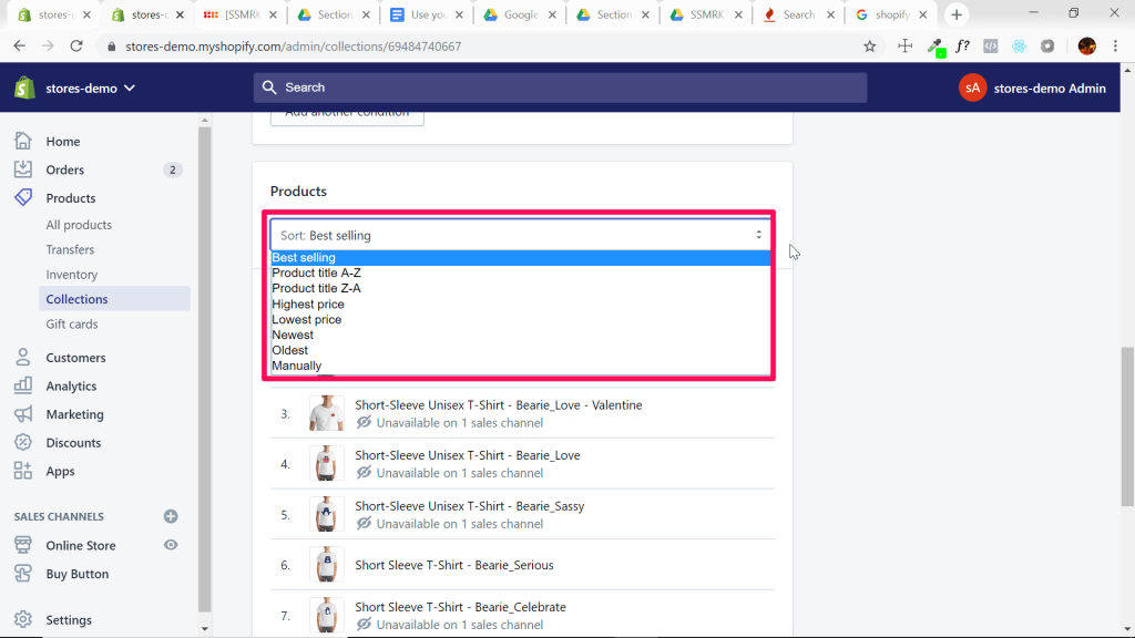
Stock Shopify Collection Pages Just Don’t Cut it Anymore
To give you an idea of what the bare minimum looks like (and what you should avoid), here’s an example of the collections page on Shopify’s Debut theme:

This page contains a simple collection title at the top, then the products with only image and title, and very basic search/sort functionality. Unfortunately, Shopify collection pages are very rigid in terms of the ability to customize them. This is in no way exciting or persuasive to visitors, so you’ll need to take steps to add style and utility using PageFly when designing your collection page.
To give you an idea of how vastly this can be improved upon, take a look at the following techniques and suggestions.
Go Above and Beyond: Shopify Collection Page Inspirations
Amazing Shopify Collection Page Product Presentation
Huckberry’s Shopify collection page does a great job of conveying the ruggedness and quality of their pants. After all, buyers invest mostly in the lifestyle and story attributed to a product more-so than the physical item itself.

This Shopify collection page gives a really clear idea of what the product looks like, with several styles displayed both on and off a human subject. The guys at the bottom are a clever way of inserting a uasi-testimonial section while also showing off the variety and look of the pants themselves.
Shopify Collection Page CTAs and Filters
Pure Cycles has a great Shopify collection page for their bicycles that is engaging to visitors.
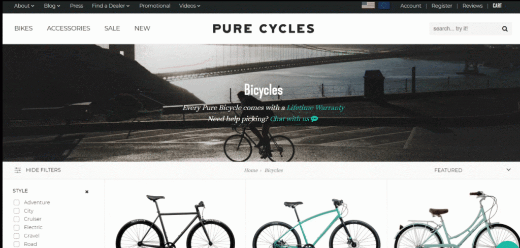
Notice they’ve got a “chat with us” CTA under the collection title. This motivates the customer to take a more in-depth approach to their selection and an opportunity for the brand to deliver the most suitable product possible. They also build trust with the lifetime warranty statement.
Finally, their filters are unreal. The checkboxes on the left make sure the shopper can immerse themselves in the process of selecting the characteristics they prefer on the final product.
Shopify Collection Page Sub-collections
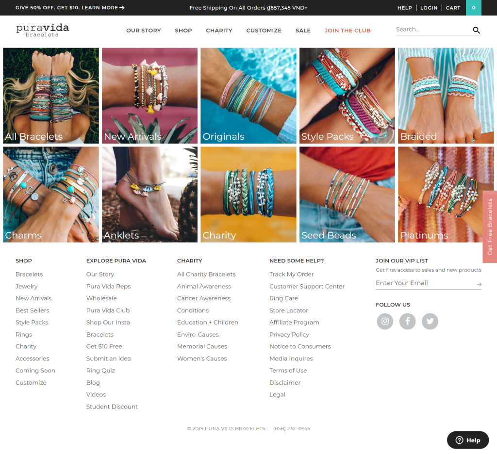
Pura Vida sells only a few types of products: bracelets, jewelry, and accessories. You might think this would make the extent of their collections quite limited. But this is ot the case – they’ve solved the problem by offering subcollections within each primary collection.
As you can see, they’ve separated the products into some very attractive groups such as style packs, anklets, and charity pieces. This is a good example of “you can do a lot with a little”. Don’t be afraid to get creative on how your products are organized and presented even if the variety might be limited.
Cross-selling to other Collections
Waaaayyyyy at the bottom of Le Sport Sac’s collection page is a clever way to entice shoppers to look further. They’ve dropped a few more collections with the “shop now” CTA to remind visitors that happen to arrive at the bottom of this immense page that the fun’s not over yet!
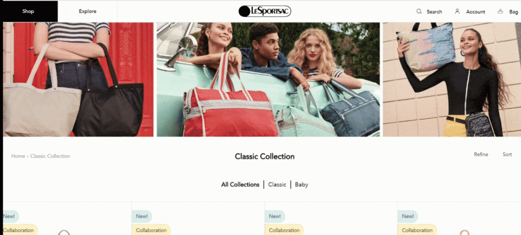
This is a super simple but effective way to keep visitors on your site and viewing your products.
How to add Great SEO to your Shopify Collection Page
Most people think that clear titles and headings for collections are sufficient to drive organic traffic to these pages. But there’s so many more possibilities for what people search for that could be relevant to your products, right? So how do you include this information on the page when a wall of text or large amounts of copy seem out of place on the collection page?

Do you notice anything special about this collection page? No?
It’s tough to see from the GIF, but take a look:
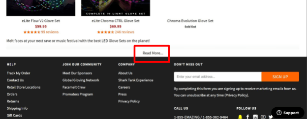
There you have it. So simple yet so beautiful.
When search engines “crawl” the page they don’t just detect what’s in the browser window, they scan all the content on the page, even if it’s hidden at first. This is an excellent chance to add all the information you think might be relevant to searches and add it to the page without compromising the design.
Let’s see what happens when we click the button:
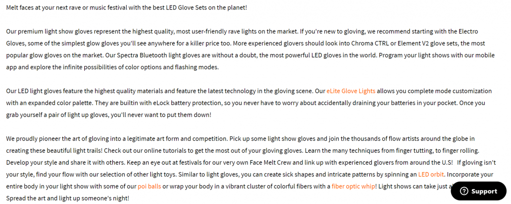
All this text was hidden on the collection pages but still affects the SEO standing of the page. Nifty trick for sure.
This technique is sure to work in favor for your collections page, but always remember to do keyword research and make any headings, titles, meta descriptions and any other text is relevant to your target as well.
Shopify Collection Page Mobile Responsiveness
Mobile shopping is on track to become the dominant method for eCommerce in coming years. It’s vital to have your pages appear clearly and well-organized regardless of the device from which it is accessed. Take Le Sport Sac, for example. They’re product page is gargantuan even on desktop, so this could very well cause problems on a much smaller smartphone screen.
They’ve done a good job of displaying everything clearly and making sure the formatting doesn’t go crazy when viewed on mobile:
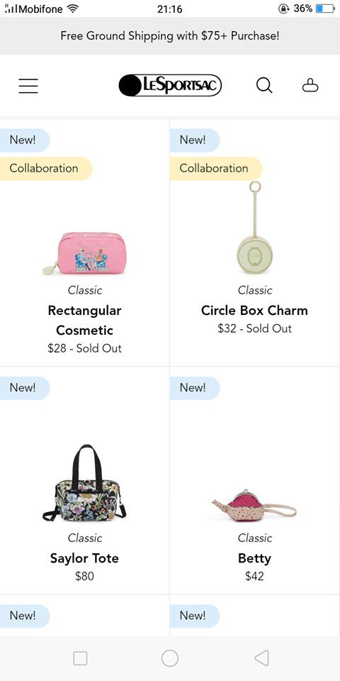
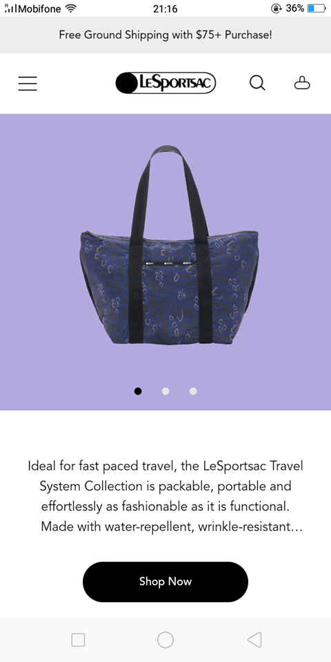
You must always keep this in mind and test your pages for responsiveness when you design them. Thankfully PageFly allows you to preview pages as they appear on different devices and grants users the flexibility to adjust certain elements to cater to the mobile experience.
Let’s make a Shopify Collection Page of our own
As you can see, there are many ways to improve the experience on your collection pages. Just because it’s not necessarily the focal point of the customers journey doesn’t mean it can’t complement and supplement the chances of conversion and up-selling.
So it’s that time again. Time to pop open the hood on the PageFly app and build your own amazing Shopify collection page. Check out the video for examples of features and functions that can assist you in making the converting collection page of your dreams.
[Video] Building Your Shopify Collection Page
Part 1
PageFly elements used in this video:
Part 2
Learn more: