![Shopify Thank You Page: How To Use It To Acquire More Sales? [With Video Tutorials]](http://pagefly.io/cdn/shop/files/Create_templates_for_app_partners_to_feature_SalesHunterThemes_products_-_1200_x_460_px_844_x_484_px_600x.png?v=1712819494)
![Shopify Thank You Page: How To Use It To Acquire More Sales? [With Video Tutorials]](http://pagefly.io/cdn/shop/files/Mother_s_day_e8929c70-79b1-4d91-9fb6-8f009b4b8306_600x.png?v=1713143762)
![Shopify Thank You Page: How To Use It To Acquire More Sales? [With Video Tutorials]](http://pagefly.io/cdn/shop/articles/Shopify_thank_you_page.png?v=1698805682&width=820)
Let’s be honest, you’d find it very disconcerting if, in a shop, the cashier simply bagged your order, took your payment and then proceeded to stare you dead in the eye until you left their store. Customers crave a bit of humanity with their transactions, and none of that desire is lost in ecommerce. Having a great Shopify Thank You page can make all the difference to a customer’s shopping experience, and therefore, their chances of returning to your store.
However, a Thank You page does not necessarily have to be just a Thank You page. There are quite a few more things that you can do to maximize this page to further increase brand awareness, customer loyalty, and generate more sales. And to an online store like yours, these benefits are always a welcome addition.
So without further ado, let’s get on to it.
Outline
- What Is A Shopify Thank You Page?
- How To Maximize Your Shopify Thank You Page? 8 Key Elements To Follow
- 01. Include Product Recommendations
- 02. Incentivize Repeat Purchases
- 03. Incentivize Referrals
- 04. Conduct ASurvey
- 05. Address Trust Issues
- 06. Display Trust Badges
- 07. Direct Customers To Your Other Content
- 08. Invite Customers To Your Emailing List
- Video Tutorial: How to Build Thank You Page That Converts
- Shopify Thank You Page Apps
- 01. AfterSell Post Purchase Upsell
- 02. ReConvert Post Purchase Upsell
- 03. Upsell & Cross Sell – Sell Easy
- 04. ReSell – Post Purchase Upsell
- 05. StoreBundle | Thank You Page++
- Conclusion: Your Shopify Thank You Page Must Be Unique To Your Business
- Frequently Asked Questions
What Is A Shopify Thank You Page?

Image Credits: Pexels
A Shopify Thank You page is the page that comes after your customer has finalized their payment. That’s why it is also called an “Order Confirmation Page” because it confirms to your customers that their purchase has been finalized and recorded.
Naturally, the page will give your customers a brief thank you message that denotes your appreciation for their trust to your products. The same page would also contain the user’s shipping address and tracking number so they can monitor their fulfillment progress.
By default, a Shopify Thank You page is pretty much very basic and it only gives the necessary information without anything else.
But as we mentioned at the beginning, an order confirmation page can also be used as a means to encourage your customers to take further actions such as:
- Sharing their purchase in social media
- Purchase more products
- Sign up to your emailing list, and more.
As a result, these actions can increase brand awareness, sales, and customer loyalty, respectively. Therefore, if you properly maximize the capacity of your Thank You page, you stand to reap some long-term benefits to it.
Benefits Of A Good Shopify Thank You Page

Image Credits: Pexels
There’s a widely held misconception that a Shopify Thank You page is the end of the line – a full stop at the conclusion of a successful conversion. However, as you’ll find out below, the best pages are the open-ended ones that grease the sales funnel and encourage customers to take further action.
It all boils down to two magical words: repeat purchases.
Nowadays, the main goal of your Shopify Thank You page should be beyond just expressing gratitude for your customers’ support and patronage. Instead, you can further leverage this to gain more tangible benefits to your online store.
At the same time, it should also have this personal touch that would make them feel the genuineness of your message. This will boost customer satisfaction – ensuring that they keep coming back.
Here are the benefits of a good Shopify Thank You Page
Increased return rates
According to Smile.io:
“After one purchase, a customer has a 27% chance of returning to your store. While that’s not a horrible return rate, if you can get that customer to come back and make a second and third purchase they have a 49% and 62% chance of making another purchase, respectively.”
Therefore, if your Shopify Thank You page is carefully designed with CRO (conversion rate optimization) in mind, your online store can reap the huge benefits of repeat purchases.
Increased AOV
Average order value (AOV) is how much your customers spend per visit. With the right upsell and cross-sell recommendations in your Shopify Thank You page, you can increase your customers’ AOV.
According to Funnel Strategist, Upsell influences e-commerce stores and it is responsible for 10% — 30% of some of the site revenues. In fact, some store owners make close to 40% of their entire revenue via sales funnels.
Thus, you should add post purchase upsells to online stores.
More referrals
Having a Share button on your Shopify Thank You page could work wonders to your online sales. Nowadays, people can make referrals using their social accounts – it is faster, easier, and it reaches a wider audience. Therefore, this simple addition to your order confirmation page could lead more customers your way.
Improved Customer Satisfaction
According to InvespCRO, retaining a customer is five times cheaper than acquiring a new one. And creating a great Shopify Thank You page is one of the things that you can do to encourage your customers to come back.
However, do note that this won’t happen automatically as there’s an effort required on your end to inspire your customers to come back – it can be a discounted succeeding purchase, free shipping, etc. Ultimately, there would be no return purchases if there’s no customer satisfaction. Thus, this one should be on top of your mind when creating your order confirmation page.
One way to ensure satisfaction is by making your customers’ lives easier after purchasing from you. One of their worries after they finalized their order is “how long it would take for their package to arrive”, as such, make sure that a track order page is easily accessible.
In Shopify, if you ship through a supported carrier, customers can track their order status in real time while a shipment location is shown on the map. On the other hand, if you use an unsupported shipper, your customers can use the tracking number to track their package from the shipping carrier’s website.
How To Maximize Your Shopify Thank You Page? 8 Key Elements To Follow
With a number of benefits that are easily up for grabs, having a customized Shopify Thank You page now sounds very appealing, isn’t it?
But exactly how can you implement an Order Confirmation page that has the right elements to increase your sales conversions?
Below, we’ve listed some sample Thank You pages with some key conversion features. You can experiment by adding one or many of these CRO elements to see which ones work best for your online store.
01. Include Product Recommendations
Product recommendations that serve as upsell and cross-sell opportunities can contribute a substantial amount of revenues to your online store. The good thing about post-purchase product recommendations is that the customers have already converted, thus, little persuasion is needed to convince them to buy a few more.
In this part, it is important that your product recommendations are actually the ones that your customer might be interested in. As such, collecting customer data and tracking their behavior on your online store could be necessary to nail your recommendations.
Nonetheless, this one is a no-brainer. Why say no to an opportunity to earn a few more bucks from your new customer, right?

True Classic demonstrates this very well in their Order Confirmation page. As you can see, after the customer finalized his purchase, True Classic quickly offered their Mystery Boxers 3-Pack. To make it more irresistible, they offered an outright 50% discount.
💡 Quick read: [Ultimate guide] How to Create a Custom Shopify Product Page Template
Additionally, they made the process of adding the purchase to the customer’s cart very easy. They no longer have to go through the entire checkout process. Instead, the customer can simply click “Accept this offer and ADD - $32.48 USD” .
As the famous saying goes, “Strike while the iron is hot.” True Classic surely knows how to apply this.

02. Incentivize Repeat Purchases
Customers come back for repeat purchases for a reason. Sometimes, they themselves don’t know the reason. And that’s why you should give them one. .
There are effective ways to do that:
- A discount - something like 20% or 30% off your next offer.
- A loyalty program - whereby your customers can build points for repeat purchases and eventually claim rewards.
Essentially, you need to know that a great Shopify Thank You page will leverage both of these to foster both near-term and long-term repeat purchasing.

Image Credits: ConvertFlow
Glamnetic has this very well-designed Shopify Thank You page that uses all the right elements to maximize its sales. Along with these elements is a bold discount offer that occupies a whole section of the page to make it very visible to the newly converted customer.
03. Incentivize Referrals
Maybe your customers need an extra push to refer their friends and relatives to your brand. If your ‘share to social’ buttons just aren’t cutting it, don’t stress, there’s another way.
Referral programs are financial incentives (or other forms of rewards) for your brand’s best advocates, your customers, to share the message of your company with their friends.
Sticking the visual steps of a referral program onto your Shopify thank you page is a really great way of getting brand new customers involved in your incentive. Doing this taps into the psychological high that customers feel directly after buying a product, giving them the drive to aim for that top tier of referrals.

Image Credits: ConvertFlow
In the example above, Bite seized the opportunity to give their new (and existing customers) the chance to become their brand ambassadors.
In their Shopify Thank You page, you’ll see a clear headline that says “Get paid when you post on TikTok!” For their customers who are active in the said social platform, this presents an opportunity for them to earn some extra bucks right after they spent some on their purchases – it’s like a win-win situation.
On the other hand, user-generated content (UGC) like these give your brand a voice from the perspective of your customers.
EveryoneSocial says that, “Almost half of customers (48%) claim that user-generated content is a great method for them to discover new products.”
Additionally, according to Stackla, “79% of people say the UGC highly impacts their purchasing decisions.”
These statistics show the power of user-generated content as they have a more genuine feel from the perspective of customers compared to brand-published content.
04. Conduct ASurvey
There’s a another way to make the most out of your Shopify Thank You page – it’s by getting your customers’ insights regarding some aspects of your business such as:
- Recommendations for improvement
- How did they hear about your business
- What made them purchase from you, and more.
You can do all these by conducting a pos-purchase survey.
Completed surveys can help you improve your store by finding out exactly what you’re doing right and what you’re doing wrong from the people who are actually buying your products.
There are some general rules for establishing a survey that actually attracts customers:
- Keep it short
- Keep it relevant
- Keep it onsite
- Keep it hassle-free
You can also offer a small completion reward, but that’s only if you find that no one is willingly taking the survey.
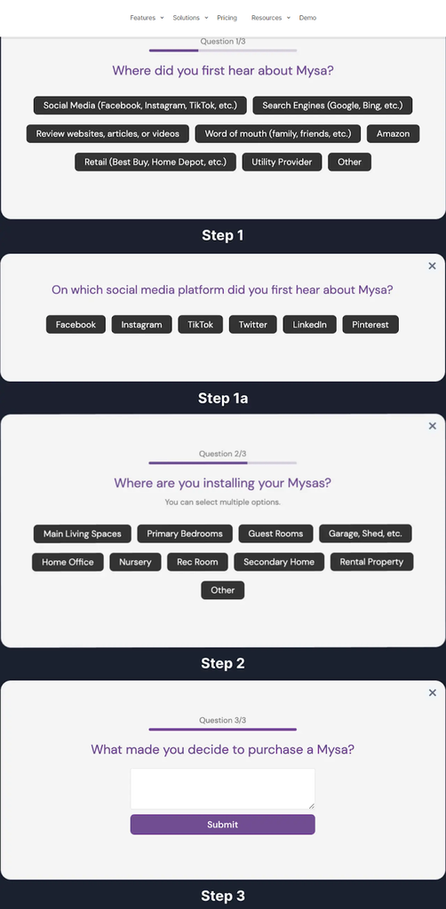
Image Credits: ConvertFlow
For their post-purchase survey, Mysa created an easy-to-fill questionnaire that only takes a few seconds to accomplish. As you can see, through this questionnaire, Mysa gets a lot of insights from their customers like:
- Where did they first hear of Mysa
- Which social platform did they hear it about
- Which part of their home would they would install the product, and
- What made them choose Mysa
Insights like these give you a better understanding of your buyer persona. And for an online store, this is invaluable information.
05. Address Trust Issues
We all know that buying things online is a huge exercise in trust. One of the biggest fears of ecommerce customers is that they won’t be able to track their product once they’ve bought it, and will be relying on their innate faith in humanity to see that their purchase actually reaches them.
Understandably this causes anxiety to most online shoppers – especially to those first-time customers.. That’s why providing tracking information can help your customers overcome their fears of being scammed.
Additionally, this also saves you from emails from customers who are inquiring about their delivery status.

Image Credits: ReConvert
By default, Shopify Thank You pages would display tracking number and a map to track the delivery in real time – that is if you are using a Shopify shipping partner.
If not, you should be able to add a View Order Status page using these Shopify apps.
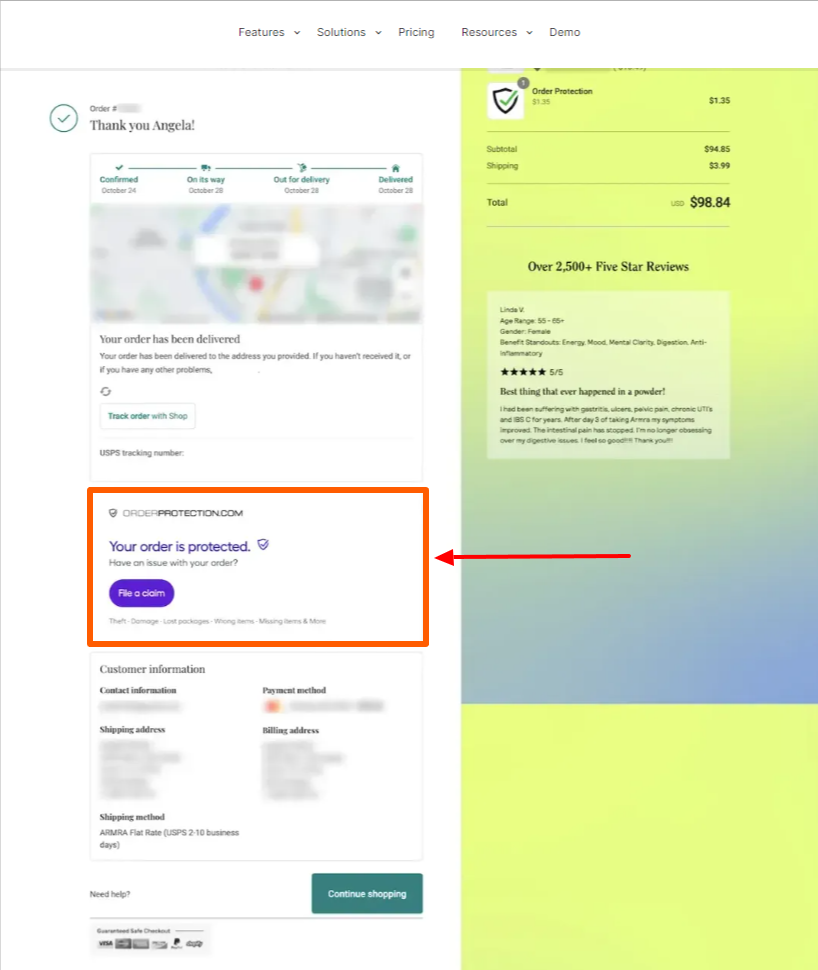
Image Credits: ConvertFlow
Another way to reaffirm your customers that their package will arrive is by putting trust badges like the one above. Armra added this section in their Shopify Thank You page to put their customers' minds at ease knowing that their orders are protected and they can file a claim if any irregularities occur.

In the same example, Armra also added a customer review section in their Shopify Thank You page to guarantee to their customers that they, indeed, made the right choice by buying from them.
This is an example of a simple, yet very trustworthy Thank You page.
06. Display Trust Badges
Trust plays a huge role in convincing your potential customers to buy from you. Additionally, it still plays a huge part in convincing previous customers to make repeat purchases.
Trust badges are visual symbols that portray important assurances about the product your customer has just bought, encompassing free shipping, money-back guarantees and endorsements from third-party services.
Usually, trust badges are reserved for product pages and checkout pages to encourage a conversion. Still, including them on a Shopify Thank You page after the conversion is done is an extra kick of assurance that cultivates long-term confidence in your service.
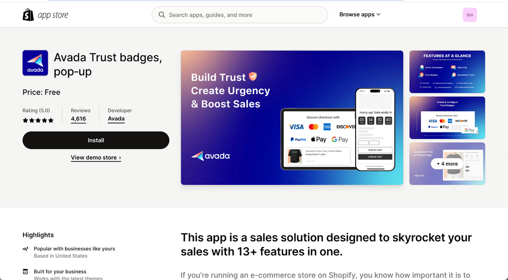
In the video above, Simple Answers provides a step-by-step guide on how you can add trust badges on any page of your Shopify store using the Avada Shopify app.
07. Direct Customers To Your Other Content
It’s best not to treat your Shopify Thank You page as the end of your customer’s journey. Instead, treat it as a chapter that would start a new journey with your customers.
To do this, you add links on your Shopify Thank You page that leads to:
- Product or collection pages to encourage them to keep on browsing
- Social media accounts to convince them to become followers
- Other content such as YouTube videos or blogs that are related to their purchases
Doing this is another way to induce trust, this time not through trust badges, but via social proof. Revealing how many loyal customers you have behind your brand is a stellar way to earn more.

Image Credits: ConvertFlow
Glamnetic is yet another great example in this one. At the end of their Shopify Thank You page, they have links to their tutorial videos so customers can properly use their products. Informational videos like these help increase customer satisfaction as they make their product usage experience a pleasurable one.
On the other hand, you can add different kinds of video content in your Thank You page such as videos of your satisfied customers.
08. Invite Customers To Your Emailing List
Last one (but definitely not the least) on our list of ways to maximize your Shopify Thank You page is the emailing list.
If you don’t know yet, if you collect additional customer data to build an email list, you get the key to accessing a multitude of benefits to your business such as:
- Send personalized emails to your valued customers to encourage repeat orders
- Win back customers by sending exclusive deals
- Acquire new customers by sending offers to your leads
- Nurture existing customers by sending personalized messages (such us on their birthdays and important holidays)
In a study conducted by Omnisend in 2022, they concluded that the average ROI for every dollar spent on emails is $40. Thus, email marketing offers a strong return on investment for online business. And as such, you shouldn’t skimp on this part.

Image Credits: ConverFlow
For the final time, let us use Glamnetic as an example (they surely do know how to create a Shopify Thank You page).
💡 Quick read: Best Practices and Examples to Create a High-Converting Email Capture Landing Page
Immediately below their Thank You message is a section of buttons that customers can click if they want to become part of Glamnetic’s emailing list.
Video Tutorial: How to Build Thank You Page That Converts
After tackling all the benefits of a custom Shopify Thank You page as well as the right elements that must be in it, you might want to apply these settings in your online store.
However, things could be a little more complicated than you expected. There are two ways to edit your Thank You page:
Customize Using Liquid Code
You see, editing your Shopify Thank You page isn’t a straightforward process. Instead, to do that, you need to edit your theme code. That is, if you know how to write Liquid code.
Here’s a sample video courtesy of Amazing Learning. In here, he discusses a step-by-step guide on how you can create a custom Thank You page and he also provided a copy of the code so users can simply add it to their online store.
Watch the video below:
Use A Shopify Thank You Page App
Undeniably, using codes to edit your online store complicates things for you – and that’s also the case for most Shopify users.
You see, you don’t have to learn Liquid code in order to create a great Shopify store. Shopify is designed to be user-friendly so that even beginners could quickly learn how to use it.
Therefore, if you want to create a customizable Shopify Thank You page without the gut-wrenching and anxiety-inducing experience of using codes, all you have to do is install a dedicated app for it.
AfterSell is one of the many apps that you can use to customize your Thank You page. The video below provides a detailed step-by-step guide on how you can set up your order confirmation page using this app.
Watch the video below if you want to learn more.
Shopify Thank You Page Apps
There are a number of Thank You page apps available in the Shopify app store. Here are some of our recommendations:
01. AfterSell Post Purchase Upsell
Rating: 5.0 out of 5
Pricing: Free plan available. Starts at $7.99 per month
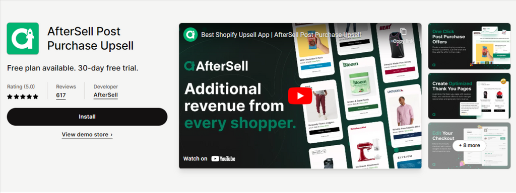
Features:
- Create post purchase one click upsell & downsell offers (single & multi-product)
- Customize thank you page with reviews, FAQs, upselling and cross-selling, & more
- Modify checkout page with order bump upsells and more (Shopify Plus Exclusive)
- Trigger upsells by products, cart value, customer tag, language, UTM, and more
- Split test your offers to see what converts best (A/B testing)
02. ReConvert Post Purchase Upsell
Rating: 4.9 out of 5
Pricing: Free plan available. Starts at $4.99 per month

Features:
- Deploy checkout & post purchase upsell funnels, get shoppers to spend more money
- Immediately boost AOV post checkout blocks, upcart with one click upsell offers
- Recharge your thank you page: run surveys, collect birthdays, & product upsell
- Easily build and manage your checkout upsell strategy with a drag & drop editor
- Selleasy segmentation to trigger bundle upsell, cross sell, one click upsell OCU
03. Upsell & Cross Sell – Sell Easy
Rating: 5.0 out of 5
Pricing: Free plan available. Starts at $8.99 per month

Features:
- Show Amazon-style "frequently bought together" product upsell bundles.
- Cross sell product addons on the product page. Embed as list / grid / etc.
- Pop-up a cart upsell funnel or addons based on items in the cart.
- Display a post purchase upsell page with one click upsell (checkout upsell).
- Cross sell related products using the thank you page upsell.
04. ReSell – Post Purchase Upsell
Rating: 4.9 out of 5
Pricing: Free plan available. Starts at $6.99 per month
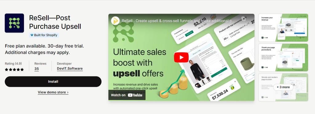
Features:
- Checkout and post-purchase one click upsell and automatic cross-sell offers
- Offer customers to make a new purchase with Thank you page upsell promotion
- Upselling and cross-selling widgets to improve your checkout and Thank you page
- Personalized recommendations or products that are frequently bought together
- Track your upsell & cross sell funnels and control everything in one place
05. StoreBundle | Thank You Page++
Rating: 5.0 out of 5
Pricing: Free plan available. $9.99 standard rate per month

Features:
- Use a one-click Reorder button on the thank you page and attach support videos.
- Improve customer experience with thank you messages and Inactive tab messages.
- Bot blocker, Redirect unwanted traffic, and Whitelist IP addresses.
QR Code Generator, Terms and Conditions, and Capture Emails with Pop-Up Bar
Conclusion: Your Shopify Thank You Page Must Be Unique To Your Business
Did this article change the way you look at your Thank You page? If yes… Awesome!
Now that you know that your Shopify Thank You page can also serve as a landing page that could help you acquire more sales, it’s up to you to apply these learnings in your online store.
There are a few things that you need to remember before taking action.
💡 Quick read: How to Create a Shopify Landing Page That Sales
The examples given above are merely inspirations so you can create your own Thank You page. This is not an exhaustive list on which everything must be used. Instead, you can use a combination of just a few of these elements until you figure out which ones work best for you. For that, you need to conduct A/B tests to come up with a concrete solution.
Finally, remember that your Thank You page is still a part of your online store, and as such, it still affects customer experience. Therefore, your branding should still apply on this page.
Frequently Asked Questions
01. What Is an Order Status Page? How Is It Different From A Thank You Page?
An order status page is the final page that your customers will see when they check out their purchases. A functional status page lets your customers:
- Check the status of their shipment without contacting you directly
- Re-order the products or buy other similar, recommended ones
- See real-time updates on where their shipment is
To put it simply, a Thank You page is a customized order status page, or in other words, an order status page with a Thank You note.
02. Can I Customize The Thank You Page URL?
Yes you can. With the help of the third-party apps mentioned above, you can customize the Thank You page URL in accordance with your own system.
03. How Can I Track Conversion With The Thank You Page?
Shopify offers a conversion tracking summary for you to easily grasp an overview of a customer’s previous visits and behavior leading up to a purchase.
The conversion summary appears on the order details page, and from this, you can see:
- The customer’s total number of orders from your store
- The customer’s total visits to your store in the last month
- The origin of the customer’s first visit
The “View conversion details” option also gives you additional information regarding that customer:
- The number of days between the first and most recent visit to your store
- An overview of the customer’s activity, including all visits
So how can you track an order’s conversion from the Thank you page?
- From your Shopify admin page, go to Orders
- Click on an order number to view its information, you will see a section called Conversions summary from the order page
- Click View conversion details and you are done!

![Cheat Sheet On How To Create A Custom Shopify Product Page [The Easy Way]](http://pagefly.io/cdn/shop/articles/32_820x400_9b1776df-4170-4d18-a574-d12d096405af.jpg?v=1545367857&width=820)

![[Ultimate guide] How to Create a Custom Shopify Product Page Template](http://pagefly.io/cdn/shop/articles/local-store-owner-stands-proud.jpg?v=1681198020&width=4460)


