A product page is where people decide whether they need your products or not. Yet, traffic to this page type is not necessarily hot traffic.
People land on your product pages for many reasons and at many temperatures. And since it’s where people make up their mind, serving each group of traffic with personalized content is critical to your conversion rate.
Essentials content needed for a personalized product page
When it comes to product pages, personalization is virtually equal to optimizing particular content to meet the needs of returning traffic. Apart from that, most of the content is needed for all traffic types. This content form the structure of a typical product page:
- Product information
- Product call-to-actions:
- Wishlist, add to cart
- Product benefits
- Product unique value proposition
- Social proof
- Product reviews
- Video testimonials
Cold traffic – Catch their attention with product USP
Usually, cold traffic is from first-time visitors who get landed into your store via a direct link. However, though browsing the page without a particular product in mind, anyone intentionally clicking on the link has a particular interest in that type of product.
For visitors with such a low level of dedication, showcasing the best features of the product should be prioritized first.
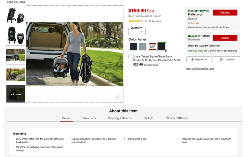
The content included in this section about cold traffic is essential content for any product pages and therefore needed for all traffic groups.
Product information
Product images
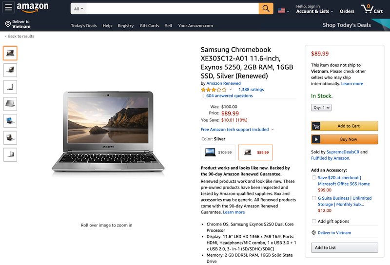
Upon entering a product page, people appreciate having at least a few different images to click through and tend to stay longer on pages that have more images.
Basically, each product needs at least 5 images to be properly evaluated, which could be grouped into 3 types:
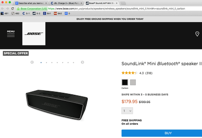
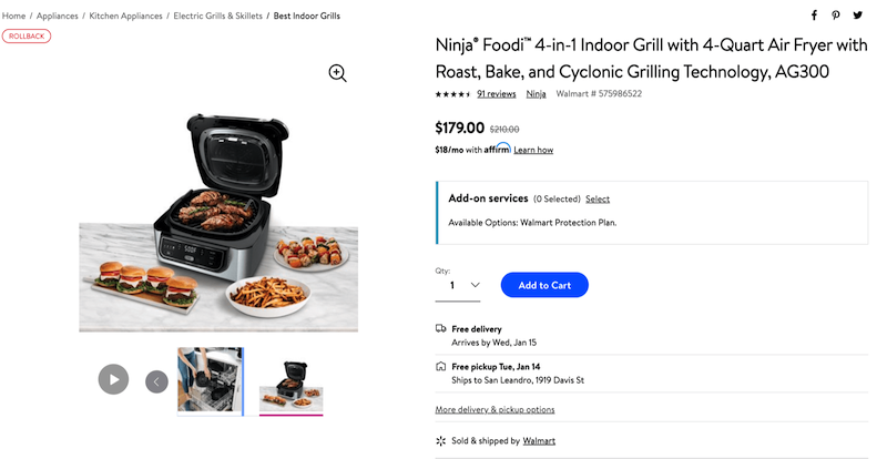
- Images that show products “in scale”: Providing images with its surroundings gives people a sense of its proportion and how it fits in their own space.
 |
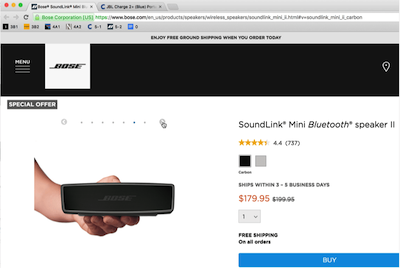 |
Gauging the size of the product becomes much easier with a hand in the image.
- Images that highlight a product’s features.
- Images that show products from a few different angles
Along with the 3 basic image types, specific types of images are necessary for certain product types:
- Lifestyle images: These help people associate the product with a desirable lifestyle.
- “Accessories included” images: If any accessory is included in the purchase price, it needs to be shown with the product in product images.
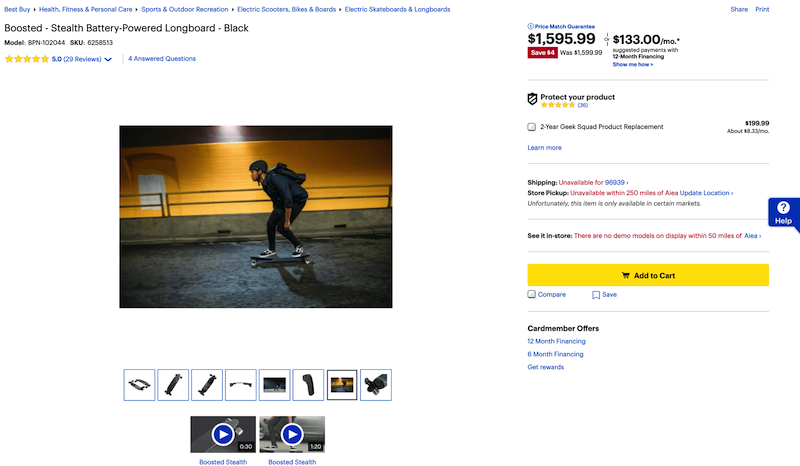
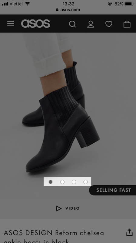
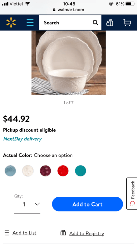
On mobile, it’s necessary to have an indicator that many product images are available. This makes sure people don’t confuse the default image as the only image. Allowing people to swipe to view the next/previous image is also important, as it creates a smooth mobile user experience and makes it easier to explore them.
Product price
Product price is the basic information that many people seek for right upon entering a product page. Being unable to quickly find the product price can easily frustrate people and even leads to a negative judgment of the whole site.
Locate and style the price so that it’s the most visible possible so that people can find it without effort.
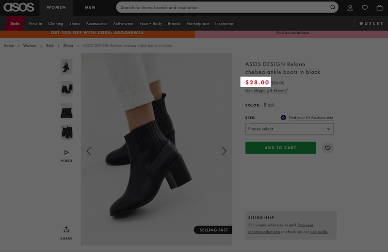
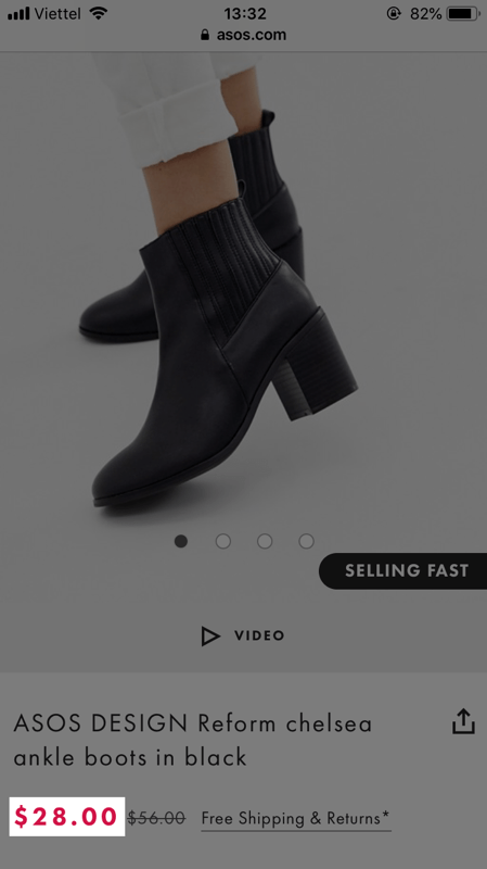
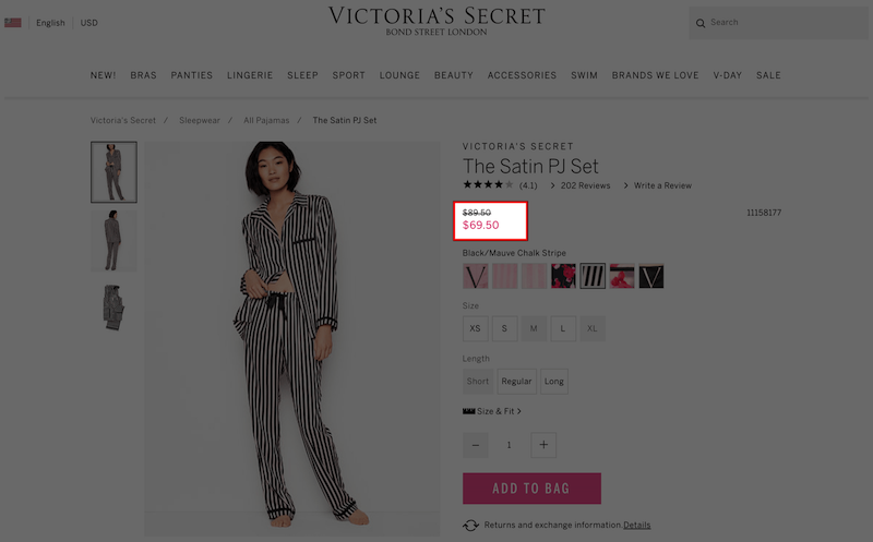
For products that are at a discount, including the original price is a must. This is to make sure visitors are aware of the amount of money saved, create a psychological impact and encourage making purchases.
Product variations
Several product types come in multiple variations. Depending on the industry, the requirement for the structure and UI of product variations varies. But regardless of the industry, there are some principles that product variation should stick to avoid fundamental UX pitfalls.
- Content consistency: Make sure product information is synchronized across all variations so that visitors can compare the variation and make an accurate assessment.
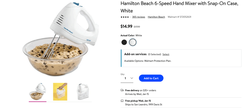
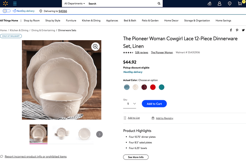
- Use color swatches, small photos or labels instead of a dropdown list: Making all variations visible gives visitors an overview of the options available and accelerates selection. Also, color swatches and small photos allow visitors to visually evaluate the variations, which cannot be done with a plain text description.
Product benefits
Be straightforward and avoid flowery language
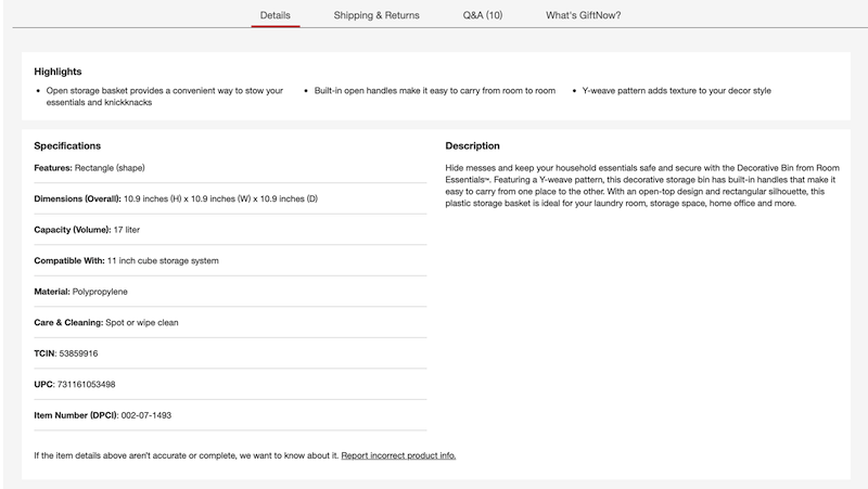
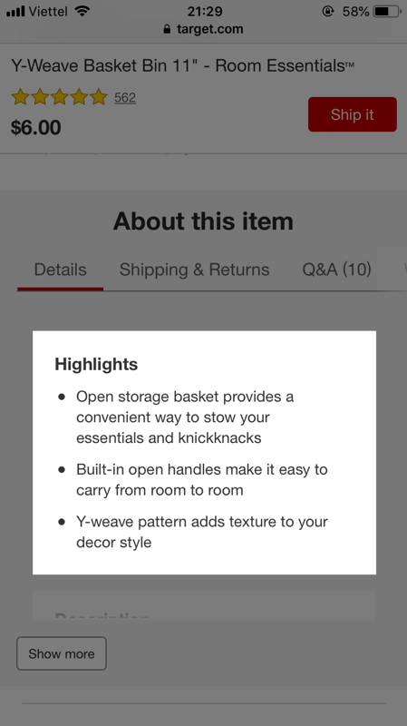
Use bullet points, blocks of text, and headlines to make the section as easy to scan as possible. Absolutely avoid flowery language that requires more reading without delivering more value.
People tend to scan everything to seek product information, lengthy language can slow down the process and lead to needless frustration.
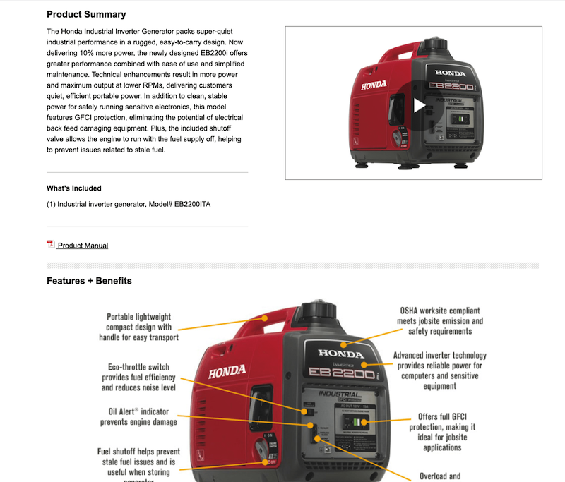
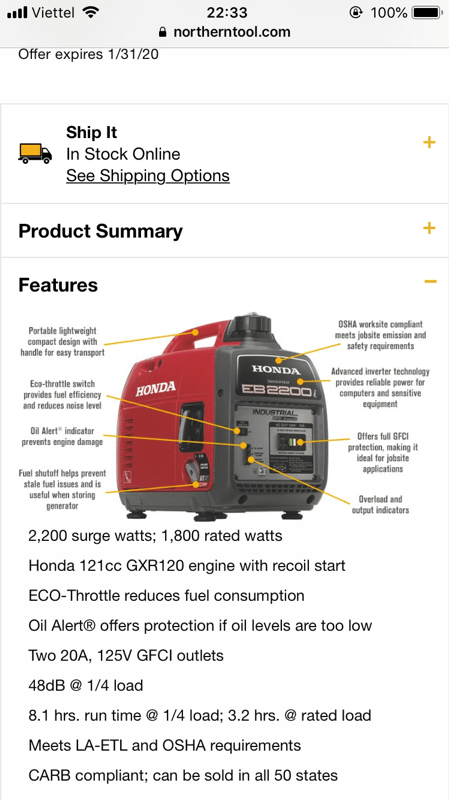
Use images and video
Compared to text, images and videos are always preferred. Not only illustrates product benefits better, images and videos also reduce the chance information is overlooked.
Product unique value proposition
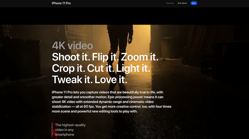
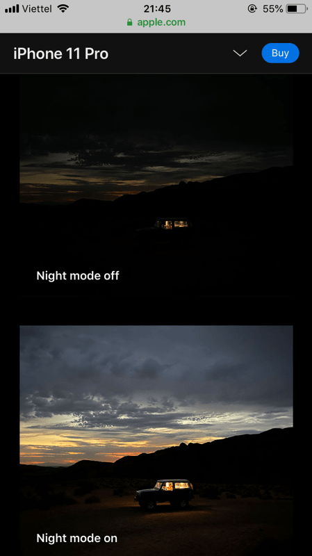
If there’s something that makes your product stand out from its alternatives, make it highly visible, even visually prominent. It can be the turning point that people make their decision to choose your product.
Warm traffic – Assure visitors with coherence
Visitors get warmer when they click a link, submit forms or view some images. Given their previous actions, warm visitors are supposed to be more familiar with the product and are seeking more information.
For these visitors, factual and neutral information, presented with coherency would push them closer to the decision to make purchases.
Social proof
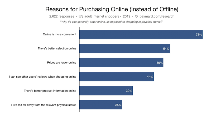
Back to Baymard’s research about why people shop online, 44% of test subjects responded that it’s because they can see other users’ reviews on the products.
Product reviews
Usually, people reach the reviews section to seek objective information. Make sure the section is as objective as possible and give them a proper perspective.
- Always have an option for visitors to submit a new review: Allowing review submission increases the objectiveness of your existing reviews. Also, encouraging users to upload images of how they used the product is also a way to increase trust with real product images.
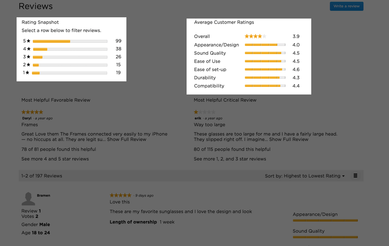
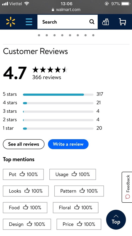
- Include a rating distribution summary: This makes sure people are not misled by the first reviews they see.
- Display 8-15 reviews and have a “View more reviews” button: Give people a decent overview of the reviews while still keeping your site from being flooded with reviews.
Video testimonials
In short, video testimonials transmit information much faster than written testimonials.
Watching other people express their thoughts also creates an emotional connection between your visitors and your customers. Regardless of how good your product information is, a few words from customers can outweigh the whole product page.
For intangible products and services, video testimonials are even more important for visitors to objectively evaluate the products.
Frequently asked questions
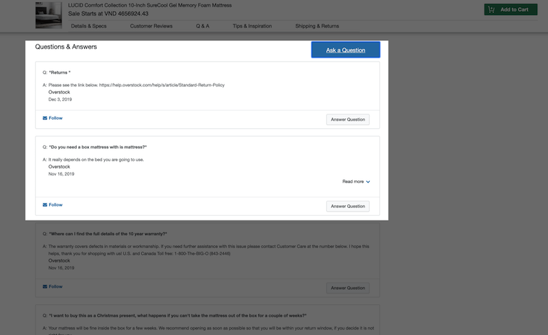
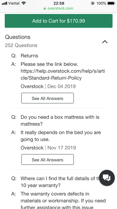
For people seeking information and considering the options, having questions answered immediately is important. Having an FAQ section allows people to leave questions and read answers for the frequently asked questions, which effectively supports their decisions to make purchases.
Product CTAs
Add-to-cart button – Give it a prominent and unique styling
On a product page, an Add-to-Cart button is indispensable. Compared to first-time visitors, the Add-to-Cart button’s features and design are important to visitors who already decided they want the products.
To avoid confusion, make sure the Add-to-Cart button has a prominent and unique styling. Ideally, Add-to-Cart buttons should be the most eye-catching and stand out from their surroundings.
Wishlist – Avoid requiring an account
When people like a product, yet are not ready to make a purchase, they tend to save it for later consideration. Among many things they might do, using wishlist accounts for 31% of the most popular behaviors, according to Baymard’s research.
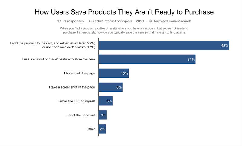
Though being favored by a considerable amount of shoppers, this feature is easily dismissed due to simple and avoidable reasons. For the feature to work effectively, make sure the following factors receive decent attention:
- Avoid requiring an account: People hate logging in. In fact, 31% of shoppers abandon their carts because they are required to create an account.
- Make sure people know how it works: This includes how to save items and how to find the items saved. Saving products means nothing if people cannot find the product they saved.
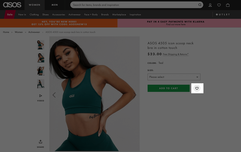
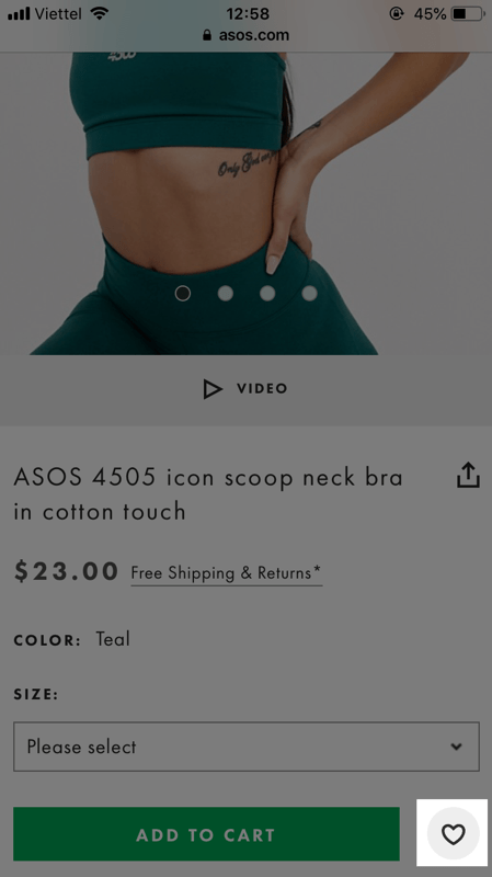
Also, though being a convenient feature, adding a product to a wishlist is not your primary goal. A wishlist button should never be visually equivalent to the prominent Add-to-Cart button.
Hot traffic – Get rid of concerns
Returning visitors who previously added products to their carts are typical of hot traffic. Adding products to carts or wishlists is the strongest evidence of a person’s interest in a product.
These visitors clearly have a demand for the product. Clearing the concerns that are stopping them from buying would be an encouragement for them to make purchases.
Payment, shipping and returns
Shipping – Always include shipping cost
Shipping and returns are still the two biggest downsides of eCommerce and the major causes of site abandonment. Though the problems that lead to cart abandonment vary, cart abandonment can basically be minimized if this information is made clear on the product page.
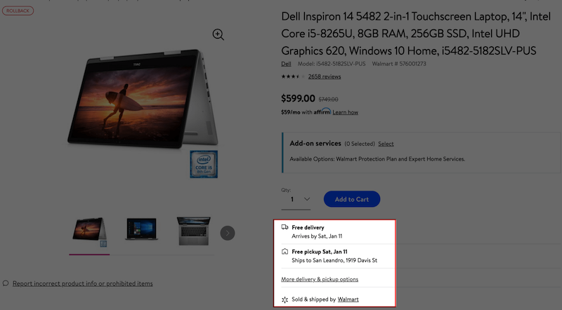
- Always include estimated shipping cost and shipping date
- Be cautious when using “Free delivery”. Try to avoid surprising people with additional costs on “Free deliver” products.
- If a product is available for “Free delivery”, place the badge near the “Buy” button
Returns Policy – Available and easy to read
People are about to pay for something they’ve never seen, held or firsthand tested. The anxiety that the products might not meet expectations is the main reason for cart abandonment. Clearing these concerns with a coherent returns policy would encourage people to buy the products.
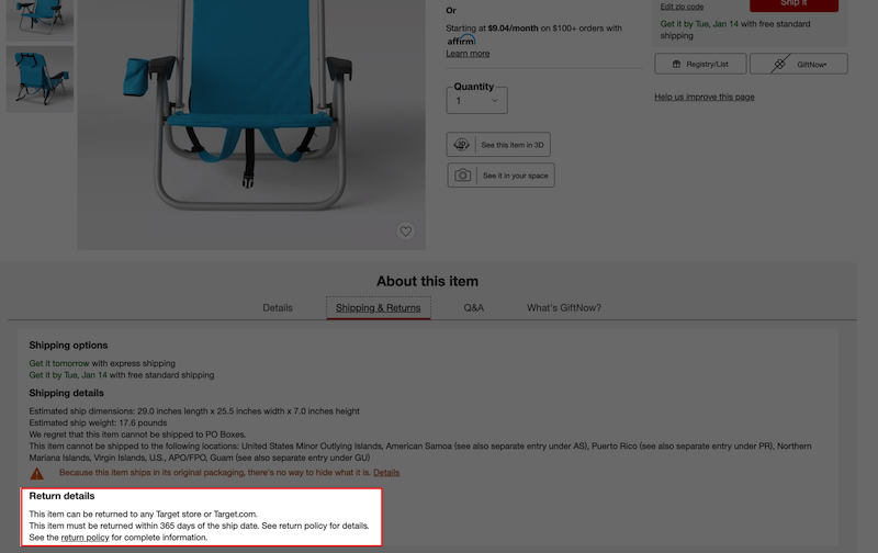
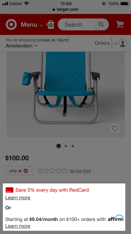
Payments – Highlight if an installment plan is available
For products with high value, the availability of an installment plan contributes significantly to the cart abandonment rate (or conversion rate). The principle is simple, if an installment plan is available, make it clear and visible so that people can easily be aware of it.
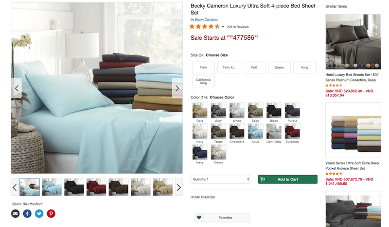
Cart content
While people are considering a product, never distract them with another product. A cart content section can serve as an urge that draws people away from the product page, which leads to page abandonment.
On its homepage, Overstock has a section showing cart content and to urge checkout. Meanwhile, the product in their cart is totally not mentioned.
Upsell / cross-sell
Product recommendation is a sensitive thing. If there’s not enough data to personalize the section with precision, consider omitting it. No recommendation is better than a “one-size-fits-all” recommendation.
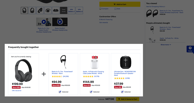
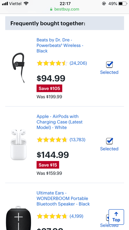
On mobile’s limited viewport, consider carefully the sequence of information. Including the upsell/cross-sell sections shouldn’t affect other important sections like the product image, product information, or product reviews. Ideally, an upsell/cross-sell section is placed at the bottom of the page.
Product page design for your inspiration
Below are some of the best product page designs assessed by Baymard’s Institute. Take a look at how the pages deliver product information in a concise and effective way. Get yourself inspired before diving in to design your own product pages.
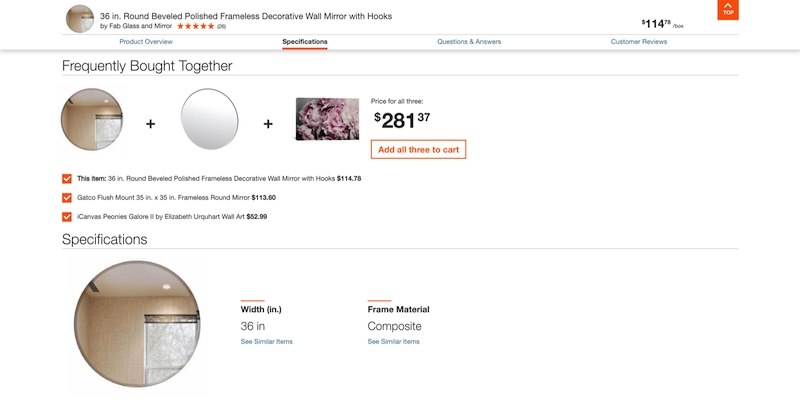
Home Depot
Home Depot’s product page is highly evaluated because of its excellent product images and good product information. Also, using a sticky bar to make product information ever-visible is a smart move to keep visitors well-informed about the product.
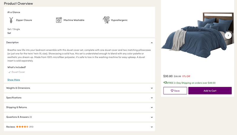
Wayfair
Good layout, good product descriptions, and good Cross-Sells & Cross-Navigation are the aspects that make Wayfair’s product pages good. The Add-to-Cart button is also a good example of prominent styling for a primary call-to-action button.
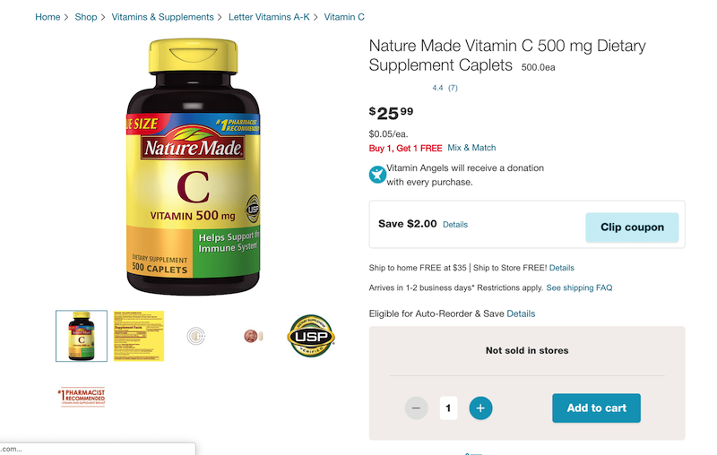
Walgreens
Image gallery UI and user reviews are the strength of Walgreens’ product pages. Due to the nature of the product as a spec-driven product, Walgreen includes a high-quality image of the product’s supplement facts and other information, which allows users to get the key information instantly.
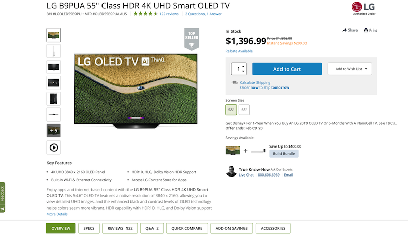
B&H Photo
B&H Photo is a typical example of good product images. Every single angle of the product is detailed thoroughly. A video is also used to illustrate the product features.
Lowe’s
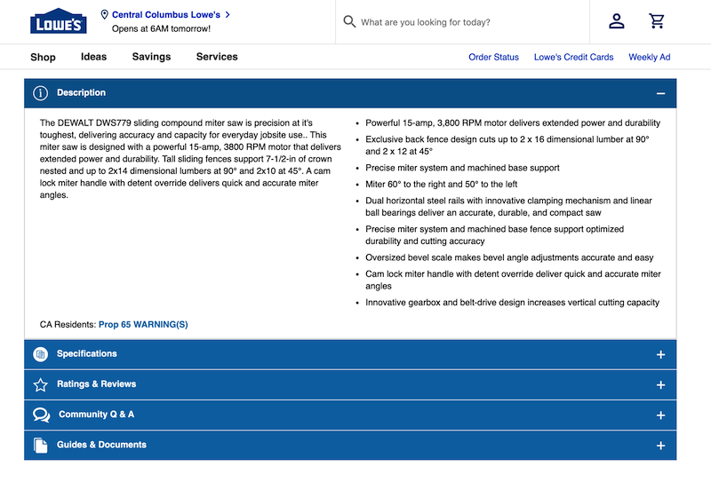
Product images and product descriptions are what improve Lowe’s product page significantly. Information is presented within vertically collapsed sections, allowing visitors to have an overview and easily explore each section.
Lowe’s product images section is a good example of including three essential image types.
Learn more
Credit: This guide uses research findings from the Baymard Institute’s e-commerce UX research.