Like practically any page on your site, traffic to a homepage can vary from any degree of sales-readiness. Visitors have different needs and look for different things to be satisfied. However, as the main hub where product diversity, brand story, and social community are reflected, people are more likely to start their journey from a homepage.
That’s what makes traffic to homepages more diverse than others.
In this chapter, you are going to learn how to align your homepage content to satisfy different types of visitors by meeting their personalized needs.

Personalizing means serving the right content for each group of visitors. Hence, it’s important to understand which content is the right content for each group.
Cold traffic – Convey brand value and product range
Cold traffic is usually people who know little about your brand. In the awareness stage, people might not even know what product they need (but they still somehow find themselves on homepage). These people are usually first-time or second-time visitors with short session durations and not much interaction.
For these types of visitors, it’s important to quickly make it clear what types of products are available. Giving people an overview of the store’s product ranges will reduce the risk of overlooking.
Also, as cold visitors are unsure what product they need specifically, featuring relevant products would help their product exploration. And now that visitors are intrigued to explore further down your homepage, strengthening your brand credibility should be the next step.
“Hero” content – Draw attention within 5 seconds
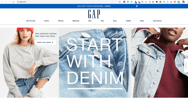
“Hero content” refers to the key message or the key offering being delivered to visitors on a page, usually the homepage.
Hero content is a simple and straightforward way to instantly captivate visitors. It can be either a static image or a slideshow and it usually comes up at the top of the page.

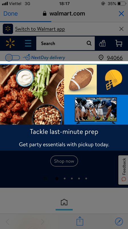
As it’s the first thing visitors see upon entering a homepage and composed of a large area, the hero content is usually used to deliver important information and messages to the audience. This includes:
- The store’s product range
- Promotions and discounts
- Featured products
When it comes to hero content, keeping in mind some important principles would help you design an effective section.
- Use static images instead of slide shows: It’s easier to design a user-friendly hero banner if you use a static image. Meanwhile, using a slide show will require much more refinements and can easily lead to bad customer experience.
- Use the 5-second test to judge coherency: Your content should ideally be coherent enough for visitors to grasp the main idea within 5 seconds.
- Always use a high-resolution image: This is where people form their first impressions of your store, so make sure it looks classy and refined with a high-quality image.
- Use video if possible: Include a video if you feel it’s the best way to deliver your message, but avoid auto-playing the video at all costs.
Featured product(s) – Boost sales on certain items
Featuring products means dedicating a section on your homepage for the specific product(s) that you want to draw attention to. This section is supposed to significantly increase traffic to these product pages and can redirect visitors to a different page immediately. For those reasons, the choice of what to feature in this section should be carefully considered.
In phases when your strategy is to target a certain demographic of your traffic, featuring the product they are likely to be interested in would increase this section’s conversion potential.
- Bestsellers: It’s a basic and common option when your homepage is not targeting any traffic group in-particular. Telling newbies what many people are buying is an easy way to intrigue them to explore further.
- New arrivals: Loyal customers want updates on new products. Featuring new items will address this interest directly.
- Discounted products: Discounts should only be offered to hot traffic. So if you are running a campaign targeting these hot visitors then feature items that are on sale.
- Trending Products: Products with a large search volume are products in high demand. Track your visitors’ search behaviors and feature the most searched product(s) to instantly meet their needs.
- Unique products: Any product that makes you stand out from your competitors can also be a wise choice to feature on the homepage.
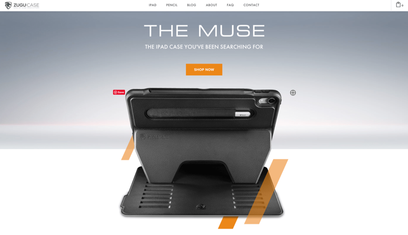
It is also necessary that the product image featured is high-quality and features the best aspects of the product. ZUGUCASE and Victoria Secret are examples of great featured product sections.

Themed Products – Allow visitors to find products by topics
Many first-time users don’t have a clear sense of what they are looking for. This is especially true when someone visits a store looking for gifts for other people. In this case, recommending products based on particular criteria will greatly improve the experience of these customers.
The criteria for product recommendation could be:
- Occasion: Christmas, Valentine’s Day, Mother’s Day, etc.
- Season: Fall, Summer, Winter, Spring.
- Type of customers / Gift recipients: Teenager, Gymer, Dancer, etc.
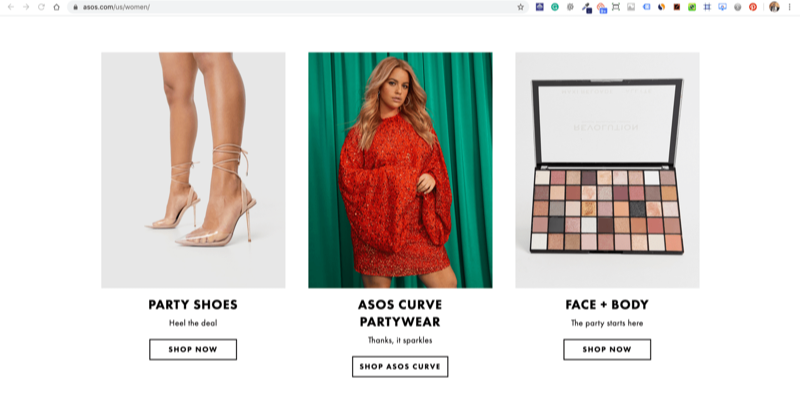
“Top Pick for Fall”, “Christmas Trending” are some typical names for this type of element. Simple names like “Shop by seasons”, “Shop by occasions” are also popular to recommend the hot products.
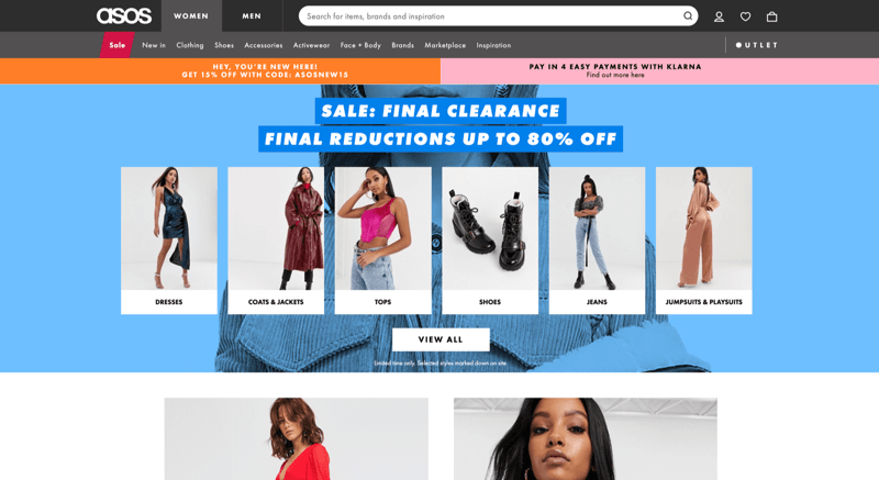
Example: A guided product browsing offered on the ASOS homepage for US women. People preparing for a party can find what they need in one section, without much browsing.
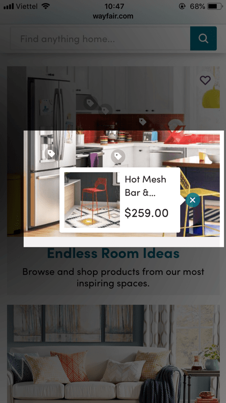
Wayfair makes it more than just themed products when providing a shoppable image of kitchen furniture and appliances.
Product collections – A quick summary of what products you offer
According to Baymard’s guideline about Featuring a Broad Range of Product Types on the Homepage, first-time visitors rely heavily on the homepage content to get a grip on which type of page they have just landed on and how broad the product range is that the store offers.
Only displaying some products usually misleads visitors that those are the only products the site offers. Therefore, displaying product collections is necessary for visitors to have an overview of the store’s available products.
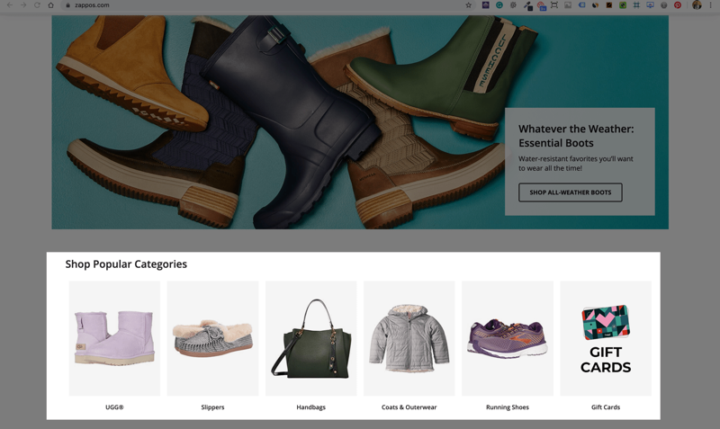
In the example, Zappos seems to understand this fact well. The “Shop Popular Categories” section is featured in the above-the-folder area. Without scrolling, people can be aware instantly that this website offers more than just boots.
On mobile devices, due to the extremely limited viewport, it is usually harder to visually feature all product collections like you can on desktops. In cases like this, using a list of text links is another possible way to give visitors an overview of the store’s products.
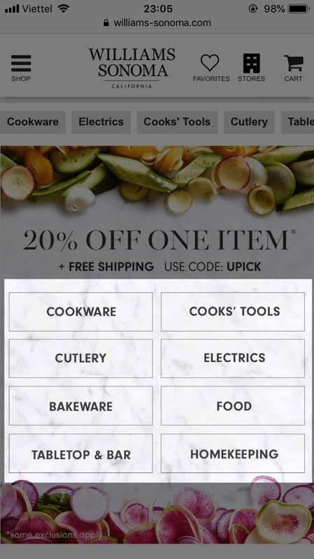
William Sonoma features its categories as buttons with a transparent background, making the area look vacant despite being filled with buttons.
Brand reputation – Critical for wholesalers and B2B websites
Brand story and value proposition
Wholesales and/or B2B customers are usually seeking long-term commitments. Displaying a transparent brand story with a clear mission, vision and value proposition is essential to developing your brand credibility.
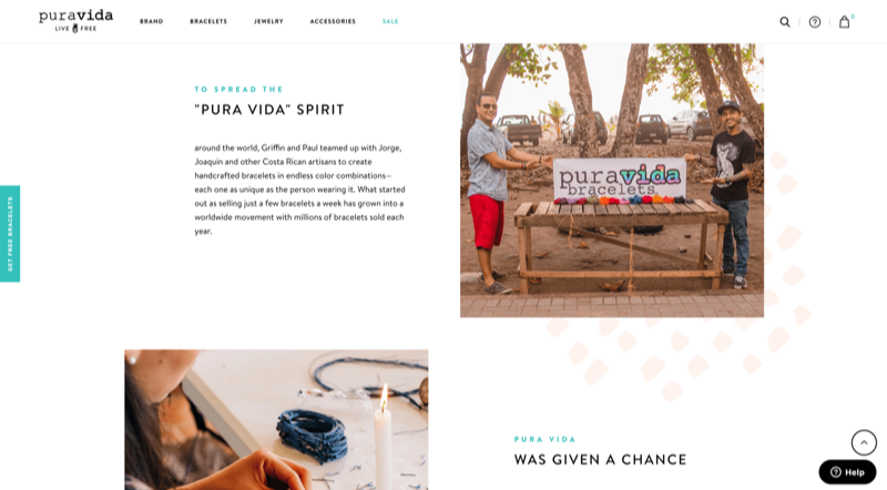
Not only wholesalers and B2B, but also social organizations or businesses with sustainable purposes need a good brand story, too. In the example, Puravida dedicates its homepage to telling their brand story, with high-quality and illustrative images.
Brand affiliation
Having experience cooperating with reputable brands is a huge advantage that would strengthen your brand’s reputation and ensure customers about your cooperating experience.
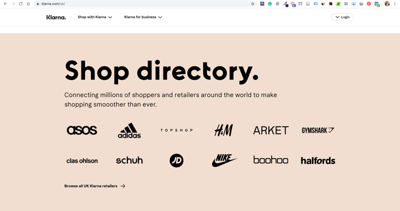
Klarna.com is a good example of brand affiliation. By dedicating a section on the homepage to feature the brands they have been cooperating with, Klarna is effectively leveraging the strength it obtains from the affiliation.
Testimonials – Indispensable for service providers
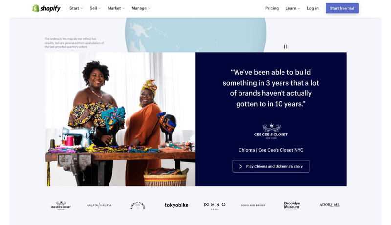
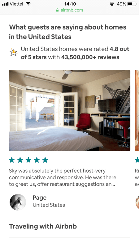
Social proof is no doubt important to any website. But while people can judge a physical product by images and videos and product descriptions, feedback from actual customers is the main way people judge a store.
Warm traffic – Make it easier than ever to find product
Who should be considered warm traffic? Judged by tracking events, they might be people who viewed products, subscribed to your newsletter, downloaded a document, or simply clicked “load more”. These people have specific needs. They are aware of their problems and seeking solutions.
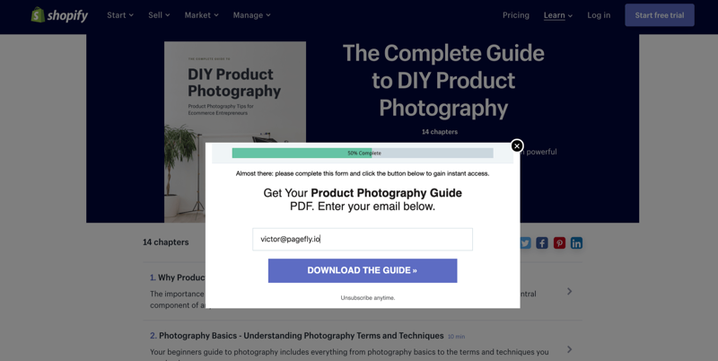
For warm visitors, you know their interests. Actions can be tracked and will give you clues about what their interest is. Promote their product of interest with quick access, give them time to consider and be available right the moment they make a decision.
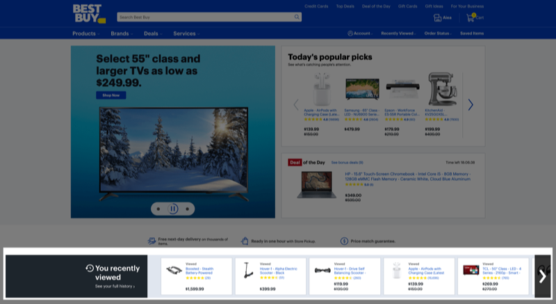
Viewed Products – Remind visitors of the products they viewed
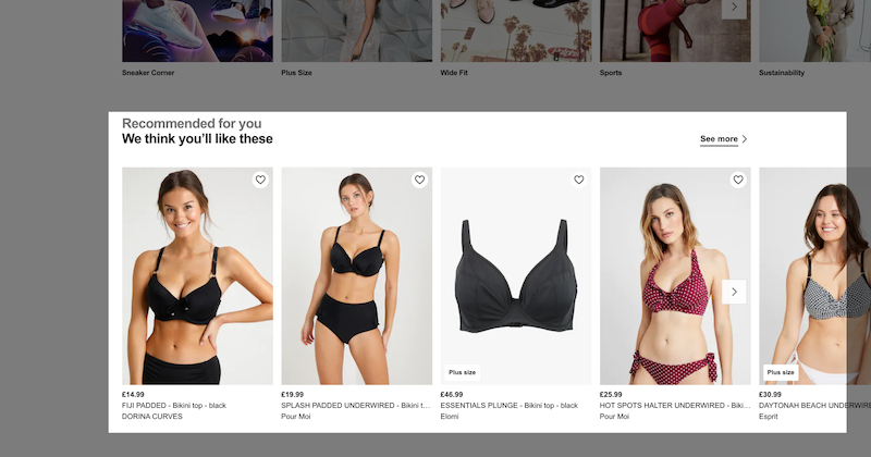
Based on people’s browsing history, you can either remind users of the product they previously viewed or recommend more products similar to those products.
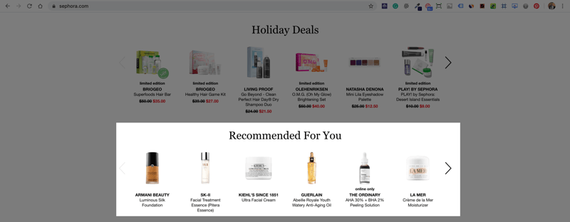
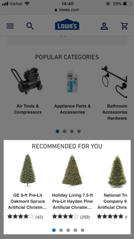
Three for mobile and six for desktop are the ideal number of items for a product recommendation section. This ensures the items are large enough to be clearly visible while displaying a wide range of products. Sephora and Lowe’s apply this principle consistently.
 Promotion campaigns and products on sale – Offered only to visitors with interests
‘Discount’, ‘Free shipping cost’, ‘Buy one get one free’ should only be offered to people that are sure to have interests, who are defined as warm traffic.
First-time visitors tend to perceive promotions for your own products as ads from external parties. Since ads on a homepage are usually perceived negatively, promotions being confused with ads would cause the same reaction and ultimately ruin their experience.
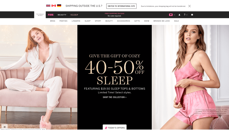
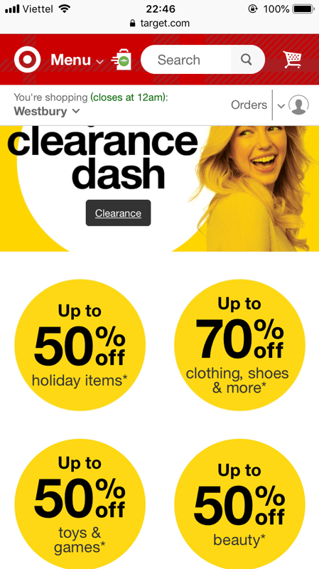
Discounts and promotions, especially on a specific product, should only be offered to people who previously showed interest in that particular product.
Hot traffic – It’s time for conversion
People who previously added a product to their cart are hot, they were so close to conversion and left for some reason. You can’t say for sure what the reason for each cart abandonment is, but you can optimize the pages and bring them back to their carts.
On the homepage, creating quick access to where people left and attracting them with irresistible offers might help.
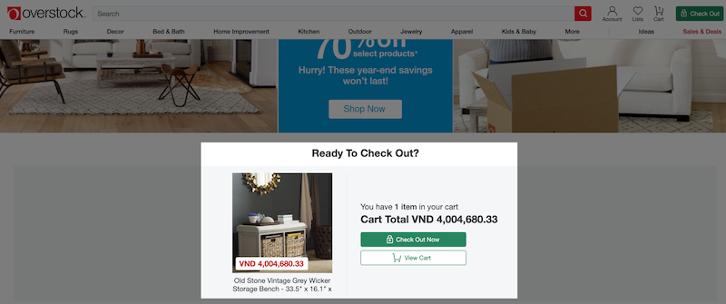
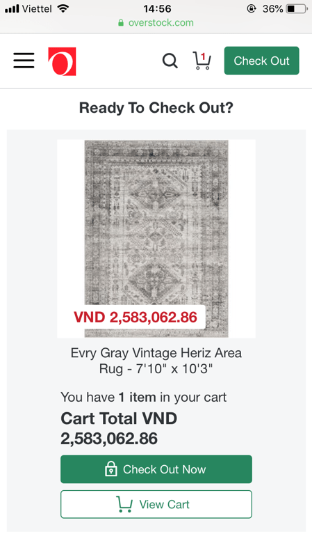
Cart content – Create a shortcut for visitors to quickly get back to where they left
Adding a product to carts is the clearest signal that people are interested in the products. Not only reminding people of what’s in their cart, but a section of the cart content also gives visitors a short cut to the cart they abandoned, thus making it easier to make a purchase.
Upsell / Cross-sell / Bundle sale – Attract people with irresistible offers
For visitors with products in their carts, you can take advantage of their cart content with a “Product related to what’s in your cart” section.
Depending on the nature of the product in the cart, you can apply upselling, cross-selling or bundle selling in a flexible manner:
- Upsell: Recommend related products that have a higher value
- Cross-sell: Recommend related products that complement the products in the cart
- Bundle sell: Recommend the products in a package at a better price, compared to while buying single products.
Best homepage design for your inspiration
Get yourself inspired by some great homepage designs. Creating a homepage is not only about the best practices and principles, but it’s also your unique way of expressing your thoughts.
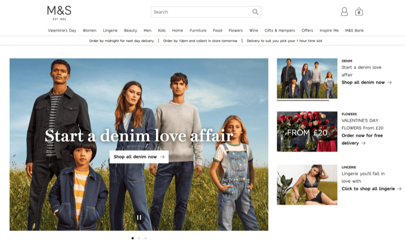
M&S
In general, M&S’s homepage adheres properly to what content to include on their homepage. In general, M&S does it excellently when it comes to product images and featuring a broad range of product collections.
ASOS
ASOS is another example of featuring a broad range of products and good product photography. Also, ASOS is good at recommending themed products.
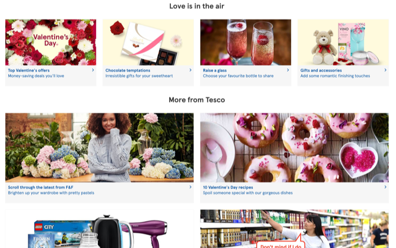
TESCO
Featuring a broad range of product collections, as well as themed products and good photography is what makes exploring Tesco’s homepage a seamless experience.
B&H Photo
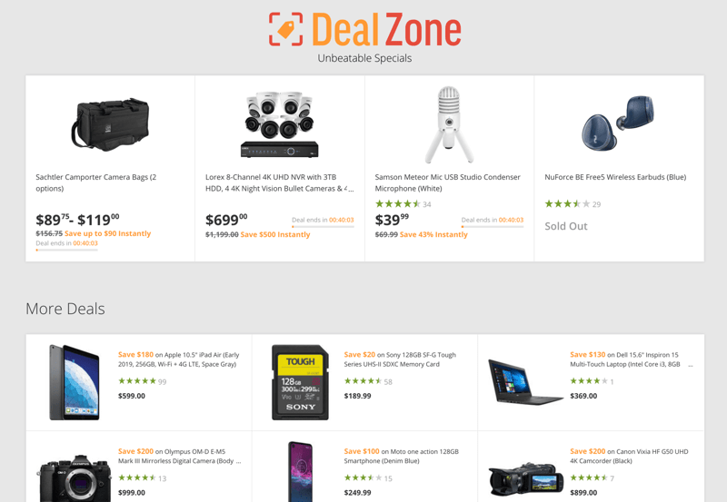
B&H Photo implements its promotion campaign on the homepage in a subtle manner, which is a good addition to its other advantages.
Walmart
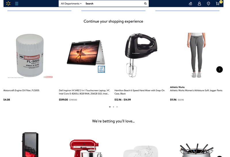
If you are confused about how the Viewed Products section that serves warm traffic might look, then Walmart is a great example. Along with that are its themed products, broad product ranges and photography.
Learn more
Credit: This guide uses research findings from the Baymard Institute’s e-commerce UX research.