The cart page is a middle ground between choosing products and checking out. Personalizing cart pages can make it more likely that people will take the final move and press buy.
But is any visitor to this page the same in terms of intent and behaviour? Well, it varies. People add a product to their cart for many reasons, and that does not always mean they have the intention to buy.
To personalize the cart page and convert as many customers as possible, understanding their intent and behaviour is critical.
Warm traffic – Save and compare the products
As people browse through product listings and details, comparing is a common practice. And though “Save” and “Wishlist” are the features commonly used to solve this problem, people prefer adding products to carts and using the cart page itself for comparison.
According to Baymard’s research on how users save the products they aren’t ready to purchase, 42% of users use cart pages as a save feature.
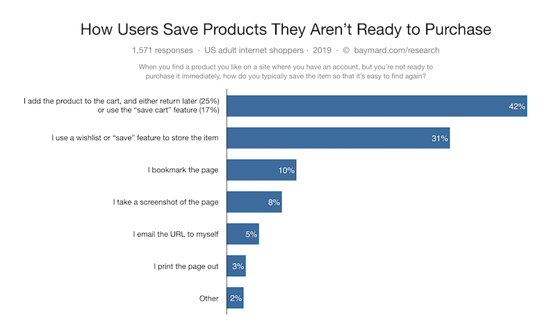
Among that 42%, only 25% “return later”, which means that the rest have no intention of making a purchase or comparing products. These visitors use the cart page plainly for storage.
For these types of visitors, making product information clear and easy to process is essential to the browsing experience.
Product Summary (Information about the products being ordered)
Product Details – Include clear and detailed product information
Product details are all the information associated with the product. Normally, this information includes product images, product price, and other specifications such as product title, product description, etc.
Clear and detailed product information makes it easier for people to both review and compare the products. This is especially important when people are ready for checkout.
By carefully reviewing the order, they reduce the risks of making mistakes, which frequently results in refunds, returns or needless frustration.
Provide large product thumbnails
When people add many products to carts, the cart page “accidentally” becomes another product listing page, where people scan and compare list items. People rely heavily on product thumbnails to fulfill this task.
Thus, providing large product thumbnails is essential to smoothen visitors’ experience. This is especially true for visually-driven products.
For people who use the cart page as storage and come back after a long time, large product thumbnails also help the product identification and verification, even for spec-driven products like vitamins, electrical appliances or spare parts.
Include main specifications
The same applies to product specifications. For people who are comparing the items, including the main specifications allows them to quickly evaluate the products and determine which is the best for them.
For visitors who return after a short time, the main product specification will complement the product thumbnails to remind them about the products.
Provide a link back to the product details page
Regardless of what people use the cart page for, revisiting product detail pages is a fundamental need. Including links to product detail pages gives people instant access to product pages and helps them easily confirm product information.
Product Variant and Quantity – Allow visitors to edit the information
During the order review step, people might either change their mind or notice a mistake that makes them want to update their cart.
In cases like this, being unable to update the cart instantly might become a huge frustration, as it means people must switch back to the product pages and start the whole process over.
Product variants and product quantity are updated most frequently and should definitely be editable.
Hot traffic – To final review the order before checkout
While 69.57% of visitors don’t make purchases upon landing on cart pages, some people are predetermined. Once people finish comparing the items in their cart, they quickly move on and review other information, in specific, product information and general order information.
By optimizing the Product Summary, the product information becomes clear for both types of visitors to review and compare. So basically, to optimize the cart page for people to be ready to buy, reviewing general order information is essential.
Cart summary
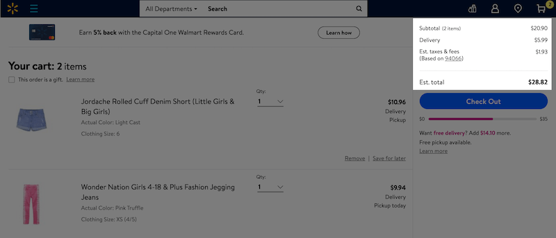
Before initiating the checkout process (which often includes filling out long forms), many people want to know about the cart’s total cost and the estimated delivery time.
This information allows them to early determine if the cart meets their budget and time requirements, and not to waste time processing the checkout just to abandon the cart at the last step.
Shipping cost
While shipping cost varies by product and destination, there are many ways the shipping cost can be presented to be more reassuring.
Display an actual lowest shipping cost
When a flat-rate shipping cost is applied, shipping cost for a specific area, time period or order value can be precisely calculated. Based on that, the lowest shipping cost can be used for orders that shipping cost is yet to be calculated.
Display an estimated shipping cost
Using an estimated shipping cost is the most common way to offer shipping cost before an accurate calculation. Estimating the shipping cost can be based on either the site’s most popular destination or the visitors’ location.
If the visitor is logged in and previously made purchases, their prior shipping cost is an ideal option for an estimated shipping cost.
Display a range of lowest-possible shipping costs
If the estimated shipping cost is not possible, at least a range of shipping costs can help. Try to use the shipping method that is the cheapest-possible and provide people with a cost range of that method.
Display Free shipping information if any
If an item has free shipping, it is important to make it clear that the shipping cost is 0. This will save people from being confused about whether the aforementioned “Free Shipping” statement actually works.
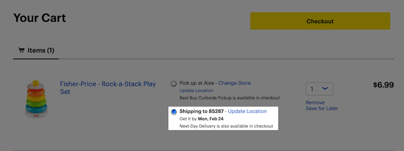
Shipping time – Use “Delivery Date” instead of “Delivery Speed”
Oftentimes, when the delivery time says things like “Arrives in 1-2 business days”, people still cannot say for sure when they receive the products. This confusion forces people to use a calendar and calculate an estimated day when the product arrives.
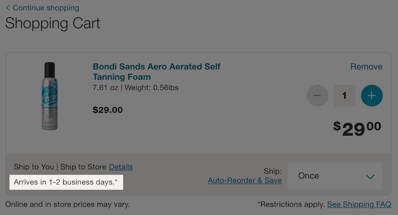
By contrast, using an estimated or exact Delivery Date gets rid of all the confusion. People know at a glance when the order arrives and can focus completely on the shipping cost to compare the options.
Total price, taxes, and fees – Provide a clear total cost
Total price is used primarily for order with more than one item.
Regarding taxes and fees, in countries like the US, where the sales tax isn’t included in the display product price, being upfront about estimated taxes and fees is necessary to avoid “sneaky additional costs”.
Much like the shipping cost, taxes and fees can be calculated based on the visitors’ previous orders, IP geo-targeting or account information. When none of this information is available, providing the lowest-possible ranges for taxes and fees can also help.
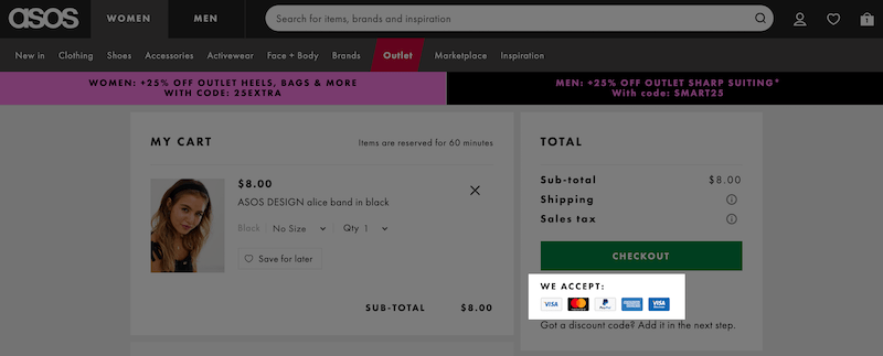
Payment- Avoid confusing visitors with too many payment options
Only include static logos (without clickable links) of the payment methods to avoid distracting people.
When it comes to payment information, informing people about the payment methods available is important. This makes sure people can easily checkout with the payment methods they are most suitable with.
However, allowing people to directly checkout with these methods is not a good idea. Too many checkout options might confuse people about deciding what’s the best option. Scientifically, this is called “choice paralysis”.
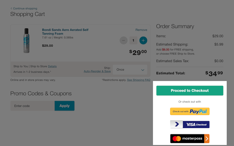
Within the scope of a cart page, people only need to be well-informed about the payment methods available. And this act of displaying the available payment methods must not affect the checkout button, which should always be visually prominent.
Only displaying the static logos of these payment methods is the solution for this. People know that they have many options at checkout, and can checkout with no confusion.
Trust elements
Security badges – Ease people’s concern about card information security
Ensuring people with security badges is helpful not only on the checkout page. Given the fact that many people keep feeling uneasy about sharing card information, they can drop out way earlier and usually before reaching the checkout page.
Which site seal do people trust the most? According to Baymard, SSL seals are the winner. It indicates card information is secured and the website is free of cyber threats.
Return policy – Make it clearly visible
Shopping online means people pay for a product without physically seeing and touching it. Due to this, being able to return a purchased item is an inseparable part of online ecommerce.
A clear return policy gets rid of the concern about receiving unsuitable products. Especially for spec-driven products, a return policy contributes significantly to people’s decision whether to buy the product.
Live chat – Be available timely to prevent cart abandonment
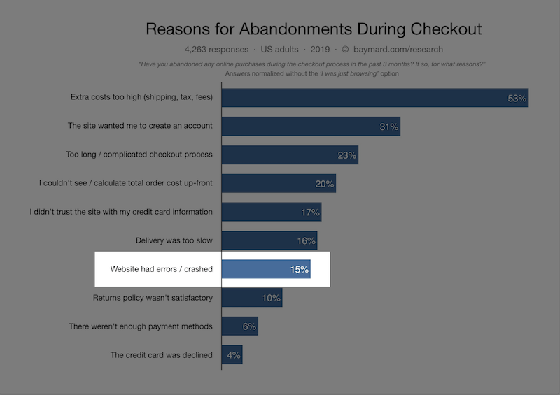
What happens if an error occurs and your checkout button doesn’t work? Chances are high that people will leave, because they just cannot checkout.
That’s just one example among many technical errors that can directly increase your cart abandonment rate. In fact, 15% of online shoppers abandon their cart because of website errors, which is too bad, because it can easily be prevented with live chat support.
Be available when your potential customers reach out for help. It’s a basic thing you can do to avoid needless cart abandonments.
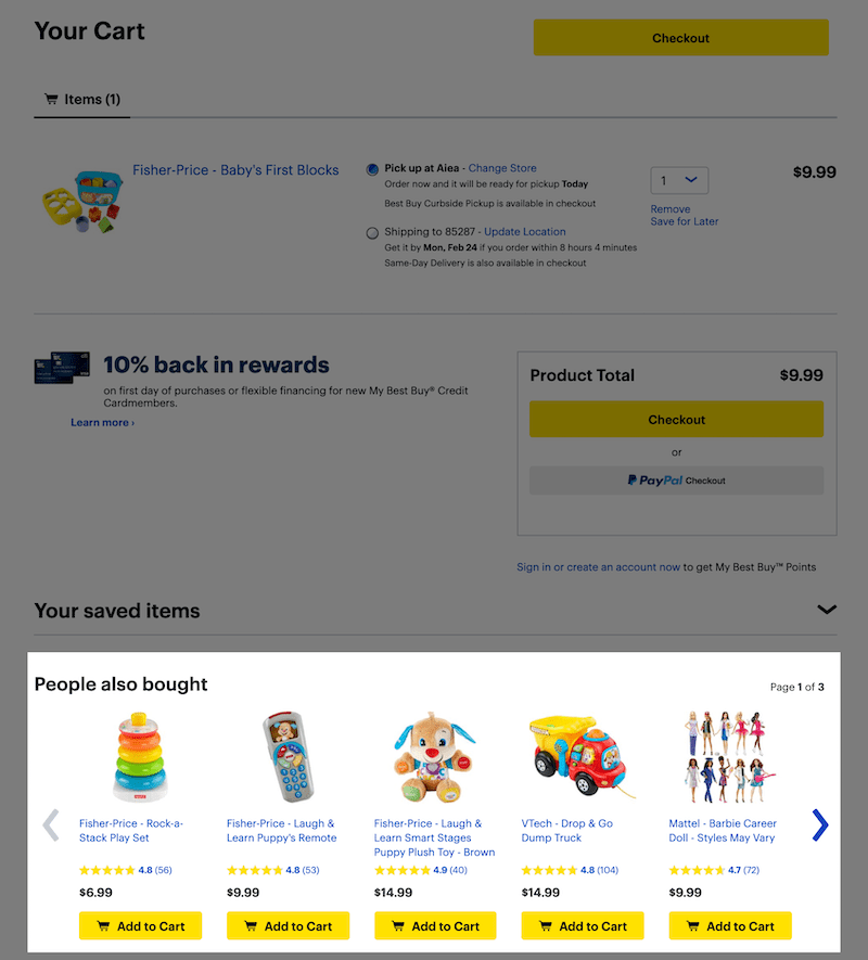
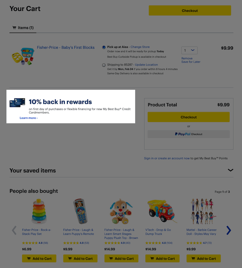
Upsell/cross-sell – Recommend the right products
Not only does upselling boost sales, but recommending relevant products can also create a positive experience if the products meet the customer’s needs. Use the products in the carts as a basis and apply upsale/cross-sale techniques cautiously.
Cross-sell – Recommend related products
Cross-selling means suggesting related products that people might need. Many products go in a pair with one another. Without a firm intention and experience, people might not even know they need a product, until they see it.
Recommending products of the same categories, complimentary products, frequently-bought-together products are common ways of cross-selling.
Upsell – Recommend better options
Recommend products with more benefits and a higher price, if any. Sometimes, upselling turns out to be a favour by reminding visitors of the products they need but have already forgotten.
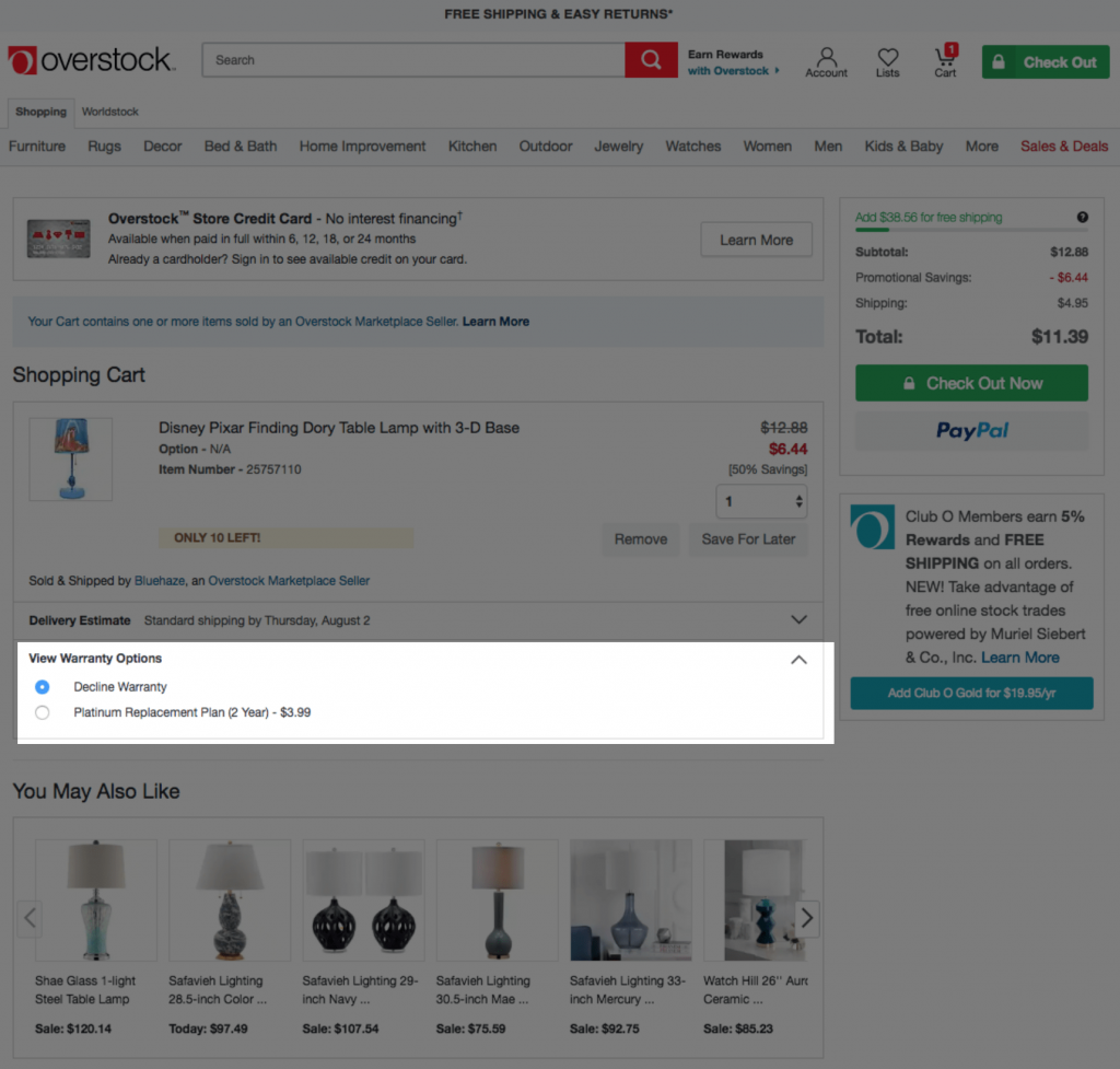
Additional offers
If there’s any offer that might encourage people to make purchases, include it within the order information. Loyalty programs, cashback, and gift cards are great options to choose from. Make sure your visitors are well-informed and can easily access these benefits.
Best shopping cart page designs for your inspiration
Check out the best shopping cart pages curated by Baymard’s Institute and learn how they apply the best practices to create the best customer experience.
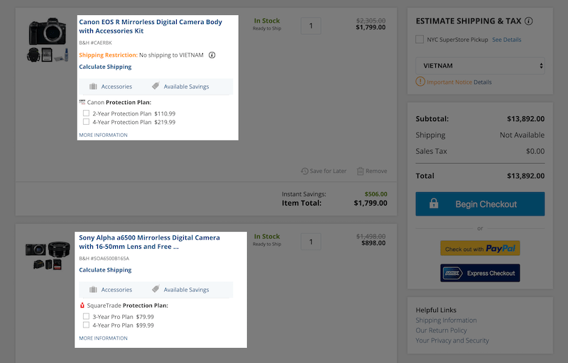
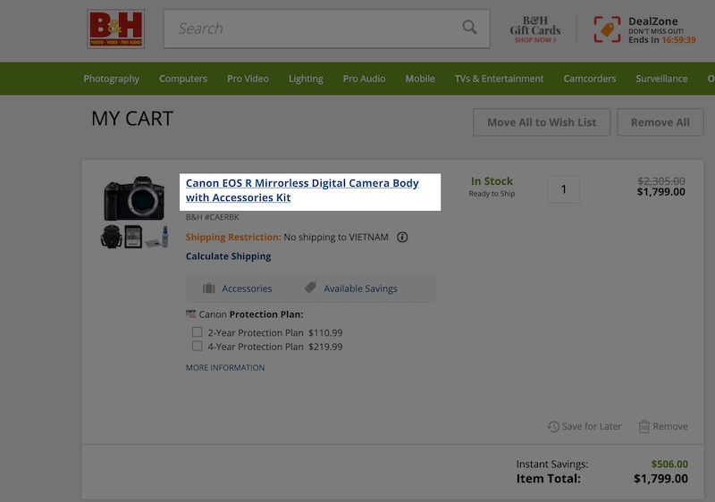
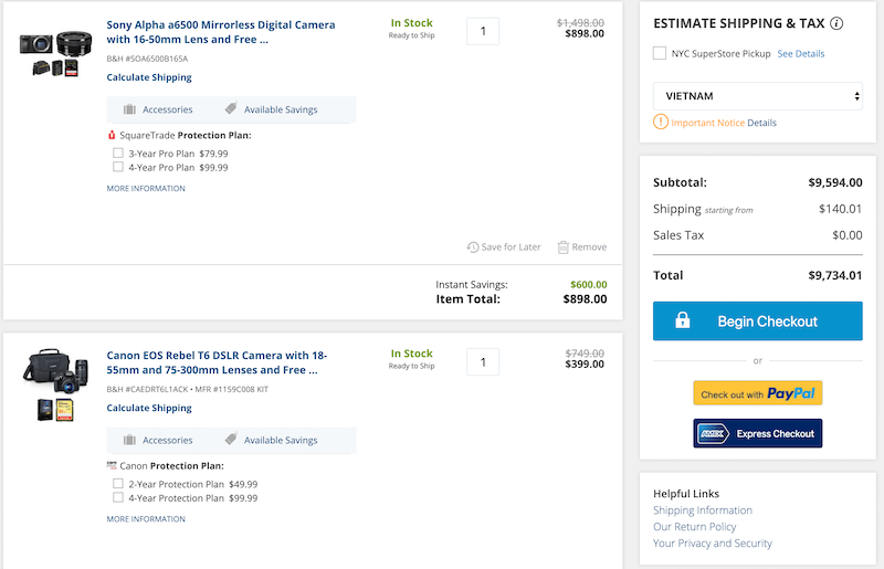
B&H Photo
B&H photo dedicates a side column for shipping cost, taxes and an estimated full order cost and styles it coherently. Product information and product thumbnails are also presented clearly, making it easy to review the order and compare items.
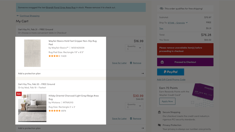
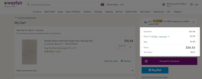
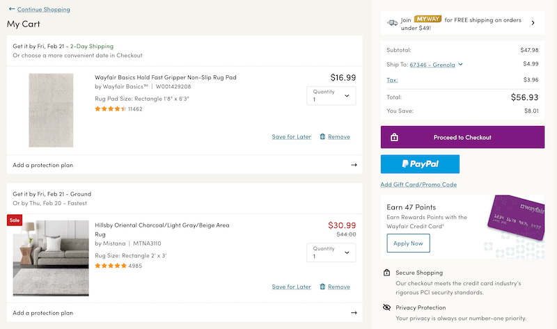
Wayfair
Along with product thumbnails, product information and the total order cost, Wayfair also pays considerable attention to the shipping information.
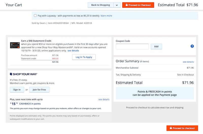
Sears
Not only does it make the estimated total cost visible, sears.com makes it ever-visible with a sticky bar, which is a good practice and can be well-applied for carts with many products.
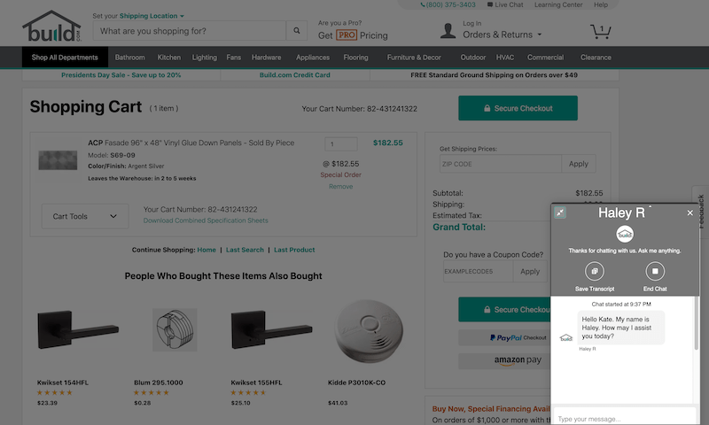
Build.com
Build.com effectively leverages space to implement cross-selling. It also successfully applies the “Free Shipping” principle: Especially when the shipping cost is 0, it needs to be included in the order summary.

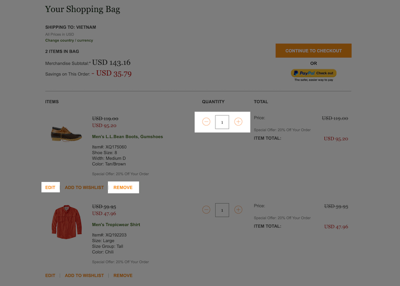
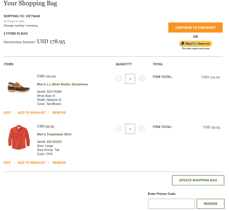
L.L.Bean
L.L.Bean makes it very clear that people can edit or remove items in the cart. The product information and product thumbnails are also presented very coherently. Both reviewing and comparing can be done easily and effectively.
Learn more
Credit: This guide uses research findings from the Baymard Institute’s e-commerce UX research.