A product listing page is a page that displays all products of a particular category. It is on a product listing page that people scan and compare the items before selecting one or more items to view further.
To personalize product listing pages, it is necessary to understand each group of visitors and what they’re looking for, then provide the personalized information that meets their needs.
Serving each traffic group with the appropriate content
A typical product listing page usually consists of the fundamental content, including:
- Page header
- Product navigation: Searching, Filtering, and Sorting
- Product presentation:
- List layout: Grid view or List view
- Items’ presentation: Product image, title, variants
- Items’ Call-to-actions: Quick view, wishlist, add to cart.
When it comes to personalizing a product listing page for particular traffic groups, specific content appears to be more relevant to each group than the others. As a result, customizing particular content becomes necessary for particular traffic groups.
Cold traffic – Make it clear what page type they’ve landed on
How come a visitor ends up on a category page without much previous browsing history?
It’s via organic search engines, direct links, or PPC ads. These visitors are considered cold traffic as there’s a high chance they know little about where they are: Your brand, your product range, even the very category page they’ve just landed on.
For these visitors, it’s important to instantly make it clear what types of products they can find on the page.
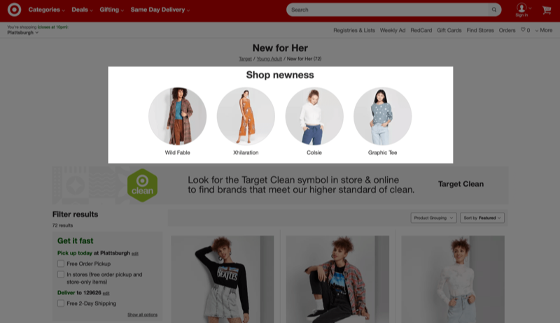
The content included in this section about cold traffic is essential content for any product listing pages and therefore needed for all traffic groups.
Page header
Make it clear what type of products are included
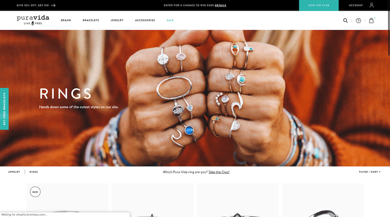
First-time visitors are people who have no previous interaction with your brand. Therefore, landing directly on a category page might be confusing if they cannot tell within a few seconds what types of products are included.
An inspirational banner, a descriptive header, and images of the best sellers will instantly inform visitors about the whole category and inspire them to scroll further down the page.
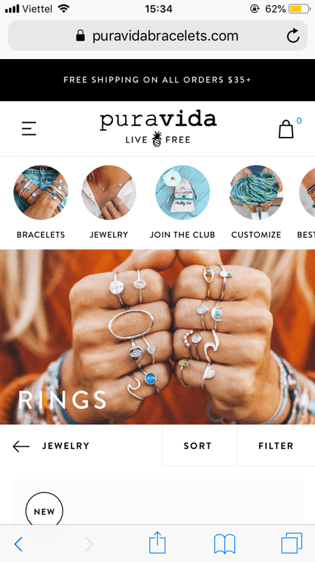
On mobile, including a hero banner also creates a sense of calm and stillness. People have time to form an idea of what type of products they are about to explore, without being confused with clusters of information.
 |
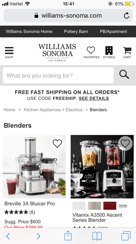 |
Pura Vida Bracelets’ product listing pages on mobiles with an inspirational banner and a concise description, compared to Williams Sonoma’s with no banner.
Products navigation
On a page that might display up to hundreds of products, search, filter, and sort are indispensable, as they help people narrow down their product scope to quickly select the appropriate items. Without finding the right product, they cannot buy it.
Search
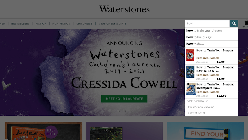
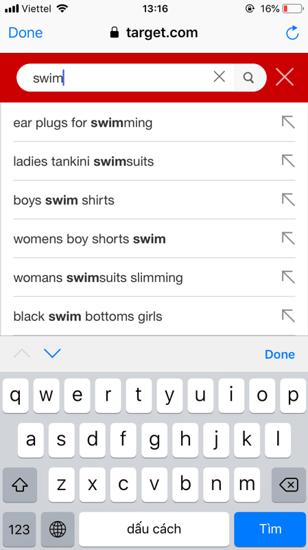
Employ autocomplete
When being done right, autocomplete is especially helpful to both first-time and returning visitors. The smart recommended search terms can inspire people’s product discovery, narrow down product scope by category or correct misspelled words.
Often, the search bar should be stuck to allow people to reach it at any time.
Filter
Have fundamental filtering options
People rely heavily on filtering options to find products. In order for the filtering tool to actually be effective, including the right filtering options is necessary. Depending on the nature of the products, different filters may be required. But for most product types, some fundamental filtering options are indispensable:
- Product attributes: Information displayed in the list items, such as color, sizes, gender, etc… should all be used as filtering options.
- Product statuses: New arrivals, Out-of-stock, Available-for-home-delivery, Store-pick-only, etc.
- Customer interaction: Customer ratings, Bestsellers, Most popular, etc.
- Product theme: Seasons (spring, summer, autumn, winter) and style (casual, formal, activewear) are two thematic filters commonly used by users in apparel stores. Thematic filters vary by product types and require precise product tags.
- Product compatibility: Cameras and lenses, laptops and adapters, phones can phone cases. Products that go with each other should be used to filter each other.

Filtering best practices
- Allow people to combine multiple filter values
- Explain industry-specific filters, “translate” terminologies in casual language that anyone can understand.
- Filters and sorting should never reset one another
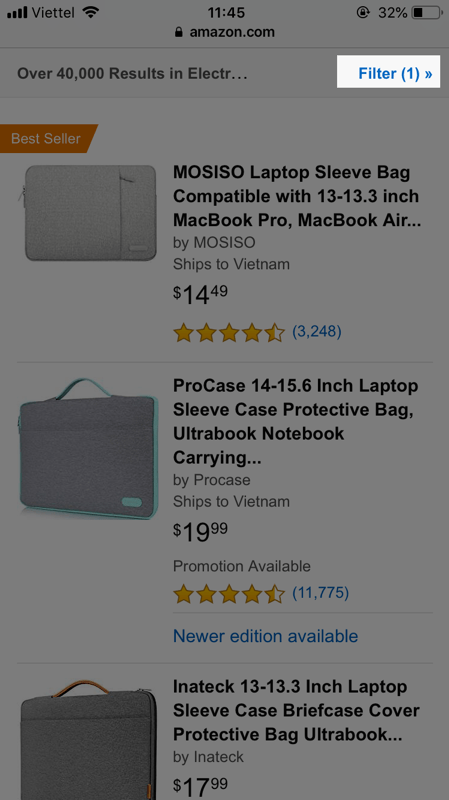
On mobile, when there are more than five filter options, use a custom filtering interface to utilize the whole viewport. Amazon’s filtering screen is a good example of a custom filtering interface on mobile.
 |
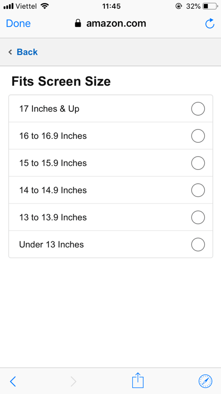 |
Amazon allows filtering by laptop screen size for Laptop Sleeve Bag
Sort
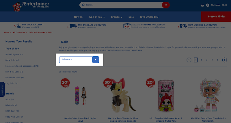
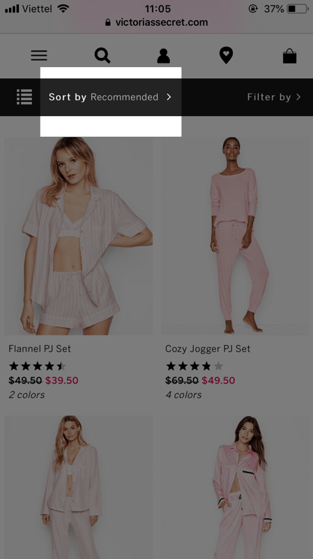
Use “Relevance” as the default sort option
Setting the default sort type as “Relevance” makes sure the first 10 – 20 items of your product listing page reflect the whole category’s diversity. This assures people about the product range and gives them reasons to invest more time on the page.
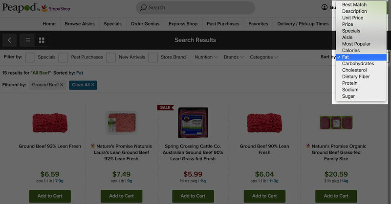
Have category-specific sort types
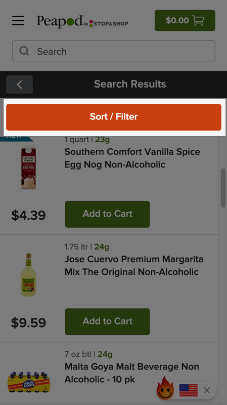
Products of different categories have different attributes, and people usually use these attributes to define their shopping preferences. Without these attributes, it’d be needlessly hard for your visitors to find the products that they actually need.
 |
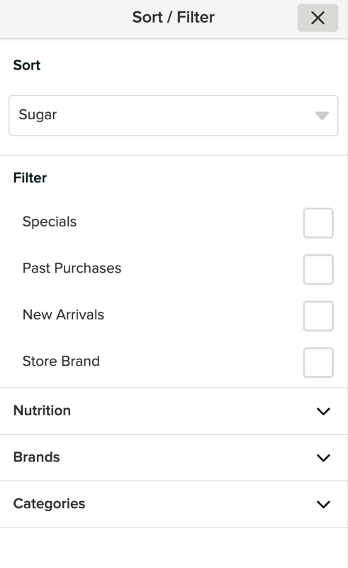 |
Peapod’s mobile-optimized sorting tools allow people to sort by category-specific types like “Sugar”
Product presentation
Fundamentally, there are two types of product presentation: Grid and List. Whether to use a list view or grid view depends much on the nature of the products and should remain unchanged regardless of the visitors’ sale-readiness.
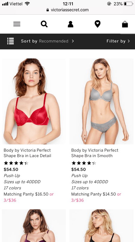
Grid view: Best for visually-driven products
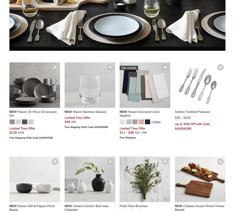
In general, grid views are commonly used for visually-driven products, in which people rely much on product thumbnails to pick the items.
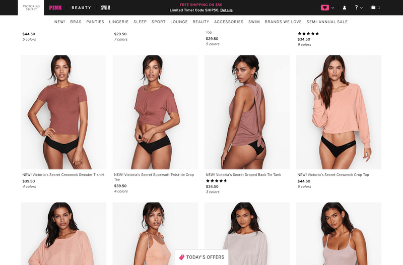
In these visually-driven product verticals and industries, many products are mainly chosen based on their aesthetic. Consequently, people would rely primarily on product thumbnails to evaluate a list item before clicking to view its product details page.
List view: Preferable for spec-driven products
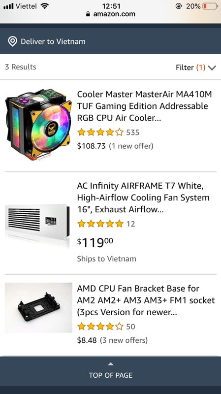
Meanwhile, people usually use list views for spec-driven products – products that people need more information to support their decision.
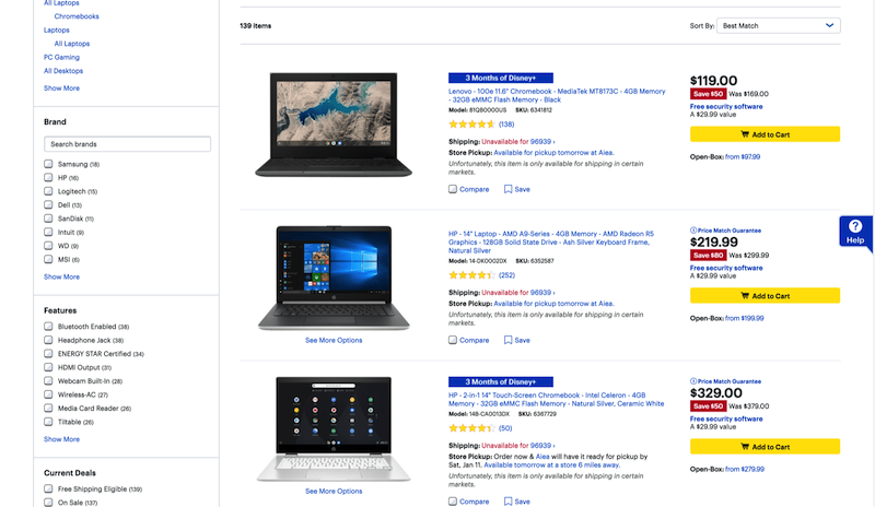
List view is better for products like laptops, mobile phones, cars, sleeping bags, camping tents, and so on. The listing is primarily based on the information and not aesthetic.
Products call-to-action (CTA)
Generally, a quick view, wishlist, and add-to-cart are the main CTAs to be used flexibly depending on the nature of each category.
Quick View – A symptom treatment for poorly designed pages
A Quick view is suggested by Baymard as an option to avoid. At first glance, this seems to be a great idea, allowing people to take a closer look at each list item to get further information. However, the action of needing to quickly look for further information by itself is a symptom of a poorly designed product list. The information should already be clear without needing to Quick View.
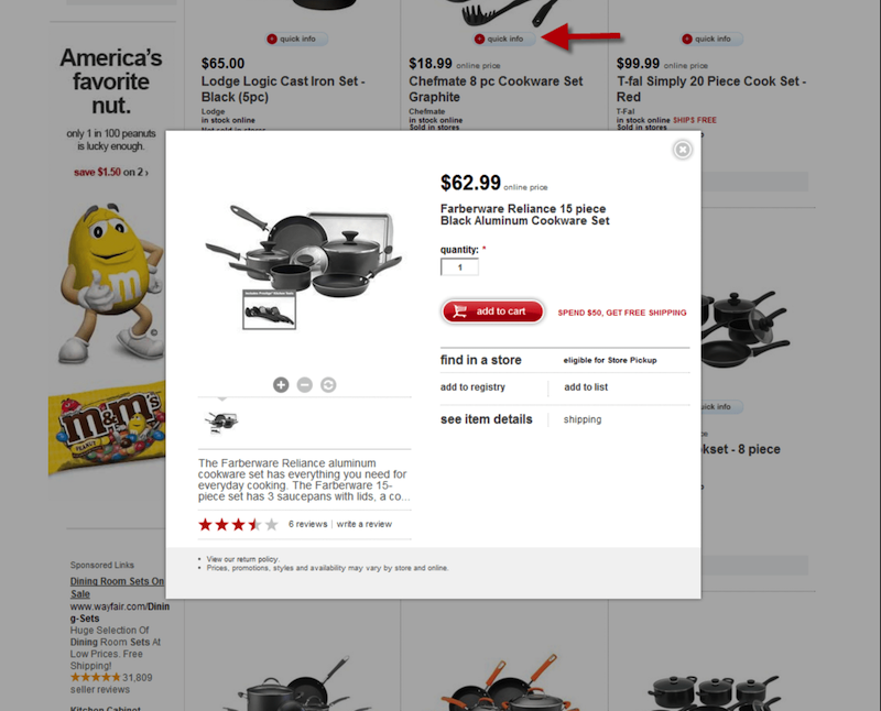
With a large enough product thumbnail, secondary hover images and essential information included, people should ideally get enough of the essential information needed to compare the listed items.
Scanning and comparing the list items are two basic actions that visitors are supposed to be able to perform seamlessly in a product list. If clicking on a quick view is required to get the essential information, both scanning and comparing and badly affected.
In some cases when secondary hovering images couldn’t be available, or when viewing a large screen-size image a more valuable, quick view still works well as a symptom treatment. In these cases, it’s necessary to be aware that this can decrease the rate of people being directed to the product detail page.
Wishlist – used to deal with out-of-stock items
In stores that people are supposed to buy a wide range of products and stores with out-of-stock products are where the wishlist proves to be the most effective. When it comes to personalization, a wishlist button is also a good way to explore further into people’s thoughts.
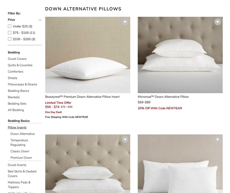
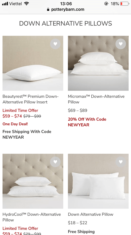
On product listing pages, due to the limited viewport of the list items, the wishlist should only be a secondary call-to-action with not too much visual weight. As in the end, adding products to the cart or clicking to view product details are ultimately the conversions to be targeted.
Add-to-cart button – Used when no further information is needed
An add-to-cart button is especially effective for visually-driven products that require little information to be bought. In these cases, an add-to-cart button allows people to quickly grab and checkout without being directed to many pages.
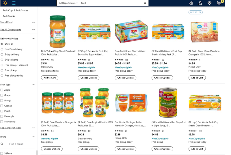
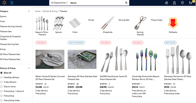
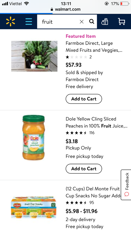
For products that require more information, people are not likely to add an item to the cart without clicking to view further details. In cases like this, the add-to-cart button should be omitted to make room for other information.
Warm traffic – Make sure visitors can find products easily
“Warm visitors” are considered warm usually because they have previous browsing history (viewed certain products, clicked certain links or came from certain referral sources, etc). Given their shopping history, it is reasonable to say these visitors are looking for certain types of products. Their obstacle at this phase would be about how to find the right product among hundreds of product list items.
If they can’t find it, they can’t buy it. Making it easy to find products is consequently essential to improving product listing pages.
Viewed products and Recommended product list
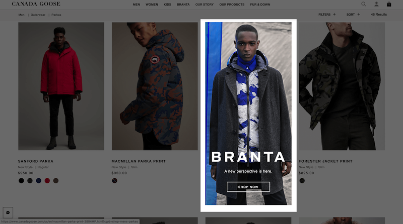
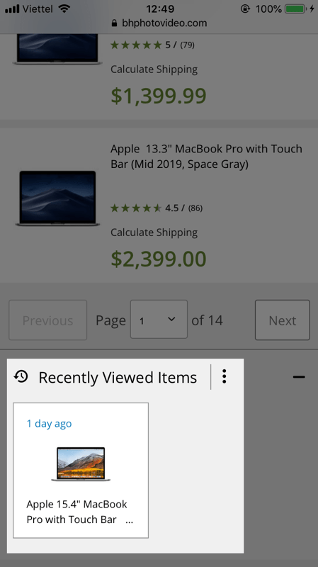
Given the limited product list view, reminding people of the product they viewed or recommending a relevant product list should be extremely subtle. Canada Goose does a great job when recommending a previously-viewed collection as a list item.
Products on sale
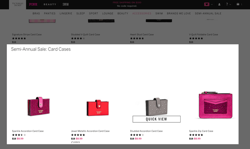
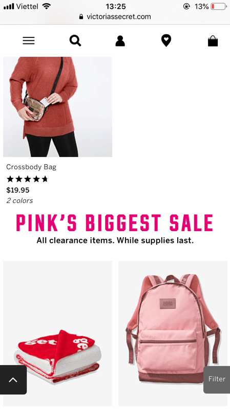
Discounts on previously-viewed products or just discounts in general are traditional ways to convert returning visitors. On product listing pages, displaying these offers as listed items is the optimum way to recommend products without occupying space.
Hot traffic – Highlight what they previously added to their carts
Hot traffic is traffic from either people who already added products to their carts, or returning customers who previously made purchases.
Either the case, highlighting what they previously bought or added to carts would make it easier for them to explore new products.
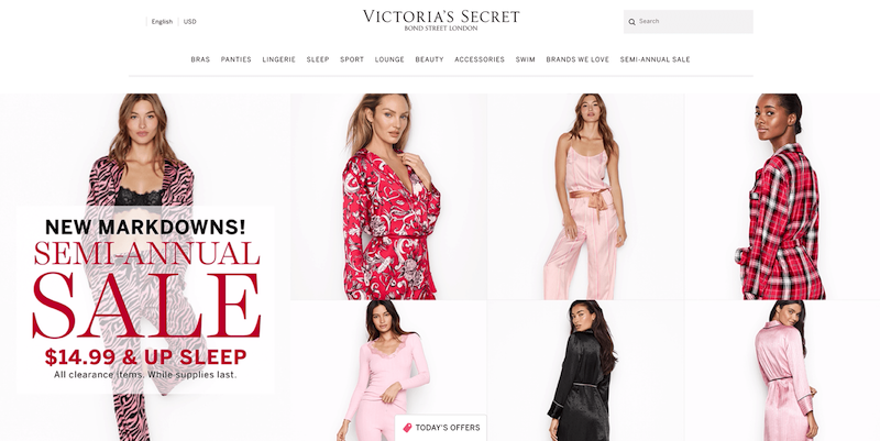
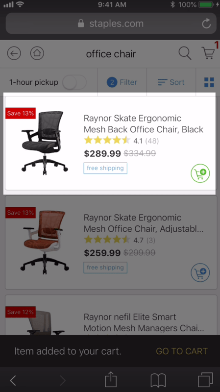
For cases when people add products to their cart and continue shopping, highlighting the products they already added to their cart is an effective and tactful way to remind people about what they were looking for recently.
Cart content
Highlighting added products or purchased products
Highlighting added products or purchased products empowers people to avoid needlessly reselecting the product they already selected, while still being able to re-select those products if they really need to.
This is also a tactful way to remind people of the products in their cart and can be implemented alongside a separate cart content list items.
Upsell / cross-sell
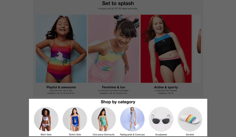
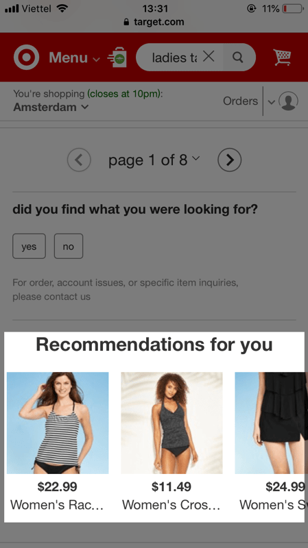
While product listing pages are type-sensitive, which means only certain types of products are supposed to be displayed in a specific category, recommending relevant products for up-selling and cross-selling can be done in the form of category recommendation.
Best product listing page design for your inspiration
Below are the best Product List & Filtering designs by the Baymard Institute. Take a look, get yourself inspired and design your best product listing page.
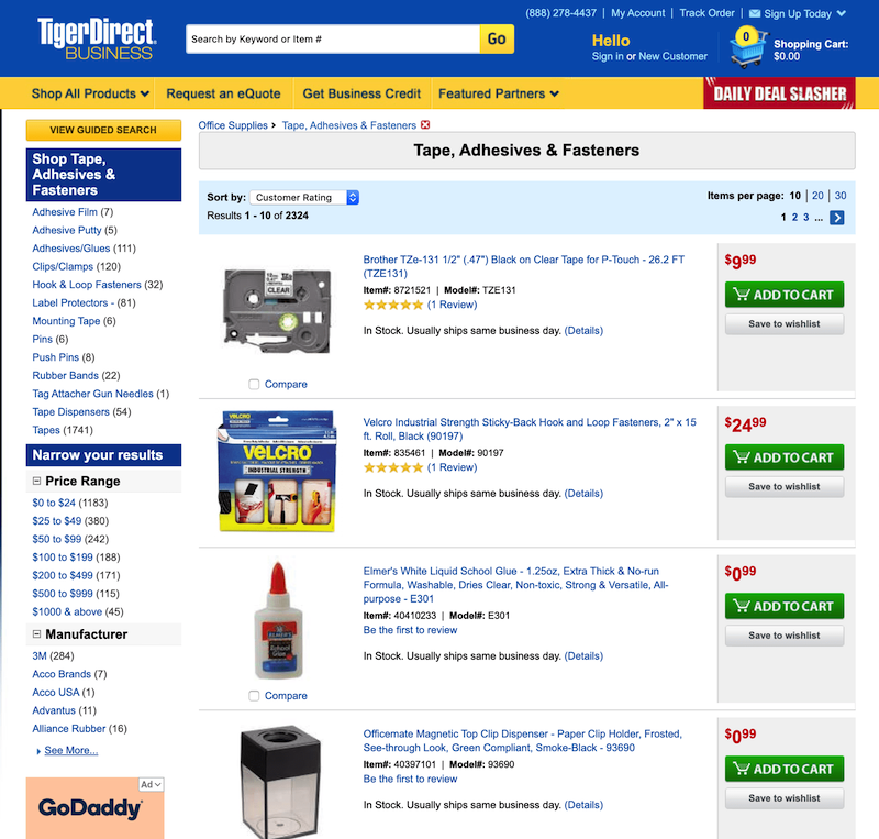
TigerDirect
The flexibility in when to use List view or Grid view, the total number of items in the product list, and the hierarchy-based breadcrumbs are what make TigerDirect’s product listing pages good in terms of List Layout.
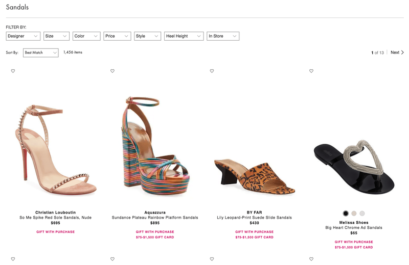
Neiman Marcus
List item presentation is what you can learn from Neiman Marcus’s product listing page. With product thumbnails, hover images and list item information all deliver the key information needed for visitors to scan the product list.
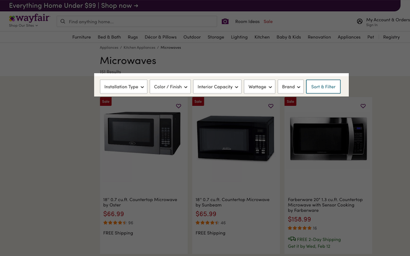
Wayfair
Wayfair is great at filtering. All list item information can be used as filtering options to narrow down the product scope. Along with the available filters, thematic filters and filtering by product statuses also make the product finding experience seamless.
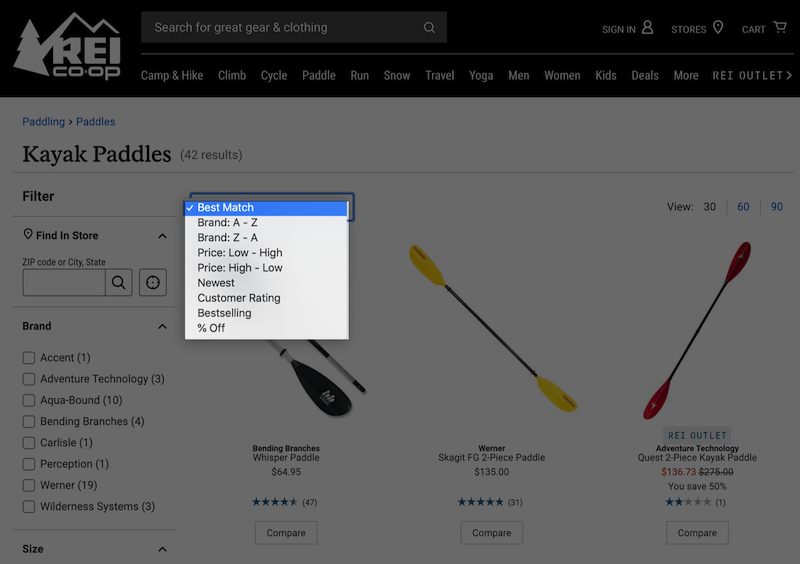
REI
Rei uses Best Match as the default sorting tool in a dropdown sorting interface, which aligns well to how a sorting tool should be presented.
Walgreens
On Walgreens product listing page, essential and category-specific product informtion are used flexibly throughout categories. The flexible use of add-to-cart buttons also adds to the coherency of the product listing pages.

Learn more
Credit: This guide uses research findings from the Baymard Institute’s e-commerce UX research.