Sadly this is the real world, and not a fairytale. The “perfect” promotion doesn’t exist, and we as e-tailers are on our own in getting the word out when we do create special offers. Thankfully, PageFly Shopify Page Builder makes it easy to construct a beautiful landing page that is sure to reach your targets and steer them toward a buying decision.
Scroll down to watch the video tutorials at the end of this chapter. Click here.

What’s a landing page?
The theory behind landing pages has been beaten to death several times over across innumerable eCommerce knowledge sources. This isn’t a bad thing, because a lot of the concepts are proven. Here’s what we know a landing page needs to do:
- Capture the attention of your target market
- Inform of a specific product, promotion, or activity
- Identify pains and offer clear remedies
- Be easy to follow
- Lead to a clear, single CTA (eg subscribe, buy now, sign up, etc)
One of the key points is that a landing page should serve one specific purpose. This makes them perfect for special offers, allowing retailers to generate a unique page for every promotion in order to tell a clear story and structure the message around being as persuasive as possible regarding what is on offer.
What does it need?
Our Best Shopify Landing Page Checklist for Increasing Conversion article goes into detail about all the must-haves and should-haves of a great landing page. It’s a great resource for determining whether your page is fully optimized or not and I definitely recommend using it when building pages of your own.
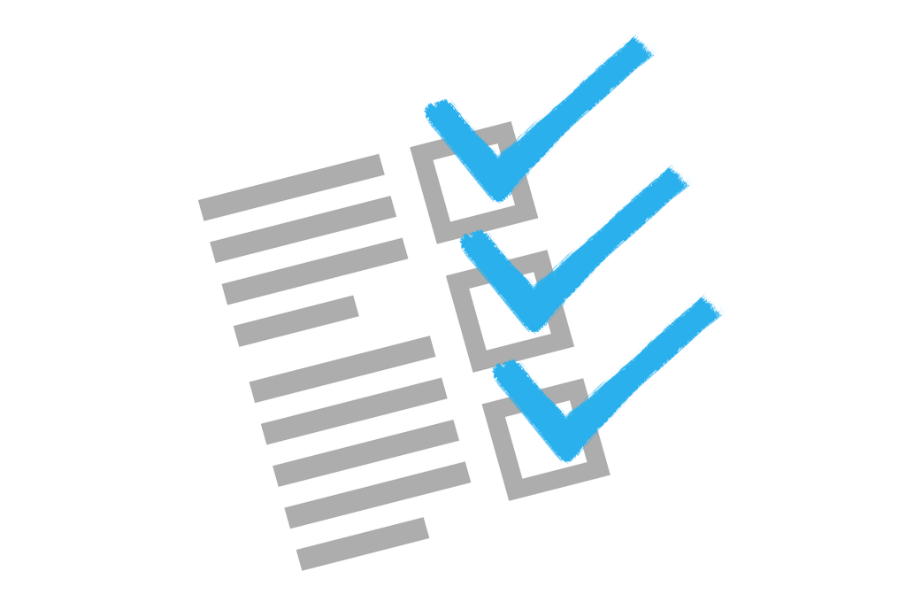
Here’s a summary of the checklist:
❏ Start with your Unique Value Proposition
❏ Maximize the speed and performance of the page
❏ Check your Shopify landing page functionality on mobile, tablet, and laptop/desktop
❏ Effective buttons on featured product(s)
❏ Include as much positive information as possible to reinforce the benefits and trust
❏ Host images on Shopify Content Delivery Network
❏ Have a strong title and brief, effective paragraphs
❏ Invest in product image quality
❏ Be fastidious with grammar and spelling
❏ Use videos to showcase products
❏ Use sliders to maximize the space on your landing page
❏ Have a strong, visually present call-to-action
❏ Use a countdown timer to create urgency
❏ Include an FAQ section so many customer inquiries can be solved from the same page
❏ Make your advertisement and landing page identical
❏ Use the optimum length
This might seem like an intimidating list at first, but the article itself goes into further detail about each piece. Plus we’ve got some great examples to help drive the point home, let’s take a look.
Examples of Great Special Offer Landing Pages
Here are some examples that represent very uniquely creative and functional landing pages. You’ll notice that all of these pages, despite differences in content and industry, all lead the visitor towards taking action.
Blue Apron
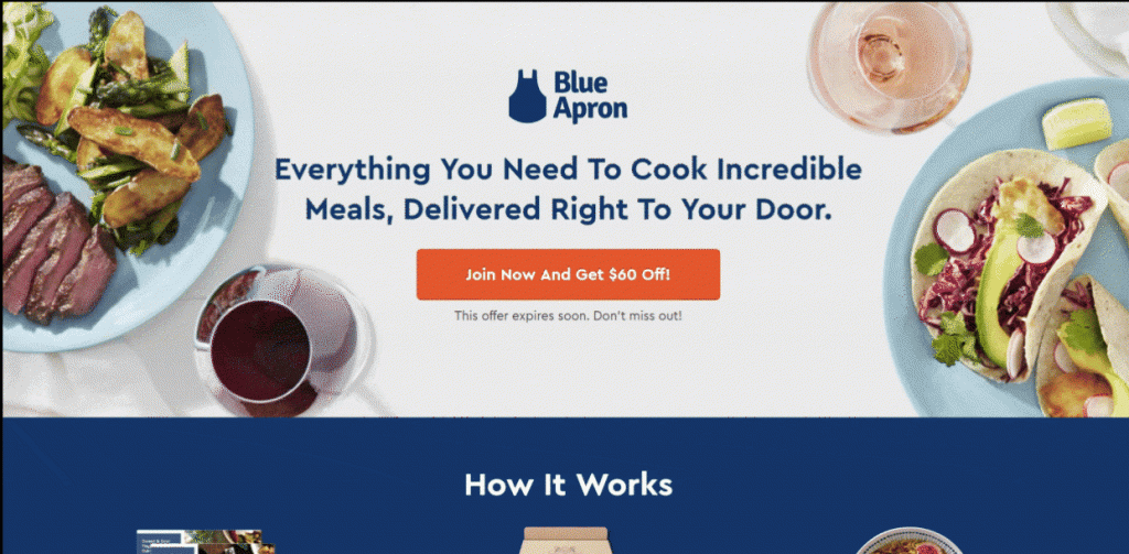
Blue Apron is a service that allows customers to choose meals, then have all of the ingredients required to make those meals delivered to their door.
The first thing to notice is that this landing page is CTA city. They have 3 massive buttons exhibiting their $60 off promotion spread out nicely across the page. Each section is concluded by the same CTA, basically ensuring that if the first or second sections don’t already have the visitor convinced, the third time’s the charm.
This landing page also has:
- Beautiful images
- Concise, effective copy
- Strong, clear headings,
- Customer reviews
- “This offer expires soon. Don’t miss out!” – a sense of urgency
- They relieve customer pain by clearly explaining the time-saving, budget-friendly, and nutrition aspects of their service
- There are no “escape routes” in the footer. The page concludes with that great CTA and nothing else
Axis
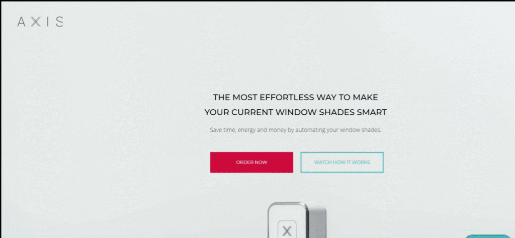
I chose this landing page primarily because of the design. This page lets the images draw you in and the copy is brief enough that it doesn’t hinder the flow.
They begin with a CTA and informative angle, then you can see the logos of where their products have been featured or mentioned. The next section is their value proposition: “What Gear can do for you”. This makes it really about the reader, fostering a closer relationship and trust.
This page is a behemoth, but as I mentioned, the design is good enough to keep you interested. The remainder of this landing page contains videos, specifications, compatibilities, integrations, practical, real-life applications, and customer reviews all speckled amongst beautiful images.
They finish off with and “order now” CTA, in proper form.
CauseBox
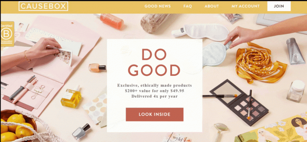
This is actually a homepage. But in the web design field we’re starting to see pages that function not only as their designated title. This is especially true with a landing/homepage.
Should we call it a homepage? ….Handing page? …. Anyway.
As soon as you visit Causebox, their ethical commitment and special offers are right there in your face (which is a good thing). Featured logos, value props, subscribe CTAs, and a slideshow of Twitter mentions convey a sense of community and make sure anyone visiting this page doesn’t miss out on what they offer.
Spark People
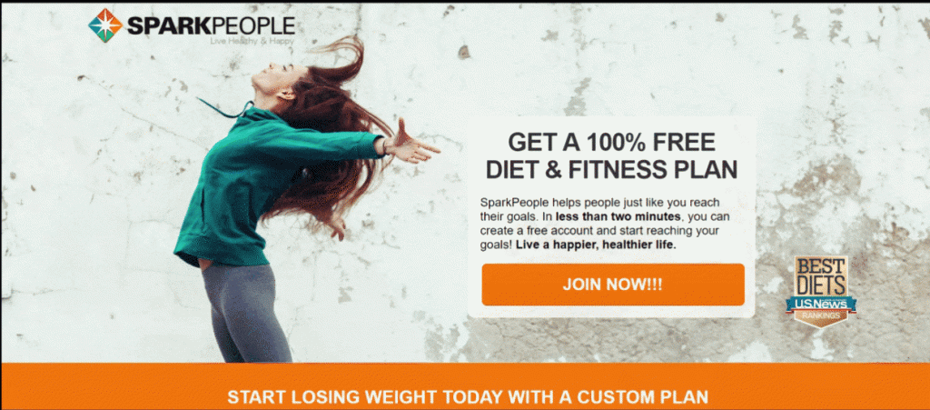
This is a quintessential special offer landing page. Let’s break it down from top to bottom:
- Amazing offer for a free diet and fitness plan
- “Best diet” award marker
- Scope of services and support
- Testimonials from customers who have successful used the service
- Further scope of (free!) services included with subscription
- Inspirational stories on the right
- Reassurance (no credit card needed to try)
- Final CTA
- No escape routes
Sp this page has a clear message, is easy to follow, is very persuasive and doesn’t drag on or contain any unnecessary, distracting information. Well done Spark People.
Ipsy
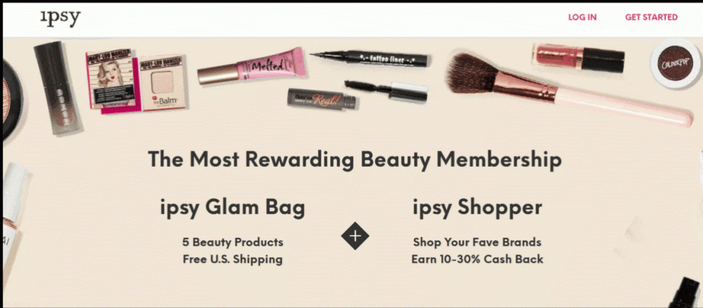
This beauty product subscription service has a very simple landing page. The first thing I notice is the wording in the heading: “The Most Rewarding Beauty Membership”. They are already positioning themselves as a superior entity amongst competitors. This might seem small, but can have a tremendous subconscious effect on visitors.
They also have two strong offers for free shipping and a cash back opportunity. Although this page is short, the offers are enough to make you want to explore further.
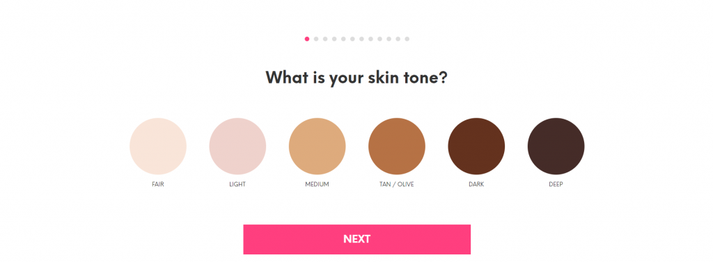
Post-click, this page takes you through a number of steps that match specific products to you based on your own characteristics. This really makes it feel like a personalized offer and ore interactive for the visitor.
Are you ready?
It’s high time to start building a special offer landing page of your own. If you take your time and make sure that the right components are present, it’s a guarantee that you will see digital and business results stemming from your landing pages.
Please follow along with our video tutorial of how to replicate the ________________ landing page using PageFly Shopify Page Builder. After learning the basics, you’ll surely be on your way to creating masterful landing pages in no time.
[Video] How To Build A Shopify Landing Page Like Nike
Learn more: