
Being an eCommerce merchant yourself, you have probably heard the term “conversion rate optimization” time and again. Of course, the goal of every online business ever is to “convert visitors” – making the most site visitors into customers as possible, otherwise, no profit would be made.
But how exactly do you convert website visitors into customers, and do so efficiently for that matter? Sadly, there are no one-size-fits-all answers, and the secret to success is far from a Google search away.
But there is no need to worry, either. We will try our best to provide you with a comprehensive list of strategies on how to increase your conversion rate. So buckle up, this is going to be a long ride!
I. What Is Conversion Rate And How Do You Calculate It?
Just in case you are a beginner at the eCommerce game, let’s walk through the basics.
1. What does conversion indicate?
Conversion is when a website visitor going to your online storefront finally does the desired action you have in mind. Most commonly, a conversion happens when a shopper makes a purchase. Depending on the specific key performance indicator you set out for your store, conversions can manifest in all different shapes. Visitors can:
- Add items to carts
- Add items to wishlists
- Sign up for newsletters
- Share your products on social media
- And so on
2. How to calculate conversion rate
There is a very simple formula for merchants to grasp how well they convert website visitors to buyers:
Conversion rate (%) = Total orders/Total visitors * 100
Conversion rate is a percentage indicator that tells you out of 100 visitors, how many found something that suits their needs and made an order. So for example, you have a total of 100 website visitors, 10 of which leave waiting for a shipment – this makes your conversion rate 10%.
Of course, you don’t have to calculate conversion rates manually at all, for eCommerce platforms like Shopify already offer easy built-in conversion tracking. Simply go to Analytics > Dashboard to see how well you convert website visitors into customers.
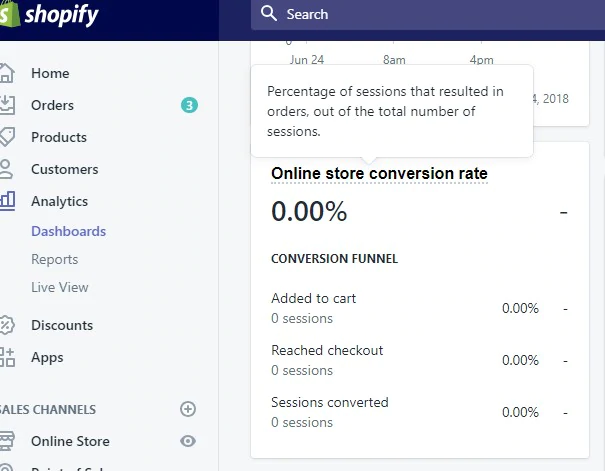
You can also use Google Analytics to track your rates. It will help you track the total marketing performance across multiple channels, including Facebook, without the ability to audit them of course.
All you need to do is simply connect your Shopify store to Google Analytics via the Online store dashboard.

3. The average conversion rate
This largely depends on your specific industry or region. For example, luxury goods can expect a 0.6% average conversion rate, while food & beverage stores should aim for 5.5%.
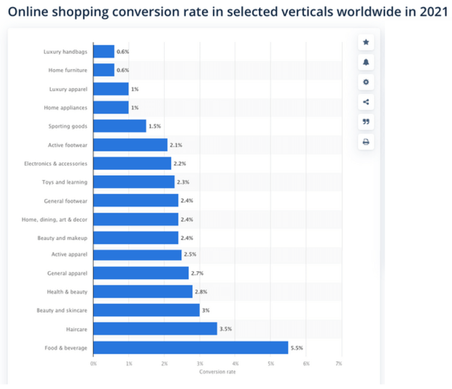
Online shopping conversion rates – Source: Smart Insights
But overall, the average eCommerce website conversion rate stands at 2.63% in the US, and 2.58% globally.
But if you are exclusively selling on Shopify, the average percentage is 1.4%, so don’t be discouraged by the low ratio, it happens to everyone.
That being said, always aim to be above average. Ideally, you would want to keep your conversion rate always higher than 2.58%, especially if you are not specialized in luxury goods.
II. Reasons Why You Are Getting Traffic But Not Conversions
Whether or not you can convert visitors depends immensely on both internal and external factors. A small mistake or just an unoptimized strategy can do terrible justice to your conversion rate.
Let’s look at a few general possible reasons why you are getting traffic but no orders at all:
1. Unoptimized website
Our lives have become so hectic nowadays that shopping has become a chore for many people. That is why shoppers want a fast and streamlined shopping experience. A slow site will make your storefront a lot more unappealing, not to mention unreliable.
2. Bad UI/UX design
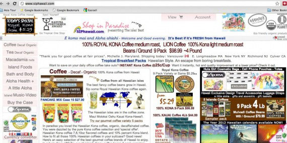
Good UI/UX (user interface/user experience) goes a long way in making consumers trust a brand. A site too cluttered will look outdated and makes browsing a nightmare, while a site too empty or minimalistic can be boring. You must look for a perfect equilibrium, or else bounce rate is going to be through the roof.
A website that looks like this is guaranteed to have zero orders for sure.
3. Bad customer service
Neglecting your customers is a big no. Shoppers are presented with an unlimited number of options nowadays, so judgment is quick to be passed. A cautious buyer will have a lot of questions, so if you are unable or even slow to answer, they will be immediately repulsed and will stray away from your services.
4. Lack of personalization
Algorithms have been devised to present customers with the desired products from the first visit. Poor utilization of such algorithms can lead to best-sellers or suitable items being buried on the 10th page of your collection page, and not a lot of people are patient enough to scroll through 10 pages.
5. Marketing to the wrong demographics
Without effective market research, you can easily determine the wrong target audience. And this is extremely costly because your items are not catered at all to the people that visit your store. How can you convert website visitors into customers if none of them have any need for your products in the first place?
Marketing to the wrong people means your store would just be filled with random people who happen to wander to a place they don’t want to be in. You have just wasted a valuable promotion budget.
III. Tips To Convert Site Visitors Into Buyers
1. A/B testing
This tip is so important that it deserves its own category. Its name is pretty self-explanatory enough, A/B testing is essentially comparing two different versions of anything to find the one with the better performance. Then you can proceed to pick one that can better convert website visitors into customers.
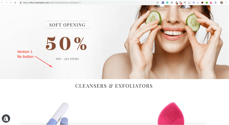
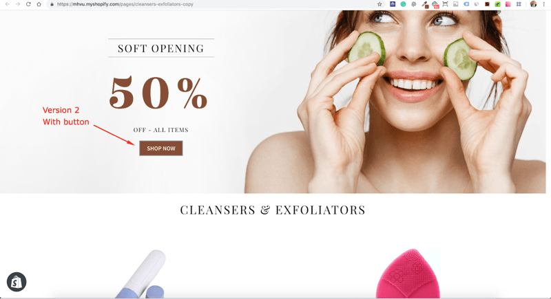 Example of A/B testing
So what do you need to conduct A/B testing on your website?
Analyze customer behavior
Find out what stops visitors from taking certain actions. You need to form an assumption before you can conduct the testing. If you don’t have a vague idea of what is affecting your site negatively, start with the ones with the most impact, or use a heat map to see which is causing the problem.
Hypothesize
How should things be changed? If you do change them, what are the expected results, and why?
You need to answer these questions clearly in order to grasp the next actions.
Test, analyze, and test again
Once you know what to do, it is time to run the A/B testing. Show one variant to half of your site visitors and one to the other half. Watch the data carefully and keep on repeating until you figure out what performs better.
Well, now that you know the gist of how to run a test, what can you test it on?
- The header and the navigation menu
- Copy and text
- Design and layout
- Fill-out forms
- CTAs
2. Website design tips
Keep navigation simple
UX is one of the first things a website visitor notices about your site, making it a major deciding factor whether said visitor chooses to stay longer with your storefront. You will need an efficient categorization system to ease the visitors down the rabbit hole. And it is crucial that you keep your navigation system simple and to the point.
Here are some basic items that you should put on your navigation menu:
- Shop (and its sub-headings)
- Collections
- Blog (if you don’t have one, you should)
- FAQs
- About us, and contact information
Furthermore, for easy navigation, make the menu bar sticky – meaning it stays put on the screen no matter where you scroll. To make it even more organized, utilize a vertical menu and locate it on the left side of the screen.

Example of an effective navigation menu – Source: Kingdom Shopify theme
Optimize your website for mobile
Mobile eCommerce sales are predicted to reach $432.2 billion by 2022. Moreover, up to 80% of shoppers have used their smartphones inside of an actual brick-and-mortar store to look up reviews and compare prices.
It is not hard to conclude that the ability to shop via mobile plays a huge part in a customer’s brand selection process. You need to optimize everything for mobile devices, or else you are missing a big portion of the pie.
A customer that has an easy and enjoyable time scrolling through a store is much more likely to stick with that brand, leading to a higher chance for a conversion.
Choose the right colors
Did you realize that fast-food chains like KFC, McDonald’s, and Burger King all have one thing in common? They all feature red as the main color in their designs. That is because the color red triggers stimulation, appetite, and hunger. It attracts attention like no other, that is why customers are always drawn to those fast-food restaurants, making those aforementioned chains household names in the industry.
Colors matter! And not only do you need to be mindful about choosing the right dominant color in your brand’s designs, but you also need to pay extra attention to your CTA (call-to-action) buttons.
What are CTAs, you ask? It’s the simple “Buy now”, “Free install”, or “Sign up” buttons you see everywhere on the Internet. Remember to include them on your landing page, and pay special attention to their colors.
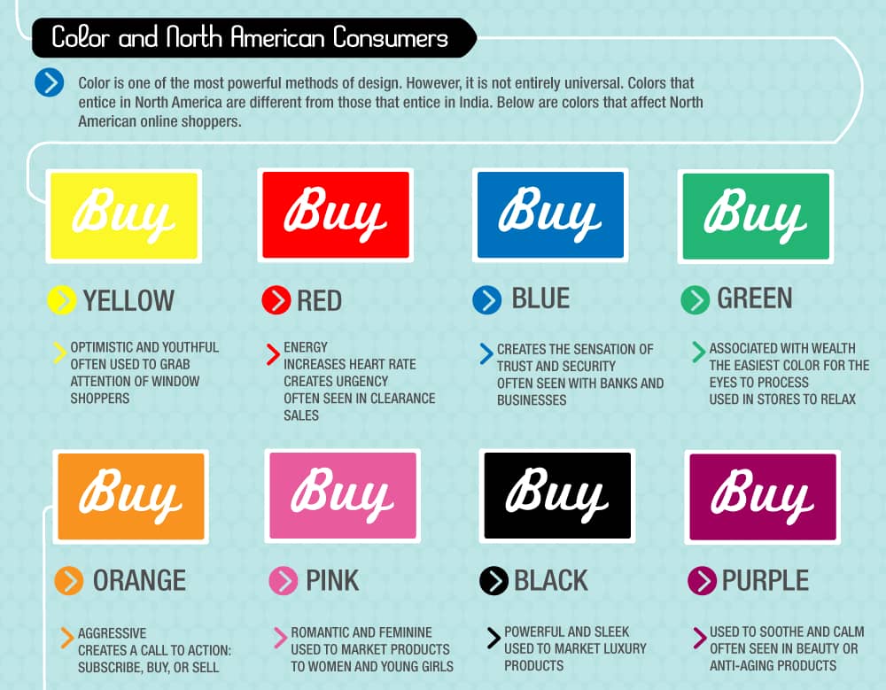
Colors’ effect on the consumer’s psychology – Source: Neil Patel
Build trust with your customers
This is essentially a no-brainer, as you cannot expect to convert visitors to customers if they don’t trust your site at all. There are a few indicators of business credibility that consumers look for to feel at ease before making a purchase decision, so you must include all of them in your store design.
- Contact information: You should at least include an email address, phone number, and social media links so customers know where to come to when they need troubleshooting.
- Shipping and return policies: Consumers generally hate “No refund” policies, so if you do have return policies, definitely show them. Moreover, customers would want to know everything to feel safe about something they just spent money on, especially when it is a large amount.
- Technical certifications: This is a bonus, but will go a long way. You can start off by adding basic payment methods like Shopify Payments or PayPal. Working with such services not only boosts your credibility but you can also get additional features like extra security.
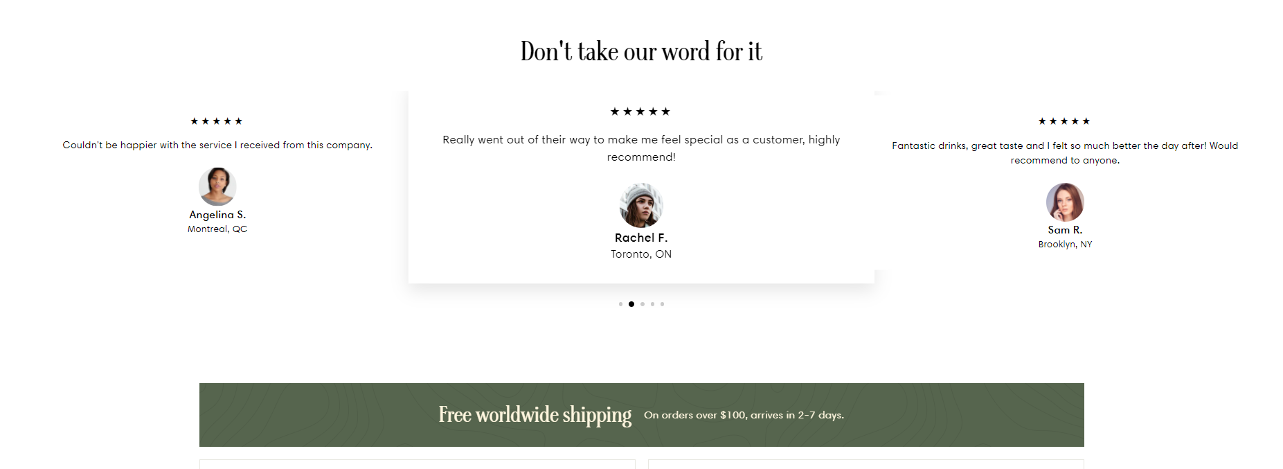
- Reviews and testimonials from existing customers: Social proof will never go out of style, especially in a time when options are so limitless. You can opt for themes when building your site that has a built-in function to display testimonials or use add-ons that can import reviews from your suppliers.
Read more: Web Design Tips & Tricks For A Professional Site That Converts
3. Digital marketing and promotion tips
You cannot expect to convert visitors if you don’t have any to convert. You need to drive traffic up first and foremost if you want to increase sales! More visitors equals more potential buyers, so the next part of the article will be dedicated to how you can push more sales through promotion.
“You may also like”
By presenting related products for every item added to cart, you increase the chance of a multiple-item cart. Always include more product recommendations at the end of every product page.
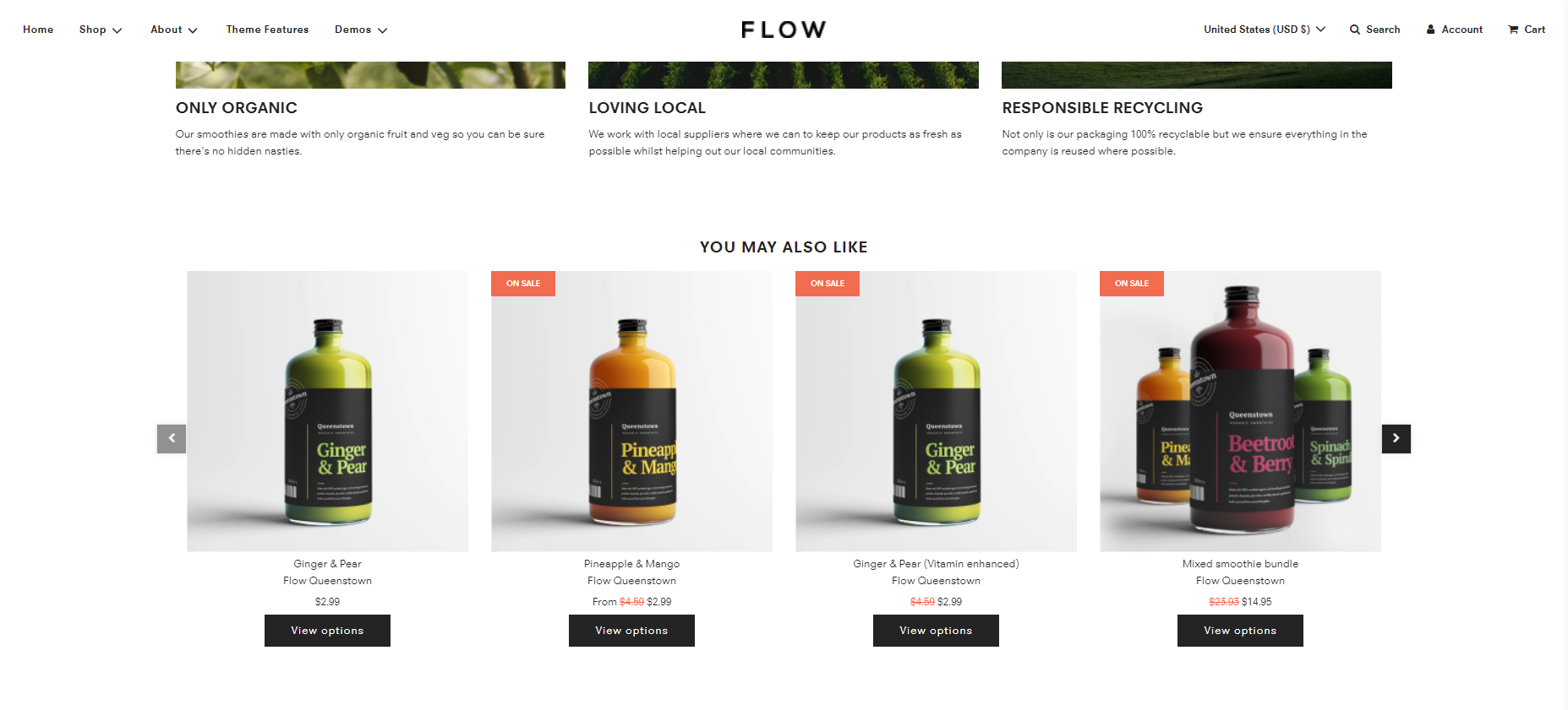
“You may also like” – Source: Flow Shopify theme.
One way you can incentivize visitors to buy more from your page is to offer free shipping when they have reached a certain price point, e.g. “Free shipping for $100+ orders”.
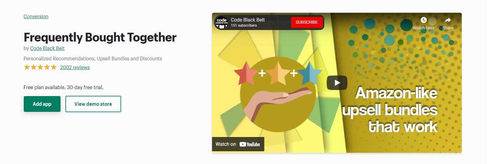
You can take this tactic a step further by cross-selling and up-selling. Group products that are frequently bought together so you can sell the entire bundle (with a small discount, of course). If you are a Shopify store owner, there are a few add-ons like Frequently Bought Together, which lets merchants group items for easy cross-selling and create a sense of FOMO to push sales.
Don’t let customers abandon their carts
Did you know that the average cart abandonment rate across all industries is 69.57%? Furthermore, mobile users have an even higher abandonment rate of 85.65%!
Out of those abandoned carts, 48% of which were due to extra costs being too pricey, or that customers are forced to create an account in order to make a purchase. If you cannot optimize your business and especially your shipping options, you can lose a lot of potential customers and profit.
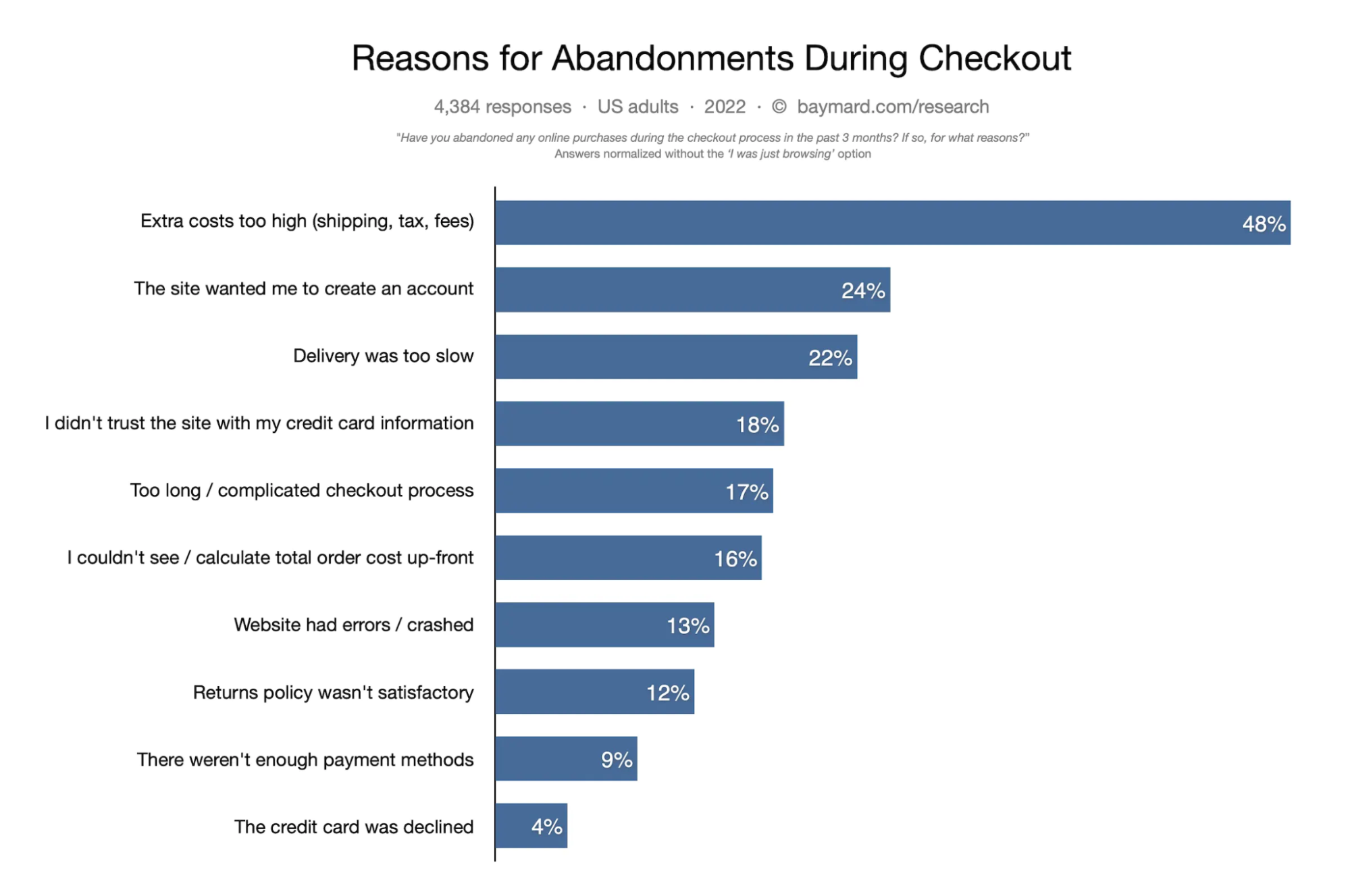
Reasons for cart abandonment – Source: Baymard Institute.
Payment methods, as you can see, play an incredibly important part in an order being fulfilled. That is why you should employ new payment methods and let customers know right away!
Moreover, pay attention to the 17% of shoppers who would drop everything if the checkout process is too long or complicated, and the 13% who do so because the website crashes. This is a good sign that you should simplify your checkout process and optimize your website.
But just because a shopper abandons their cart doesn’t mean there is a problem. It could very much be them forgetting to finish the purchase. So what you need to do is send a follow-up email to every customer who doesn’t finish the order and remind them of their abandoned cart.
Make customers your ambassadors
But don’t just stop at sending emails to customers who forgot to buy something, send one for those who did check out their carts too! Ask them to share your products on social media if they are content with your service, and don’t forget to offer them an incentive like a discount!
If you fear that might be too much work and no customers will bother to do work for you, why not ask them to do something lighter? Simply ask them to leave a review that you can feature on your site as a testimonial!
4. Other tips to convert website visitors into customers
The next steps are tailored to influence the consumer’s behaviors, so they will mainly deal with psychological effects. Don’t be fooled by their simplicity, they work wonders for converting website visitors into customers, even though they might seem unnecessary at first!
Quid pro quo
We want mutually beneficial relationships, they are second nature to us now. As an online business owner, this means you should offer a gift in exchange for an act you want your website visitors or even existing customers to do.
Of course, you need to first figure out what action will benefit your business the most, and whether customers are willing to do it for you. It could be something as simple as leaving a review, registering for an account or for your newsletter, or sharing a link to your website on social media, etc.
Fortunately, this tactic is as simple as it sounds, all you need to offer them is free stuff, a gift for when they have finished the desired action:
- Free gifts: E-books, coupons, vouchers, free shipping, etc.
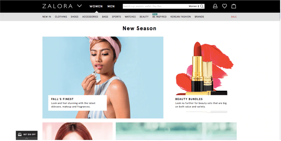
- Offer content for exclusive customers: If you have a blog on your website, consider saving an exclusive blog post or two for special customers. For example, if you run an online fashion store, consider gifting customers fashion guides related to the products they bought.
Read more: Quality Content: 15 Best Practices To Boost CRO In 2020
Create a sense of urgency or scarcity
We as a human collective are driven by FOMO – fear of missing out. Website visitors feel a need to get something rare that can set them apart from the mass. Something marketed as a “limited time offer” or “limited edition” will easily make something a lot more attention-grabbing.
There are many ways something can be limited, it can either be part of a seasonal collection that will no longer be in production after a few weeks, or an item can just be soon out of stock.
To create this scarcity, you can add the following elements to your website:
- Countdown timers
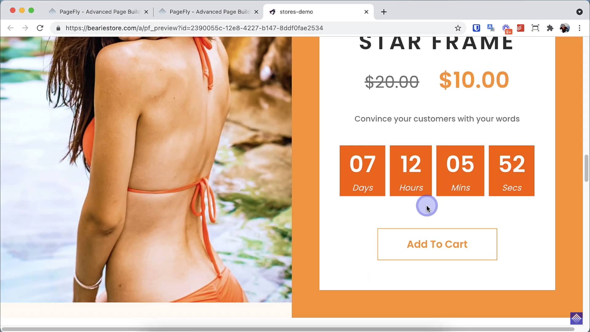
- “Limited edition” tags
- Impending out-of-stock announcements
Make visitors commit to your brand
The principle of commitment and consistency dictates that people will go to great lengths to appear consistent in their words and actions – even to the extent of doing things that are basically irrational.
You can take advantage of this human flaw to push sales by making website visitors commit to your brand. If you can get a visitor to make a small commitment, they are already one foot in the conversion funnel. To do so, try these out:
- Email/Member signup: This is extremely common in eCommerce, where brands ask website visitors to sign up for a newsletter or a membership. For the latter, do consider creating a community where paying customers can exchange user-generated content.
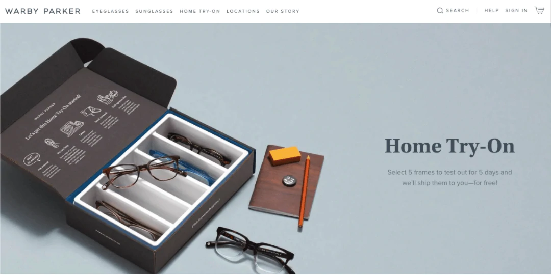
- Trial program: When a shopper gets a product in their hand, even if there is no incentive to actually buy it, he is more likely to make a purchase just because he’s familiarized himself with your brand. This was the principle behind famous Warby Parker’s Free Home Try-On Program.
IV. Conclusion
The path to conversion rate optimization is a long winding road. You need to try out every tactic you can gather if you want to successfully convert website visitors into customers. From conversion tracking to A/B testing to web design, risks are an inherent part of helping your business grow.
There are so many ways of improving conversions, and these tips are just the tip of the iceberg. Feel free to check out our blog for more in-depth and actionable tips to be a successful merchant!