 pagefly.io
01. Set common styling
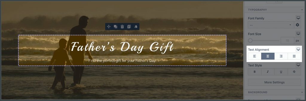
If some styling settings need to have effects on all children, then do settings for the parent element, not individual child. Example of stylings that should be inherited are:
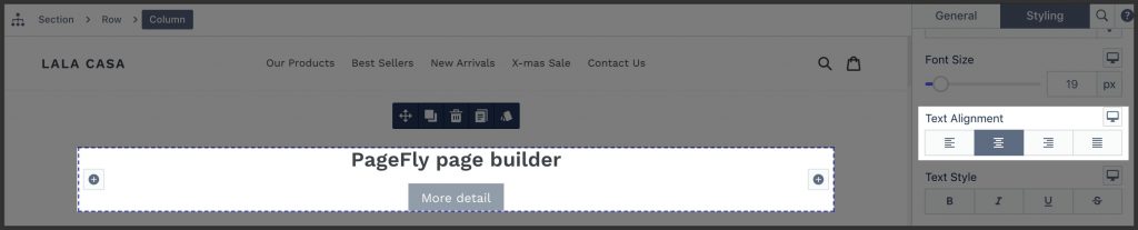
- Text alignment
- Color
Important!
The following styling should be set to individual elements to avoid the theme’s override:
- Font styles
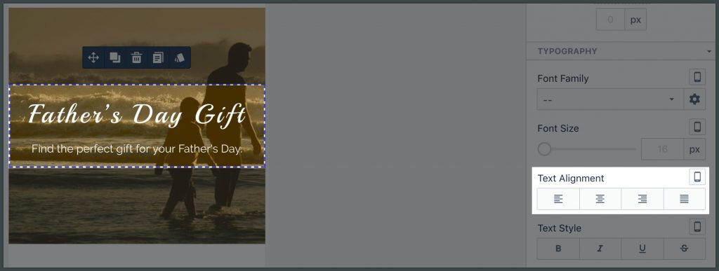
02. Set device-specific styling
2.1. Set device-specific value only when needed
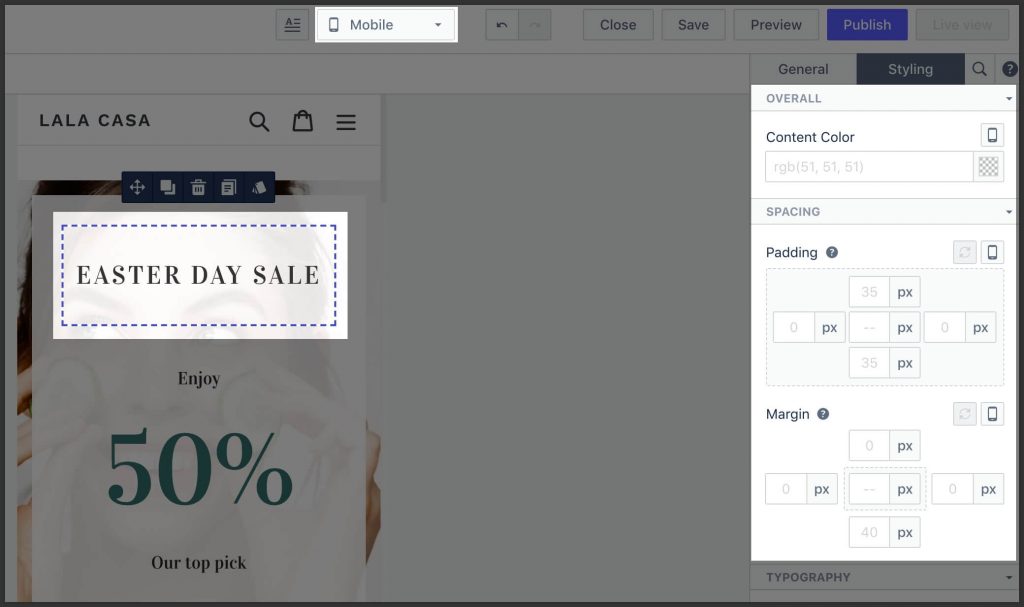
When editing the device-specific layout:
- If no special styling is required, leave the value to either “–” or blank.
- If special styling is required, try to update those parameters that already has some value set in “All”.
2.2. Use device-specific image only when needed
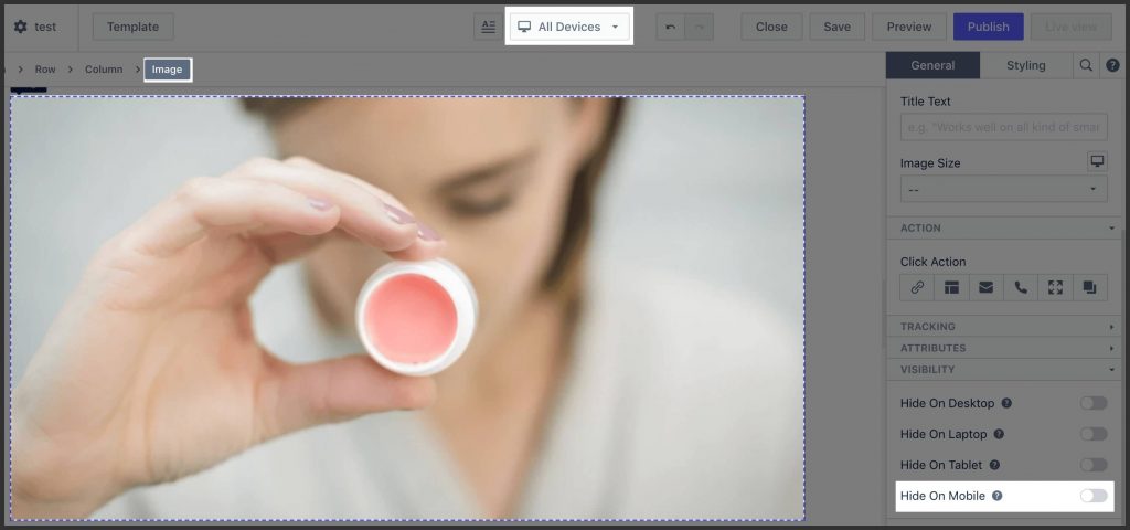
If no special image is required for individual devices, just set once in “All” mode. PageFly will automatically generate and choose appropriate image size for individual devices.
03. Set background
3.1. Set background image
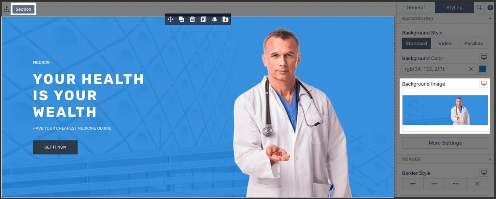
- Be thoughtful when selecting which container to have a background. For example:
- The full-width background must be set to section.
- A background designed only for a specific container must be set to the column.
- The decorative background of some elements must be set to that element.
- Clearly, understand the Background Size parameter and choose “Contain” and “Cover” carefully.
- If “Size” is set to “cover”, then “Repeat” is not required.
- If the background is patterned, create a seamless background image carefully and utilize the “Repeat” parameter accordingly.
3.2. Handle background image with border properly
If the background image has a border, better to cut that border out of background image and use “Border” settings instead. That will make the layout looks good on all devices automatically.

Also, the border will look “cleaner” (without “dirt” created by JPEG compression).
04. Handle lines
4.1. Use border if possible
Most of the time, lines are just a decoration of some elements. In that case, use border settings of that element instead of the Divider element.
4.2. Use divider when needed
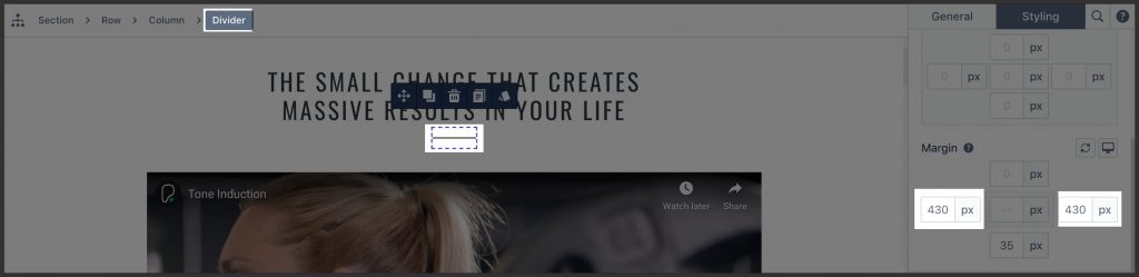
If the design is sophisticated, which made it impossible to use a border, use the divider element.
4.3. Handle inline & block elements
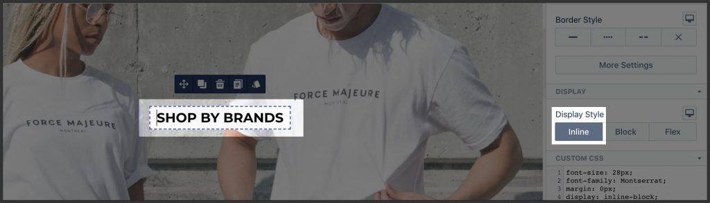
By default, block-level elements (heading, paragraph, etc.) will expand their width to the full container. If you want those elements to have width-by-content behavior, then set “Inline” in the Display section.
Read more about the difference between inline and block elements.
05. Keep line-height consistent
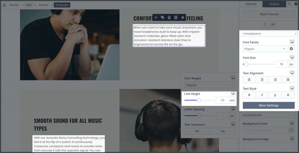
- The line-height of similar text elements should be the same.
- If no special design requirements, the recommended value is 1.5 for both heading and paragraph.
06. Do not set redundant values
Case #1
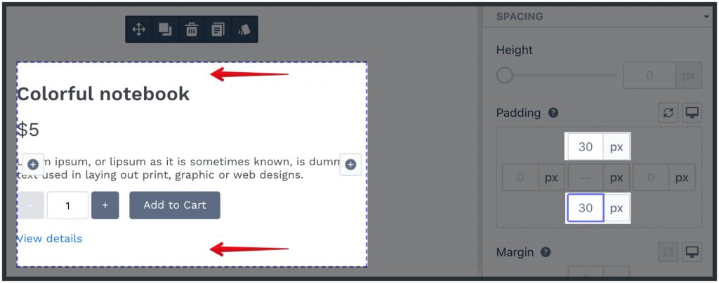
If there are no visual boundaries around content, do not set spacing parameters.
Case #3
If some parameter is set in “All” mode already, no need to set it on “Mobile” to the same value.
07. Avoid using Custom CSS code
- Try to use element parameters to get the job done with no custom CSS code involved.
- Set styling parameters only when necessary. It’s better to keep the page inherit style from the theme.
 Previous chapter