Shopify Food and Beverage Stores: What You Can Learn From Their Customer Acquisition Strategies
Before we dive into top 05 best Shopify food and beverage stores, let’s talk a bit about procrastination: It sucks!

Hello procrastination my old friend…
That eternal tomorrow which has become the graveyard of countless projects and great ideas.
But a lot of the time the reason behind that dreadful word is not that you do not want to do it, but rather that you don’t know how to do it. So you tell yourself you’re gonna do some research and two hours later you’re inexplicably watching a video on the hidden art of Mongolian throat singing. You look at your watch and tell yourself you’ll do the research tomorrow… And tomorrow… And tomorrow…
But not today. Today you were lucky enough to click on this Shopify food and beverage stores review and be inspired! Not only will we look at the 5 best stores, but we’ll also be looking at the criteria which make those online shops tick. And finally, we’re gonna have a quick look at some tips that you can use to implement the same type of strategies with your store.
Check out other case studies in our Store Reviews series HERE
What Makes A Great Online Store Great?
Before we get into the reviews let’s have a look at exactly what we mean when we are referring to certain criteria. This way everyone will be on the same page when I get all lyrical about the “copy” or “tone” or what-have-you… This will also help you identify the areas where you may want to improve and learn.
- Tone: Tone is that old universal truth known by countless significant others… “It’s not what you say, it’s how you say it…” Basically it comes down to knowing and understanding your customers.
- Content: Ah, yes, the infamous c-word that so much of the industry is obsessed with these days. But here’s the thing: content isn’t just posts, blogs, and social media updates. It’s all the copy and media on the site, plus how it is laid out, and whether or not it’s been adapted for a search engine to actually find it.
- Design: The design simply refers to how it makes one feel to explore the site. Is the design intuitive, with relevant types of information following each other, or is it just a rag-tag bunch of webpages stitched together with some code?
- Trust: This refers to the amount of trust the site evokes from people using it. The overall feeling of trust can be influenced by a couple of factors like a secure connection, quality product photos, and having contact details on the page.
- Ease of Purchase: The name is pretty self-explanatory. Let’s not kid ourselves, we’re not making nice online shops just to showcase our products, we’re doing it to sell! And the key to selling your products once a customer has pushed that “Add to Cart” button is to make the process that follows as simple as possible.
- Customer Friendly Eco-System: Okay, so this is a word that I just coined. To explain it I want you to imagine walking into a shop in a busy mall on a Saturday. Once you enter, you realise you are the only customer there… Weird huh? That’s how people feel when they get to a shop and there’s no trace of other customers. No reviews, no comments, no testimonials, nothing. Enough to give any prospective customer the heebie-jeebies!
- Creating Want: This is the basis of any good sales strategy – convincing the customer that he/she really wants the product and then making them believe that if they do not act immediately their capability to get the product may be impaired. “Limited amount left – Act now to avoid disappointment – Free shipping for 48 hours…”
- Upsell: This goes hand and hand with creating want, and if you want to build any successful business it will be a cornerstone of that endeavour. It’s the buy one get one free offer, the free shipping with orders of… you get the idea.
So with that out of the way, let’s turn our attention to the actual Shopify food and beverage stores.
The Stores
We’ll be looking at five Shopify food and beverage stores.
The stores range from fitness nutrition to sauces, all the way to exclusive wine by the glass. We’ll be touching on some of the elements mentioned in the above guide, so you can get a better idea of what works and what does not. But first, you might want to grab yourself a nice strong cup of Joe because first off we have a caffeine-fueled tour de force…
Read more: The Exclusive Guide To Selling Food Online
01. Store 1: Death Wish Coffee – A Store Build On Not Saying Sorry
Everything about Death Wish Coffee screams unapologetic authenticity. This enables the product to do something that you don’t see everyday… Instead of the good guys and gals at Death Wish Coffee spending time figuring out who exactly their audience is they’ve created a product that draws a certain type of audience to them. Genius!
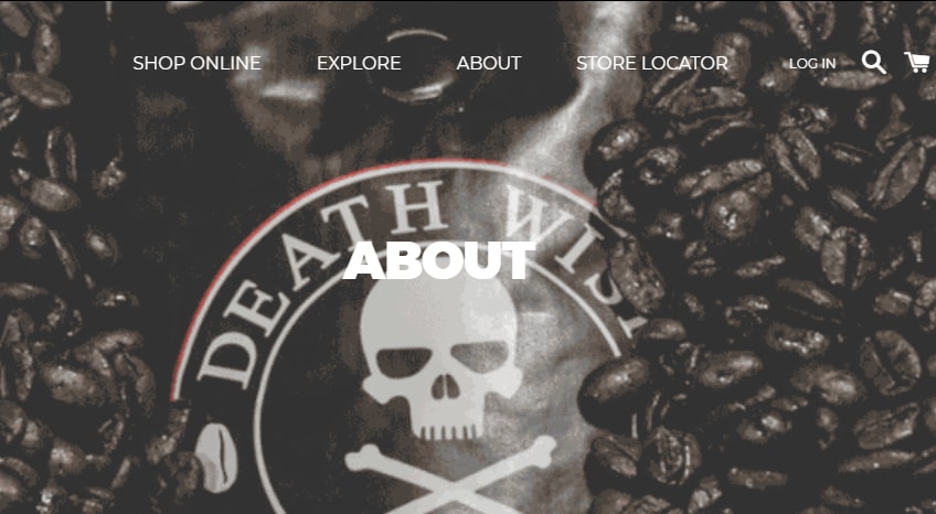
With Death Wish Coffee you know what to expect from the start
And the tone on the website reinforces that with great copy using phrases like “Hell Yeah” and “Try it, you Mug!”. From the get-go, you know exactly whether you are a Death Wish Coffee kind of person or not.
The actual design is also unique because of the type of product that coffee is. Because they don’t have to convince anyone to actually start using coffee, as you would with a new type of product or service, they concentrate on what they are actually selling – the “outlawness” of the actual product. The entire design of the site is there to enforce one central message: “Our coffee is strong as hell. Sorry, not sorry. Try it if you think you’ve got what it takes.” This leads us to the next great feature of the site: creating want.
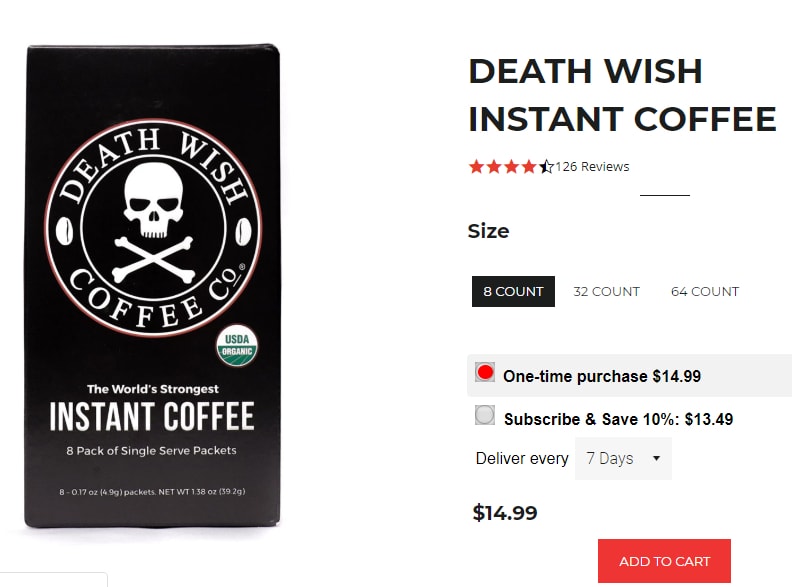
Offering a 10% discount for a subscription -some out of the box thinking.
Because of the unique selling point of the product, being the “world’s strongest”, there are already a couple of angles to lure in customers. This ranges from the novelty of trying the product once to the subtle reverse psychology of “try it if you dare.” It’s smart marketing that’s ingrained into the very essence of the product. But the smart marketing does not end there…
The real genius behind Death Wish Coffee’s marketing is how they collect their customers’ information. Customer info is one of the most important assets if you want to once-off customers into satisfied regulars. That’s why Death Wish Coffee has incentivised the sharing of customer info. “Want free domestic delivery in the US? No problem, just create an account. Want to qualify for a 10% discount? Cool, just subscribe and we’ll organize that for you.”
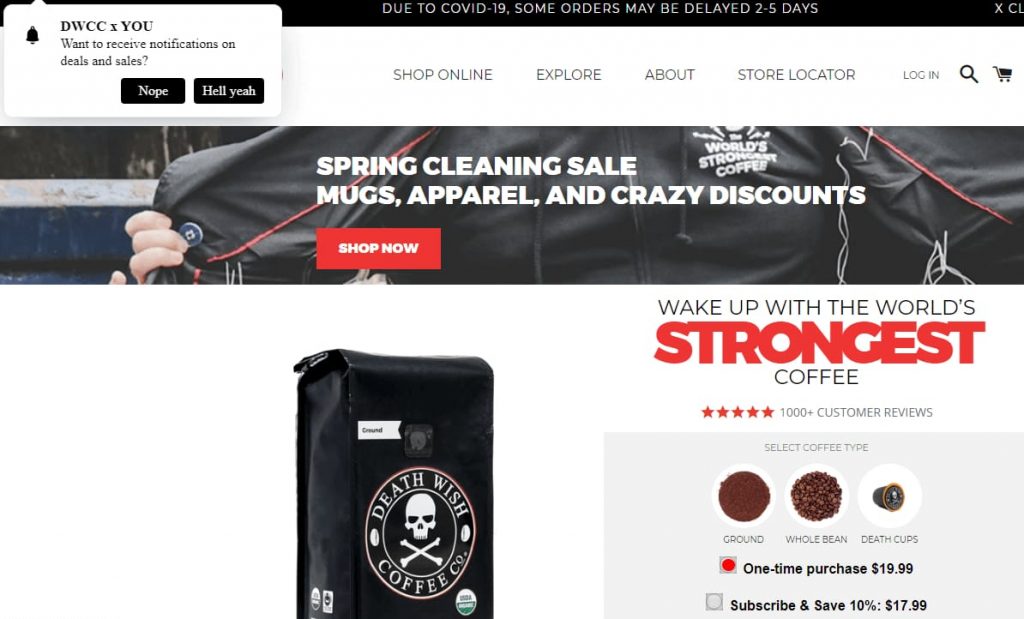
It’s brash. It’s bold. It’s unapologetic.
Lastly, they’ve created a gritty loyalty system called Death Wish Stash, which rewards customers with DW Stash Cash to be used when they crave caffeine in future. In truth, the only negative is the fact that there’s no floating menu to allow easy navigation. But then again, it kind of fits with the non-conformist attitude of this product and website.
02. Store 2: Huel – A Store Build On Trust
Next up we have a company specializing in nutrition, or as they put it “Human + Fuel = Huel.” creating a name for yourself in the (over)populated world of nutrition solutions was always going to be a daunting task, but Huel did this by focusing on a niche within the niche of food and beverage: nutrition with a conscience.
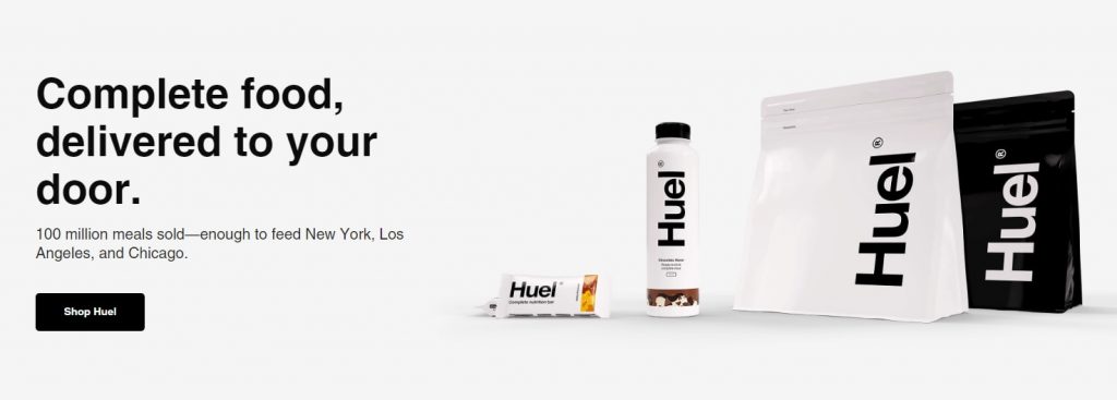
Huel’s website design echoes its product design
Their mission is simple: “To make nutritionally complete, convenient, affordable food, with minimal impact on animals and the environment.” This is important because much like Death Wish Coffee, they are now able to draw an audience towards their products. To further accentuate their ‘wholesome’ tone they opted for a simplistic and modern design, much in keeping with their physical product design.
But where DW Coffee is selling a product that the consumer is familiar with – coffee – Huel have to sell a product that most consumers don’t know – their own branded nutritional solutions. That’s why Huel spent most of the real estate on their landing page establishing trust to settle the nerves of prospective buyers.
They do this by listing all of the trusted media platforms which have featured their products, then back this up by listing all of the benefits of using Huel. You would think that this would be enough, but in the highly competitive market of nutritional products, you’ll be wrong! That’s why Huel’s landing page also features the nutritional information of their products as well as a list of testimonials from dietary experts.

Establishing trust by listing the outlet they’ve been featured on
But the real layer of trust lays in the way Huel uses social media to convince prospective buyers that real everyday people are using and enjoying their products. This kind of marketing is invaluable because it creates a fad – a sense of exclusiveness of being a “Hueligan” – while also lending credibility to the brand.
As with some of the other Shopify food and beverage stores on the list, when it comes to creating want, Huel knows exactly what to do. This is because they completely understand what they are selling, and who they are selling it to. Huel is selling a socially responsible product to a segment of society that wants it known that they are being socially responsible.
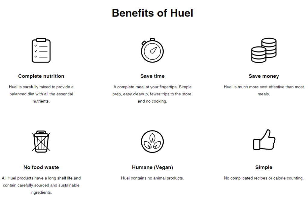
Huel has to spend more time and energy on convincing people to buy their products.
All the copy and media on the site repeats this message, and they do so successfully. The only chink in the armour is when you get to the check out stage. The process is as straightforward as it could be. But in their defence, Huel has a dedicated and passionate consumer base, so abandoned shopping carts are probably not that big of an issue.
03. Store 3: Bushwick Kitchen – A Store Build On A Template
You’d be forgiven if you experience deja vu when browsing through Bushwick Kitchen’s array of edgy sauces. Somewhere, some part of you might go “I’ve seen this before. Not with sauces, but…” This is because Bushwick Kitchen uses Shopify’s Brooklyn template. Yup that’s right, not only are they using a template, they are using a free template.
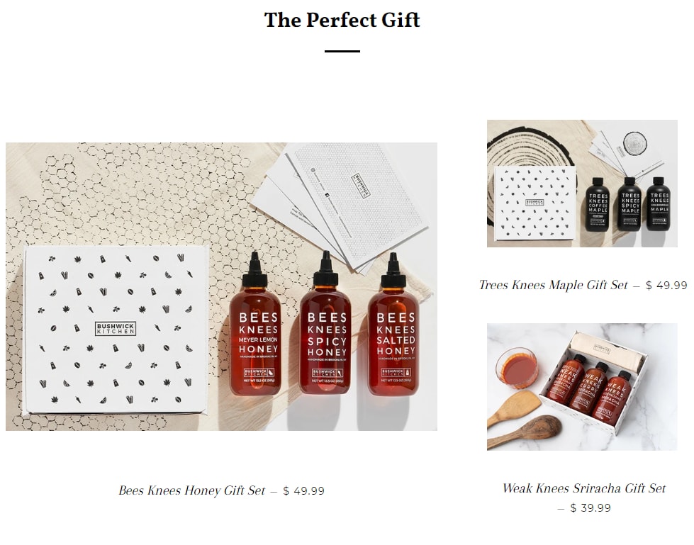
A great example of how an eloquent design can be done for free.
And why not? It works, doesn’t it? It’s clean and smooth and minimal. Plus it’s a page that converts: in Bushwick Kitchen’s first ten months they managed $170,000 in revenue. Take that so-called eCommerce “experts” who tell you you shouldn’t use a free template…
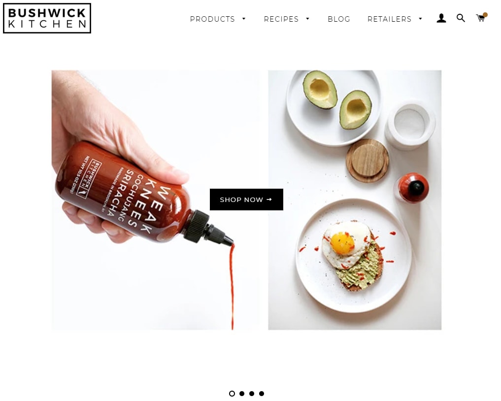
The lovely simplicity of the Brooklyn Shopify theme.
But before you stop reading and scurry off to finish your online shop, you need to understand that Bushwick Kitchen was built by real experts who wanted to document the entire process of starting an online shop. So it wasn’t just a case of adding a couple of photos to the Shopify template and relaxing. Luckily though, today there are lots of good Shopify Page Builders to help you customize free Shopify themes and templates.
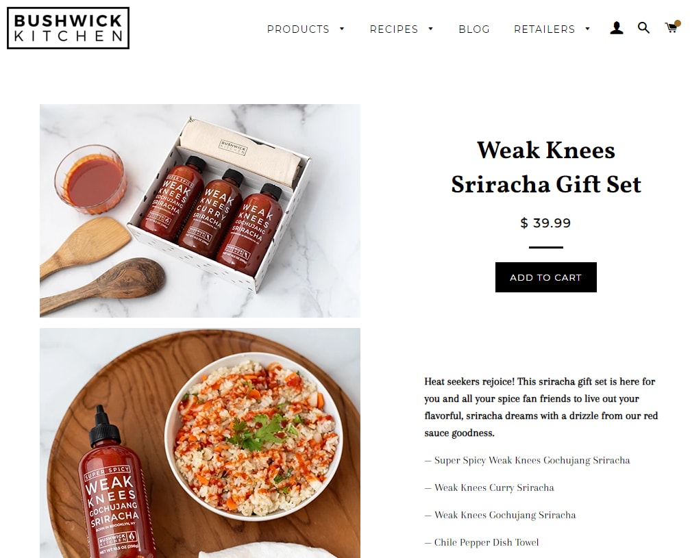
The checkout process is as straightforward as you’d expect.
But I digress… Back to the page.
The minimalist copy serves to make the actual products stand out. The design is classic and effortless to navigate as is the checkout and shopping cart system. I mean, what else would you expect from a Shopify mainstay like the Brooklyn theme? And why fix something that ain’t broke?
04. Store 4: Knack – A Store Build On The Gift Of Giving
Some people just understand how to give a gift. You might even say that they’ve got a knack for it… For the rest of us there’s Knack, an awesome gift giving online store that helps you create and give thoughtful gifts to your loved ones. This on its own is already brilliant, but…
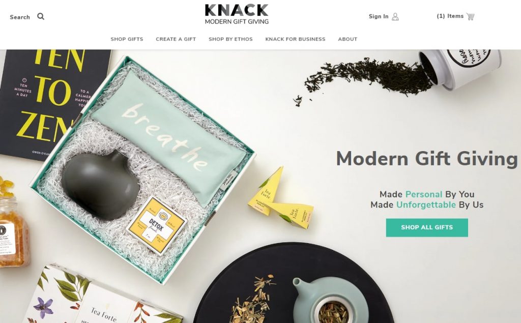
Knack… giving the gift of gift-giving.
The one feature that this online shop has nailed is the upsell. The entire process of the shop is to fill up a beautiful gift box with custom goodies to give to your loved ones. But the entire process of building that box is so much fun that soon you find yourself overspending, but more importantly, not caring!
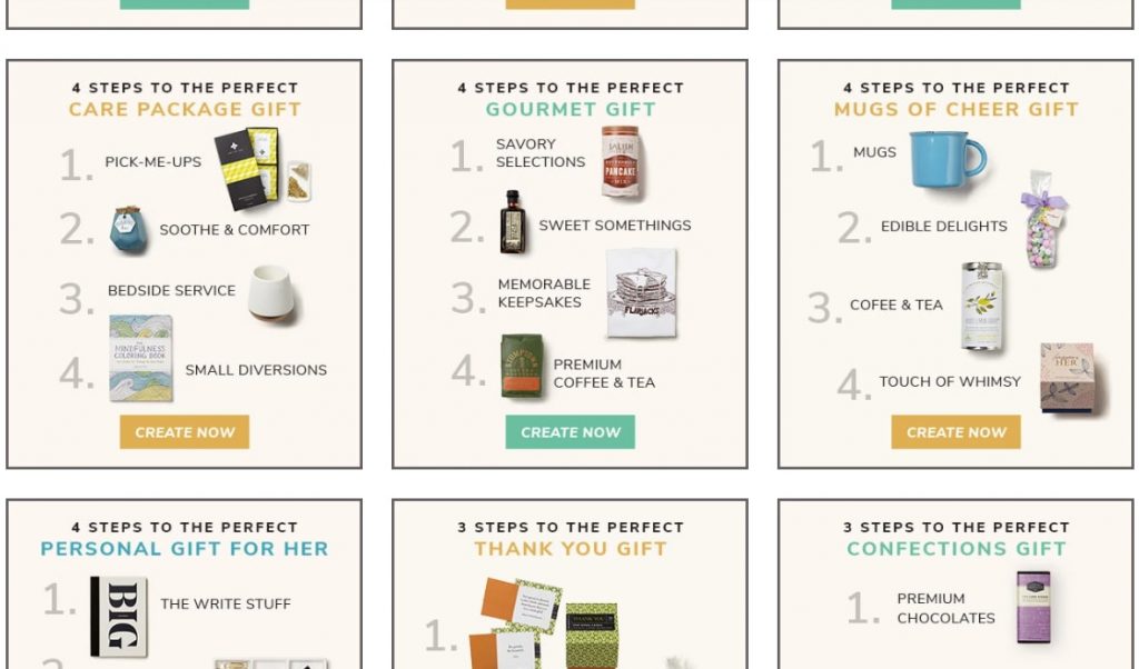
You’ll find whatever gift you want…
The shop turns someone like me, who’s horrible at gift-giving, into a gift-giving expert and for a while there I went drunk with power! The key to Knack’s success is the templates of types of gifts that the shop gives you access to. Let’s say I’ve got a foodie friend with a birthday coming up… I just select the gourmet gift selection and an assortment of relevant gifts are there for me to choose from.
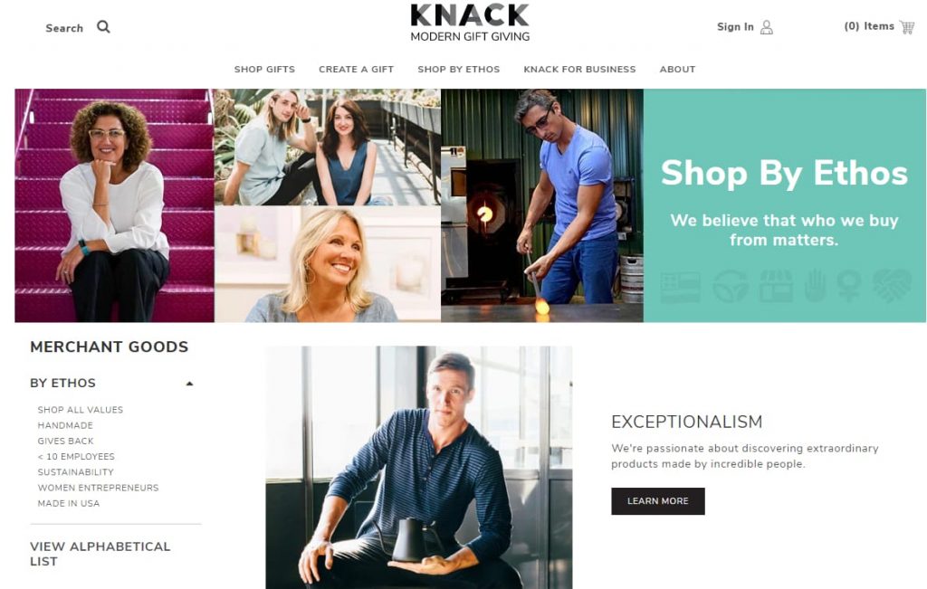
While supporting the types of businesses that you want to.
The customizability of the process is also brilliant and you can see that a whole lot of thought went into the design process. This allows you to browse the products with ease or even shop by the specific ethos of said products. It seems that every time that I return to this online store I Discover something new… Knack is the online food and beverage store that just keeps on giving!
05. Store 5: Vinebox – A Store Build On Exclusivity
Finally, we have one of my favorite Shopify food and beverage stores ever. Vinebox is a subscription-based wine club that delivers to customers glasses of exclusive wines. They had me at wine and deliver…
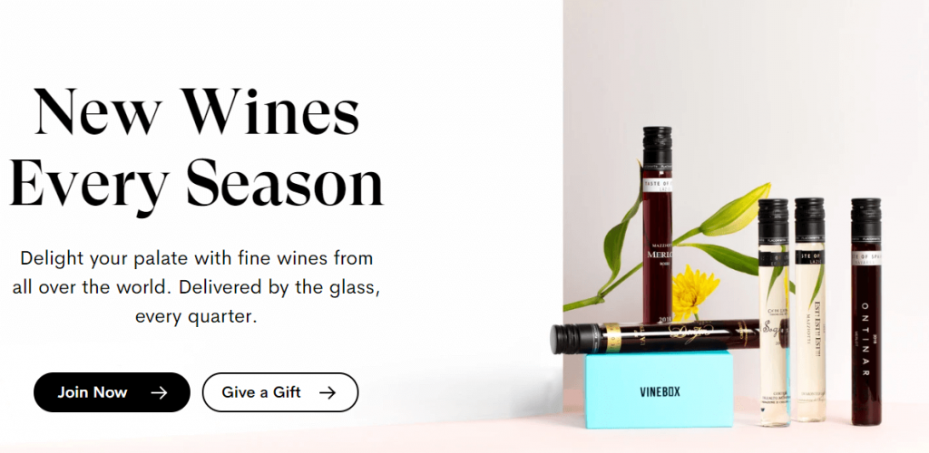
Vinebox -redefining the term box wine forever…
The real strength of the store, however, is creating a sense of exclusivity as soon as one reaches the landing page. It’s the virtual equivalent of walking into a restaurant that you know people usually have to book months in advance. The design couples perfectly with the “upmarketness” of the product. Each word of the copy evokes a sense of luxury: “Delight” “palate” “fine”…
As with some of the other Shopify food and beverage stores on the list, the brilliance lies in what Vinebox is selling. They are selling the guidance of a personal sommelier, guiding you on a journey of taste as you sample some of the best wines in the world.
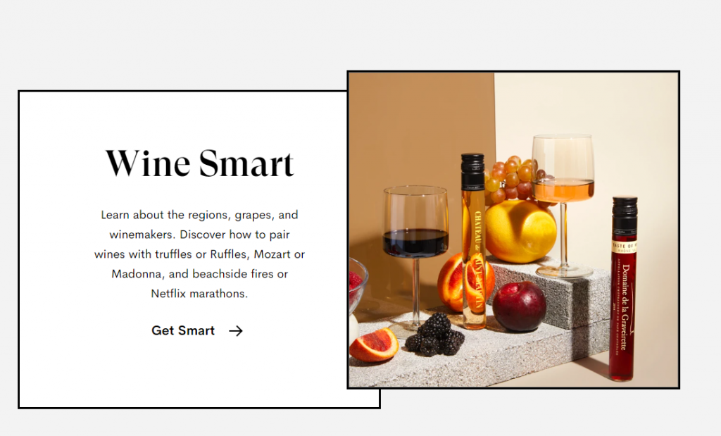
Vinebox offers the knowledge and insight of a personal sommelier
The loyalty program means that you then get to earn credits which you may use to buy some of your favourite bottles that you’ve sampled. What’s better than revealing an expensive bottle of wine at a dinner party? Telling your guests exactly what they are tasting while you are enjoying a said bottle of wine.
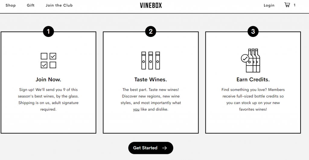
The credit system will ensure return customers.
Because this is a subscription box system the purchasing process has certain limitations to it, things like having to sign up and complete forms, which would usually cause people to abandon their shopping carts. They do still try and give you options, like ordering for two or upgrading to annual which is great. The credit system is also quite generous as you’ll earn $120.00 in credits for a total of $288.00 spent – a feature that is sure to have people coming back for more!
A Couple Of Tips To Help Create Your Perfect Food And Beverage Shopify Stores
Okay, so finally let’s have a quick look at some of the tips that will help you create an online store that will be just as good as the reviewed Shopify food and beverage stores! Shopify comes with 14 day Shopify Free Trial with no credit cards options to help you build your store.
- Find your Niche: People tend to overthink the process of finding a niche these days. Take Death Wish Coffee as an example: having decided on food and beverages they narrowed the scope to coffee and then narrowed it again to extremely strong coffee. It’s that simple; you don’t need to go any further…
- Create a store based on the tone of your product: Ask yourself what does your product sound like? Is it a roaring V8 like Death Wish Coffee or the excited chattering of satisfied customers like Huel. Your answer will inform your content and your design.
- Make your checkout process as simple as possible: Avoid the filling in of forms unless it is part of the business model like Vinebox. Remember most online shopping is done on mobile and the process of going through a form on a phone’s keyboard leads to loads of abandoned carts. If you really need to have your customer fill in a form, incentivise it as Death Wish Coffee and Huel did.
- Social Media: You can use social media to create both a sense of FOMO or credibility with your customers. Or you can just use it to create a community of like-minded individuals as is the case with Knack.
- Be fearless… but be ready to ask for help. Bushwick Kitchen showed us what can be achieved using a free template from Shopify. But they also showed us that any successful business owner should know their own limitations and not be afraid to reach out to address those limitations.
- Pro Tip: If you ever come across a Shopify store design you really like, bookmark it, then run it through this tool – which tells you which Shopify Theme that store is using. From then, you can try out the theme and see if it fits your store design.
And finally, be relentless. Running your own online store is not an easy thing. But if you put in the hours, the dedication, and the passion that’s needed you’ll be sure to make a success of it. And now that you’ve had your fill of procrastination its time to get to work!