
Unlock Your PageFly Potential. Learn, Grow, Succeed
Empower your e-commerce success with PageFly Academy. Gain the knowledge and skills to build stunning, revenue-driving online stores.
Explore our top courses
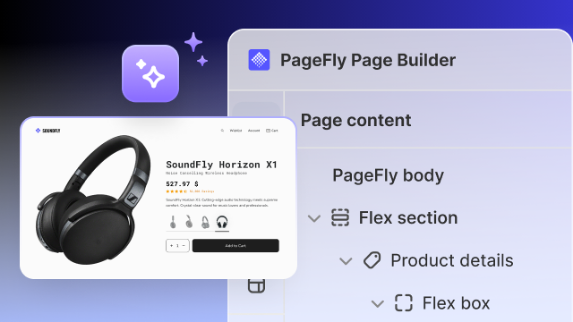
PageFly 101: Complete Guide to Building Shopify Pages
From initial setup to advanced design tweaks, learn to build high-converting Shopify pages with PageFly.

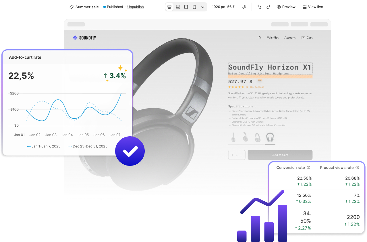
Boost Your Shopify Conversions
Learn how to design, customize, and optimize Shopify pages with PageFly to optimize conversions and shopping experience.
Optimize Page Speed and Page Performance
Learn how to enhance your page speed and performance to improve user experience and page performance.
Why choose PageFly Academy?
Learn from experts
Our courses are designed and delivered by PageFly Experts who understand your needs.

Tailored for Shopify success
Every course is crafted to help you maximize the potential of PageFly to build your Shopify store.
Practical, actionable knowledge
Gain skills and insights you can immediately apply to create high-converting page.
Frequently asked questions
PageFly Academy is an educational platform that offers courses to help Shopify merchants and e-commerce professionals enhance their skills and grow their businesses.
Simply sign up for a PageFly Academy account, browse the course catalog, and click 'Enroll' on the course of your choice.
All courses are free.
Yes, our courses offer certifications upon completion to showcase your achievements.
While our courses are tailored for Shopify merchants, the skills and strategies taught can benefit all e-commerce professionals.
Experience PageFly: Where Learning Meets Action
Created with